Create a report from a custom chart
In this example, you create a report that charts which products were purchased over a period of time.
This example uses the timechart command and chart options to create and customize a chart.
This example uses the productName field from the Enabling field lookups section of this tutorial.
If you do not configure the field lookups, the searches in this section will not produce the correct results.
- Start a new search.
- Change the time range to All time.
- Run the following search.
sourcetype=access_* | timechart count(eval(action="purchase")) by productName usenull=f useother=fThis search uses the
count()function to count the number of events that have the fieldaction=purchase.The search also uses the
usenullanduseotherarguments to ensure that thetimechartcommand counts events that have a value forproductNameEvents that have null values for productName are not included.The following table appears on the Statistics tab.

- Click the Visualization tab.
- Change the chart type to a Line chart.
- Use the Format drop-down to format the X-Axis, Y-Axis, and Legend to produce the following chart.
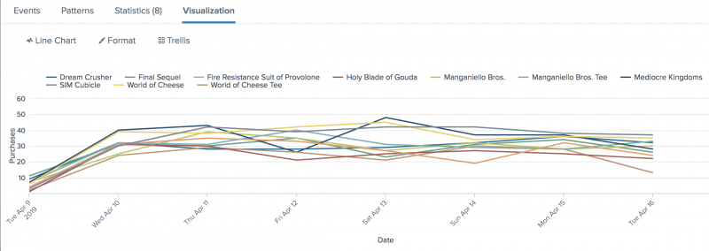
This table lists the changes made to the chart.Chart changes Setting or value Chart type Line X-Axis CustomTitle Date X-Axis Labels -45 degree angle Y-Axis Custom Title Purchases Y-Axis Interval 10 Legend Position Top - Click Save As and select Report.
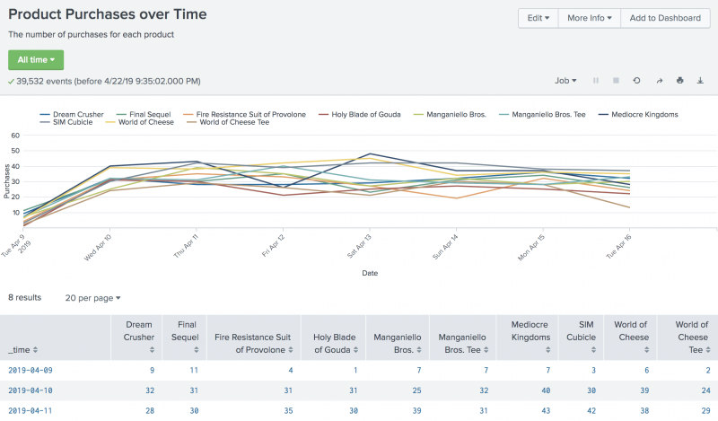
- In the Save Report As dialog box, for Title type
Product Purchases over Time. - For Description, type
The number of purchases for each product. - For Content, select the first option Line Chart and Statistics Table.
- For Time Range Picker, keep the default setting Yes.
- In the Save Report As dialog box, for Title type
- Click Save.
- In the confirmation dialog box, click View to see the report.


Next step
Create a report from a sparkline chart
See also
timechart command in the Search Reference
Chart overview in Dashboards and Visualizations
About reports in the Reporting Manual
| Create an overlay chart and explore visualization options | Create a report from a sparkline chart |
This documentation applies to the following versions of Splunk® Enterprise: 7.3.0, 7.3.1, 7.3.2, 7.3.3, 7.3.4, 7.3.5, 7.3.6, 7.3.7, 7.3.8, 7.3.9, 8.0.0, 8.0.1, 8.0.2, 8.0.3, 8.0.4, 8.0.5, 8.0.6, 8.0.7, 8.0.8, 8.0.9, 8.0.10, 8.1.0, 8.1.1, 8.1.2, 8.1.3, 8.1.4, 8.1.5, 8.1.6, 8.1.7, 8.1.8, 8.1.9, 8.1.10, 8.1.11, 8.1.12, 8.1.13, 8.1.14
Feedback submitted, thanks!