Create dashboards and panels
In this section, you will save a search as a dashboard panel and add an input element to the dashboard.
Save a search as a dashboard panel
- Start a new search.
- Change the time range to Previous week.
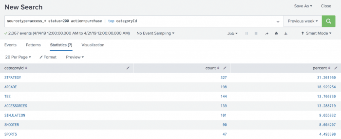
- Run the following search.
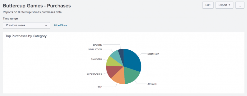
sourcetype=access_* status=200 action=purchase | top categoryIdThis search returns events from web server access log files for successful (status=200) purchases. The
topcommand automatically returns the count of purchases for each product and the percent each product is of the total purchases.
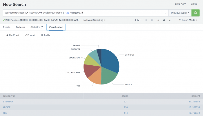
- Click the Visualization tab. The displays shows a Line Chart.
- Change the Line Chart to Pie Chart.
- Click Save As and select Dashboard Panel.
- Define a new dashboard and dashboard panel.
- For Dashboard, click New.
- For Dashboard Title, type
Buttercup Games - Purchases.
The Dashboard ID field displays buttercup_games__purchases. - For Dashboard Description, type
Reports on Buttercup Games purchases data. - For Dashboard Permissions, keep the default setting Private.
- For Panel Title, type
Top Purchases by Category. - For Panel Content, keep the setting for Pie Chart.
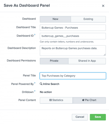
- Click Save.
- In the confirmation dialog box, click View Dashboard.
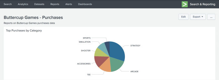


You now have a dashboard with one report panel. To add more report panels, you can either run new searches and save them to this dashboard, or you can add saved reports to this dashboard. You will add more panels to this dashboard in the next section.
For now, let's spend a little bit more time on this dashboard panel.
View and edit dashboard panels
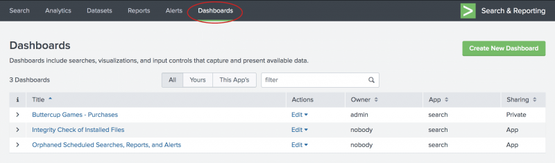
There is a separate view to see a list of the dashboards that you have access to. From this view, you can create dashboards, and make changes to dashboards and dashboard panels.
- Click Dashboards in the App bar to see the Dashboards view.
You might see a pop-up dialog box asking if you want to take a tour about dashboards. If you take the tour, there is an option at the end of the tour to try dashboards yourself. This option displays the Dashboards view.
In addition to the Buttercup Games - Purchases dashboard that you created, there are several built-in dashboards in the list.
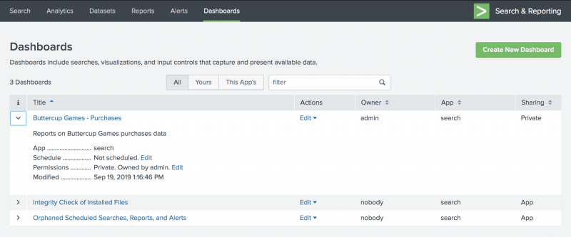
- For the Buttercup Games - Purchases dashboard, click the arrow ( > ) symbol in the i column to expand the dashboard information.
You can see information about the app that this dashboard is associated with, whether or not the dashboard is scheduled, and the dashboard permissions.


Add controls to a dashboard
You can add input controls, such as the Time range picker, to dashboard panels.
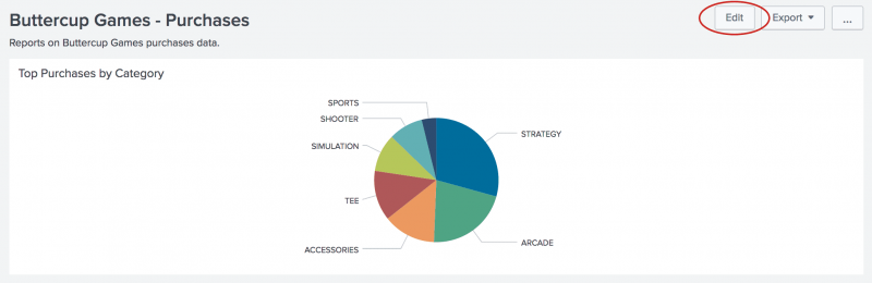
- In the Dashboards list, click Buttercup Games - Purchases to display that dashboard.
- Click Edit.
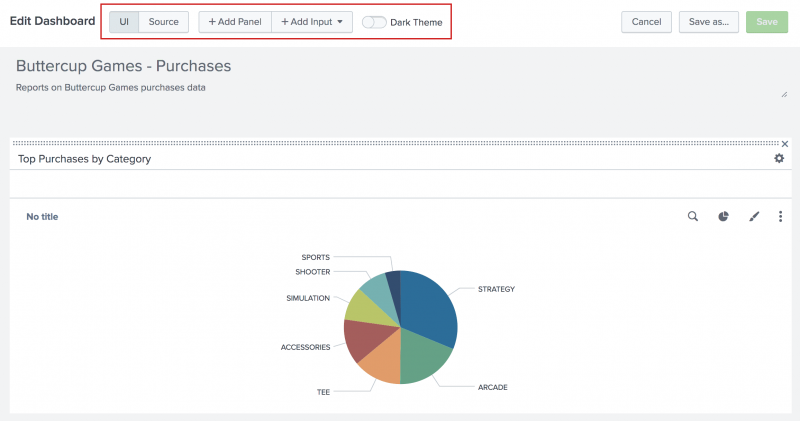
You can either edit the dashboard using the UI or the Source. With the UI option you can add panels and inputs to the dashboard.- You can use the Add Panel option is used to create a new panel, add a report as a panel, or clone from an existing dashboard.
- You can use the Add Input option to choose from a list of controls to add to the dashboard, including text, a checkbox, and a time range picker.
- You can use the Dark Theme option to change the background appearance of the dashboard. To enable the theme change, you must Save and Refresh the dashboard.
With the Source option, you can edit the XML source for the panel directly. Editing the source directly is not discussed in this tutorial.
- Click Add Input, and select Time.
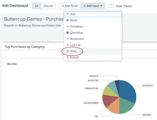
The Time range picker input control appears on the dashboard.
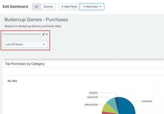
- Click the Edit Input icon for the Time range picker. The icon looks like a pencil.
This opens a set of input controls. The Time input type is selected.
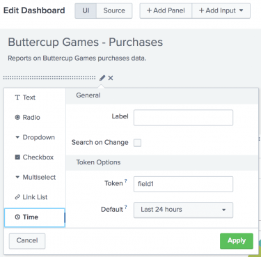
- For Label, type
Time range. - For Token, replace the default token name
field1. TypeBG_Purchases_Time_Range.
The controls that you add to a dashboard have identifiers called input tokens. This step redefines the name of the input token for the Time range picker. The default names for input tokens are field1, field2, field3, and so on. You can change the input tokens when you add controls to your dashboard. Naming the tokens makes it easier to understand which input you are working with. In this example you are using a token name that includes the a short version of the dashboard title. - For Default, change the default time range to Previous week.
- Click Apply.
The input controls that you add to a dashboard are independent from the dashboard panels. If you want the chart on the panel to refresh when you change the time range, you need to connect the dashboard panel to the Time range picker input control. - For Label, type
- In the dashboard panel, click the Edit Search icon. The icon looks like a magnifying glass.
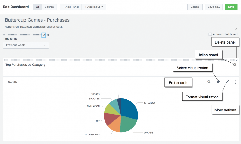
- In the Edit Search dialog box, for Time range the default selection is Use time picker. Click to see the options. You want to select Shared Time Picker (BG_Purchases_Time_Range).
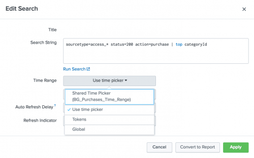
- Click Apply.
- In the Edit Dashboard window, click Save to save the changes to the dashboard.
The panel is now connected to the Time range picker input control in the dashboard. This Time range picker is referred to as the shared time picker. The inline search that powers the panel now uses the time range that is specified in the shared time picker.


You can have dashboards that contain a mix of panels. Panels that are connected to the shared Time range picker, and panels that show data for the time range specified in the search that the panel is based on.
You will learn more about connecting other panels to the shared time picker in the next section.
Next step
Learn about adding more panels to a dashboard.
See also
- About the Dashboard Editor in Dashboards and Visualizations
- Configure dashboard permissions in Dashboards and Visualizations
| About dashboards | Add more panels to dashboards |
This documentation applies to the following versions of Splunk® Enterprise: 8.0.0, 8.0.1, 8.0.2, 8.0.3, 8.0.4, 8.0.5, 8.0.6, 8.0.7, 8.0.8, 8.0.9, 8.0.10, 8.1.0, 8.1.1, 8.1.2, 8.1.3, 8.1.4, 8.1.5, 8.1.6, 8.1.7, 8.1.8, 8.1.9, 8.1.10, 8.1.11, 8.1.12, 8.1.13, 8.1.14
Feedback submitted, thanks!