Part 4 Add a pie chart visualization
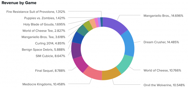
As a representative of Buttercup Games, you need to present a breakdown of the store's revenue comes. In Splunk Dashboard Studio, you can add a pie chart visualization and choose between a pie or donut appearance. To showcase the revenue breakdown, create a donut chart that divides the store's total revenue by game.
- Select the add chart icon (
 ) in the editing toolbar, and then select Pie.
 - In the New Data Source panel, name the source Revenue by Game.
- Add your search. For this tutorial, copy and paste the following search into the Search with SPL box:
index=main sourcetype=access_* action=purchase status=200
| stats count values(price) as Price by productName productId
| table productName productId count Price
| eval revenue=count*Price
| fields productName revenue
| rename productName as "Game" revenue as "Revenue"
| sort -Revenue
- Expand the Code section and change the Data Source ID to ds_revenue_by_game.
- Select Run & Save. At this point, you've created a new data source, given it a unique ID, and assigned it to a pie chart.
- Title your pie chart Revenue by Game and leave the description box empty.
- In the Appearance section of the Configuration panel, select Donut.
- In the Labels section, select Values & Percent.
- For Dashboard Studio in Splunk Enterprise, in the Labels section, select Show Values. Showing percentages is currently unavailable for Dashboard Studio in Splunk Enterprise.
- Expand the Code section and change the Visualization ID to viz_gameRevenue. At this point, you've given your chart a unique ID, changed its appearance to a donut, and labeled each game with a percentage.
- Move and resize your pie chart to center it on the top left gray rectangle.
- In the General section of the Configuration panel, change the Background to transparent.
- For Dashboard Studio in Splunk Enterprise, you can change the background color by opening the source editor and adding the option
"backgroundColor": "transparent".
- For Dashboard Studio in Splunk Enterprise, you can change the background color by opening the source editor and adding the option
After completing Part 4, your donut chart looks similar to this:
Next step
You've completed Part 4 of the Splunk Dashboard Studio tutorial.
Now your dashboard has a donut chart. Next, add a base search and chain searches, and use them to create area charts. Continue to Part 5: Add area charts using chain searches.
| Part 3 Add a table with column formatting | Part 5 Add area charts using chain searches |
This documentation applies to the following versions of Splunk® Enterprise: 8.2.0, 8.2.1, 8.2.2, 8.2.3, 8.2.4, 8.2.5, 8.2.6, 8.2.7, 8.2.8, 8.2.9, 8.2.10, 8.2.11, 8.2.12

 Download manual
Feedback submitted, thanks!