Add and format shapes and other visualizations
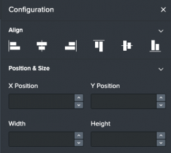
In addition to using charts and classic Splunk visualizations, you can add images, rectangles, ellipses, and connecting lines. There are two editing elements in the visual editor: the editing toolbar, located at the top of the canvas, and a Configuration panel, located to the right of the canvas.
You can only use shapes if you are using the absolute layout.
The options available to you in the Configuration panel depend on the object you've selected. Each chart has its own topic that that expands on the formatting information in this topic.
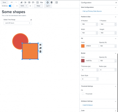
When you select an object, you can use the Configuration panel to format the object and also add a search-powered ad hoc data source to drive it in the form of a search string. For example, if you've selected an ellipse, you can use the Position & Size section to edit the position and the Border section to modify the color, opacity, thickness, and border style of the shape. You can also add a data source and enable thresholding.
You can perform the following actions using the toolbar and Configuration panel in the visual editor:
| Action | Description |
|---|---|
| Create and customize visualizations | For more information on how to work with shapes and other visualizations see Create and customize visualizations. |
| Configure source code within the visual editor | For more information see Access visualization source code in the visual editor. |
| Configure thresholding | You can use the visual editor to make shapes and many other visualizations change color according to value ranges. For more information, see Configure thresholding. |
| Add drilldown to a visualization | For more information on how to add drilldown, see Use drilldown to connect a visualization to a URL. |
| Select multiple objects and modify them all at once | For more information, see Select multiple visualizations at once. |
| Change a visualization by using the visualization picker | For more information, see Change a visualization by using the visualization picker. |
| Use keyboard shortcuts | When you select an object in the canvas, you can customize it using the Configuration panel or with keyboard shortcuts. For more information on the available keyboard shortcuts, see Use keyboard shortcuts to edit your dashboard. |
| Use reference options for shapes | You can format most shapes using the Configuration panel. Some options are only available by adding them in the source editor. To see a complete list of options available for shapes, see Options reference for shapes |
| Use reference options for charts and other visualizations. | Some options are only available by adding them in the source editor. To see a complete list of options available for these objects, select the object topic from the Table of Contents and scroll down to the reference section. |
Create and customize visualizations
Use the editing toolbar to add charts, ellipses, lines, and rectangles to your dashboard. Use the Configuration panel to format your visualizations.
When an object, such as a shape, is placed at (0,0) on the canvas axis, the top left corner of the object is placed in the top left corner of the canvas. When you increase the X value, the object moves to the right. When you increase the Y value, the object moves down. The (0,0) location is the default for background images.
For example, to add a shape:
- On the editing toolbar, click the shapes icon (
 ).
). - Select a shape to add it to the dashboard. When a shape is selected in the canvas, you can customize using the Configuration panel or you can use keyboard shortcuts. For more information on keyboard shortcuts see keyboard shortcuts.
Change the position and size of visualizations
Expand Position & Size section of the Configuration panel.
- Change the object's position on the canvas by entering the position of the shape in pixels in the X and Y fields. You can also drag the object to reposition it.
- Change the height or width by entering the dimensions of the shape in pixels in the W and H fields. You can also drag the edges to adjust the size.
Change the color and opacity of ellipses and rectangles
Expand the Fill section of the Configuration panel.
- To change the fill color, enter a color hex code, such as
#ffff00. You can also choose a default color from the color palette. - Adjust the opacity by specifying a percentage in the Opacity (%) field.
Change the border of ellipses and rectangles
You can customize the color, thickness, and dash style of ellipses and rectangles. You can also round the corners of rectangles by changing the border radius.
Expand the Border section of the Configuration panel.
- Change the border Color by entering a hex code such as
#FFFF00. You can also choose a color from the color palette. - Adjust the border Opacity by specifying an opacity percentage. The higher the percentage, the less opaque (darker) the border becomes.
- Adjust the border Thickness by specifying a number in pixels.
- Adjust the Radius to change the corner curvature percentage of a rectangle. You can specify a number from 0-100. All corners are affected by this setting.
- Adjust the border Dash style by specifying a number representing the length of the dashes as well as the spaces between them in pixels. For example, specifying a 4 will result in a border composed of dashes 4 pixels long and spaces of 4 pixels.
Format lines and use them to connect objects
Add a line using the shapes button (![]() ). A blue dot appears on the ends of the line when it is selected.
). A blue dot appears on the ends of the line when it is selected.
- To change the color and opacity of the line, expand the Stroke section.
To change the stroke color, enter a hex code such as#FFFF00. You can also choose a color from the color palette. - Change the opacity by specifying a percentage in the Opacity field.
- Change the line thickness by specifying a number in pixels in the Thickness field.
- Change the style of the line by specifying a number in the Line Dash Style field.
The number of pixels you specify is the length of the dashes, as well as the spaces between them. - Hide or show arrows at either end of the line by expanding the Arrows section of the Configuration panel.
- To change the length of a line, select the line, click the blue circle, and drag the end of the line to the position you want.
- You can also snap to arbitrary points or objects.
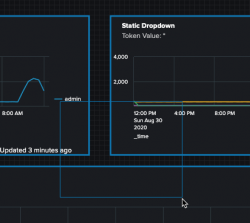
When you hover over the blue circle of a line, a four-sided arrow appears. Use this arrow to snap the line to one of the plus (+) symbols placed in convenient areas on the canvas or to an object, such as a chart, visualization, shape, or icon.
Lines are unlike the other visualizations because they have anchoring options in the layout instead of just positions. When you anchor a line to a plus (+) symbol of an object, the layout position structure for the line position is the first letter of the cardinal coordinates using the position.from.port and position.to.port fields. For example, the following layout snippet shows a line that is anchored to the northern side of one visualization, and the western of another visualization:
{
	"item": "viz_aVKLvBZJ",
	"type": "line",
	"position": {
		"from": {
			"item": "viz_mOyNaOqn",
			"port": "n"
		},
		"to": {
			"item": "viz_wwVMhJey",
			"port": "w"
		}
	}
The following shows a complete dashboard definition that uses one line connecting two objects with cardinal coordinates and one line that is not attached to an object. The unattached line is positioned by pixel placement.
Dashboard definition example
Source code
Expand the box to view the complete definition. You can copy/paste the code into your own instance to see the connected options.
{
	"visualizations": {
		"viz_wwVMhJey": {
			"type": "viz.rectangle"
		},
		"viz_aVKLvBZJ": {
			"type": "abslayout.line"
		},
		"viz_khzp2MP7": {
			"type": "abslayout.line",
			"options": {
				"fromArrow": true,
				"toArrow": true
			}
		},
		"viz_mOyNaOqn": {
			"type": "viz.rectangle"
		}
	},
	"dataSources": {},
	"inputs": {},
	"layout": {
		"type": "absolute",
		"options": {},
		"structure": [
			{
				"item": "viz_wwVMhJey",
				"type": "block",
				"position": {
					"x": 440,
					"y": 50,
					"w": 150,
					"h": 150
				}
			},
			{
				"item": "viz_aVKLvBZJ",
				"type": "line",
				"position": {
					"from": {
						"item": "viz_mOyNaOqn",
						"port": "n"
					},
					"to": {
						"item": "viz_wwVMhJey",
						"port": "w"
					}
				}
			},
			{
				"item": "viz_khzp2MP7",
				"type": "line",
				"position": {
					"from": {
						"x": 695,
						"y": 134
					},
					"to": {
						"x": 799,
						"y": 70
					}
				}
			},
			{
				"item": "viz_mOyNaOqn",
				"type": "block",
				"position": {
					"x": 130,
					"y": 50,
					"w": 150,
					"h": 150
				}
			}
		]
	},
	"description": "",
	"title": "Line connected objects"
}
Access visualization source code in the visual editor
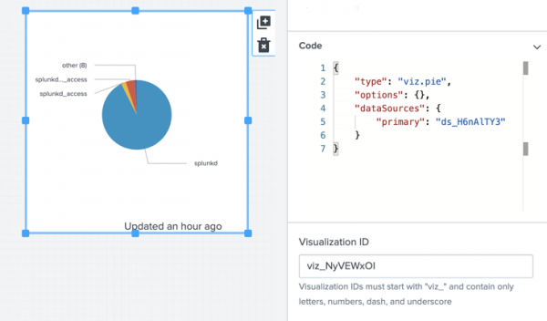
You can modify the source code of a visualization or data source in the visual editor by selecting the visualization or search and opening the code window in the Configuration panel. The changes you make will instantly affect the visualization or data source you're working with. For example:
Configure thresholding
Configure thresholding on filler gauges, marker gauges, and shapes to determine the color of the value or background of the visualization, which indicates the current status of the value being measured.
Thresholding allows you to configure the colors you want for various numerical value ranges or strings resulting from a dynamic search or static test data. The color is meant to indicate the current value and will change when it enters different ranges.
For visualizations of the type splunk.<visualization>, see the formatting section of the specific visualization. For example, to view how to apply dynamic coloring to a table, see Table configuration panel options.
Apply thresholding
This capability is supported by all visualizations of type viz.<visualization> that support thresholding.
- In edit mode, select the single value visualization for which you want to configure thresholds.
- In the Configuration panel, expand Threshold Settings.
- Toggle Thresholds to enable thresholding for the visualization.
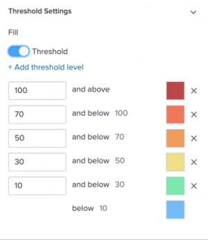
The following are the default values and their associated colors:
- If the value is below 10, the visualization is blue.
- If the value is greater than or equal to 10 or below 30, the visualization is green.
- If the value is greater than or equal to 30 or below 50, the visualization is yellow.
- If the value is greater than or equal to 50 or below 70, the visualization is orange.
- If the value is greater than or equal to 70 or below 100, the visualization is dark orange.
- If the value is greater than or equal to 100 and above, the visualization is red.
You can change the colors by clicking the color box and either selecting from the options in the panel or by entering a hex color code.
Use drilldown to connect a visualization to a URL
You can drilldown from either a visualization or a shape to a custom URL. The URL can be relative, such as coming from a local site, or absolute, such as coming from an external site. Adding drilldown to an object allows a user to click on the object to be directed to the URL you specify.
To add drilldown to an object complete the following steps:
- Select the object you want to drill down from.
- In the Configuration panel, click +Add Drilldown.
- For On Click, choose Link to custom URL.
- Provide a relative or absolute URL.
If you do not provide an http:// address, the generated URL is considered internal to Splunk Enterprise and uses a localhost URL, such as
localhost:8000/. If you provide an http:// prefix, such as/ http://splunk.com, the drilldown directs to that external URL. - (Optional) Select Open in new tab so the drilldown link opens in a new tab.
- Click Save.
When drilling down from a visualization with data, you must click the actual value in the visualization, not just anywhere in the visualization, in order to go to the link.
Select multiple visualizations at once
To select multiple visualizations at one time, click and drag the blue editing frame until it covers a part of every visualization you want to select.
An Align panel will open in the Configuration panel where you can choose from different layouts. You can also move and perform some editing on all of the objects at the same time using your mouse. Only the editing options available for all of the objects selected will be available.
Change a visualization using the visualization picker
If your data is formatted correctly, you can change one visualization into another by performing the following steps:
- In the visual editor select the visualization that you would like to change.
- Open the Configuration panel.
- Select the visualization tab.
- Use the Visualization dropdown menu to select the new visualization.
Use keyboard shortcuts to edit your dashboard
The following is a list of keyboard shortcuts that you can use in the editor.
| Function | Keyboard shortcut |
|---|---|
| Select multiple objects | Hold command/control and use your mouse to select the visualizations. |
| Cancel object selection | Press esc to cancel the selection of a visualization. |
| Change the size of an object | Select one or more visualizations and hold the alt or option key while using the arrow keys to change the size of the visualization(s). |
| Move an object 1 pixel | Select an object and hold down shift while using the arrow keys to move it one pixel in the desired direction. |
| Move an object 10 pixels at once | Select an object and use the arrow keys to move it 10 pixels in the desired direction. |
| Copy an object | Select an object and use command/control + C to copy it. |
| Paste an object | After copying an object, use command/control + V to paste it. |
| Delete an object | Select an object and click delete. |
Options reference for shapes
While most of these options are available using the visual editor, some must be added to the visualization stanza in the source editor in the options field. The general anatomy of a shape visualization is similar to the following:
"viz_65TNIqLF": {
			"type": "viz.rectangle",
			"options": {
				"fill": "#0000FF"
			},
			"dataSources": {
				"primary": "ds_gcEN4c7Q"
			}
		}
Ellipses
The following options are available for editing an ellipse:
| Property | Type | Default | Description |
|---|---|---|---|
| stroke | number | Specify the color of the stroke using a hex code. For example, "#FF0000".
| |
| strokeOpacity | number | 1 | Specify the opacity of the stroke. Choose a number in the range of 0-1. You can also express the value as a percentage. For example, "0.80" or "80%". |
| strokeWidth | number | 1 | Specify the width of the stroke, in pixels, in the range of 1-25. |
| fill | string | Specify the color fill using a hex code. For example, "#FF0000".
| |
| fillOpacity | number | 1 | Specify the opacity of the fill. Choose a number in the range of 0-1. You can also express the value as a percentage. For example, "0.80" or "80%". |
| strokeDasharray | number | 0 | Specify the size, in pixels, of dashes and spaces used to create a custom, stitched outline. The value you specify applies to both dashes and spaces. |
| opacity | number | 1 | Specify the opacity of the entire object. Stroke and fill colors are retained. Choose a number in the range of 0-1. You can also express the value as a percentage. For example, "0.80" or "80%". |
Line shape
The following options are available for editing a line:
| Property | Type | Default | Description |
|---|---|---|---|
| strokeColor | string | light mode: "#000000". Dark mode: "#FFFFFF"
|
Specify the color of the line. |
| strokeOpacity | number | 1 | Specify the opacity of the stroke. Choose a number in the range of 0-1. You can also express the value as a percentage. For example, "0.80" or "80%". |
| strokeWidth | number | 1 | Specify the width of the stroke, in pixels, in the range of 1-25. |
| strokeDasharray | number | 0 | Specify the size, in pixels, of dashes and spaces used to create a custom, stitched outline. The value you specify applies to both dashes and spaces. |
| toArrow | boolean | false | Specify whether the line begins with an arrow. |
| fromArrow | boolean | false | Specify whether the line ends with an arrow. |
Rectangles
The following options are available for editing a rectangle:
| Property | Type | Default | Description |
|---|---|---|---|
| stroke | number | Specify the color of the stroke using a hex code. For example, "#FF0000".
| |
| strokeOpacity | number | 1 | Specify the opacity of the stroke. Choose a number in the range of 0-1. You can also express the value as a percentage. For example, "0.80" or "80%". |
| strokeWidth | number | 1 | Specify the width of the stroke, in pixels, in the range of 1-25. |
| fill | string | Specify the color fill using a hex code. For example, "#FF0000".
| |
| fillOpacity | number | 1 | Specify the opacity of the fill. Choose a number in the range of 0-1. You can also express the value as a percentage. For example, "0.80" or "80%". |
| strokeDasharray | number | 0 | Specify the size, in pixels, of dashes and spaces used to create a custom, stitched outline. The value you specify applies to both the dashes and the spaces. |
| opacity | number | 1 | Specify the opacity of the entire object. Stroke and fill colors are retained. Choose a number in the range of 0-1. You can also express the value as a percentage. For example, "0.80" or "80%". |
| rx | number | auto | Specify the curvature of the horizontal corner (or border) radius with an integer or a percent greater than or equal to zero. |
| ry | number | auto | Specify the curvature of the vertical corner, or border radius with an integer or a percent greater than or equal to zero. |
| strokeLinejoin | (arcs | bevel | miter | miter-clip | round) | miter | Specifies the shape to be used at the corners of paths when they are joined. |
| Table | Add an image |
This documentation applies to the following versions of Splunk® Enterprise: 8.2.1, 8.2.2, 8.2.3, 8.2.4, 8.2.5, 8.2.6, 8.2.7, 8.2.8, 8.2.9, 8.2.10, 8.2.11, 8.2.12
 Download manual
Feedback submitted, thanks!