Single value visualizations
Use single value visualizations to display data generated from search queries, trends over time, and at-a-glance status updates.
Single value
A single value can be a count or other aggregation of distinct events. The following are common use cases for single values:
- key performance indicators or metrics
- aggregate events
- specific strings
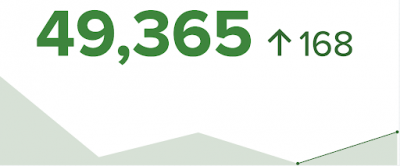
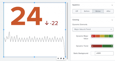
Apply dynamic coloring to single values for trend, sparkline stroke, major values, and background. For example, use the following search to create a single value.
index = _internal | timechart count | head 5
You can then configure the visualization with dynamic coloring for sparkline and trend, which will generate a single value with an area chart and bolded trend line.
Single value icon
You can add icons to single values to help signal significant changes and clarify what the single value represents. This is useful when the icon accurately represents the data, and you don't want to use a visualization title or description to explain the metric.
For example, the following steps create a single value icon visualization.
- Make sure you're in Absolute layout. Single value icons only work in the absolute layout.
- Add an icon by choosing an icon from the Add Icons dropdown menu ( ).
- Enter the following search query.
index = _internal source = "*splunkd.log" log_level = "error" | stats count - Enable the Major Value and Trend toggle.
- Select Icon & Major Value from the Dynamic Elements dropdown in the Coloring section.
Single value radial
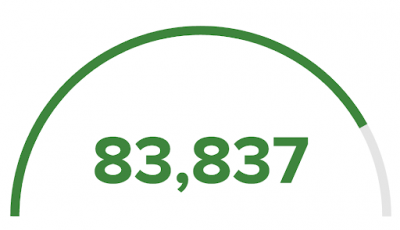
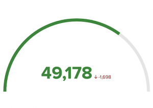
Add a radial visualization to a single value to help illustrate progressive change or percentage of completeness. For example, use the following search to create single value radial visualization.
index = _internal | timechart count | table count
You can then configure the visualization with dynamic coloring and a maxValue to show the percentage of completeness.
A caption, unit notation, and range colors emphasize the returned value. If you use the timechart command, a trend indicator is shown beneath the visualization to show how data has changed over time. For more details, see Use timechart to generate a single value and trend indicator.
Data formatting
Single value visualizations work best for queries that aggregate data using the stats command or create a time series chart using the timechart command. In particular, a single value's sparkline depends on data generated from the timechart command.
Use timechart command to generate trend indicator
To access trend indicators, your search must include the timechart command. Using timechart means that time series data becomes available to trend indicator processing. When you use the timechart command, instead of the stats command, the first column of results is the field _time. Use the table command to ensure the fields sort, so the value you want returned is in the first column.
For example, the following search will display count column as the major value, which is the number of log_level errors in some specified time range.
index=_internal source="*splunkd.log" log_level="error" | timechart count | table count _time
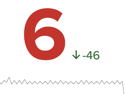
The resulting single value visualization will have an upward or downward arrow indicating the trend and the value of change.
Generate a single value visualization
- Select a single value visualization using the visual editor by clicking the Add Chart dropdown menu (
 ) in the editing toolbar and either browsing through the available charts, or by using the search option.
- Select the visualization to highlight it.
- Set up a new data source by adding a search to the Search with SPL window.
- To select an existing data source, close the Configuration panel and reopen it. In the Data Configurations section, click +Setup Primary Data Source and select an existing search/data source or create a new search. You can also choose a new ID that describes the search better than the default.
Configuration panel options for single value visualizations
You can use the Configuration panel to configure the following components.
Title (single value and single value radial)
Give your visualization a title. This is also helpful when searching for individual visualizations in the dashboard definition. This name is not the same as the automatically assigned unique ID.
Description (single value and single value radial)
Give your visualization a description to explain what the user is viewing.
Data Configurations
Choose an existing search or create a new one.
Position & Size
You can use your mouse to change the size or location of the visualization panel, or the Position & Size section of the Configuration panel for sizing by pixel and for placement on the canvas.
Selected Data Field (single value)
Use the dropdown menu to select the field value from your search results that will be displayed as the major value.
Major Value & Trend (single value)
- Use the Unit Position dropdown menu to place a unit string before or after the major value.
- Use the Unit Label field to specify a unit using a string.
- Use Precision to choose the number of decimal places displayed.
- Use the Major Value Size (px) field to change the display size of the major value in pixels.
- Use Trend Display to choose to show the trending value as either a percent or an absolute number. You can also choose to remove the trend value from the visualization.
- Use the Trend Size (px) field to change the display size of the trend value in pixels.
Major Value & Trend (single value icon)
- Toggle the Enable switch to add a major value and a trending value to an icon.
- Use the Unit Position dropdown menu to place a unit string before or after the major value.
- Use the Unit Label field to add a unit using a string.
- Use Precision to choose the number of decimal places displayed.
- Use Major Value Size (px) to change the display size of the major value in pixels.
- Use Trend Display to choose to show the trending value as either a percent or an absolute number.
- Use Trend Size (px) to change the display size of the trend value in pixels.
Major Value & Trend (single value radial)
- Use the Unit Position dropdown menu to place a unit string before or after the major value.
- Use the Unit Label field to specify a unit using a string.
- Use Precision to choose the number of decimal places displayed.
- Use Trend Display to choose to show the trending value as either a percent or an absolute number. You can also choose to remove the trend value from the visualization.
Sparkline (single value)
Configure your sparkline.
- Off removes your sparkline
- Before places the sparkline to the left of the single value
- Below places the sparkline beneath the single value
- After places the sparkline to the right of the single value
Coloring
Use the Coloring section to set colors that will apply to value ranges returned by search-generated data sources.
- Dynamic Elements
There are multiple options to choose from for each single value visualization. Use the Dynamic Elements dropdown menu to select the visualization elements you want for color thresholding. After you've selected, the elements will populate in the configuration panel for further color formatting. For more information, see Add dynamic options to visualizations.
Drilldown Settings
Click + Add Drilldown to allow a user to click the value of a visualization to link to an external or internal URL.
Code
Select your visualization or its search to view and edit the source code in real-time. You can also change the Visualization ID to a more readable ID to help identify this visualization in the source code.
Add emphasis to a returned value using dynamic formatting
A caption, a unit notation, and threshold coloring emphasize the returned value. If you use a command that returns multiple fields or values, you can use the Major Value & Trend section in the Configuration panel to add a trend indicator and a sparkline (single value only) to show how data values compare.
Add dynamic coloring in several ways. For example, the following search uses the timechart command to track daily errors for a Splunk deployment and displays a trend indicator and sparkline.
index=_internal source="*splunkd.log" log_level="error" | timechart count
You can apply color thresholding to both the major value and the trend indicator.
For more information, see Add dynamic options to visualizations.
Source options for single value visualizations
While you can use the visual editor to set most of the options, there are additional options, such as coloring the area under the sparkline, that can only be set in the source editor for splunk.singlevalue, splunk.singlevalueicon, and splunk.singlevalueradial. These options are added to the options field of the visualization stanza. The following example shows a single value visualization with a dynamically colored major value and trend value. It also has a sparkline and a static background color.
Use the following search to reproduce the example.
index=_internal source="*splunkd.log" log_level="error" | timechart count
Single value
Single value options
Expand the code box to view the options that are available for the single value visualization.
| Property | Type | Default | Description |
|---|---|---|---|
| backgroundColor | string | > themes.defaultBackgroundColor | Specify the color for the background. You may use a dataSource to apply the color. The default for enterprise light is "#ffffff". The default for enterprise dark is "#000000". The default for prisma dark is "#0b0c0e". |
| majorColor | string | > themes.defaultFontColor | Specify the color for the major value. You may use a dataSource to apply the color. The hexadecimal value format should be "#FFFFFF". The default for enterprise light is "#000000". The default for enterprise dark is "#ffffff". The default for prisma dark is "rgba(255, 255, 255, 0.98)". |
| majorFontSize | number | N/A | Specify the font size (px) for the major value. By default the major value font size is calculated dynamically based on the available space. |
| majorValue* | (string | number) | > sparklineValues|lastPoint() | The major value to display in the visualization. |
| majorValueField | string | > majorValue | getField() | The field name of major value. |
| numberPrecision | number | 0 | Specify the number of decimal places to display. For example, to display 3 decimal places, use a value of 3. The maximum value is 20. |
| shouldAbbreviateTrendValue | boolean | FALSE | Specify whether to abbreviate the trend value to 2 decimal points. A magnitude unit will be displayed. |
| shouldSparklineAcceptNullData | boolean | TRUE | Specify whether to convert null and non-numeric values in the sparkline to 0. |
| shouldUseThousandSeparators | boolean | TRUE | Specify whether numeric values use commas as thousandths separators. |
| showSparklineAreaGraph | boolean | FALSE | Specify whether to show the sparkline as an area graph rather than a line. |
| showSparklineTooltip | boolean | FALSE | Show a tooltip to display values on the sparkline. |
| sparklineAreaColor | string | > sparklineStrokeColor | Specify the color for the sparkline area fill. You may use a dataSource to apply the color. The hexadecimal value format should be "#FFFFFF". The graph area will have an opacity of 20% and will blend with the background color. |
| sparklineDisplay | ("before" | "after" | "below" | "off") | below | Specify how to display a sparkline. |
| sparklineHighlightDots | number | 0 | Specify the number of markers, or dots, to display at the top of a sparkline area graph. |
| sparklineHighlightSegments | number | 0 | Specify the number of segments to be highlighted at the top of a sparkline area graph. |
| sparklineStrokeColor | string | > themes.defaultSparklineStrokeColor | Specify the color for the sparkline stroke. You may use a dataSource to apply the color. The hexadecimal value format should be "#FFFFFF". The default for enterprise light is "#000000". The default for enterprise dark is "#ffffff". The default for prisma dark is "rgba(255, 255, 255, 0.98)". |
| sparklineValues | (string | number) | > primary|seriesByPrioritizedTypes("number", "string", "time") | List of numerical values to display on a sparkline. If the values are string type, the sparkline will not be shown. |
| trendColor | string | > themes.defaultFontColor | Specify the color for the trend value. You may use a dataSource to apply the color. The hexadecimal value format should be "#FFFFFF". The default for enterprise light is "#000000". The default for enterprise dark is "#ffffff". The default for prisma dark is "rgba(255, 255, 255, 0.98)". |
| trendDisplay | ("percent" | "absolute" | "off") | absolute | Specify how to display the trend value. |
| trendFontSize | number | N/A | Specify the font size (px) for the trend value. By default the trend value font size is calculated dynamically based on the available space. |
| trendValue | number | delta(-2) | The trend value to display in the visualization. |
| underLabel | string | N/A | Specify the text that appears below the major value. |
| underLabelFontSize | number | 12 | Specify the font size (px) for the under label text. |
| unit | string | N/A | Specify text to show next to the major value. |
| unitPosition | ("before" | "after") | after | Specify whether the unit text should appear before or after the major value. |
Single value icon
Single value icon options
Expand the code box to view the options that are available for the single value visualization.
| Property | Type | Default | Description |
|---|---|---|---|
| backgroundColor | string | transparent | Specify the color for the background. You may use a dataSource to apply the color. The hexadecimal value format should be "#FFFFFF". |
| icon | string | default | Specify an icon. |
| iconColor | string | N/A | Specify the color for the icon. You may use a dataSource to apply the color. The hexadecimal value format should be "#FFFFFF". The default for enterprise light is "#000000". The default for enterprise dark is "#ffffff". The default for prisma dark is "rgba(255, 255, 255, 0.98)". |
| iconOpacity | number | 1 | Specify the opacity for the icon using a number between 0 and 1 (inclusive). |
| iconPosition | string | before | Specify where to display the icon in relation to the major value. |
| majorColor | string | > themes.defaultFontColor | Specify the color for the major value. You may use a dataSource to apply the color. The hexadecimal value format should be "#FFFFFF". The default for enterprise light is "#000000". The default for enterprise dark is "#ffffff". The default for prisma dark is "rgba(255, 255, 255, 0.98)". |
| majorFontSize | number | N/A | Specify the font size (px) for the major value. By default the major value font size is calculated dynamically based on the available space. |
| majorValue | (string | number) | > primary|seriesByPrioritizedTypes("number", "string", "time")|lastPoint() | The major value to display in the visualization. |
| majorValueField | string | > majorValue | getField() | The field name of major value. |
| numberPrecision | number | 0 | Specify the number of decimal places to display. For example, to display 3 decimal places, use a value of 3. The maximum value is 20. |
| shouldAbbreviateTrendValue | boolean | FALSE | Specify whether to abbreviate the trend value to 2 decimal points. A magnitude unit will be displayed. |
| shouldUseThousandSeparators | boolean | TRUE | Specify whether numeric values use commas as thousandths separators. |
| showValue | boolean | TRUE | Specify whether to enable or disable the value and trend indicator displays. |
| trendColor | string | > themes.defaultFontColor | Specify the color for the trend value. You may use a dataSource to apply the color. The hexadecimal value format should be "#FFFFFF". The default for enterprise light is "#000000". The default for enterprise dark is "#ffffff". The default for prisma dark is "rgba(255, 255, 255, 0.98)". |
| trendDisplay | ("off" | "percent" | "absolute") | absolute | Specify whether the trend value is displayed as a percentage or an absolute count. |
| trendFontSize | number | N/A | Specify the font size (px) for the trend value. By default the trend value font size is calculated dynamically based on the available space. |
| trendValue | number | > primary|seriesByPrioritizedTypes("number", "string", "time")|delta(-2) | The trend value to display in the visualization. |
| underLabel | string | N/A | Specify the text that appears below the major value. |
| unit | string | N/A | Specify text to show next to the major value. |
| unitPosition | ("before" | "after") | after | Specify whether the unit text should appear before or after the major value. |
Single value radial
Single value radial options
Expand the code box to view the options that are available for the single value radial visualization.
| Property | Type | Default | Description |
|---|---|---|---|
| backgroundColor | string | > themes.defaultBackgroundColor | Specify the color for the background. The hexadecimal value format should be "#ffffff". The default for enterprise light is "#ffffff". The default for enterprise dark is "#000000". The default for prisma dark is "#0b0c0e". |
| majorColor | string | > themes.defaultFontColor | Specify the color for the major value. You may use a dataSource to apply the color. The hexadecimal value format should be "#ffffff". The default for enterprise light is "#000000". The default for enterprise dark is "#ffffff". The default for prisma dark is "rgba(255, 255, 255, 0.98)". |
| majorValue | (string | number) | > primary | seriesByPrioritizedTypes("number", "string", "time") | lastPoint() | Specify the dataSource applied to the major value. |
| majorValueField | string | > majorValue | getField() | Specify the field that should be mapped to the major value. |
| maxValue | number | 100 | Specify the value the radial fills up to. |
| numberPrecision | number | 0 | Specify the number of decimal places to display. For example, to display 3 decimal places, use a value of 3. The maximum value is 20. |
| radialBackgroundColor | string | > themes.defaultRadialBackgroundColor | Specify the color for the radial background. The hexadecimal value format should be "#ffffff". The default for enterprise light is "rgba(0, 0, 0, 0.1)". The default for enterprise dark is "rgba(255, 255, 255, 0.15)". The default for prisma dark is "rgba(255, 255, 255, 0.15)". |
| radialStrokeColor | string | > majorColor | Specify the color for the radial. You may use a dataSource to apply the color. The hexadecimal value format should be "#ffffff". The default for enterprise light is "#000000". The default for enterprise dark is "#ffffff". The default for prisma dark is "rgba(255, 255, 255, 0.98)". |
| shouldAbbreviateTrendValue | boolean | FALSE | Specify whether to abbreviate the trend value to 2 decimal points. A magnitude unit will be displayed. |
| shouldUseThousandSeparators | boolean | TRUE | Specify whether numeric values use commas as thousandths separaters. |
| trendColor | string | > themes.defaultFontColor | Specify the color for the trend value. You may use a dataSource to apply the color. The hexadecimal value format should be "#FFFFFF". The default for enterprise light is "#000000". The default for enterprise dark is "#ffffff". The default for prisma dark is "rgba(255, 255, 255, 0.98)". |
| trendDisplay | ("percent" | "absolute" | "off") | absolute | Specify how to display the trend value. |
| trendValue | number | > primary | seriesByPrioritizedTypes("number", "string", "time") | delta(-2) | Specify the dataSource applied to the trend value. |
| underLabel | string | N/A | Specify the text that appears below the major value. |
| unit | string | N/A | Specify text to show next to the major value. |
| unitPosition | ("before" | "after") | after | Specify whether the unit text should appear before or after the major value. |
| Shapes | Table |
This documentation applies to the following versions of Splunk® Enterprise: 9.0.0, 9.0.1, 9.0.2, 9.0.3, 9.0.4, 9.0.5, 9.0.6, 9.0.7, 9.0.8, 9.0.9, 9.0.10
 Download manual
Feedback submitted, thanks!