Bar and column charts
Use column and bar charts to compare field values across a data set.

Data formatting
Column and bar charts represent one or more data series. To make sure that a search generates one or more series, check the Statistics tab in Search & Reporting. The table should have at least two columns.
Search results not structured as a table with valid x-axis or y-axis values cannot generate column or bar charts. For example, using the eval or fields commands might change search result structure.
Statistics table order and chart axis
Column and bar charts each use the Statistics table values in different ways. Column charts get x-axis values from the first column in the table. The next table columns contain y-axis values.
Bar charts get y-axis values from the first column in the table. The next table columns contain x-axis values.
As an example, any search using the timechart reporting command generates a table where _time is the first column. A column chart generated with this search has a _time x-axis. A bar chart using this search has a _time y-axis.
Single and multiple data series
Column and bar charts can visualize single or multiple data series. The following examples show you how to generate these series.
Single series
This search compares the activity of different Splunk users. In this search, the over operator indicates that user is the first table column.
index=_internal|chart count over user
The search produces the following table.

Column and bar charts represent this single series differently.
- Column chart
- X-axis
uservalues are placed horizontally . The y-axiscountvalues are placed vertically.
- Bar chart
- X-axis
uservalues are placed vertically. The bar chart y-axiscountvalues are placed horizontally.
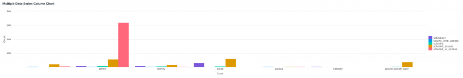
Multiple data series
To generate multiple data series, you can also change the query to introduce a split-by field.
For example, change the previous single series search by adding sourcetype as a split-by field.
...| chart count over user by sourcetype
The split-by field produces multiple data series. Each sourcetype is a data series with its own count values for each user.

Generate a bar or column chart
- Select the Add chart button (
 ) in the editing toolbar and browse through the available charts. Choose a bar or column chart.
 - Select the chart on your dashboard to highlight it with the blue editing outline.
- Set up a new data source by selecting + Create search and adding a search to the SPL query window. Or, you can select an existing data source under the Search, Saved search, or Chain search sections.
- (Optional) You can also write a new ID that describes the search better than the default by changing the ID in Data source name.
- Select Apply and close.
Configuration Panel options for bar and column charts
You can use the Configuration panel to configure the following bar and column chart components.
Title
Give your visualization a name. This is also helpful when searching for individual visualizations in the dashboard definitions. This name is not the same as the automatically assigned unique ID.
Description
Give your visualization a description to explain what the user is viewing.
Data Sources
Choose an existing ad hoc search or create a new one.
Position & Size
You can use your mouse to change the size of the panel, or the Position & Size section of the Configuration panel for pixel perfect sizing and placement.
General
Use the following Stack Modes:
| Stack option | Column or bar appearance | Use case |
|---|---|---|
| Unstacked | Columns or bars for different series appear next to each other. | An unstacked chart is useful for a lower number of series. As the number of series increases, the chart can become more difficult to understand. |
| Stacked | Data points within a series appear as segments of a column or bar. The total column or bar value is the sum of all of the segments. | Use a stacked column or bar chart to highlight the relative volume, frequency, or importance of data points in a series. See the stacked chart example below. |
| Stacked 100% | Each bar or column is divided into segments representing the distribution percentage for each data value in one series. | Use stacked 100% to show data distributions when there is significant segment size variation in each column or bar. |
Show Data Values
Choose whether to show all data values (On), no data values (Off), or only the minimum and maximum (Min/Max).
Axis
- Use X Axis title to name your x-axis.
- Use Y Axis title to name your y-axis.
Legend
- Use Position to choose the position of the legend.
- Use Truncation to choose how legend labels are truncated when they overflow the layout boundaries by choosing where to place ellipses (...)
Drilldown
Drilldown from a bar or column chart to let users click on a part of the chart to open an internal or external URL.
Code
Select your visualization or its search to view and edit the source code in real-time. You can also change the Visualization ID to a more readable ID to help identify this visualization in the source code.
Source options for bar and column charts
You can customize your dashboard with the Dashboard Studio UI or set options in the source editor for splunk.bar and splunk.column. The UI and source options both produce the same design results.
Additionally, you can write advanced configurations in the source editor using selector and formatting functions and dynamic options syntax. For more details, see Modify and write dynamic options syntax.
Add source options to the options field of the visualization stanza. The following example shows the addition of background color settings using a hexadecimal code.
"viz_25NNIqLF": {
  "type": "splunk.bar",
  "options": {
    "backgroundColor": "#0000FF",
  },
  "dataSources": {
    "primary": "ds_gcEN4c7Q"
  }
}
To read more on how visualization stanzas are structured, see The source code stanza of a visualization. Below are all of the options available.
Bar chart options
The following options are available for editing bar charts in the source editor:
| Property | Type | Default | Description |
|---|---|---|---|
| x | (string | number) | > primary | seriesByIndex(0) | Specify the dataSource applied to the x-axis. |
| y | (string | number) | > primary | frameBySeriesIndexRange(1) | Specify the dataSource applied to the y-axis. |
| y2 | (string | number) | n/a | Specify the dataSource applied to the y2-axis |
| xField | string | > x | getField() | Specify the field that should be mapped to the x-axis. |
| yFields | string | > y | getField() | Specify the field that should be mapped to the y-axis. |
| y2Fields | (array | string) | > y2 | getField() | Specify field(s) that should be mapped to a second y-axis. |
| backgroundColor | string | > themes.defaultBackgroundColor | Specify the color for the background. You may use a dataSource to apply the color. The default for enterprise light is "#ffffff". The default for enterprise dark is "#000000". The default for prisma dark is "#0b0c0e". |
| barSpacing | number | n/a | Specify, in pixels, the spacing between columns in a bar chart. |
| dataValuesDisplay | ("off" | "all" | "minmax") | off | Specify whether chart should display no labels, all labels, or only the min and max labels. |
| legendDisplay | ("right" | "left" | "top" | "bottom" | "off") | right | Specify the location of the legend on the panel. |
| legendLabels | string | n/a | Specify a list of labels to pre-populate the legend. For example, ["percent", "count"]. |
| legendTruncation | ("ellipsisEnd" | "ellipsisMiddle" | "ellipsisStart" | "ellipsisOff") | ellipsisEnd | Specify how to display legend labels when they overflow the layout boundaries by replacing overflow text with an ellipsis. |
| lineWidth | number | 2 | Specify the line width, in pixels, for chart overlay. |
| resultLimit | number | 50000 | Specify the number of data points rendered in a chart. |
| seriesColors | string | #7B56DB,#009CEB,#00CDAF,#DD9900,#FF677B,#CB2196,#813193,#0051B5,#008C80,#99B100,#FFA476,#FF6ACE,#AE8CFF,#00689D,#00490A,#465D00,#9D6300,#F6540B,#FF969E,#E47BFE | Specify the colors used for a series. For example, ["#FF0000", "#0000FF", "#008000"]. |
| seriesColorsByField | object | n/a | Specify the colors used for specific fields in a series. For example, {"count": "#008000", "percent": "#FFA500"}. |
| seriesSpacing | number | n/a | Specify, in pixels, the spacing between clustered series in column and bar charts. |
| stackMode | ("auto" | "stacked" | "stacked100") | auto | Specify stack mode. |
| showIndependentYRanges | boolean | FALSE | Specify whether split series charts have independent y-ranges. |
| showSplitSeries | boolean | FALSE | Set to "true" to split a multi-series chart into separate charts that are stacked from top to bottom; one for each series. |
| showXMajorGridLines | boolean | FALSE | Specify whether major grid lines are visible on the x-axis. |
| showYMajorGridLines | boolean | TRUE | Specify whether major grid lines are visible on the y-axis. |
| showY2MajorGridLines | boolean | FALSE | Specify whether major grid lines are visible on the y2-axis. |
| showYMinorGridLines | boolean | FALSE | Specify whether minor grid lines are visible on the y-axis. |
| showY2MinorGridLines | boolean | FALSE | Specify whether minor grid lines are visible on y2-axis. |
| showYAxisExtendedRange | boolean | TRUE | Specify whether the y-axis should be extended to include whole major tick marks. |
| showYAxisWithZero | boolean | FALSE | Specify whether the y-axis range includes zero. |
| showY2AxisWithZero | boolean | FALSE | Specify whether the y2-axis range includes zero. |
| xAxisLabelVisibility | ("auto" | "show" | "hide") | auto | Specify whether to show or hide labels on the x-axis. |
| yAxisLabelVisibility | ("auto" | "show" | "hide") | auto | Specify whether to show or hide labels on the y-axis. |
| y2AxisLabelVisibility | ("auto" | "show" | "hide") | auto | Specify whether to show or hide labels on the y2-axis. |
| xAxisLineVisibility | ("show" | "hide") | hide | Specify whether to show or hide the x-axis line. |
| yAxisLineVisibility | ("show" | "hide") | hide | Specify whether to show or hide the y-axis line. |
| y2AxisLineVisibility | ("show" | "hide") | hide | Specify whether to show or hide the y2-axis line. |
| xAxisMajorTickSize | number | 6 | Specify the size, in pixels, of major tick marks on the x-axis. |
| yAxisMajorTickSize | number | 6 | Specify the size, in pixels, of major tick marks on the y-axis. |
| y2AxisMajorTickSize | number | 6 | Specify the size, in pixels, of major tick marks on the y2-axis. |
| yAxisMinorTickSize | number | 6 | Specify the size, in pixels, of minor tick marks on the y-axis. |
| y2AxisMinorTickSize | number | 6 | Specify the size, in pixels, of minor tick marks on the y2-axis. |
| xAxisMajorTickVisibility | ("auto" | "show" | "hide") | auto | Specify whether to show or hide major tick marks on the x-axis. |
| yAxisMajorTickVisibility | ("auto" | "show" | "hide") | auto | Specify whether to show or hide major tick marks on the y-axis. |
| y2AxisMajorTickVisibility | ("auto" | "show" | "hide") | auto | Specify whether to show or hide major tick marks on the y2-axis. |
| yAxisMinorTickVisibility | ("auto" | "show" | "hide") | auto | Specify whether to show or hide minor tick marks on the y-axis. |
| y2AxisMinorTickVisibility | ("auto" | "show" | "hide") | auto | Specify whether to show or hide minor tick marks on the y2-axis. |
| xAxisMaxLabelParts | number | 3 | Specify the maximum number of time-parts that a tick label will have (the 3 possible parts are year, month, time). |
| yAxisScale | ("linear" | "log") | linear | Specify the type of scale that applies to a numerical y-axis. |
| y2AxisScale | ("linear" | "log") | linear | Specify the type of scale that applies to a numerical y2-axis. |
| xAxisTitleText | string | n/a | Specify the title of the x-axis. |
| yAxisTitleText | string | n/a | Specify the title of the y-axis. |
| y2AxisTitleText | string | n/a | Specify the title of the y2-axis. |
| xAxisTitleVisibility | ("show" | "hide") | show | Specify whether to show or hide the title of the x-axis. |
| yAxisTitleVisibility | ("show" | "hide") | show | Specify whether to show or hide the title of the y-axis. |
| y2AxisTitleVisibility | ("show" | "hide") | show | Specify whether to show or hide the title of the y2-axis. |
| yAxisAbbreviation | ("off" | "auto") | auto | Specify whether to abbreviate large y-axis values with the closest SI prefix. |
| y2AxisAbbreviation | ("off" | "auto") | auto | Specify whether to abbreviate large y2-axis values with the closest SI prefix. |
| yAxisMajorTickInterval | (string | number) | auto | Specify the spacing unit between major tick marks along the numeric y-axis. |
| y2AxisMajorTickInterval | (string | number) | auto | Specify the spacing unit between major tick marks along the numeric y2-axis. |
| yAxisMax | (string | number) | auto | Specify the maximum number for the visible y-axis range. |
| y2AxisMax | (string | number) | auto | Specify the maximum number for the visible y2-axis range. |
| yAxisMin | (string | number) | auto | Specify the minimum number for the visible y-axis range. |
| y2AxisMin | (string | number) | auto | Specify the minimum number for the visible y2-axis range. |
| overlayFields | (array | string) | n/a | Specify field(s) that should be differentiated on the chart and displayed as chart overlays. |
| showOverlayY2Axis | boolean | FALSE | Enable a y2-axis for chart overlays. All overlay fields will be mapped to a second y-axis. |
| showRoundedY2AxisLabels | boolean | TRUE | Specify whether to round y2-axis values to the nearest integer. |
Column chart options
The following options are available for editing column charts in the source editor:
| Property | Type | Default | Description |
|---|---|---|---|
| x | (string | number) | > primary | seriesByIndex(0) | Specify the dataSource applied to the x-axis. |
| y | (string | number) | > primary | frameBySeriesIndexRange(1) | Specify the dataSource applied to the y-axis. |
| y2 | (string | number) | n/a | Specify the dataSource applied to the y2-axis |
| xField | string | > x | getField() | Specify the field that should be mapped to the x-axis. |
| yFields | string | > y | getField() | Specify the field that should be mapped to the y-axis. |
| y2Fields | (array | string) | > y2 | getField() | Specify field(s) that should be mapped to a second y-axis. |
| annotationColor | string | n/a | Specify the annotation colors. You may use a dataSource to apply the color. For example, ["#FF0000", "#0000FF", "#008000"]. |
| annotationLabel | string | n/a | Specify a list of labels used for the annotations. You may use a dataSource to apply the labels. For example, ["houston, we have a problem", "just close the jira", "looking good now"]. |
| annotationX | (string | number) | n/a | Specify the dataSource field applied to the event annotation on the x-axis. |
| backgroundColor | string | > themes.defaultBackgroundColor | Specify the color for the background. You may use a dataSource to apply the color. The default for enterprise light is "#ffffff". The default for enterprise dark is "#000000". The default for prisma dark is "#0b0c0e". |
| dataValuesDisplay | ("off" | "all" | "minmax") | off | Specify whether chart should display no labels, all labels, or only the min and max labels. |
| columnGrouping | ("auto" | "overlay") | auto | Specify the column grouping mode. If chart.stackMode is defined it will override grouping behavior. |
| columnSpacing | number | n/a | Specifies, in pixels, the spacing between columns in a column chart. |
| legendDisplay | ("right" | "left" | "top" | "bottom" | "off") | right | Specify the location of the legend on the panel. |
| legendLabels | string | n/a | Specify a list of labels to pre-populate the legend. For example, ["percent", "count"]. |
| legendTruncation | ("ellipsisEnd" | "ellipsisMiddle" | "ellipsisStart" | "ellipsisOff") | ellipsisEnd | Specify how to display legend labels when they overflow the layout boundaries by replacing overflow text with an ellipsis. |
| lineWidth | number | 2 | Specify the line width, in pixels, for chart overlay. |
| resultLimit | number | 50000 | Specify the number of data points rendered in a chart. |
| seriesColors | string | #7B56DB,#009CEB,#00CDAF,#DD9900,#FF677B,#CB2196,#813193,#0051B5,#008C80,#99B100,#FFA476,#FF6ACE,#AE8CFF,#00689D,#00490A,#465D00,#9D6300,#F6540B,#FF969E,#E47BFE | Specify the colors used for a series. For example, ["#FF0000", "#0000FF", "#008000"]. |
| seriesColorsByField | object | n/a | Specify the colors used for specific fields in a series. For example, {"count": "#008000", "percent": "#FFA500"}. |
| seriesSpacing | number | n/a | Specify, in pixels, the spacing between clustered series in column and bar charts. |
| stackMode | ("auto" | "stacked" | "stacked100") | auto | Specify stack mode. |
| showIndependentYRanges | boolean | FALSE | Specify whether split series charts have independent y-ranges. |
| showSplitSeries | boolean | FALSE | Set to "true" to split a multi-series chart into separate charts that are stacked from top to bottom; one for each series. |
| showTooltip | boolean | TRUE | Specify whether a tooltip should be visible on hover |
| showXMajorGridLines | boolean | FALSE | Specify whether major grid lines are visible on the x-axis. |
| showYMajorGridLines | boolean | TRUE | Specify whether major grid lines are visible on the y-axis. |
| showY2MajorGridLines | boolean | FALSE | Specify whether major grid lines are visible on the y2-axis. |
| showYMinorGridLines | boolean | FALSE | Specify whether minor grid lines are visible on the y-axis. |
| showY2MinorGridLines | boolean | FALSE | Specify whether minor grid lines are visible on y2-axis. |
| showYAxisExtendedRange | boolean | TRUE | Specify whether the y-axis should be extended to include whole major tick marks. |
| showYAxisWithZero | boolean | FALSE | Specify whether the y-axis range includes zero. |
| showY2AxisWithZero | boolean | FALSE | Specify whether the y2-axis range includes zero. |
| xAxisLabelRotation | (-90 | -45 | 0 | 45 | 90) | 0 | Specify the rotation of the x-axis label in degrees. |
| xAxisLabelVisibility | ("auto" | "show" | "hide") | auto | Specify whether to show or hide labels on the x-axis. |
| yAxisLabelVisibility | ("auto" | "show" | "hide") | auto | Specify whether to show or hide labels on the y-axis. |
| y2AxisLabelVisibility | ("auto" | "show" | "hide") | auto | Specify whether to show or hide labels on the y2-axis. |
| xAxisLineVisibility | ("show" | "hide") | hide | Specify whether to show or hide the x-axis line. |
| yAxisLineVisibility | ("show" | "hide") | hide | Specify whether to show or hide the y-axis line. |
| y2AxisLineVisibility | ("show" | "hide") | hide | Specify whether to show or hide the y2-axis line. |
| xAxisMajorTickSize | number | 6 | Specify the size, in pixels, of major tick marks on the x-axis. |
| yAxisMajorTickSize | number | 6 | Specify the size, in pixels, of major tick marks on the y-axis. |
| y2AxisMajorTickSize | number | 6 | Specify the size, in pixels, of major tick marks on the y2-axis. |
| yAxisMinorTickSize | number | 6 | Specify the size, in pixels, of minor tick marks on the y-axis. |
| y2AxisMinorTickSize | number | 6 | Specify the size, in pixels, of minor tick marks on the y2-axis. |
| xAxisMajorTickVisibility | ("auto" | "show" | "hide") | auto | Specify whether to show or hide major tick marks on the x-axis. |
| yAxisMajorTickVisibility | ("auto" | "show" | "hide") | auto | Specify whether to show or hide major tick marks on the y-axis. |
| y2AxisMajorTickVisibility | ("auto" | "show" | "hide") | auto | Specify whether to show or hide major tick marks on the y2-axis. |
| yAxisMinorTickVisibility | ("auto" | "show" | "hide") | auto | Specify whether to show or hide minor tick marks on the y-axis. |
| y2AxisMinorTickVisibility | ("auto" | "show" | "hide") | auto | Specify whether to show or hide minor tick marks on the y2-axis. |
| xAxisMaxLabelParts | number | 3 | Specify the maximum number of time-parts that a tick label will have (the 3 possible parts are year, month, time). |
| yAxisScale | ("linear" | "log") | linear | Specify the type of scale that applies to a numerical y-axis. |
| y2AxisScale | ("linear" | "log") | linear | Specify the type of scale that applies to a numerical y2-axis. |
| xAxisTitleText | string | n/a | Specify the title of the x-axis. |
| yAxisTitleText | string | n/a | Specify the title of the y-axis. |
| y2AxisTitleText | string | n/a | Specify the title of the y2-axis. |
| xAxisTitleVisibility | ("show" | "hide") | show | Specify whether to show or hide the title of the x-axis. |
| yAxisTitleVisibility | ("show" | "hide") | show | Specify whether to show or hide the title of the y-axis. |
| y2AxisTitleVisibility | ("show" | "hide") | show | Specify whether to show or hide the title of the y2-axis. |
| yAxisAbbreviation | ("off" | "auto") | auto | Specify whether to abbreviate large y-axis values with the closest SI prefix. |
| y2AxisAbbreviation | ("off" | "auto") | auto | Specify whether to abbreviate large y2-axis values with the closest SI prefix. |
| yAxisMajorTickInterval | (string | number) | auto | Specify the spacing unit between major tick marks along the numeric y-axis. |
| y2AxisMajorTickInterval | (string | number) | auto | Specify the spacing unit between major tick marks along the numeric y2-axis. |
| yAxisMax | (string | number) | auto | Specify the maximum number for the visible y-axis range. |
| y2AxisMax | (string | number) | auto | Specify the maximum number for the visible y2-axis range. |
| yAxisMin | (string | number) | auto | Specify the minimum number for the visible y-axis range. |
| y2AxisMin | (string | number) | auto | Specify the minimum number for the visible y2-axis range. |
| overlayFields | (array | string) | n/a | Specify field(s) that should be differentiated on the chart and displayed as chart overlays. |
| showOverlayY2Axis | boolean | FALSE | Enable a y2-axis for chart overlays. All overlay fields will be mapped to a second y-axis. |
| showRoundedY2AxisLabels | boolean | TRUE | Specify whether to round y2-axis values to the nearest integer. |
| Area and line charts | Bubble charts |
This documentation applies to the following versions of Splunk® Enterprise: 9.1.0, 9.1.1, 9.1.2, 9.1.3, 9.1.4, 9.1.5, 9.1.6, 9.1.7, 9.1.8, 9.1.9, 9.2.0, 9.2.1, 9.2.2, 9.2.3, 9.2.4, 9.2.5, 9.2.6, 9.3.0, 9.3.1, 9.3.2, 9.3.3, 9.3.4, 9.4.0, 9.4.1, 9.4.2
Feedback submitted, thanks!