Table
Tables can help you compare and aggregate field values. Use a table to visualize patterns for one or more metrics across a data set. Start with a query to generate a table and use formatting to highlight values, add context, or create a focus for the visualization. You can also configure dynamic settings with the table visualization. For more details, see Dynamic options in Dashboard Studio.
For example, the following is a table with dynamically colored text in the splunk_web_access column and dynamically colored backgrounds in the splunk_web_service column:
Generate a table
- Select the Add chart button (
 ) in the editing toolbar and browse through the available charts. Choose the table.
 - Select the table on your dashboard to highlight it with the blue editing outline.
- Set up a new data source by selecting + Create search and adding a search to the SPL query window. Or, you can select an existing data source under the Search, Saved search, or Chain search sections.
- (Optional) You can also write a new ID that describes the search better than the default by changing the ID in Data source name.
- Select Apply and close.
Configuration panel options
You can use the Configuration panel to configure the following table components.
Title
(Optional) Name your visualization. A unique name is helpful when searching for individual visualizations in the dashboard definitions. This name is not the same as the automatically assigned unique ID.
Description
(Optional) Give your visualization a description to explain what the user is viewing.
Data sources
Choose an existing search or create a new one.
Visibility
(Optional) Hide the visualization when data is unavailable.
Position and size
You can use your mouse to change the size and position of the panel, or the Position and size section of the Configuration panel for pixel perfect sizing.
Data display
- Specify how many rows to display.
- Select whether to show or hide row numbers.
- Select whether to show or hide internal fields. Internal fields begin with an underscore, such as
_inventoryor_color_hex. - Select formatting for the header row.
Color and style
- Select a static background color from the color palette or enter a hexadecimal code.
- Choose to alternate the shade of the rows.
- Select a font type.
- Select a font size.
- Select column formatting
Column-specific formatting
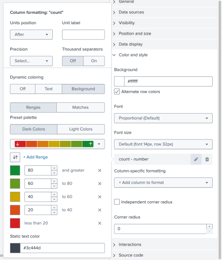
Navigate to column formatting from the Color and style section of the configuration panel. You can select + Add column to format to choose a column of returned values. Modify columns with the following UI:
- The Units position selector specifies the position of a unit in relation to the value.
- The Unit label field specifies a unit to display.
- The Precision dropdown list specifies the number of decimal places to display.
- The Thousand separators apply to values greater than 999 and add a comma for every third digit from the right.
- The Independent corner radius selector rounds the corners of the table.
- The Dynamic coloring selector specifies coloring for the column's text and background.
Dynamic coloring
After choosing a column to format by selecting + Add column to format, navigate to Dynamic coloring by selecting the pencil icon next to a specific column to bring up the formatting menu window. You can do the following with the dynamic coloring formatting menu:
- Choose the text or background of the column that will be dynamically colored.
- Choose between dark and light colors, depending on which works best for the theme of your dashboard.
- Select the color grid to choose from the preset palettes. You can also customize the color of the ranges you specify.
- Specify 2-7 color ranges using the visual editor. You can also add an unlimited number of color ranges using the source editor.
- If you've decided not to use a preset color palette, you can specify the color you want by clicking on the color box next to the range and adding a hexadecimal color.
- Choose colors for value matches.
- Choose a static color for the element that is not dynamic. For example, if you choose to use dynamic coloring on the column's background, choose a static color for the text.
The following example shows the column formatting options in the visual editor:
Interactions
Use drilldown to allow users to click the visualization to navigate to an internal or external URL.
Source code
Select your visualization or its search to view and edit the source code in real time. You can also change the Visualization ID to a more readable ID to help identify this visualization in the source code.
Additional options can only be set in the source editor. For a complete list of options available, see: Table in the Configuration options reference.
Table formatting example
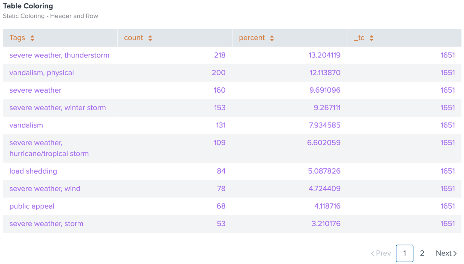
You can format the color of a table's header and row text with the tableFormat option. The following table visualization's headers are formatted with the hexadecimal "#d47e45" and the text in each row is formatted with the hexadecimal "#A870EF".
Source code
Expand the window to see the source code for the table formatting example. Notice the tableFormat option in the options stanza. Also, notice how rowColors uses dynamic options syntax to pick tableRowColor from the context stanza. For more details about dynamic options syntax, see Dynamic options in Dashboard Studio.
{
   "visualizations": {
       "viz_OK8zmU15": {
           "type": "splunk.table",
           "dataSources": {
               "primary": "ds_1zIJZTrx"
           },
           "title": "Table Coloring",
           "description": "Static Coloring - Header and Row",
           "options": {
               "backgroundColor": "> themes.defaultBackgroundColor",
               "tableFormat": {
                   "rowColors": "> table | pick(tableRowColor)",
                   "headerColor": "#d47e45"
               }
           },
           "context": {
               "tableRowColor": [
                   "#A870EF"
               ]
           }
       }
   },
   "dataSources": {
       "ds_1zIJZTrx": {
           "type": "ds.search",
           "options": {
               "query": "| inputlookup outages_example.csv\n| top Tags limit=15"
           },
           "name": "Search_1"
       }
   },
   "defaults": {
       "dataSources": {
           "ds.search": {
               "options": {
                   "queryParameters": {
                       "latest": "$global_time.latest$",
                       "earliest": "$global_time.earliest$"
                   }
               }
           }
       }
   },
   "inputs": {
       "input_global_trp": {
           "type": "input.timerange",
           "options": {
               "token": "global_time",
               "defaultValue": "-24h@h,now"
           },
           "title": "Global Time Range"
       }
   },
   "layout": {
       "type": "absolute",
       "options": {
           "width": 1440,
           "height": 960,
           "display": "auto"
       },
       "structure": [
           {
               "item": "viz_OK8zmU15",
               "type": "block",
               "position": {
                   "x": 20,
                   "y": 20,
                   "w": 860,
                   "h": 500
               }
           }
       ],
       "globalInputs": [
           "input_global_trp"
       ]
   },
   "description": "",
   "title": "tableFormat example"
}
Column formatting example
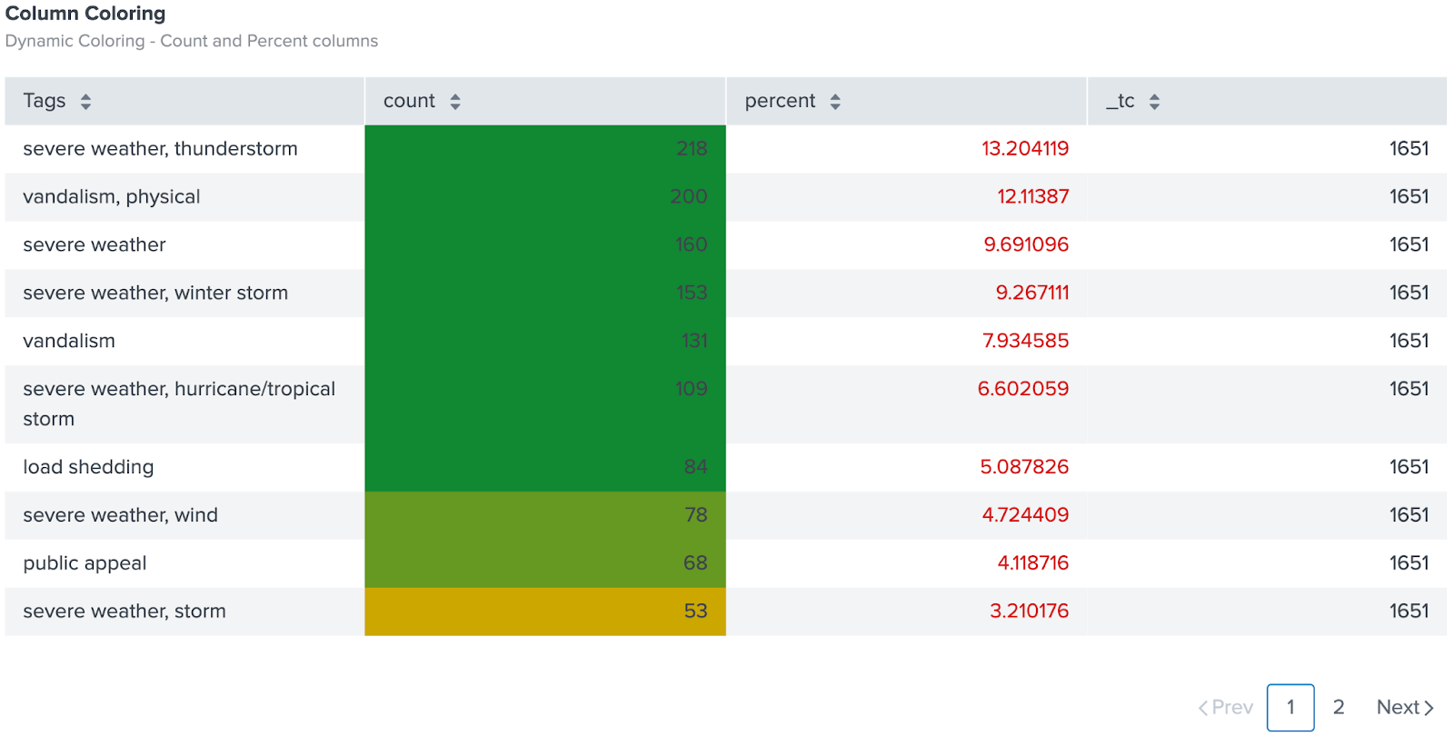
You can format the color of a column's background or text using the Configuration UI or by modifying the columnFormat option in the source code. The following table visualization uses a sequential color palette to format the background of the count column and the text in the percent column.
Source code
Expand the window to see the source code for the column coloring example. Notice the columnFormat option in the options stanza.
{
   "visualizations": {
       "viz_VbXzKtTH": {
           "type": "splunk.table",
           "title": "Column Coloring",
           "description": "Dynamic Coloring - Count and Percent columns",
           "options": {
               "columnFormat": {
                   "count": {
                       "data": "> table | seriesByName(\"count\") | formatByType(countColumnFormatEditorConfig)",
                       "rowColors": "> table | seriesByName('count') | pick(countRowColorsEditorConfig)",
                       "rowBackgroundColors": "> table | seriesByName('count') | rangeValue(countRowBackgroundColorsEditorConfig)"
                   },
                   "percent": {
                       "data": "> table | seriesByName(\"percent\") | formatByType(percentColumnFormatEditorConfig)",
                       "rowColors": "> table | seriesByName('percent') | rangeValue(percentRowColorsEditorConfig)"
                   }
               }
           },
           "dataSources": {
               "primary": "ds_LxcUcplm"
           },
           "context": {
               "countColumnFormatEditorConfig": {
                   "number": {
                       "thousandSeparated": false,
                       "unitPosition": "after"
                   }
               },
               "countRowColorsEditorConfig": [
                   "#3c444d"
               ],
               "countRowBackgroundColorsEditorConfig": [
                   {
                       "to": 20,
                       "value": "#D41F1F"
                   },
                   {
                       "from": 20,
                       "to": 40,
                       "value": "#D94E17"
                   },
                   {
                       "from": 40,
                       "to": 60,
                       "value": "#CBA700"
                   },
                   {
                       "from": 60,
                       "to": 80,
                       "value": "#669922"
                   },
                   {
                       "from": 80,
                       "value": "#118832"
                   }
               ],
               "percentColumnFormatEditorConfig": {
                   "number": {
                       "thousandSeparated": false,
                       "unitPosition": "after"
                   }
               },
               "percentRowColorsEditorConfig": [
                   {
                       "to": 20,
                       "value": "#D41F1F"
                   },
                   {
                       "from": 20,
                       "to": 40,
                       "value": "#D94E17"
                   },
                   {
                       "from": 40,
                       "to": 60,
                       "value": "#CBA700"
                   },
                   {
                       "from": 60,
                       "to": 80,
                       "value": "#669922"
                   },
                   {
                       "from": 80,
                       "value": "#118832"
                   }
               ]
           }
       }
   },
   "dataSources": {
       "ds_LxcUcplm": {
           "type": "ds.search",
           "options": {
               "query": "| inputlookup outages_example.csv\n| top Tags limit=15"
           },
           "name": "Search_1"
       }
   },
   "defaults": {
       "dataSources": {
           "ds.search": {
               "options": {
                   "queryParameters": {
                       "latest": "$global_time.latest$",
                       "earliest": "$global_time.earliest$"
                   }
               }
           }
       }
   },
   "inputs": {
       "input_global_trp": {
           "type": "input.timerange",
           "options": {
               "token": "global_time",
               "defaultValue": "-24h@h,now"
           },
           "title": "Global Time Range"
       }
   },
   "layout": {
       "type": "absolute",
       "options": {
           "width": 1440,
           "height": 960,
           "display": "auto"
       },
       "structure": [
           {
               "item": "viz_VbXzKtTH",
               "type": "block",
               "position": {
                   "x": 0,
                   "y": 0,
                   "w": 980,
                   "h": 510
               }
           }
       ],
       "globalInputs": [
           "input_global_trp"
       ]
   },
   "description": "",
   "title": "Column formatting example"
}
Format the time string
Formatting a time string in a table improves the readability of time-related data that needs comparison and interpretation. You can format the time string with the following steps:
- Select your table to highlight the visualization in a blue outline.
- In the Configuration panel, navigate to the Color and style section.
- In the Column-specific formatting section, select + Add column to format.
- Select the time field with the type "time". Sometimes the time field is labeled as "_time". After selecting the field from the drop-down list, a time field will appear in the Column-specific formatting section.
- Select the pencil icon in the "time" field. A window will appear called Column formatting: "time".
- In the Date & Time formatting field, add a time format. For example, the following are valid time formats:
- DD-MM-YYYY
- ddd, MMM DD, YYYY
- ddd, MMM DD, YYYY [at] hh:mm A (MM-DD-YYYY)
Formatted time string example
The following is a screenshot of four tables with differently formatted time strings.
Source code example
The following is a source code example of four tables with differently formatted time strings. Notice the options and context sections for each table visualization.
Select Expand to see the full source code example.
{
"visualizations": {
"viz_D0lYhTt0": {
"type": "splunk.table",
"dataSources": {
"primary": "primary"
},
"options": {
"columnFormat": {
"time": {
"data": "> table | seriesByName(\"time\") | formatByType(timeColumnFormatEditorConfig)"
}
}
},
"context": {
"timeColumnFormatEditorConfig": {
"time": {
"format": ""
}
}
}
},
"viz_Y8UuIPcY": {
"type": "splunk.markdown",
"options": {
"markdown": "### **No string formatting**"
}
},
"viz_YUdngFVI": {
"type": "splunk.table",
"dataSources": {
"primary": "ds_tbHE32L8_primary"
},
"options": {
"columnFormat": {
"time": {
"data": "> table | seriesByName(\"time\") | formatByType(timeColumnFormatEditorConfig)"
}
}
},
"context": {
"timeColumnFormatEditorConfig": {
"time": {
"format": "DD-MM-YYYY"
}
}
}
},
"viz_Z3GfeoA0": {
"type": "splunk.markdown",
"options": {
"markdown": "### **DD-MM-YYYY formatting**"
}
},
"viz_t9kRIRVf": {
"type": "splunk.table",
"dataSources": {
"primary": "ds_wie2lHuZ_primary"
},
"options": {
"columnFormat": {
"time": {
"data": "> table | seriesByName(\"time\") | formatByType(timeColumnFormatEditorConfig)"
}
}
},
"context": {
"timeColumnFormatEditorConfig": {
"time": {
"format": "ddd, MMM DD, YYYY"
}
}
}
},
"viz_W5IDGWOD": {
"type": "splunk.markdown",
"options": {
"markdown": "### **ddd, MMM DD, YYYY formatting**"
}
},
"viz_2aOfgORj": {
"type": "splunk.table",
"dataSources": {
"primary": "ds_pW2p8Dnu_primary"
},
"options": {
"columnFormat": {
"time": {
"data": "> table | seriesByName(\"time\") | formatByType(timeColumnFormatEditorConfig)"
}
}
},
"context": {
"timeColumnFormatEditorConfig": {
"time": {
"format": "ddd, MMM DD, YYYY [at] hh:mm A (MM-DD-YYYY)"
}
}
}
},
"viz_k1bcaC6D": {
"type": "splunk.markdown",
"options": {
"markdown": "### **ddd, MMM DD, YYYY [at] hh:mm A (MM-DD-YYYY) formatting**"
}
}
},
"dataSources": {
"primary": {
"type": "ds.test",
"options": {
"requestParams": {
"offset": 0,
"count": 20
},
"data": {
"fields": [
{
"name": "number1"
},
{
"name": "time"
}
],
"columns": [
[
"2000",
"10000000",
"13",
"60",
"43"
],
[
"2018-05-02T18:10:46.000-07:00",
"2018-05-02T18:11:47.000-07:00",
"2018-05-02T18:12:48.000-07:00",
"2018-05-02T18:13:49.000-07:00",
"2018-05-02T18:15:50.000-07:00"
]
]
},
"meta": {
"totalCount": 100
}
}
},
"ds_tbHE32L8_primary": {
"type": "ds.test",
"options": {
"requestParams": {
"offset": 0,
"count": 20
},
"data": {
"fields": [
{
"name": "number1"
},
{
"name": "time"
}
],
"columns": [
[
"2000",
"10000000",
"13",
"60",
"43"
],
[
"2018-05-02T18:10:46.000-07:00",
"2018-05-02T18:11:47.000-07:00",
"2018-05-02T18:12:48.000-07:00",
"2018-05-02T18:13:49.000-07:00",
"2018-05-02T18:15:50.000-07:00"
]
]
},
"meta": {
"totalCount": 100
}
}
},
"ds_wie2lHuZ_primary": {
"type": "ds.test",
"options": {
"requestParams": {
"offset": 0,
"count": 20
},
"data": {
"fields": [
{
"name": "number1"
},
{
"name": "time"
}
],
"columns": [
[
"2000",
"10000000",
"13",
"60",
"43"
],
[
"2018-05-02T18:10:46.000-07:00",
"2018-05-02T18:11:47.000-07:00",
"2018-05-02T18:12:48.000-07:00",
"2018-05-02T18:13:49.000-07:00",
"2018-05-02T18:15:50.000-07:00"
]
]
},
"meta": {
"totalCount": 100
}
}
},
"ds_6NlRcjk3_primary": {
"type": "ds.test",
"options": {
"requestParams": {
"offset": 0,
"count": 20
},
"data": {
"fields": [
{
"name": "number1"
},
{
"name": "time"
}
],
"columns": [
[
"2000",
"10000000",
"13",
"60",
"43"
],
[
"2018-05-02T18:10:46.000-07:00",
"2018-05-02T18:11:47.000-07:00",
"2018-05-02T18:12:48.000-07:00",
"2018-05-02T18:13:49.000-07:00",
"2018-05-02T18:15:50.000-07:00"
]
]
},
"meta": {
"totalCount": 100
}
}
},
"ds_pW2p8Dnu_primary": {
"type": "ds.test",
"options": {
"requestParams": {
"offset": 0,
"count": 20
},
"data": {
"fields": [
{
"name": "number1"
},
{
"name": "time"
}
],
"columns": [
[
"2000",
"10000000",
"13",
"60",
"43"
],
[
"2018-05-02T18:10:46.000-07:00",
"2018-05-02T18:11:47.000-07:00",
"2018-05-02T18:12:48.000-07:00",
"2018-05-02T18:13:49.000-07:00",
"2018-05-02T18:15:50.000-07:00"
]
]
},
"meta": {
"totalCount": 100
}
}
}
},
"defaults": {
"dataSources": {
"ds.search": {
"options": {
"queryParameters": {
"latest": "$global_time.latest$",
"earliest": "$global_time.earliest$"
}
}
}
}
},
"inputs": {
"input_global_trp": {
"type": "input.timerange",
"options": {
"token": "global_time",
"defaultValue": "-24h@h,now"
},
"title": "Global Time Range"
}
},
"layout": {
"options": {},
"globalInputs": [
"input_global_trp"
],
"tabs": {
"items": [
{
"layoutId": "layout_1",
"label": "New tab"
}
]
},
"layoutDefinitions": {
"layout_1": {
"type": "absolute",
"structure": [
{
"item": "viz_D0lYhTt0",
"type": "block",
"position": {
"x": 20,
"y": 100,
"w": 470,
"h": 220
}
},
{
"item": "viz_Y8UuIPcY",
"type": "block",
"position": {
"x": 150,
"y": 50,
"w": 180,
"h": 30
}
},
{
"item": "viz_YUdngFVI",
"type": "block",
"position": {
"x": 520,
"y": 100,
"w": 470,
"h": 220
}
},
{
"item": "viz_Z3GfeoA0",
"type": "block",
"position": {
"x": 650,
"y": 50,
"w": 200,
"h": 40
}
},
{
"item": "viz_t9kRIRVf",
"type": "block",
"position": {
"x": 20,
"y": 470,
"w": 470,
"h": 220
}
},
{
"item": "viz_W5IDGWOD",
"type": "block",
"position": {
"x": 130,
"y": 430,
"w": 250,
"h": 30
}
},
{
"item": "viz_2aOfgORj",
"type": "block",
"position": {
"x": 520,
"y": 470,
"w": 470,
"h": 220
}
},
{
"item": "viz_k1bcaC6D",
"type": "block",
"position": {
"x": 530,
"y": 430,
"w": 480,
"h": 30
}
}
],
"options": {
"width": 1440,
"height": 960,
"display": "auto"
}
}
}
},
"description": "",
"title": "Tables with formatted time strings"
}
You can use a hidden field in your table to impact the dynamic coloring of other visible fields. Internal fields begin with an underscore, such as _inventory or _color_hex. Select whether to show or hide internal fields in the Data display section of the Configuration panel.
The following table visualization on the left shows an _inventory column. The table visualization on the right hides the _inventory column and uses the hidden values in the _inventory column to color the values in the product column. A product displays as green when it's in stock. Conversely, the product displays as red when the inventory is 0.
Source code
Expand the window to see the full source code for the example of using a hidden field to modify the color of another field. Notice how the product column uses dynamic options syntax to alter the color of its fields. For more details about dynamic options syntax, see Dynamic options in Dashboard Studio.
{
   "visualizations": {
       "viz_Y8x5MvXI": {
           "type": "splunk.table",
           "dataSources": {
               "primary": "ds_khzrqtty"
           },
           "title": "Table showing internal fields (_inventory)"
       },
       "viz_yYKU3I9d": {
           "type": "splunk.table",
           "dataSources": {
               "primary": "ds_khzrqtty"
           },
           "title": "Table hiding internal fields - colored by inventory",
           "options": {
               "columnFormat": {
                   "_inventory": {
                       "data": "> table | seriesByName(\"_inventory\") | formatByType(_inventoryColumnFormatEditorConfig)",
                       "rowColors": "> table | seriesByName(\"_inventory\") | rangeValue(_inventoryRowColorsEditorConfig)"
                   },
                   "product": {
                       "data": "> table | seriesByName(\"product\") | formatByType(productColumnFormatEditorConfig)",
                       "rowColors": "> table | seriesByName(\"_inventory\") | rangeValue(_inventoryRowColorsEditorConfig)"
                   }
               },
               "showInternalFields": false
           },
           "context": {
               "_inventoryColumnFormatEditorConfig": {
                   "number": {
                       "thousandSeparated": false,
                       "unitPosition": "after"
                   }
               },
               "_inventoryRowColorsEditorConfig": [
                   {
                       "value": "#D41F1F",
                       "to": 1
                   },
                   {
                       "value": "#118832",
                       "from": 1
                   }
               ],
               "productColumnFormatEditorConfig": {
                   "string": {
                       "unitPosition": "after"
                   }
               }
           },
           "description": "Has inventory = green"
       }
   },
   "dataSources": {
       "ds_khzrqtty": {
           "type": "ds.search",
           "options": {
               "query": "| makeresults count=3 \n| streamstats count \n| eval product=case(count=1, \"cookies\", count=2, \"ice cream\", count=3, \"bananas\"), _inventory=case(count=1, 45, count=2, 21, count=3, 0), price=case(count=1, \"$8.99\", count=2, \"$4.99\", count=3, \"$1.99\")\n| fields - _time count"
           },
           "name": "Table 1"
       },
       "ds_nYCAFWXC": {
           "type": "ds.search",
           "options": {
               "query": "| makeresults count=3 \n| streamstats count \n| eval color_name=case(count=1, \"Lilac purple\", count=2, \"Asparagus green\", count=3, \"Banana yellow\"), _color_hex=case(count=1, \"dbd7ec\", count=2, \"87a96b\", count=3, \"ffe135\")\n| fields - count _time"
           },
           "name": "Table 2"
       }
   },
   "defaults": {
       "dataSources": {
           "ds.search": {
               "options": {
                   "queryParameters": {
                       "latest": "$global_time.latest$",
                       "earliest": "$global_time.earliest$"
                   }
               }
           }
       }
   },
   "inputs": {
       "input_global_trp": {
           "type": "input.timerange",
           "options": {
               "token": "global_time",
               "defaultValue": "-24h@h,now"
           },
           "title": "Global Time Range"
       }
   },
   "layout": {
       "type": "absolute",
       "options": {
           "width": 1440,
           "height": 960,
           "display": "auto"
       },
       "structure": [
           {
               "item": "viz_Y8x5MvXI",
               "type": "block",
               "position": {
                   "x": 30,
                   "y": 40,
                   "w": 340,
                   "h": 200
               }
           },
           {
               "item": "viz_yYKU3I9d",
               "type": "block",
               "position": {
                   "x": 410,
                   "y": 40,
                   "w": 340,
                   "h": 200
               }
           }
       ],
       "globalInputs": [
           "input_global_trp"
       ]
   },
   "description": "",
   "title": "Using a hidden field to modify the color of another field"
}
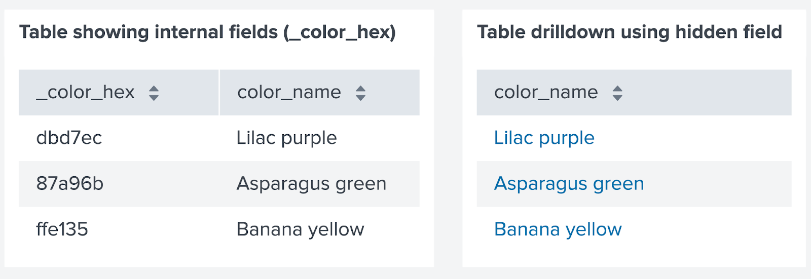
You can use a hidden field in your table as a token added to a drilldown link for another field. Internal fields begin with an underscore. For example, _inventory or _color_hex. Select whether to show or hide internal fields in the Data display section of the Configuration panel.
The following table on the left shows the _color_hex column. The table on the right hides the _color_hex column and uses its fields as tokens to pass into the URL link of the fields in the color_name column. When a user selects a value in the color_name column, they'll be redirected to a URL that uses a value from the _color_hex column. For example, if a user selects "Lilac purple", the URL might look like https://www.example.com/color/dbd7ec with the color hexadecimal at the end of the URL.
Source code
Expand the window to see the full source code for the example of using a hidden field as a token to modify a drilldown link. Notice the $hex$ token used in the URL.
{
   "visualizations": {
       "viz_959zg8fJ": {
           "type": "splunk.table",
           "dataSources": {
               "primary": "ds_nYCAFWXC"
           },
           "title": "Table showing internal fields (_color_hex)"
       },
       "viz_9Bi0uom6": {
           "type": "splunk.table",
           "title": "Table drilldown using hidden field",
           "dataSources": {
               "primary": "ds_nYCAFWXC"
           },
           "options": {
               "showInternalFields": false
           },
           "eventHandlers": [
               {
                   "type": "drilldown.setToken",
                   "options": {
                       "tokens": [
                           {
                               "token": "hex",
                               "key": "row._color_hex.value"
                           }
                       ]
                   }
               },
               {
                   "type": "drilldown.customUrl",
                   "options": {
                       "url": "https://www.color-hex.com/color/$hex$",
                       "newTab": true
                   }
               }
           ]
       }
   },
   "dataSources": {
       "ds_nYCAFWXC": {
           "type": "ds.search",
           "options": {
               "query": "| makeresults count=3 \n| streamstats count \n| eval color_name=case(count=1, \"Lilac purple\", count=2, \"Asparagus green\", count=3, \"Banana yellow\"), _color_hex=case(count=1, \"dbd7ec\", count=2, \"87a96b\", count=3, \"ffe135\")\n| fields - count _time"
           },
           "name": "Table 2"
       }
   },
   "defaults": {
       "dataSources": {
           "ds.search": {
               "options": {
                   "queryParameters": {
                       "latest": "$global_time.latest$",
                       "earliest": "$global_time.earliest$"
                   }
               }
           }
       }
   },
   "inputs": {
       "input_global_trp": {
           "type": "input.timerange",
           "options": {
               "token": "global_time",
               "defaultValue": "-24h@h,now"
           },
           "title": "Global Time Range"
       }
   },
   "layout": {
       "type": "absolute",
       "options": {
           "width": 1440,
           "height": 960,
           "display": "auto"
       },
       "structure": [
           {
               "item": "viz_959zg8fJ",
               "type": "block",
               "position": {
                   "x": 30,
                   "y": 30,
                   "w": 300,
                   "h": 180
               }
           },
           {
               "item": "viz_9Bi0uom6",
               "type": "block",
               "position": {
                   "x": 350,
                   "y": 30,
                   "w": 240,
                   "h": 180
               }
           }
       ],
       "globalInputs": [
           "input_global_trp"
       ]
   },
   "description": "",
   "title": "Using a hidden field as a token to modify a drilldown link"
}
Example of transforming search with the table command
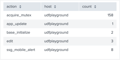
This search generates search results with statistics columns action, host, and count.
index = _internal | stats count by action, host
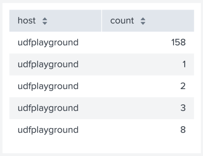
To change the columns that appear in the table or to change column order, add the table command to this search. For example, add | table host count to generate a table with only the host and count columns.
index = _internal | stats count by action, host | table host count
Source options for tables
When you set formatting options using the visual editor, the corresponding source code options can have dynamic or static settings. These options are added to the options field of the visualization stanza. Some options have nested settings. Although the defaults are generally dynamically formatted, you can replace some settings with static settings.
The format of the dynamic settings is different than the format of the static settings and you should not modify them directly, unless you are familiar with it. For example, do not replace dynamic options with static options if you've set up dynamic coloring through the visual editor.
Each dynamic option for a column that is defined in the context section is called beneath the field name (or column header) in the columnFormat option. Dynamic global table options are also set in the context section, but called in the tableFormat option. Global static options, such as backgroundColor, are not nested.
Adjust table column width
You can interactively adjust the width of your table's columns in the UI by clicking and dragging the borders of the column. Or, you can change the column in the source editor. In the options section, you can specify the column's name as a nested column setting within columnFormat. The following example sets the width of the splunk_web_service column to 250.
{
  "type": "splunk.table",
  "dataSources": {
    "primary": "ds_I7lQsSYd"
  },
  "options": {
    "columnFormat": {
      "splunk_web_service": {
        "width": 250
      }
    }
  },
  "context": {},
  "showProgressBar": false,
  "showLastUpdated": false
}
To read more on how visualization stanzas are generally structured see, What is a dashboard definition.
Table options
Expand the window to see the source options for a table visualization. The following options for tables do not have nested settings.
| Property | Type | Default | Description |
|---|---|---|---|
| backgroundColor | string | > themes.defaultBackgroundColor | Specify the color for the background. You might use a data source to apply the color. The default for enterprise light is "#FFFFFF". The default for enterprise dark is "#000000". The default for prisma dark is "#0B0C0E". |
| count | number | 10 | Specify the maximum number of rows to display. |
| font | ("proportional" | "monospace") | proportional | Specify the font style to use for table content. |
| fontSize | ("extraSmall" | "small" | "default" | "large") | default | Specify the font size to use for table content. Font sizes range from extra small (10px) to large (16px) with the default being 14px. |
| headers | string[] | > table | getField() | Specify an array of headers to display on the table. Though these can be statically listed, it's best to use the dynamic default, as it will return the fields of your search. |
| headerVisibility | ("none" | "fixed" | "inline") | inline | Specify how to display the table header row. |
| paginateDataSourceKey | string | primary | Specify the data source key for pagination and sorting. |
| showInternalFields | boolean | TRUE | Specify whether to show internal fields that start with an underscore. The _time field will still be shown if false. |
| showRowNumbers | boolean | FALSE | Show row numbers in the first column. |
| table | (string | number | (string | number)[ ])[ ][ ] | > primary | Two dimensional array of data to be displayed in the table. |
tableFormat (object type)
Expand the window to see the source options for a table visualization. The following are nested settings set in the context section of the visualization stanza. They can then be called within tableFormat in the options section and can be used to format global table options. For more details, see the Table formatting example.
| Property | Type | Default | Description |
|---|---|---|---|
| align | string[][] | > table | type() | matchValue(tableAlignByType) | Alignment for each cell in the table. Valid alignments include "left", "center", and "right". Takes a two dimensional array. |
| cellTypes | string[][] | > table | type() | matchValue(tableCellTypeByType) | Render the data in one of the supported cell type. Valid cell renders include "TextCell", "ArrayCell", "SparklineCell". Takes a two dimensional array. |
| data | (string | number | (string | number)[])[][] | n/a | Two dimensional data to be displayed in the table. This is usually formatted data instead of raw data from search. Takes a two dimensional array. |
| headerBackgroundColor | string | > themes.defaultHeaderBackgroundColor | Background color of table header. |
| headerColor | string | n/a | Text color of the table header. |
| rowBackgroundColors | string[][] | > table | seriesByIndex(0) | pick(tableAltRowBackgroundColorsByTheme) | Array of colors for background color of each row of the table. For example, ["#2C333B", "#32373D"]. Takes a two dimensional array. |
| rowColors | string[][] | n/a | Array of colors for text color of each row of the table. For example, ["#2C333B", "#32373D"]. Takes a two dimensional array. |
| sparklineAreaColors | string[][] | Defaults to the global background color. | Array of colors for sparkline area of each row of the table. For example, ["#2C333B", "#32373D"]. Takes a two dimensional array. |
| sparklineColors | string[][] | n/a | Array of colors for sparkline line of each row of the table. For example, ["#2C333B", "#32373D"]. Takes a two dimensional array. |
| sparklineTypes | string[][] | n/a | Area or Line sparkline. Valid sparkline types include "line", and "area". Takes a two dimensional array. |
columnFormat (object type)
Expand the window to see the source options for a table visualization. The following are nested settings set in the context section of the visualization stanza. They can then be called within columnFormat in the options section and can be used to format individual columns by specifying their fields. For more details, see the Column formatting example.
| Property | Type | Default | Description |
|---|---|---|---|
| align | string[] | n/a | Alignment for each cell in the column. Valid alignments include "left", "center", and "right". Takes a one dimensional array. |
| cellTypes | string[] | n/a | Specify how to render data in cells. Valid cell renders include "TextCell", "ArrayCell", and "SparklineCell". Takes a one dimensional array. |
| data | (string | number | (string | number)[])[] | n/a | Data points to be displayed in the cells of a column. |
| rowBackgroundColors | string[] | Defaults to the background color. | Specify a list of colors, in hex code, for the background color of each column of the table. For example: ["#2C333", "#32373D"]. |
| rowColors | string[] | n/a | Specify a list of colors, in hex code, for the text color of the cells of a column. For example, ["#2C333", "#32373D"]. |
| sparklineAreaColors | string[] | Defaults to the global background color. | Specify a list of colors, in hex code, for the sparkline area of each column. For example, ["#2C333", "#32373D"]. |
| sparklineColors | string[] | n/a | Specify a list of colors, in hex code, for the sparkline stroke of each column. For example, ["#2C333", "#32373D"]. |
| sparklineTypes | string[] | ("line" | "area") | Choose either area or line formatting for the Sparkline. Valid sparkline types include "line" and "area". Takes a one dimensional array. |
| Single value visualizations | Add an image |
This documentation applies to the following versions of Splunk® Enterprise: 9.1.2, 9.1.3, 9.1.4, 9.1.5, 9.1.6, 9.1.7, 9.1.8, 9.1.9, 9.2.0, 9.2.1, 9.2.2, 9.2.3, 9.2.4, 9.2.5, 9.2.6, 9.3.0, 9.3.1, 9.3.2, 9.3.3, 9.3.4

![Four different tables with time columns. Each time column is formatted differently. The first time column has no formatting, the second is formatted with DD-MM-YYYY, the third is formatted with ddd, MMM DD, YYYY, and the last is formatted with ddd, MMM DD, YYYY [at] hh:mm A (MM-DD-YYYY).](/images/thumb/d/d4/FormatTime.png/800px-FormatTime.png)

 Download manual
Feedback submitted, thanks!