Add pivots to a dashboard
This topic continues where you left off in Part 3: Designing a Pivot Report. The last pivot you created was a pie chart. If you haven't created that chart, you can return to the previous topic and do so. Now, you will save that visualization to a new dashboard panel and then add all previous pivot reports to the same dashboard.
Save a Pivot as a dashboard panel
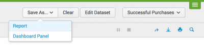
You just created a pie chart, now let's save it to a dashboard panel.
- Click Save as and select Dashboard Panel.
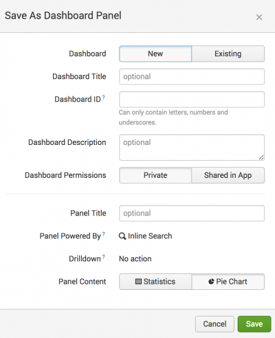
- In the Save As Dashboard Panel dialog box, specify the following values:
- For Dashboard, New is already selected. You are creating a new dashboard to hold the new dashboard panel. There is no need to change this.
- For Dashboard Title type
Buttercup Games. - The Dashboard ID automatically updates to show
buttercup_games. There is no need to change this value. - Optional. For Dashboard Description type
Reports on Buttercup Games online shop data. - The Dashboard Permissions is already set to Private. There is no need to change this setting. If you want to share a dashboard with others, you can change the setting later.
- For Panel Title type
Successful Purchases by Category. - For Panel Content, Pie is already selected.
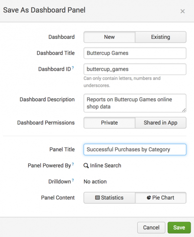
- Click Save.
- Click View Dashboard.


View and edit dashboard panels
After you save a dashboard, you can access it by clicking Dashboards in the app navigation bar.
- Click Dashboards in the app navigation bar.
This takes you to the Dashboards listing page.
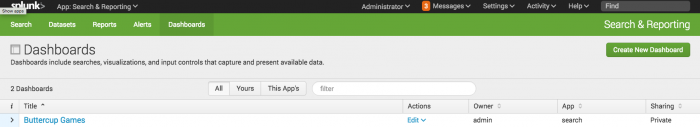
You can Create a new dashboard and edit existing dashboards. You see the Buttercup Games dashboard you just created. - Under the i column, click the arrow next to Buttercup Games to see more information about the dashboard: What app context it is in, whether or not it is scheduled, and its permissions.
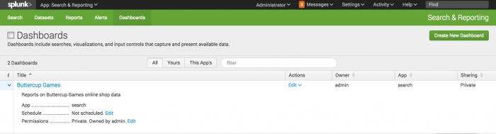
There are also quick links to edit the dashboard's Schedule and Permissions inline with the information. To view the dashboard, click the dashboard's Title or select the Edit option under Actions. Note: If you click to view a dashboard and you cannot view it (or it displays blank), check that you have read access to the data model. To do this, go to the Manage Data Models view and edit the Permissions for the Buttercup Games data model to share in the App.


Add an input to the dashboard
- In the Dashboards list, click Buttercup Games to return to that dashboard.
- Click Edit. The Edit: Buttercup Games view opens.
In this view, you have edit buttons: Add Input, Add Panel, and Source. - Click Add Input and select Time.
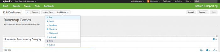
This adds a shared time range picker input to the dashboard editor.
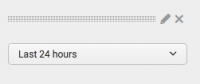
- Click the Edit Input icon for the time range picker. It looks like a pencil.
This opens a set of input controls. The Time input type should be preselected.
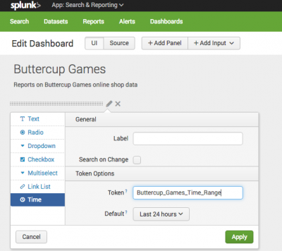
- Change the Token value to Buttercup_Games_Time_Range and click Apply.
- This step redefines the name of the input token for the time range picker. Because the default names of input tokens are not very descriptive (field1, field2, field3, and so on), you may want to do this when you give your dashboard multiple inputs. It makes it easier to understand which input you are working with.
- You can also optionally change the default time range for the picker by changing the value of Default. Right now it defaults to Last 24 hours.
- In the next two steps you connect your dashboard panel to this time range picker.
- In the Successful Purchases by Category dashboard panel, click the Edit Search icon, which looks like a magnifying glass.
The Edit Search dialog opens.
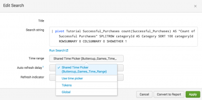
- Click Time Range and select Shared Time Picker (Buttercup_Games_Time_Range).
- Click Apply.
- The panel is now hooked up to the shared time range picker input. The inline search that powers the panel now uses the time range selected for the shared time range picker.
- If your chart does not appear, try changing the time range picker to Last 7 days. The reason that this might occur is that you uploaded the
tutorialdata.zipfile more than 24 hours ago and there are no events in the tutorial data for the last 24 hours.
- You can have dashboards that offer a mix of panels that work with the shared time range picker and panels that show data for fixed time ranges.
- If your dashboard does not appear, try refreshing the page.
- Click 'Save to save your changes to the dashboard.


Add saved reports to the dashboard
Add another panel using one of the saved reports you created earlier.
- In the Buttercup Games dashboard, click Edit.
- In the Edit: Buttercup Games view, click Add Panel. The Add Panel sidebar menu slides open.
- To add a new panel from a report, click New from Report.
- Click Total Purchase Requests.
This slides open a preview panel with information about the saved report.
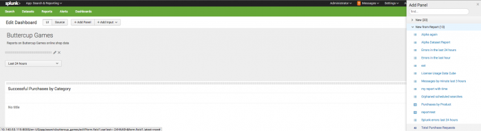
- Click Add to Dashboard. The new panel is placed in the dashboard editor. You can click anywhere to close the Add Panel sidebar menu or choose another report to add to the dashboard. Before you close the Add Panel sidebar menu, add a second report.
- Click Purchases by Product.
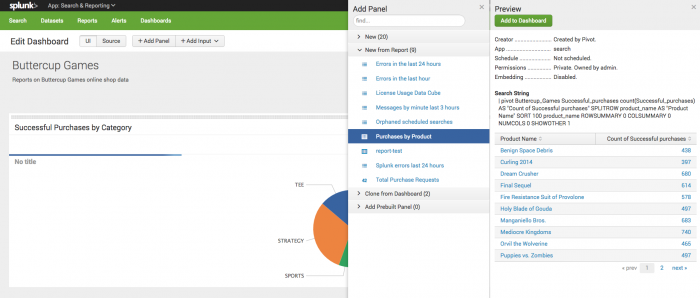
- Click Add to Dashboard.
- Close the sidebar menu. While in the dashboard editor view, drag and drop the panels to rearrange them on the dashboard.
- Click Save.
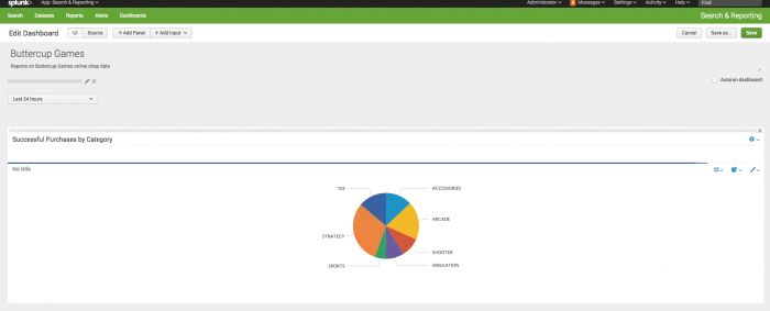
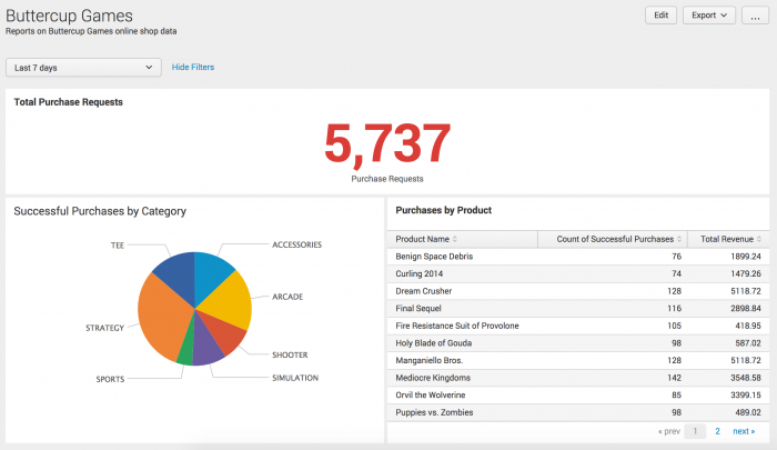
Your dashboard should look like this:


The type of panel that you add to a dashboard determines whether you can connect the panel to the shared Time Range Picker. If the panel is a report, you cannot connect it to the shared Time Range Picker. However, reports can be scheduled to run at a set time interval.

Next steps
This completes the Data Model and Pivot Tutorial. Continue to the next chapter to read about what you can do next.
| About dashboards | More Data model and Pivot resources |
This documentation applies to the following versions of Splunk® Enterprise: 7.0.0, 7.0.1, 7.0.2, 7.0.3, 7.0.4, 7.0.5, 7.0.6, 7.0.7, 7.0.8, 7.0.9, 7.0.10, 7.0.11, 7.0.13
Feedback submitted, thanks!