Create a pivot chart
In the previous topic you used Pivot visualization editor to build a table. In this topic, you will use the same dataset to create chart visualizations.
Define a new Pivot
- From the Splunk bar, select Settings > Data models.
- Select the Buttercup Games data model.
- In the Datasets editor page, click Pivot. In the Select a Dataset page, select the Successful Purchases child dataset.
The New Pivot editor for Successful Purchases opens.

Add Pivot elements
For the pivot chart, let's report on the count of successful purchases by category.
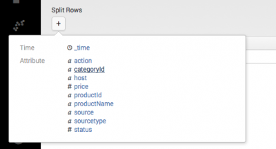
To do this, you will add a Split Row using the categoryId field.
- Under Split Rows, click + and select
categoryIdfrom the list.
- For Label type
Category. 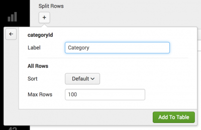
- Click Add to table.
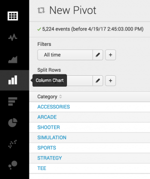
- The Pivot table displays a list of the product categories and a count of the successful purchases.
- The next step is to change the table into a chart.


Change the visualization type
- Click the Column Chart icon from the visualization bar.
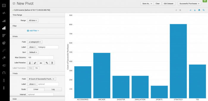
The display changes to show you the options for the Column chart visualization.- Column charts use the first split row element in pivot table definitions to provide their X-axis values. In this case, that Split Row is Category.
- Column charts use the first column value element in pivot table definitions to provide their Y-axis values. Here, that Column Value is Count of Successful Purchases.
- Click the Pie Chart icon from the visualization bar.
The display changes to show you the options for the Pie chart visualization.- Pie charts use the values from the first Split Row element (Category) to determine the number and colors of their slices.
- Pie charts use the first Column Value element (Count of Successful Purchases) to determine the relative sizes of their slices.
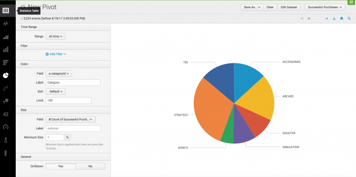
Hover over a slice of the pie chart to view the metrics. You will see Category, Count of Successful Purchases, and the percentage that the slice of pie is of the total Count of Successful Purchases.


This data can also be visualized as a pie chart.

Next steps
In this chapter you created three pivots and saved two of them as reports. This last pivot chart, you will save as a dashboard panel. Continue to the next chapter to read about dashboards.
| Create a pivot table | About dashboards |
This documentation applies to the following versions of Splunk® Enterprise: 7.0.0, 7.0.1, 7.0.2, 7.0.3, 7.0.4, 7.0.5, 7.0.6, 7.0.7, 7.0.8, 7.0.9, 7.0.10, 7.0.11, 7.0.13
Feedback submitted, thanks!