Part 6 Add a single value visualization
In this part of the tutorial, add total revenue as a single value visualization to your dashboard. You can add a single value by attaching the visualization to a data source and adjusting visual formatting options. By adding total revenue as a single value in the Buttercup Games dashboard, you can highlight an important metric in a way that's visually compelling.
- Select the add chart icon (
 ) in the editing toolbar, and then select Single Value.
 - By default, the New Data Source panel pops up. Because you want to create a new chain search data source, select Cancel.
- In the Data Configurations section of the Configuration panel, select + Set up Primary Data Source.
- Select + Create Chain Search and name the search Total Revenue.
- Select Revenue by Game in the Parent Search drop-down menu.
- Add your extended search. For this tutorial, copy and paste the following search into the Search with SPL box:
| stats sum(Revenue) as "Total Revenue"
- Expand the Code section and change the Data Source ID to ds_total_revenue.
- Select Run & Save.
- In the Selected Data Field section, select Total Revenue (number).
- In the Major Value & Trend section, follow these steps:
- Change the Unit Position to Before.
- Enter $ for the Unit Label.
- Increase the Precision value to 2.
- Turn the Sparkline off.
- Change the Static Background to transparent.
- Expand the Code section and change the Visualization ID to viz_totalRevenue.
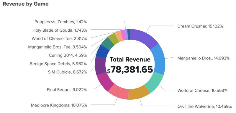
- Move and resize the single value so that it fits inside the center of the donut chart.
- Add a title to the single value visualization by selecting the add Markdown icon (
 ) in the editing toolbar.
- Enter ### Total Revenue in the text box.
- Resize and position the text box to fit above the single value and inside the donut chart.
You can add a title and description in the '''Visualization Options''' section of the '''Configuration''' panel, but adding separate text boxes provides more flexibility in visual formatting.
After completing Part 6, your single value inside the donut chart looks similar to this:
Next step
You've completed Part 6 of the Splunk Dashboard Studio tutorial.
Now your dashboard has a single value visualization. Next, add a drop-down menu input to filter the visualizations you've added so far. Continue to Part 7: Add an input.
| Part 5 Add area charts using chain searches | Part 7 Add an input |
This documentation applies to the following versions of Splunk® Enterprise: 8.2.8, 8.2.9, 8.2.10, 8.2.11, 8.2.12

 Download manual
Feedback submitted, thanks!