Using the Analysis Workspace in Splunk App for Infrastructure
Use the Analysis Workspace to analyze performance metrics and log sources for a single entity, or a specific group of entities. Determine poor performing entities for a set of metrics, or determine a point in time when multiple entities began performing in a similar way. Create alert conditions and search logs collected from your servers to perform root cause analysis and understand why your infrastructure is performing the way it is.
Select data sources to create interactive charts in the workspace. Then, apply filters and aggregations to gain insight into your system's metrics and performance. The Analysis Workspace helps you quickly identify and respond to any issues or anomalies in your data.
From the Infrastructure Overview or the List View, access the Analysis Workspace by clicking an entity or group:
- If clicking an entity, you drilldown to the Entity Overview. Click the Analysis tab to access the Analysis Workspace.
- If clicking a group, you drilldown to the Analysis Workspace.
You can also navigate groups or entities in the Analysis Workspace by clicking the group or entity navigation dropdown to view what entities are in a group, or what groups an entity is a part of.
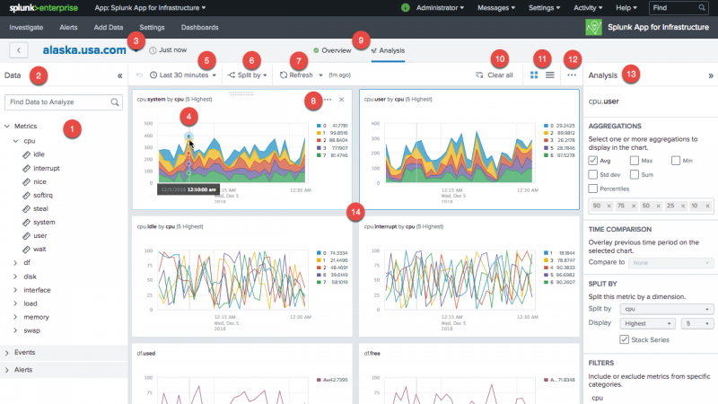
The workspace contains three panels.
- The left-side Data panel shows all data sources that are available for analysis.
- The Main panel in the center is where you see your data represented in charts.
- The right-side Analysis panel lists the aggregations and analytic functions that you can apply to your data. For more information about the Analysis panel, see About Analytics in the Analysis Workspace in Splunk App for Infrastructure.
To add a chart to your workspace to view data represented as a time series, use the search box to find metrics, event, or alerts, or browse through the hierarchy of available data sources. Click the data source, and a chart displays in the workspace. Use the workspace analysis tools customize your charts. The chart must have data to access chart actions, and you must have admin privileges to perform chart actions. For more information about chart actions, see Use Chart Actions to create an alert, open in search, or save as a dashboard panel.
| Number | Element | Description |
|---|---|---|
| 1 | Search metrics, events, or alerts | Search available metrics, events or alerts to analyze and display in the workspace charts. Manage alerts that you have created, and perform actions such as deleting an alert. See Using Alerts in Splunk App for Infrastructure for detailed information about using alerts. |
| 2 | Data panel | The Data panel contains all of the data sources that you have available for visualization and analysis. Search metrics, events, or alerts, or browse for data to view and analyze in the workspace.
Every data source that you select in the Data panel appears as a separate chart in the workspace. Each chart contains a time series based on at least one aggregation. Hover over any point on the series to see the corresponding values in the chart legend to the right of the chart. |
| 3 | Group and Entity navigation | View entities contained in a group, or view what groups an entity is a part of, by expanding the group or entity navigation dropdown. For example when viewing a group in the Analysis Workspace, click the down arrow next to the group name and a list of entities contained in the group display. Click an entity in the group to view the entity in the Analysis Workspace, or use the search field to search for an entity in the group. If viewing an entity in the Analysis Workspace, click the down arrow next to the entity name to view what groups the entity is a part of, click a group from the list to view the group in the Analysis Workspace, or search for a particular group. |
| 4 | Pinpoint time range | Hover to view a shared hairline on all charts. Click and drag to zoom in on a narrower time range. |
| 5 | Time range picker | Select a common time range to display for all charts. The default time range for time series is one hour. Adjust the time range to gain more insight from your charts. Adjust the time range by either the time range picker, or by zooming in on a chart. You can select a custom time range by clicking and dragging your cursor over the time period you want to view. |
| 6 | Split by | Split charts to show a separate time series for each value of a dimension. Click a dimension in a chart and select an action such as Investigate Entity to drilldown to further details. |
| 7 | Refresh | Refresh charts to include the most recent data. Refresh manually or enable auto-refresh. |
| 8 | Chart actions | Click the ellipsis to view the chart action menu. Perform chart actions such as creating an alert, saving a chart as a dashboard panel, opening the chart in Search, saving the chart as a Report, and other tasks. See Use Chart Actions to create an alert, open in search, or save as a dashboard panel. |
| 9 | Entity Overview or Analysis Workspace | Select to display the Analysis Workspace or display system information about the selected host, including operating system, IP address, version information, and associate dimensions. |
| 10 | Clear all | Clear all charts from the workspace. |
| 11 | Grid layout or stack layout | Display charts in grid layout, which displays multiple charts in each row, or stack layout, which displays one chart per row. |
| 12 | Save all charts to a dashboard | Save all charts to a dashboard. |
| 13 | Analysis panel | Select analysis tools, such as aggregation, time comparison, split by, and filters, to display in the Analysis Workspace.
Depending on your data source, the following operations are available:
See Analytics in the Analysis Workspace for detailed information about the different operations you can use to analyze your data. |
| 14 | Main panel | The Main panel is contains charts. Every data source that you select in the Data panel appears as a separate chart in the workspace, or Main panel. Each chart contains a time series based on at least one aggregation. Hover over any point on the series to see the corresponding values in the chart legend to the right of the chart. |
Use Chart Actions to create an alert, open in search, or save as a dashboard panel
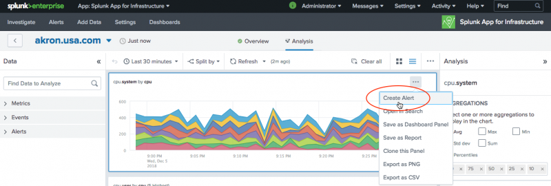
Perform chart actions using the chart action menu, such as creating an alert, saving a chart as a dashboard panel, opening the chart in Search, saving the chart as a Report, and other tasks. Click the ellipsis to access the chart action menu. You must have admin privileges and data in the chart to access this menu and perform actions.
If you create a dashboard panel, click the Dashboard tab to view your dashboards in Splunk Enterprise. See the Splunk Enterprise Dashboards and Visualizations guide.
If you open your chart in Search, see the Splunk Enterprise Search Manual
| Using the List View in Splunk App for Infrastructure | Using the Entity Overview in Splunk App for Infrastructure |
This documentation applies to the following versions of Splunk® App for Infrastructure (EOL): 1.2.2, 1.2.3


 Download manual
Feedback submitted, thanks!