Bar and column charts
Use column and bar charts to compare field values across a data set.

Data formatting
Column and bar charts represent one or more data series. To make sure that a search generates one or more series, check the Statistics tab in Search & Reporting. The table should have at least two columns.
Search results not structured as a table with valid x-axis or y-axis values cannot generate column or bar charts. For example, using the eval or fields commands might change search result structure.
Statistics table order and chart axes
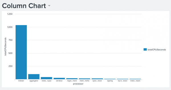
Column and bar charts each use the Statistics table values in different ways. Column charts get x-axis values from the first column in the table. The next table columns contain y-axis values.
Bar charts get y-axis values from the first column in the table. The next table columns contain x-axis values.
As an example, any search using the timechart reporting command generates a table where _time is the first column. A column chart generated with this search has a _time x-axis. A bar chart using this search has a _time y-axis.
Single and multiple data series
Column and bar charts can visualize single or multiple data series. The following examples show you how to generate these series.
Single series
A search compares the average number of bytes passed through each source. In this search, the over operator indicates that source is the first table column.
index=_internal|chart avg(bytes) over source
The search produces the following table.

Column and bar charts represent this single series differently.
- Column chart
sourcevalues are used for the x-axis. The y-axis in the column chart isavg(bytes).
- Bar chart
avg(bytes)values are used for the x-axis. The bar chart y-axis would representsourcefield values.
Multiple data series
To generate multiple data series, introduce the timechart command to add a _time field to search results. You can also change the query to introduce a split-by field.
For example, change the previous single series search by adding clientip as a split-by field.
...| chart avg(bytes) over source by clientip
The split-by field produces multiple data series. Each clientip is a data series with its own avg(bytes) values for each source.

Generate a bar or column chart
- Select the bar or column chart using the visual editor by clicking the Add Chart button (
 ) in the editing toolbar and either browsing through the available charts, or by using the search option.
 - Select the chart on your dashboard so that it's highlighted with the blue editing outline.
- Set up a new data source by adding a search to the Search with SPL window if you are selecting a chart, or by clicking + Setup Primary Data Source if you've selected a shape.
- To select an existing data source, close the Configuration panel and reopen it. In the Data Configurations section, click +Setup Primary Data Source and click + Create Ad hoc Search to create a new search from this window. You can also choose a new ID that describes the search better than the default.
Configuration Panel options for bar and column charts
You can use the Configuration panel to configure the following bar and column chart components.
Title
Give your visualization a name. This is also helpful when searching for individual visualizations in the dashboard definitions. This name is not the same as the automatically assigned unique ID.
Description
Give your visualization a description to explain what the user is viewing.
Data Configurations
Choose an existing ad hoc search or create a new one.
Position & Size
You can use your mouse to change the size of the panel, or the Position & Size section of the Configuration panel for pixel perfect sizing and placement.
General
Use the following Stack Mode (area charts only) options:
| Stack option | Column or bar appearance | Use case |
|---|---|---|
| Unstacked | Columns or bars for different series appear next to each other. | An unstacked chart is useful for a lower number of series. As the number of series increases, the chart can become more difficult to understand. |
| Stacked | Data points within a series appear as segments of a column or bar. The total column or bar value is the sum of all of the segments. | Use a stacked column or bar chart to highlight the relative volume, frequency, or importance of data points in a series. See the stacked chart example below. |
| Stacked 100% | Each bar or column is divided into segments representing the distribution percentage for each data value in one series. | Use stacked 100% to show data distributions when there is significant segment size variation in each column or bar. |
Show Data Values
Choose whether to show all data values (On), no data values (Off), or only the minimum and maximum (Min/Max).
Axes
- Use X Axis title to name your x-axis.
- Use Y Axis title to name your y-axis.
Legend
- Use Position to choose the position of the legend.
- Use Truncation to choose how legend labels are truncated when they overflow the layout boundaries by choosing where to place ellipses (...)
Drilldown
Drilldown from a bar or column chart to let users click on a part of the chart to open an internal or external URL.
Code
Select your visualization or its search to view and edit the source code in real-time. You can also change the Visualization ID to a more readable ID to help identify this visualization in the source code.
Source options for bar and column charts
While some of these options can be set using the visual editor, there are additional options that can only be set in the source editor for viz.bar and viz.column. These options are added to the options field of the visualization stanza. For example, the following example shows the addition of background color and font color settings using a hex code:
"viz_25NNIqLF": {
			"type": "viz.bar",
			"options": {
				"backgroundColor": "#0000FF",
                                "fontColor": "#0000FF"
			},
			"dataSources": {
				"primary": "ds_gcEN4c7Q"
			}
		}
For more details about visualization stanzas, see The source code stanza of a visualization. The following lists the available chart options.
Bar chart options
The following options are available for editing bar charts in the source editor:
| Property | Type | Default | Description |
|---|---|---|---|
| axisY2.enabled | boolean | false | Enable a y2-axis for chart overlays. |
| axisY2.fields | string | N/A | Specify a field to map to a second y-axis for chart overlays. |
| axisLabelsY.integerUnits | boolean | false | Specify whether the major unit of the y-axis is rounded to the nearest integer. |
| axisY.includeZero | boolean | false | Specify whether the y-axis range includes zero. |
| axis2Y.includeZero | boolean | false | Specify whether the y2-axis range includes zero. |
| axisY.maximumNumber | (number | auto) | auto | Specify the maximum number for the visible y-axis range. |
| axisY2.maximumNumber | (number | auto) | auto | Specify the maximum number for the visible y2-axis range. |
| axisY.minimumNumber | (none | auto) | auto | Specify the minimum number for the visible y-axis range. |
| axisY2.minimumNumber | (none | auto) | auto | Specify the minimum number for the visible y2-axis range. |
| axisY.scale | (linear | log) | linear | Specify the scale type that applies to a numerical y-axis. |
| axisY2.scale | (linear | log) | linear | Specify the scale type that applies to a numerical y2-axis. |
| axisTitleX.text | string | N/A | Specify the title of the x-axis. |
| axisTitleY.text | string | N/A | Specify the title of the y-axis. |
| axisTitleY2.text | string | N/A | Specify the title of the y2-axis. |
| axisTitleX.visibility | (visible | collapsed) | visible | Specify whether to show the title of the x-axis. |
| axisTitleY.visibility | (visible | collapsed) | visible | Specify whether to show the title of the y-axis. |
| axisTitleY2.visibility | (visible | collapsed) | visible | Specify whether to show the title of the y2-axis. |
| gridLinesX.showMajorLines | boolean | false | Specify whether major grid lines are visible on the x-axis. |
| gridLinesY.showMajorLines | boolean | false | Specify whether major grid lines are visible on the y-axis. |
| gridLinesY2.showMajorLines | boolean | false | Specify whether major grid lines are visible on the second y-axis. |
| chart.overlayFields | string | N/A | Specify a field, a space, or a comma-delimited list of fields that you want to map to the y2-axis. |
| backgroundColor | string | N/A | Specify the color used for the chart background by using the hex code. For example, "#0000FF".
|
| fontColor | string | N/A | Specify the color used for fonts (axis labels, legends) using the hex code. For example, "#0000FF".
|
| foregroundColor | string | N/A | Specify the color used for the chart foreground by specifying the hex code. For example, "#0000FF".
|
| fieldColors | object | N/A | Specify the color used for a field by specifying the hex code. For example, "{"count": "#ff0000","percent": "#cb3b43"}".
If you would like to maintain a space between two fields, you can use the backslash and quotes to surround the string and maintain the space. In this example:
|
| seriesColors | array | (dark and light mode defaults) ["#1E93C6", "#F2B827", "#D6563C", "#6A5C9E", "#31A35F"] | Specify the hex color codes for the bars to use in order from largest to smallest. For example, ["#FF0000","#0000FF","#008000"].
|
| drilldown | (all | none) | all | Specify whether to enable or disable drilldown for the chart. |
| chart.barSpacing | number | N/A | Specify the spacing, in pixels, between columns in a bar chart. |
| chart.seriesSpacing | number | N/A | Specify the spacing, in pixels, between clustered series in column and bar charts. |
| chart.stackMode | (default | stacked | stacked100) | default | Specify stacking options. |
| chart.resultTruncationLimit | number | 50000 | Specify a limit for the number of data points rendered in a chart. |
| legend.placement | (right | left | top | bottom | none) | right | Specify the location of the legend on the panel. |
| legend.labelStyle.overflowMode | (ellipsisEnd | ellipsesMiddle | ellipsisStart | ellipsesNone) | ellipsesMiddle | Specify how to display legend labels when they overflow the layout boundaries by replacing overflow text with an ellipsis. |
| layout.splitSeries | boolean | false | Set to true to split a multi-series chart into separate charts that are stacked from top to bottom; one for each series. |
| data.fieldListMode | (show_hide | hide_show) | hide_show | Specify the order in which to apply the fieldShowList and fieldHideList filters. |
| data.fieldShowList | array | N/A | Specify a list of fields to show in the results. For example: ["#FF0000", "#000000", "#FFFFFF"].
|
| data.fieldHideList | array | N/A | Specify a list of fields to hide in the results. For example: ["#FF0000", "#000000", "#FFFFFF"].
|
| chart.showDataLabels | (none | all | minmax) | none | Specify whether you want bar charts to display no labels, all labels, or only the min and max labels. |
Column chart options
The following options are available for editing column charts in the source editor:
| Property | Type | Default | Description |
|---|---|---|---|
| annotation.categoryColors | object | N/A | Map comma-delimited, hexadecimal color values to specified categories. For example, {"count": "#ff0000","percent": "#cb3b43"}.
|
| axisY2.enabled | boolean | false | Enable a y2-axis for chart overlays. |
| axisY2.fields | string | N/A | Specify a field to map to a second y-axis for chart overlays. |
| axisY.includeZero | boolean | false | Specify whether the y-axis range includes zero. |
| axis2Y.includeZero | boolean | false | Specify whether the y2-axis range includes zero. |
| axisY.maximumNumber | (number | auto) | auto | Specify the maximum number for the visible y-axis range. |
| axisY2.maximumNumber | (number | auto) | auto | Specify the maximum number for the visible y2-axis range. |
| axisY.minimumNumber | (none | auto) | auto | Specify the minimum number for the visible y-axis range. |
| axisY2.minimumNumber | (none | auto) | auto | Specify the minimum number for the visible y2-axis range. |
| axisY.scale | (linear | log) | linear | Specify the scale type that applies to a numerical y-axis. |
| axisY2.scale | (linear | log) | linear | Specify the scale type that applies to a numerical y2-axis. |
| axisTitleX.text | string | N/A | Specify the title of the x-axis. |
| axisTitleY.text | string | N/A | Specify the title of the y-axis. |
| axisTitleY2.text | string | N/A | Specify the title of the y2-axis. |
| axisTitleX.visibility | (visible | collapsed) | visible | Specify whether to show the title of the x-axis. |
| axisTitleY.visibility | (visible | collapsed) | visible | Specify whether to show the title of the y-axis. |
| axisTitleY2.visibility | (visible | collapsed) | visible | Specify whether to show the title of the y2-axis. |
| gridLinesX.showMajorLines | boolean | false | Specify whether major grid lines are visible on the x-axis. |
| gridLinesY.showMajorLines | boolean | false | Specify whether major grid lines are visible on the y-axis. |
| gridLinesY2.showMajorLines | boolean | false | Specify whether major grid lines are visible on the second y-axis. |
| chart.overlayFields | string | N/A | Specify a field or a space or comma-delimited list of fields to map to the y2-axis. |
| backgroundColor | string | N/A | Specify the color used for the chart background by using the hex code. For example, "#0000FF".
|
| data.fieldListMode | (show_hide | hide_show) | hide_show | Specify the order in which to apply the fieldShowList and fieldHideList filters. |
| data.fieldShowList | array | N/A | Specify a list of fields to show in the results. For example: ["#FF0000", "#000000", "#FFFFFF"].
|
| data.fieldHideList | array | N/A | Specify a list of fields to hide in the results. For example: ["#FF0000", "#000000", "#FFFFFF"].
|
| fontColor | string | N/A | Specify the color used for fonts using the hex code. For example, "#0000FF".
|
| foregroundColor | string | N/A | Specify the color used for the chart foreground by specifying the hex code. For example, "#0000FF".
|
| fieldColors | object | N/A | Specify the color used for a field by specifying the hex code. For example, "{"count": "#ff0000","percent": "#cb3b43"}".
If you would like to maintain a space between two fields, you can use the backslash and quotes to surround the string and maintain the space. In this example:
|
| legend.labelStyle.overflowMode | (ellipsisEnd | ellipsesMiddle | ellipsisStart | ellipsesNone) | ellipsesMiddle | Specify how to display legend labels when they overflow the layout boundaries by replacing overflow text with an ellipsis. |
| legend.placement | (right | left | top | bottom | none) | right | Specify the location of the legend on the panel. |
| seriesColors | array | (dark and light mode defaults) ["#1E93C6", "#F2B827", "#D6563C", "#6A5C9E", "#31A35F"] | Specify the hex color codes for the bars to use in order from largest to smallest. For example, ["#FF0000","#0000FF","#008000"].
|
| drilldown | (all | none) | all | Specify whether to enable or disable drilldown for the chart. |
| chart.seriesSpacing | number | N/A | Specify the spacing, in pixels, between clustered series in column and bar charts. |
| chart.columnSpacing | number | N/A | Specify the spacing, in pixels, between columns in a column chart. |
| chart.stackMode | (default | stacked | stacked100) | default | Specify stacking options. |
| chart.resultTruncationLimit | number | 50000 | Specify a limit for the number of data points rendered in a chart. |
| chart.showDataLabels | (none | all | minmax) | none | Specify whether you want column charts to display no labels, all labels, or only the min and max labels. |
| layout.splitSeries | boolean | false | Set to true to split a multi-series chart into separate charts that are stacked from top to bottom; one for each series.
|
| layout.splitSeries.allowIndependentYRanges | boolean | false | Specify whether split series charts have independent y-ranges. |
| Line and area charts | Bubble charts |
This documentation applies to the following versions of Splunk® Enterprise: 8.2.1, 8.2.2, 8.2.3, 8.2.4, 8.2.5, 8.2.6, 8.2.7, 8.2.8, 8.2.9, 8.2.10, 8.2.11, 8.2.12
Feedback submitted, thanks!