Sankey diagrams
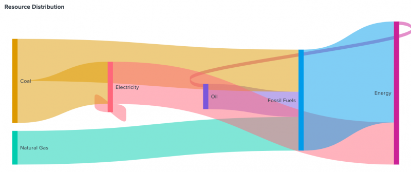
Use Sankey diagrams to visualize node entities and the proportional flow between them. The width of the links represent the volume of flow.
Generate a Sankey diagram
- Select the Add chart button (
 ) in the editing toolbar and browse through the available charts. Choose the Sankey diagram.
 - Select the diagram on your dashboard to highlight it with the blue editing outline.
- Set up a new data source by selecting + Create search and adding a search to the SPL query window. Or, you can select an existing data source under the Search, Saved search, or Chain search sections.
- (Optional) You can also write a new ID that describes the search better than the default by changing the ID in Data source name.
- Select Apply and close.
Configuration panel options
You can use the Configuration panel to configure the following Sankey diagram components.
Title
Give your visualization a name. This is also helpful when searching for individual visualizations in the dashboard definitions. This name is not the same as the automatically assigned unique ID.
Description
Give your visualization a description to explain what the user is viewing.
Data Sources
You can choose one of the following data options:
- An existing data source or create a new data source
- A chain search
- A saved search
Your data source must have the following in the fields stanza:
source- the node entity from which flow beginstarget- the node entity to which flow endsvalue- a numerical value that represents the width of the source node
You can also add an optional field for dynamic coloring. For example, if you add another value and name it value2.
Data Selection
Use the Link Value Field to specify the data source field that determines link width.
Coloring
- Color Mode - Choose between Categorical or Dynamic. Categorical uses a unique color for each source node. Dynamic provides the ability to assign colors based on values returned from a selected field.
- Background - To change the background color of the diagram panel, click the color box to select from a palette or enter a hexadecimal code. For example, enter #FF7189 for a shade of pink.
Code
Select your visualization or its search to view and edit the source code in real-time. You can also change the Visualization ID to a more readable ID to help identify this visualization in the source code.
Sankey diagram example
The following example bypasses the visual editor and directly sets the diagram's data source in the source editor.
Source code
The following source code is an example of a Sankey diagram. Notice how ds_sankey is set as the primary data source for viz_sankeyDiagram and the data is manually added to dataSources with prefilled columns and fields.
[...]
"visualizations": {
       "viz_sankeyDiagram": {
           "type": "splunk.sankey",
           "dataSources": {
               "primary": "ds_sankey"
           },
           "title": "Resource Distribution"
       },
       "options": {}
   },
   "dataSources": {
       "ds_sankey": {
           "type": "ds.test",
           "options": {
               "data": {
                   "columns": [
                       [
                           "Oil",
                           "Natural Gas",
                           "Coal",
                           "Coal",
                           "Fossil Fuels",
                           "Electricity",
                           "Electricity",
                           "Energy"
                       ],
                       [
                           "Fossil Fuels",
                           "Fossil Fuels",
                           "Fossil Fuels",
                           "Electricity",
                           "Energy",
                           "Energy",
                           "Electricity",
                           "Oil"
                       ],
                       [
                           15,
                           20,
                           25,
                           25,
                           60,
                           25,
                           5,
                           2
                       ],
                       [
                           1,
                           20,
                           3,
                           4,
                           50,
                           6,
                           7,
                           8
                       ]
                   ],
                   "fields": [
                       "source",
                       "target",
                       "value",
                       "value2"
                   ]
               }
           }
       }
   },
[...]
Source options for Sankey diagrams
| Property | Type | Default | Description |
|---|---|---|---|
| backgroundColor | string | > themes.defaultBackgroundColor | Specify the color for the background. You may use a dataSource to apply the color. The default for enterprise light is "#ffffff". The default for enterprise dark is "#000000". The default for prisma dark is "#0b0c0e". |
| colorMode | (categorical | dynamic) | categorical | Specify the coloring method used for the links. When set to "categorical" the nodes and links will be colored based on the "seriesColors". When set to "dynamic" the links will be colored based on the dynamic string assigned to "linkColors". ("categorical" | "dynamic") |
| linkOpacity | number | 0.5 | Specify the opacity of the links. Choose a number in the range of 0 - 1 (inclusive). |
| linkValues | string | > primary | seriesByType('number') | Specify the dataSource to apply link width. |
| linkColors | string | > linkValues | rangeValue(linkColorRangeConfig) | Specify the coloring method used for the links when the colorMode "dynamic" is specified. |
| resultLimit | number | 1000 | Specify the maximum length of link data points rendered. |
| seriesColors | string | #7B56DB,#009CEB,#00CDAF,#DD9900,#FF677B,#CB2196,#813193,#0051B5,#008C80,#99B100,#FFA476,#FF6ACE,#AE8CFF,#00689D,#00490A,#465D00,#9D6300,#F6540B,#FF969E,#E47BFE | Specify the colors used for a series. For example, ["#FF0000", "#0000FF", "#008000"]. |
| Punchcard charts | Scatter charts |
This documentation applies to the following versions of Splunk® Enterprise: 9.1.2, 9.1.3, 9.1.4, 9.1.5, 9.1.6, 9.1.7, 9.1.8, 9.1.9, 9.2.0, 9.2.1, 9.2.2, 9.2.3, 9.2.4, 9.2.5, 9.2.6, 9.3.0, 9.3.1, 9.3.2, 9.3.3, 9.3.4, 9.4.0, 9.4.1, 9.4.2

 Download manual
Feedback submitted, thanks!