Part 2: Create a dashboard
To tell a story about the revenue and purchasing trends of Buttercup Games, you can create a dashboard in Splunk Dashboard Studio with compelling visualizations powered by insightful searches.
Select a layout option
Splunk Dashboard Studio provides two different layout options: grid and absolute. In the grid layout, visualizations have automatic, snap-to alignment. This means that charts will snap to your specified rows without any manual input. The grid layout is best for a quick dashboard building experience. The absolute layout provides more flexibility with pixel-perfect control and customizable backgrounds, shapes, and icons. For this tutorial, select the absolute layout. To learn more about both layouts, see Compare absolute and grid layouts.
- Select Create New Dashboard from the Dashboards tab of the Search & Reporting app.
- Title your dashboard Buttercup Games Online Store and add Dashboard Studio Tutorial in the description box.
- Choose Private or Shared in App in the Permissions drop-down menu. Other app users can see your dashboard with the Shared in App option.
- Select the Dashboard Studio option for this dashboard.
- Select the Absolute layout.
- Select Create. This opens the visual editor.
There are two editing options available in Splunk Dashboard Studio: the visual editor and the source code editor. Although it's not always necessary to use the source code editor to build a dashboard, you can edit the source code for more customizability beyond the visual editor.
About the visual editor
In this tutorial, you will practice using tools in the editing toolbar to customize a dashboard. The editing toolbar is shown in the following screenshot:
![]()
In the editing toolbar, you can add objects to a dashboard, adjust visual formatting options, access the data source overview panel, and more.
Use the following table as a reference for all tools in the editing toolbar:
In the Configuration panel, only visible in Edit mode, you can adjust canvas settings, preferences, and view options. See Set up a dashboard.
About the source code editor
The source code for Splunk Dashboard Studio is JSON-based. In this tutorial, you will not use the source code editor to edit your dashboard. To learn more about the source code editor and how to write and edit dashboard source code, see What is a dashboard definition.
Set up the dashboard canvas
Before adding visualizations to your dashboard, prepare the canvas by adding a background image and some shapes. Preparing the dashboard canvas with design elements can help you later when choosing visual formatting options for visualizations.
- Select the Global Time Range element.
- In the Configuration panel, select Last 7 Days as the value for the Default Value dropdown. This sets the default setting for Global Time Range to be 7 days rather than 24 hours.
- Set the Global Time Range dropdown on the canvas to Last 7 Days. Although you already set the default value of the Global Time Range to 7 days, this only changes the time range when a dashboard is freshly loaded. Since you've already loaded this dashboard, you need to select Last 7 Days again to update this specific dashboard. By default, searches use the global time range picker. You will use the default time range for all your visualizations in this dashboard.
- Select anywhere on the canvas away from the Global Time Range element to return to the main Configuration panel. Using the Configuration panel, which now displays information about the canvas, make sure the Display Mode is set to Fit to Width.
- Make sure that Canvas Width is set to 1440 and Canvas Height to 960. To learn more, see Compare absolute and grid layouts.
- Open the Buttercup Games background image in a new tab and download the image to your computer.
- In the Background Image section of the Configuration panel, upload the Buttercup Games background image.
- In the Configuration panel, change the background image size setting from Contain to Cover.
The image size limit for Dashboard Studio is 16 MB.
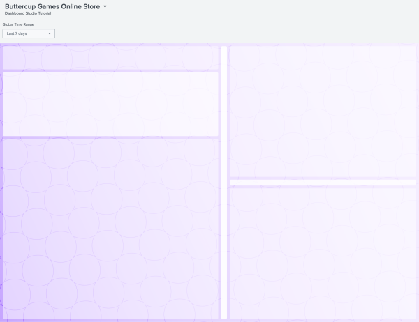
After completing Part 2, your dashboard will look similar to the following:
Next step
You've completed Part 2 of the Splunk Dashboard Studio tutorial.
Now you have a canvas ready for visualizations. Next, add a new data source and assign it to a table visualization. Continue to Part 3: Add a table with column formatting.
| Part 1: Configure data sources for the Splunk Dashboard Studio tutorial | Part 3: Add a table with column formatting |
This documentation applies to the following versions of Splunk® Enterprise: 9.1.3, 9.1.4, 9.1.5, 9.1.6, 9.1.7, 9.1.8, 9.1.9, 9.2.1, 9.2.2, 9.2.3, 9.2.4, 9.2.5, 9.2.6, 9.3.0, 9.3.1, 9.3.2, 9.3.3, 9.3.4, 9.4.0, 9.4.1, 9.4.2

 Download manual
Feedback submitted, thanks!