Creating charts
You can create a variety of charts the new Search Experience preview.
The steps to create charts are:
- Identify the module for the charts
- Import the datasets
- Create the search statements
- Create the charts
Identify the module for the charts
Charts are created inside a module, using your SPL2 search statements.
Open an existing module, or add a new module, where you want to create the charts.
Import the datasets
You can use your own data or the sample data to create charts. You need to import the datasets into the module where you want to create the charts.
The following examples use the sample data included with the new Search Experience for Splunk Cloud Platform. To use the sample data, you must import the sample data into a module.
Here's an example of the import statement:
import {
    sample_data_index,
    sample_prices_lookup,
    sample_products_lookup,
    sample_suppliers_lookup
 } from /splunk_sample_data
Create the search statements
Create one or more search statements that filter the data down to the search results that you want to chart.
- If you are new to the Splunk Search Processing Language (SPL), see Search using point and click.
- If you are familiar with SPL, see Search using SPL2.
Create the charts
To create a chart, use these steps:
- In the outline panel, select the Options icon
 next to the search that you want to use as the basis for the chart.
 - Select Add chart.
Charts and aggregations
Charts show aggregated summaries of information, such as count, sum, and average. You can perform these aggregations, as part of the chart creation process or before you create a chart.
For example, the following search retrieves data from the sample_data_index and uses filters in the where clause to return only the events where a successful purchase was made.
$purchases = from sample_data_index where status=200 AND action="purchase"
AND productId != NULL AND productId != ""
The results are a set of events.
Because the sample data is from July 2021, your charts with render better if you specify a custom time range. Use the Date & time range option to specify from 7/12/2021 to 7/21/2021.
Create charts from a set of events
You can create charts from a set of raw events. There is no need to perform aggregations on the data first.
- Select a field from the list of fields to display that field in the results pane. For example, select the categoryId field.
- In the results pane, click on that field.
- In the Data Distribution panel, choose Chart. A chart appears in the Chart Editor, which counts the values in the field you selected.
- You can change and enhance the chart by changing the settings on the Data and Formatting tabs. For example, you can change the chart type, or specify the axis and series fields.
- By default, a bar chart is created. On the Data tab. Change the Chart Type to Line Chart.
The chart options on both the Data and Formatting tabs change based on the chart type you select. For example, for a line chart the X Axis automatically uses the _time field to display dates or time values on that axis. There is no X Axis option on the Data tab for a line chart.
The chart looks like this:

You can create another chart from the same set of raw events, such as the pie chart shown in the following image:

You can change the field used for the values by removing the current field and selecting a different field from the list. For example you can remove the categoryId field and select the productId field.
Create charts from aggregated search results
If you have already aggregated your data, you can use those aggregations in your charts.
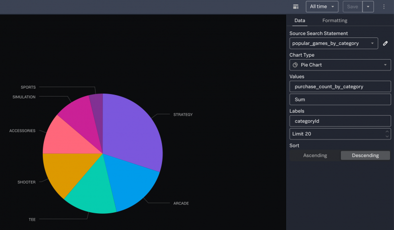
Create a pie chart
To create a pie chart, you must have at least the following two fields in your search results:
- A field that contains string values to use as the labels for the pie slices
- A field that contains the aggregated numeric values to use for the sizes of each pie slice
Suppose you have search results that look like this:
| categoryId | purchase_count |
|---|---|
| ACCESSORIES | 9 |
| ARCADE | 13 |
| SHOOTER | 11 |
| SIMULATION | 8 |
| SPORTS | 3 |
| STRATEGY | 24 |
| TEE | 12 |
To create a pie chart, use these steps:
- Select the field that contains the string values, which will be used as labels for each piece of pie. In this example, select the categoryId field.
- Keep Top values as the type of values to chart.
- Click Chart. The chart appears in the chart editor, which has two tabs, Data and Formatting.
- By default, a bar chart is created. On the Data tab, change the Chart type to Pie.
- To specify which values to use for the pie pieces, for Values choose the field that contains the numeric values. In this example, select the purchase_count_by_category field.
- Change the aggregation from Count to Sum.

The Formatting tab contains options for formatting the chart, for example you can add percentages next to the pie slice labels or change the chart to a donut-shaped pie chart.
Create a column chart
To create a column chart, you must identify the following fields in your search results:
- A field that contains string values to use as the data series. This field will be used for the legend in your chart.
- A field that contains numeric values to use the Y axis.
- A field that contains the values to use the X axis. This can be the
_timefield or another field, depending on what you are trying to show in your chart.
Consider the following search against the sample data:
$categories_over_time = from $purchases
| stats count() AS purchase_count_by_category BY categoryId, _time span=1d
| select purchase_count_by_category, categoryId, _time
There are 38 results. The search results look like this:
| _time | categoryId | purchase_count_by_category |
|---|---|---|
| 2021-07-14 | ACCESSORIES | 18 |
| 2021-07-15 | ACCESSORIES | 16 |
| 2021-07-16 | ACCESSORIES | 12 |
| 2021-07-18 | ACCESSORIES | 6 |
| 2021-07-19 | ACCESSORIES | 12 |
| 2021-07-14 | ARCADE | 6 |
| 2021-07-15 | ARCADE | 6 |
To create a column chart, use these steps:
- Select the field that contains the string values. In this example, select the categoryId field.
- Keep Top values as the type of values to chart.
- Click Chart. The chart appears in the chart editor, which has two tabs, Data and Formatting.
- By default, a bar chart is created. On the Data tab, change the Chart type to Column Chart.
- For the Y Axis, select the field that contains the aggregated data. In this example, select the purchase_count_by_category field from the list.
- By default, Count is the aggregation used for the Y Axis. Click X to remove the aggregation. The field already contains aggregated values.
- For the X Axis, type _time to show dates along the X Axis.
- For the Series, select categoryId from the list.
- For the Limit, specify a number that is equal to or higher than the number of results returned from your search. In this example, the Limit is set to 50.

The Formatting tab contains options for formatting the chart. For example you can create a stacked column chart, display the numeric values above each column, add titles to the Y axis and X axis, and reposition the legend.
Examples using the sample data
You can use the sample data to explore how to create charts.
To use the sample data, you must set the time range to All time.
Start with a base search
The following search retrieves data from the sample_data_index and uses four filters in the where clause to return only the events where a successful purchase was made. Events that have a productId field with a NULL value or that are empty are removed from the search results.
$purchases = from sample_data_index where status=200 AND action="purchase"
AND productId != NULL AND productId != ""
The results of this base search look similar to this:
| _time | raw | productId | status |
|---|---|---|---|
| 5:57:57 PM Tue, Jul 20, 2021 |
"JSESSIONID":"SD5SL6FF7ADFF53001","_raw":"12.130.60.5 - - [20/Jul/2021:17:57:57]
\"POST /cart.do?action=purchase&itemId=EST-12&JSESSIONID=SD5SL6FF7ADFF530... |
WC-SH-T02 | 200 |
| 10:37:29 AM Tue, Jul 20, 2021 |
"JSESSIONID":"SD4SL1FF6ADFF50812","_raw":"112.111.162.4 - - [20/Jul/2021:10:37:29]
\"POST /cart.do?action=purchase&itemId=EST-26&JSESSIONID=SD4SL1FF6ADFF508... |
DB-SG-G01 | 200 |
| 9:36:36 PM Tue, Jul 20, 2021 |
"JSESSIONID":"SD7SL4FF6ADFF50596","_raw":"110.159.208.78 - - [20/Jul/2021:09:36:36]
\"POST /cart.do?action=purchase&itemId=EST-13&JSESSIONID=SD7SL4FF6ADFF505.. |
FI-AG-G08 | 200 |
| 9:36:32 PM Tue, Jul 20, 2021 |
"JSESSIONID":"SD7SL4FF6ADFF50596","_raw":"110.159.208.78 - - [20/Jul/2021:09:36:32]
\"POST /cart.do?action=purchase&itemId=EST-18&JSESSIONID=SD7SL4FF6ADFF5059... |
WC-SH-T02 | 200 |
This is your base search.
Chart the top values
You can use the results of a base search as the dataset for subsequent searches.
For example, the following search determines the most popular game categories.
- This search starts with the base search and uses a
statscommand to count the number of purchases made in each category. - The results of the count are grouped by the category ID.
- The
selectclause specifies which fields to return.
$popular_games_by_category = from $purchases
| stats count() AS purchase_count_by_category BY categoryId
| select categoryId, purchase_count_by_category
The results of this search look similar to this:
| categoryId | purchase_count |
|---|---|
| ACCESSORIES | 9 |
| ARCADE | 13 |
| SHOOTER | 11 |
| SIMULATION | 8 |
| SPORTS | 3 |
| STRATEGY | 24 |
| TEE | 12 |
With these results, the most useful charts to create are pie, column, or bar.
To create a bar chart from this data, use these steps:
- Select the field that contains the string values. In this example, select the categoryId field.
- Keep Top values as the type of values to chart.
- Click Chart. The chart appears in the chart editor.
- By default, a bar chart is created.
- On the Data tab, for the X Axis, select the field that contains the aggregated data. In this example, select the purchase_count_by_category field from the list.
- By default, Count is the aggregation used for the Y Axis. Click X to remove the aggregation. The values in the field ar already aggregated.
- For the Y Axis, select the categoryId field from the list.
Here is an example of a bar chart that is created from this data.

Chart top values by multiple fields
Here's an example of a search that takes the most popular game categories and further separates out the individual games within each category.
- This search starts with the base search which returns only the events that are successful purchase events.
- The
group bycommand separates the search results first by category ID and they by product ID. - The
selectclause specifies which fields to return, and includes thecountfunction as a count of the purchases made.
$popular_products = from $purchases
| group by categoryId, productId select categoryId, count() AS purchase_count, productId
The results look like this:
| categoryId | productId | purchase_count |
|---|---|---|
| ACCESSORIES | WC-SH-A01 | 4 |
| ACCESSORIES | WC-SH-A02 | 5 |
| ARCADE | BS-AG-G09 | 3 |
| ARCADE | FI-AG-G08 | 3 |
| ARCADE | MB-AG-G07 | 7 |
| SHOOTER | WC-SH-G04 | 11 |
| SIMULATION | SC-MG-G10 | 8 |
| SPORTS | CU-PG-G06 | 3 |
| STRATEGY | DB-SG-G01 | 8 |
| STRATEGY | DC-SG-G02 | 7 |
| STRATEGY | FS-SG-G03 | 5 |
| STRATEGY | PZ-SG-G05 | 4 |
| TEE | MB-AG-T01 | 5 |
| TEE | WC-SH-T02 | 7 |
With these results, the most useful chart to create is column or bar.
To create a column chart from this data, use these steps:
- Select the field that contains the string values for the first group of data. In this example, select the categoryId field.
- Keep Top values as the type of values to chart.
- Click Chart. The chart appears in the chart editor.
- By default, a bar chart is created. On the Data tab, change the Chart type to Column Chart.
- For the Y Axis, select the field that contains the aggregated data. In this example, select the purchase_count field from the list.
- By default, Count is the aggregation used for the Y Axis. Click X to remove the aggregation. The values in the field are already aggregated.
- For the X Axis, select the field that contains the strings for the first grouping. In this example, select the categoryId field from the list.
- For the Series, select the field that contains the strings for the second grouping. In this example, select the productId field from the list.
Here is an example of a column chart that is created from this data. In this chart, the horizontal axis shows the category IDs and the columns represent the product IDs that were purchased within each a category.

Using a lookup to display information in a chart
The following search uses a lookup dataset to return the names of the products instead of the product IDs. The results are the same as shown in Chart top values by multiple fields with the product names replacing the product IDs.
- The product ID field, although spelled differently, is common to both the
sample_data_indexand thesample_products_lookupdatasets. - The results are grouped by the product names.
- The
selectclause returns a count of the purchase action and the product name.
$popular_game_products = from $purchases
| lookup sample_products_lookup productID AS productId OUTPUTNEW product_name
| group BY product_name select count() AS purchase_count, product_name
The results look like this:
| categoryId | product_name | purchase_count |
|---|---|---|
| ACCESSORIES | Fire Resistance Suit of Provolone | 5 |
| ACCESSORIES | Holy Blade of Gouda | 4 |
| ARCADE | Benign Space Debris | 3 |
| ARCADE | Manganiello Bros. | 7 |
| ARCADE | Orvil the Wolverine | 3 |
| SHOOTER | World of Cheese | 11 |
| SIMULATION | SIM Cubicle | 8 |
| SPORTS | Curling 2014 | 3 |
| STRATEGY | Dream Crusher | 7 |
| STRATEGY | Final Sequel | 5 |
| STRATEGY | Mediocre Kingdoms | 8 |
| STRATEGY | Puppies vs. Zombies | 4 |
| TEE | Manganiello Bros. Tee | 5 |
| TEE | World of Cheese Tee | 7 |
With these results, the most useful chart to create is a column or bar.
To create a column chart from this data, use these steps:
- Select the field that contains the string values for the first group of data. In this example, select the categoryId field.
- Keep Top values as the type of values to chart.
- Click Chart. The chart appears in the chart editor.
- By default, a bar chart is created. On the Data tab, change the Chart type to Column Chart.
- For the Y Axis, select the field that contains the aggregated data. In this example, select the purchase_count field from the list.
- By default, Count is the aggregation used for the Y Axis. Click X to remove the aggregation. The values in the field are already aggregated.
- For the X Axis, select the field that contains the strings for the first grouping. In this example, select the categoryId field from the list.
- For the Series, select the field that contains the strings for the second grouping. In this example, select the product_name field from the list.
Here is an example of a column chart that is created from this data. In this chart, the horizontal axis shows the category IDs and the columns represent the product IDs that were purchased within each a category.
Additional formatting has been applied to this chart, using the Formatting tab:
- The chart is converted to a stacked column chart.
- The data values are displayed in the chart.
- The axes have titles.
- The legend is positioned at the bottom of the chart.

|
PREVIOUS Create, save, and manage modules |
NEXT Extract fields in a search |
This documentation applies to the following versions of Splunk Cloud Platform™: search2preview
Feedback submitted, thanks!