Filler and marker gauges
Use a filler or marker gauge to map a value in relation to a range. A gauge visualization provides metric status and range information that you can interpret quickly. You can use a real-time search to generate a gauge that tracks value fluctuations as they occur.
Data formatting
To generate a gauge, use a search that returns a single numerical value. For example, use a search that returns an event count for events with a specific field value in a time period or real-time window. If you use a real-time search, the range marker moves to show the metric changing over time.
Gauge types
All gauge types visualize a single aggregated metric. For example, the following search aggregates error log events.
index=_internal source="*splunkd.log" log_level="error" | stats count as errors
The search can generate either filler or marker gauge types.
Filler gauge
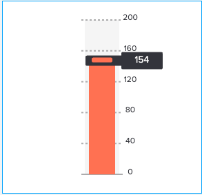
A filler gauge includes a value scale container that fills and empties as the current value changes. The fill level shows where the current value is on the value scale.
The current value also appears inside the filled portion of the gauge. The container appears empty for a value lower than the minimum and full for a value higher than the maximum.
Marker gauge
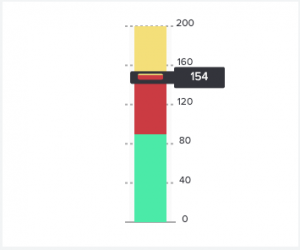
A marker gauge shows value ranges and colors with a marker that moves to indicate the current value. If the search generates a current value outside of the configured minimum or maximum range, the marker stops at the lower or upper end of the value scale.
Generate a filler or marker chart
- Select the filler or marker chart using the visual editor by clicking the Add Chart button (
 ) in the editing toolbar and either browsing through the available charts, or by using the search option.
 - Select the chart on your dashboard so it's highlighted with the blue editing outline.
- Set up a new data source by adding a search to the Search with SPL window.
- To select an existing data source, close the Configuration panel and reopen it. In the Data Configurations section, click +Setup Primary Data Source and click + Create Ad hoc Search to create a new search from this window. You can also choose a new ID that describes the search better than the default.
Configuration Panel options for filler and marker gauges
You can use the Configuration panel to configure the following line chart components.
Title
Give your visualization a name. This is also helpful when searching for individual visualizations in the dashboard definitions. This name is not the same as the automatically assigned unique ID.
Description
Give your visualization a description to explain what the user is viewing.
Data Configurations
Choose an existing ad hoc search or create a new one.
Position & Size
You can use your mouse to change the size or location of the visualization, or the Position & Size section of the Configuration panel for pixel perfect sizing and placement.
Select Data Field
Select the type of value you want shown in the gauge. For example, you can gauge count or time.
Gauge Settings
- Set the Value Display to show the filler value as a number, percentage, or turn the display off.
- Set the Label Display to show the value ranges of the gauge as numbers, percentages, or turn the display off.
- Use the Orientation buttons to choose a Vertical or Horizontal orientation.
Coloring (filler gauge)
Select a static or dynamic gauge with the Dynamic Elements dropdown.
- Use the Static Gauge section to choose a gauge color by clicking the color box to select from a palette or enter a hexadecimal code. For example, the hexadecimal code #FF7189 is a shade of pink.
- Use the Dynamic Gauge section to set your value ranges and their associated colors. Click the color box to select from a palette or enter a hexadecimal code. For example, the hexadecimal code #7B56DB is a shade of purple.
- Use Background to change the background color of the gauge panel. Click the color box to select from a palette or enter a hexadecimal code. For example, the hexadecimal code #708794 is a shade of gray.
Coloring (marker gauge)
The default threshold colors and values do not appear in the associated source code. When you make a change through the visual editor, the threshold formatting will appear. Use this to see how to change values and colors in the source editor or code window in the visual editor.
- Use the Gauge Ranges section to set your value ranges and their associated colors. Click the color box to select from a palette or enter a hexadecimal code, for example, #FF7189 for a shade of pink.
- Use Background to change the background color of the gauge panel. Click the color box to select from a palette or enter a hexadecimal code. For example, enter #FF7189 for a shade of pink.
Code
Select your visualization or its search to view and edit the source code in real-time. You can also change the Visualization ID to a more readable ID to help identify this visualization in the source code.
Source options for filler and marker gauges
While some of these options can be set using the visual editor, there are additional options that can only be set in the source editor for splunk.fillergauge. These options are added to the options field of the visualization stanza. For example, the following example shows the addition of a vertical orientation and a background color using a hexadecimal code:
"viz_filler_gauge": {
    "type": "splunk.fillergauge",
    "options": {
        "backgroundColor": "#0000FF",
        "orientation": "vertical"
    },
    "dataSources": {
        "primary": "ds_Search1"
    }
}
To read more on how visualization stanzas are structured see: Elements of a visualization. Below are all of the options available.
Filler gauge options
The following options are available for editing filler gauges in the source editor:
| Property | Type | Default | Description |
|---|---|---|---|
| backgroundColor | string | > themes.defaultBackgroundColor | Specify the color used for the background. The default for enterprise light is "#ffffff". The default for enterprise dark is "#000000". The default for prisma dark is "#0b0c0e". |
| gaugeColor | string | #7B56DB | Specify the color for the gauge color of the filler gauge. You may use a dataSource to apply the color. The hex value format should be "#FFFFFF". |
| labelDisplay | ("number" | "percentage" | "off") | number | Specify whether to display the labels as numbers, percentages, or off. |
| majorTickInterval | (string | number) | auto | Specify, in pixels, the spacing between major tick marks. |
| orientation | ("vertical" | "horizontal") | vertical | Specify the axis orientation of the gauge. |
| value | number | > primary | seriesByType("number") | lastPoint() | Specify the dataSource applied to the value of the filler gauge. |
| valueDisplay | ("number" | "percentage" | "off") | number | Specify whether to display the value as a number, percentage, or off. |
Marker gauge options
The following options are available for editing marker gauges in the source editor:
| Property | Type | Default | Description |
|---|---|---|---|
| backgroundColor | string | > themes.defaultBackgroundColor | Specify the color used for the background. You can also use a hexadecimal code. For example, "#FFFFFF". |
| gaugeRanges | object[] | [object Object],[object Object],[object Object] | Specify the overall range of the gauge as a series of continuous, color-coded subranges. For example, [{"from": 0, "to": 20, "value": "#4BEBA8"}, {"from": 20, "to": 50, "value": "#F4DF7A"}]. |
| labelDisplay | ("number" | "percentage" | "off") | number | Specify whether to display the labels as numbers, percentages, or off. |
| majorTickInterval | (string | number) | The charting library logic decides the default on your behalf. | Specify, in pixels, the spacing between major tick marks. |
| orientation | ("horizontal" | "vertical") | vertical | Specify the vertical or horizontal axis orientation of the gauge. |
| value | string | > primary | seriesByType("number") | lastPoint() | Specify the data source applied to the value of the marker gauge. |
| valueDisplay | ("number" | "percentage" | "off") | number | Specify whether to display the value as a number, percentage, or off. |
| Choropleth SVG | Icons |
This documentation applies to the following versions of Splunk® Enterprise: 9.0.0, 9.0.1, 9.0.2, 9.0.3, 9.0.4, 9.0.5, 9.0.6, 9.0.7, 9.0.8, 9.0.9, 9.0.10


 Download manual
Feedback submitted, thanks!