Table
Tables can help you compare and aggregate field values. Use a table to visualize patterns for one or more metrics across a data set. Start with a query to generate a table and use formatting to highlight values, add context, or create focus for the visualization.
For example, the following is a simple table with default formatting:

Generate a table
- Select the table visualization using the visual editor by clicking the Add Chart button (
 ) in the editing toolbar and either browsing through the available charts, or by using the search option.
 - Select the table on your dashboard so that it's highlighted with the blue editing outline.
- Set up a new data source by adding a search to the Search with SPL window.
- To select an existing data source, close the Configuration panel and reopen it. In the Data Configurations section, click +Setup Primary Data Source and click + Create Ad hoc Search to create a new search from this window. You can also choose a new ID that describes the search better than the default.
Configuration panel options
You can use the Configuration panel to configure the following table components.
Title
Give your visualization a name. This is also helpful when searching for individual visualizations in the dashboard definitions. This name is not the same as the automatically assigned unique ID.
Description
Give your visualization a description to explain what the user is viewing.
Data Configurations
Choose an existing ad hoc search or create a new one.
Position & Size
You can use your mouse to change the size and position of the panel, or the Position & Size section of the Configuration panel for pixel perfect sizing.
Global Formatting
- Specify how many rows to display.
- Toggle the switch to show or hide row numbers.
- Decide how the header row is formatted.
- Select a static background color from the color pallet or enter a hex code.
- Choose to alternate the shade of the rows.
Column Formatting
When you click, + Add column to format, you can select a column of returned values. Click on the pencil of the selected comma to bring up the formatting menu window. Use the menu to do the following:
- Use the Units Position selector to specify the position of a unit in relation to the value.
- Use the Unit Label field to specify a unit to display.
- Use the Precision dropdown menu to specify the number of decimal places to display.
Dynamic Coloring
If you choose to leave dynamic coloring off, those columns will be the color you specified for the background.
To enable dynamic coloring:
- Choose the text or background of the column that will be dynamically colored.
- Choose between dark and light colors, depending on which work best for the theme of your dashboard.
- Select the color grid to choose from the preset pallets. You can also customize the color of the ranges you specify.
- Specify a total of seven or fewer ranges using the visual editor. You can add more than seven by using the source editor.
- If you've decided not to use a preset color pallet, you can specify the color you want to use by clicking on the color box next to the range and adding a hex color.
- Choose a static color for the element that is not dynamic. For example, if you chose to use dynamic coloring on the background of the column, choose a static color for the text.
The following example shows the column formatting options in the visual editor:

Drilldown
Use drilldown to allow users to click the visualization to navigate to and internal or external URL.
Code
Select your visualization or its search to view and edit the source code in real-time. You can also change the Visualization ID to a more readable ID to help identify this visualization in the source code.
There are additional options that can only be set in the source editor. For a complete list of options available, see: Table in the Configuration options reference.
Examples
The following table shows the use of the sequential color palette on the text for the splunk_web_access column and the background of the splunk_web_service column:

When dynamic coloring is used, the source settings and options have a different formatting from the way that thresholding works for other visualization types. You should set these options in the visual editor unless you're comfortable with how they work. For example, the following dashboard definition represents a table with the column splunk_web_access with text formatted by range value using the sequential color palette and the column splunk_web_service with the background fill formatted in the same way. The ranges and color pallets set in the visual editor are represented by properties set in the context section of the stanza and called in the top-level options section of the visualization stanza. Note that there are other dynamic options selected as well. For more information, see The visualizations section in What is a dashboard definition.
Expand the window for an example of the dashboard definition of a table with both dynamic and static settings.
{
	"visualizations": {
		"viz_pUzLzgnn": {
			"type": "splunk.table",
			"dataSources": {
				"primary": "ds_qzMsDpGD"
			},
			"options": {
				"columnFormat": {
					"splunk_web_access": {
						"data": "> table | seriesByName(\"splunk_web_access\") | formatByType(splunk_web_accessColumnFormatEditorConfig)",
						"rowColors": "> table | seriesByName('splunk_web_access') | rangeValue(splunk_web_accessRowColorsEditorConfig)"
					},
					"splunk_web_service": {
						"data": "> table | seriesByName(\"splunk_web_service\") | formatByType(splunk_web_serviceColumnFormatEditorConfig)",
						"rowColors": "> table | seriesByName('splunk_web_service') | pick(splunk_web_serviceRowColorsEditorConfig)",
						"rowBackgroundColors": "> table | seriesByName('splunk_web_service') | rangeValue(splunk_web_serviceRowBackgroundColorsEditorConfig)"
					}
				}
			},
			"context": {
				"splunk_web_accessColumnFormatEditorConfig": {
					"number": {
						"thousandSeparated": false,
						"unitPosition": "after"
					}
				},
				"splunk_web_accessRowColorsEditorConfig": [
					{
						"to": 20,
						"value": "#D41F1F"
					},
					{
						"from": 20,
						"to": 40,
						"value": "#D94E17"
					},
					{
						"from": 40,
						"to": 60,
						"value": "#CBA700"
					},
					{
						"from": 60,
						"to": 80,
						"value": "#669922"
					},
					{
						"from": 80,
						"value": "#118832"
					}
				],
				"splunk_web_serviceColumnFormatEditorConfig": {
					"number": {
						"thousandSeparated": false,
						"unitPosition": "after"
					}
				},
				"splunk_web_serviceRowColorsEditorConfig": [
					"#ffffff"
				],
				"splunk_web_serviceRowBackgroundColorsEditorConfig": [
					{
						"to": 20,
						"value": "#D41F1F"
					},
					{
						"from": 20,
						"to": 40,
						"value": "#D94E17"
					},
					{
						"from": 40,
						"to": 60,
						"value": "#CBA700"
					},
					{
						"from": 60,
						"to": 80,
						"value": "#669922"
					},
					{
						"from": 80,
						"value": "#118832"
					}
				]
			}
		}
	},
	"dataSources": {
		"ds_qzMsDpGD": {
			"type": "ds.search",
			"options": {
				"query": "index=_internal \n| timechart count by sourcetype \n| table _time splunk_web_access splunk_web_service"
			},
			"name": "Search_1"
		}
	},
	"defaults": {
		"dataSources": {
			"ds.search": {
				"options": {
					"queryParameters": {
						"latest": "$global_time.latest$",
						"earliest": "$global_time.earliest$"
					}
				}
			}
		},
		"visualizations": {
			"global": {
				"showLastUpdated": true
			}
		}
	},
	"inputs": {
		"input_global_trp": {
			"type": "input.timerange",
			"options": {
				"token": "global_time",
				"defaultValue": "-24h@h,now"
			},
			"title": "Global Time Range"
		}
	},
	"layout": {
		"type": "absolute",
		"options": {},
		"structure": [
			{
				"item": "viz_pUzLzgnn",
				"type": "block",
				"position": {
					"x": 0,
					"y": 0,
					"w": 1170,
					"h": 480
				}
			}
		],
		"globalInputs": [
			"input_global_trp"
		]
	},
	"description": "",
	"title": "Dynamic Table"
}
- Transforming search with the table command
This search generates search results with statistics columnsaction,host, andcount.index = _internal | stats count by action, host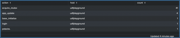
To change the columns that appear in the table or to change column order, add the
tablecommand to this search. For example, add| table host countto generate a table with only thehostandcountcolumns.index = _internal | stats count by action, host | table host count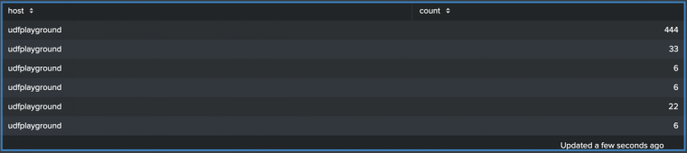


Source options for tables
When you set formatting options using the visual editor, the corresponding source code options can have dynamic or static settings. These options are added to the options field of the visualization stanza. Some options have nested settings. Note that though the defaults are generally dynamically formatted, you can replace some settings with static settings.
Each dynamic option for a column that is defined in the context section is called beneath the field name (or column header) in columnFormat option. Dynamic global table options are also set in the context section, but called in the tableFormat option. Global static options, such as backgroundColor are not nested. The following example is an example of a table that has both dynamic column settings as well as a static background color.
The format of the dynamic settings is different than the format of the static settings and you should not modify them directly, unless you are familiar with it. For example, do not replace dynamic options with static options if you've set up dynamic coloring through the visual editor.
Expand the window for an example of the dashboard definition of a table with both dynamic and static settings.
{
 "visualizations": {
	 "viz_wVm8mX3k": {
		"type": "splunk.table",
		"options": {
			"columnFormat": {
				"mongod": {
					"data": "> table | seriesByName(\"mongod\") | formatByType(mongodColumnFormatEditorConfig)",
					"rowColors": "> table | seriesByName('mongod') | pick(mongodRowColorsEditorConfig)",
					"rowBackgroundColors": "> table | seriesByName('mongod') | rangeValue(mongodRowBackgroundColorsEditorConfig)"
				}
			},
			"tableFormat": {
				"headerBackgroundColor": "#b19cd9"
			}
		},
		"dataSources": {
			"primary": "ds_IULrzuI8"
		},
		"context": {
			"mongodColumnFormatEditorConfig": {
				"number": {
					"thousandSeparated": false,
					"unitPosition": "after",
					"precision": 1
				}
			},
			"mongodRowColorsEditorConfig": [
				"#ffffff"
			],
			"mongodRowBackgroundColorsEditorConfig": [
				{
					"to": 20,
					"value": "#D41F1F"
				},
				{
					"from": 20,
					"to": 40,
					"value": "#D94E17"
				},
				{
					"from": 40,
					"to": 60,
					"value": "#CBA700"
				},
				{
					"from": 60,
					"to": 80,
					"value": "#669922"
				},
				{
					"from": 80,
					"value": "#118832"
				}
			]
		}
	}
},
    "dataSources": {
	"ds_IULrzuI8": {
		"type": "ds.search",
		"options": {
			"query": "index=_internal \n|timechart count by sourcetype"
		},
		"name": "Search_1"
	}
},
   "defaults": {
	"dataSources": {
		"ds.search": {
			"options": {
				"queryParameters": {
					"latest": "$global_time.latest$",
					"earliest": "$global_time.earliest$"
				}
			}
		}
	},
	"visualizations": {
		"global": {
			"showLastUpdated": true
		}
	}
},
"inputs": {
	"input_global_trp": {
		"type": "input.timerange",
		"options": {
			"token": "global_time",
			"defaultValue": "-24h@h,now"
		},
		"title": "Global Time Range"
	}
},
  "layout": {
	"type": "absolute",
	"options": {},
	"structure": [
		{
			"item": "viz_wVm8mX3k",
			"type": "block",
			"position": {
				"x": 20,
				"y": 30,
				"w": 1020,
				"h": 470
			}
		}
	],
	"globalInputs": [
		"input_global_trp"
	]
},
  "description": "",
  "title": "Table"
}

Adjust table column width
You can adjust the width of your table's columns by specifying the column's name as a nested column setting within columnFormat in the options section. The following example sets the width of the splunk_web_service column to 250.
{
  "type": "splunk.table",
  "dataSources": {
    "primary": "ds_I7lQsSYd"
  },
  "options": {
    "columnFormat": {
      "splunk_web_service": {
        "width": 250
      }
    }
  },
  "context": {},
  "showProgressBar": false,
  "showLastUpdated": false
}
To read more on how visualization stanzas are generally structured see: What is a dashboard definition. Below are all of the options available.
Table options
The following options for tables do not have nested settings.
| Property | Type | Default | Description |
|---|---|---|---|
| backgroundColor | string | > themes.defaultBackgroundColor | Specify the color for the background. You might use a data source to apply the color. The default for enterprise light is "#FFFFFF". The default for enterprise dark is "#000000". The default for prisma dark is "#0B0C0E". |
| count | number | 10 | Specify the maximum number of rows to display. |
| headers | string[] | > table | getField() | Specify an array of headers to display on the table. Though these can be statically listed, it's best to use the dynamic default, as it will return the fields of your search. |
| headerVisibility | ("none" | "fixed" | "inline") | inline | Specify how to display the table header row. |
| paginateDataSourceKey | string | primary | Specify the data source key for pagination and sorting. |
| showInternalFields | boolean | TRUE | Specify whether to show internal fields that start with an underscore. The _time field will still be shown if false. |
| showRowNumbers | boolean | FALSE | Show row numbers in the first column. |
| table | (string | number | (string | number)[ ])[ ][ ] | > primary | Two dimensional array of data to be displayed in the table. |
tableFormat (object type)
The following are nested settings that are set in the context section of the visualization stanza. They can then be called within tableFormat in the options section and an be used to format global table options:
| Property | Type | Default | Description |
|---|---|---|---|
| align | ("left" | "center" | "right") | > table | type() | matchValue(tableAlignByType) | Alignment for each cell in the table. Valid alignments include "left", "center", and "right". |
| cellTypes | ("TextCell" | "ArrayCell" | "SparklineCell") | > table | type() | matchValue(tableCellTypeByType) | Render the data in one of the supported cell type. Valid cell renders include "TextCell", "ArrayCell", "SparklineCell". |
| data | (string | number) | n/a | Two dimensional data to be displayed in the table. This is usually formatted data instead of raw data from search. |
| headerBackgroundColor | string | > themes.defaultHeaderBackgroundColor | Background color of table header. |
| headerColor | string | n/a | Text color of the table header. |
| rowBackgroundColors | string | > table | seriesByIndex(0) | pick(tableAltRowBackgroundColorsByTheme) | Array of colors for background color of each row of the table. |
| rowColors | string | n/a | Array of colors for text color of each row of the table. |
| sparklineAreaColors | string | Defaults to the global background color. | Array of colors for sparkline area of each row of the table. |
| sparklineColors | string | n/a | Array of colors for sparkline line of each row of the table. |
| sparklineTypes | ("line" | "area") | n/a | Area or Line Sparkline. Valid sparkline types include "line", "area". |
columnFormat (object type)
The following are nested settings that are set in the context section of the visualization stanza. They can then be called within columnFormat in the options section and an be used to format individual columns by specifying their fields:
| Property | Type | Default | Description |
|---|---|---|---|
| align | (left | center | right ) | n/a | Alignment for each cell in the column. |
| cellTypes | (TextCell | ArrayCell | SparklineCell ) | n/a | Specify how to render data in in cells. |
| data | (string | number) | n/a | Data points to be displayed in the cells of a column. |
| rowBackgroundColors | string | Defaults to the background color. | Specify a list of colors, in hex code, for the background color of each column of the table. For example: ["#2C333", "32373D"]. |
| rowColors | string | n/a | Specify a list of colors, in hex code, for the text color of the cells of a column. For example, ["#2C333", "32373D"]. |
| sparklineAreaColors | string | Defaults to the global background color. | Specify a list of colors, in hex code, for the sparkline area of each column. For example, ["#2C333", "32373D"]. |
| sparklineColors | string | n/a | Specify a list of colors, in hex code, for the sparkline stroke of each column. For example, ["#2C333", "32373D"]. |
| sparklineTypes | line | (line | area) | Choose either area or line formatting for the Sparkline. |
| Single value visualizations | Add an image |
This documentation applies to the following versions of Splunk® Enterprise: 9.0.0, 9.0.1, 9.0.2, 9.0.3, 9.0.4, 9.0.5, 9.0.6, 9.0.7, 9.0.8, 9.0.9, 9.0.10
 Download manual
Feedback submitted, thanks!