Add visualizations to glass tables in ITSI
Visualizations in the glass table editor in IT Service Intelligence (ITSI) comprise KPI and ad hoc search widgets, charts, tables, shapes, icons, and text. You can modify the layout in the UI and in the visualization section of the source editor.
Add a KPI visualization
Add a KPI visualization to display the associated search values. The KPIs continuously update in real-time according to the search schedule that you define when you create the search. By default, KPIs are represented by single value visualizations with a sparkline. For more information about KPIs, see Overview of creating KPIs in ITSI.
- Click the data icon
 to display the services available in your IT environment. Only services you have permission to read are listed.
 - Expand a service to view its KPIs.
- Select a KPI to add it as a visualization.
- (Optional) Configure KPI visualization settings. See Configuration options for single value and single value icon visualizations.
- Click save
 when you're finished.
When you add a KPI to a glass table, the data powering the KPI is automatically populated in the dataSources section of the source definition. For more information, see Add data sources to glass tables in ITSI.
KPI datasources are not supported for the Pie, Scatter, Bubble, Punchcard and Map visualizations.
Add an ad hoc search visualization
Create a custom visualization to display search results based on an ad hoc search.
- Click the data icon
 to display the services available in your IT environment. Only services you have permission to read are listed.
 - Click Create Ad hoc Search.
- Provide a data source name and enter a search. For example:
Note that for a single-value visualization, the first column in the search results must be the number you want to display. For example, the above search produces results in the formatindex=_internal | timechart countcount,_time,_span. You need to make sure the results force the column count first. For example:index=_internal | timechart count | fields count * - Click Run & Save. The search is added to the list of ad hoc searches.
- Click the ad hoc search to add it to the glass table.
- (Optional) Configure visualization settings. See Configuration options for single value and single value icon visualizations.
- Click save
 when you're finished.
When you add an ad hoc search to a glass table, the data powering the search is automatically populated in the dataSources section of the source definition. For more information, see Add data sources to glass tables in ITSI.
Add a chart, table, events or map visualization
A chart visualization shows one or more data dimensions in a results set. A table visualization shows patterns of one or more metrics across a data set. A events visualization shows the events in the tabular format. A map visualization shows geospatial data.
- Click the chart icon
 and select any visualization.
 - (Optional) Provide a title and description of the visualization. These fields show up in both Edit and View mode.
- Provide a data source name and a search query to generate results in the correct format for the visualization you're building. For information and examples, see Data structure requirements for visualizations in the Dashboards and Visualizations manual.
- Click save
 when you're finished.
For information about how chart visualizations are structured in the source editor, see Chart overview. For information about how table visualizations are structured in the source editor, see Table visualization overview.
Add icons
You can add custom icons to the icon gallery as long as they are in SVG format. Icons uploaded to the icon gallery are available to all users. Uploaded icons remain in the KV store so you can use them again later. To delete an icon from the icon gallery, click the X that appears when you hover over it.
- In the editing toolbar, click the icon button
 .
. - Drop your image or click browse... to add it to the icon gallery.
- Click the the icon to add it to your glass table.
- (Optional) Provide a title and description for the icon. These fields show up in both Edit and View mode.
- Change the icon color and opacity on the Configuration panel.
If you upload a multi-colored icon, the original colors are retained in the gallery but you cannot recolor in multi-color. For example, if you upload a red and black icon, you cannot change red to blue and black to green. If you want to change the color, you must choose a single color.
Add shapes
Use the glass table toolbar to add shapes to your glass table. You can add ellipses, lines, and rectangles.
- On the editing toolbar, click the shapes button

- Select a shape to add it to the glass table.
- (Optional) Provide a title and description for the shape. These fields show up in both Edit and View mode.
- (Optional) Configure dynamic coloring for your shapes. See Set dynamic colors for shapes.
Add text
You can add custom text to your glass table.
- While in edit mode, click the text button
 in the editing toolbar.
 - In the Markdown Settings section of the Configuration panel, add a font.
- In the General section of the Configuration panel, choose font color, font size, and background color.
- Click save
 to save your changes.
Connect a single value or single value icon to a data source
You can connect visualizations to a specific data source, such as a KPI or service health score. When you connect a visualization to a data source, the visualization's color changes based on the status of that data source.
- Add a single value visualization by clicking the chart icon (
 ) in the editing toolbar and selecting one of the options. Add an icon by choosing an icon from the icon dropdown menu (
  ).
).
- Select the visualization on your glass table.
- To select an existing data source, close the Configuration panel and reopen it. In the Data Configurations section, click Set up Primary Data Source. To create a new search, click Create Ad hoc Search.
Configuration options for single value and single value icon visualizations
The following table lists the options available in the Configuration panel for single value and single value icon visualizations:
| Setting | Description |
|---|---|
| Title | Give your visualization a title. This is also helpful when searching for individual visualizations in the dashboard definitions. This name is not the same as the automatically assigned unique ID. |
| Description | Give your visualization a description to explain what the user is viewing. |
| Data Configurations | Choose an existing search or create a new one. |
| Position & Size | Size a visualization by pixel and configure placement on the canvas. |
| Selected Data Field (single value) | Use the dropdown menu to select the field value from your search results that will be displayed as the major value. |
| Major Value & Trend (for single value visualizations) | Display a trending arrow comparing the current value to the previous one.
|
| Major Value & Trend (for single value icon visualizations) | You must first toggle the Enable switch to add a major value and trending value to an icon.You can configure similar settings for single value icon visualizations that you can for single value visualizations. |
| Sparkline (for KPI and ad hoc search visualizations) | Show the single value sparkline that displays time-based trends. Choose from the following sparkline locations:
|
| Coloring | Apply color thresholding to visualizations connected to data sources that include a search.
|
| Interactions | Click + Add interaction to allow a user to click the value of a visualization to link to a an external or internal URL. |
| Code | Select your visualization or its search to view and edit the source code.
Note: Threshold coloring is now applied to major values for KPI visualizations instead of the background color. In order to apply coloring to the background color instead of the major value, change the |
Configuration options for map visualizations
When using map visualizations, you can configure how information is displayed for each of the supported layer types.
Data layer formatting
To configure the data layer, start by selecting the map's layer type.
- The Marker layer type uses map pins to visualize data and clusters.
- Select the Latitude list to pick the data source for the visualization's latitude.
- Select the Longitude list to pick the data source for the visualization's longitude.
- The Bubble layer type uses differently sized circles or pie charts to visualize data and clusters.
- Select the Latitude list to pick the data source for the visualization's latitude.
- Select the Longitude list to pick the data source for the visualization's longitude.
- Select the Size list to pick the visualization's bubble size data source.
- The Choropleth layer type uses differently colored map areas to visualize distinct data concentrations.
- Select the Region Area IDs list to pick the field from your data source for the type of geographical area you want visualized with data.
- Select the Values list to pick the data source for measuring results.
Marker Map example
The following marker map example uses colorRangeConfig to create differently colored marker clusters to demonstrate a range of HTTP requests across geographical regions. Red indicates a high number of requests, yellow shows a medium level, and green indicates a low level.
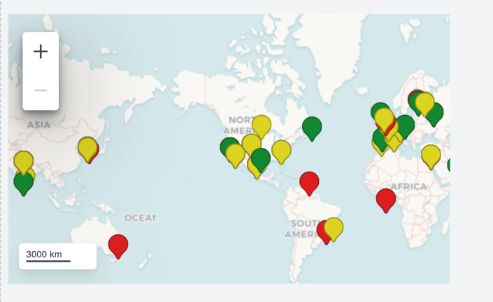
This is the source code for the marker map example shown above:
{
    "visualizations": {
        "viz_marker_cluster": {
            "type": "splunk.map",
            "options": {
                "center": [
                    37.7749,
                    -122.4195
                ],
                "zoom": 0,
                "layers": [
                    {
                        "type": "marker",
                        "latitude": "> primary | seriesByName(\"lat\")",
                        "longitude": "> primary | seriesByName(\"lon\")",
                        "dataColors": "> primary | seriesByName(\"bytes\") | rangeValue(colorRangeConfig)"
                    }
                ]
            },
            "context": {
                "colorRangeConfig": [
                    {
                        "from": 3000,
                        "value": "#de1d20"
                    },
                    {
                        "from": 2000,
                        "to": 3000,
                        "value": "#de1d20"
                    },
                    {
                        "from": 100,
                        "to": 2000,
                        "value": "#ded41d"
                    },
                    {
                        "to": 1000,
                        "value": "#4ade1d"
                    }
                ]
            },
            "dataSources": {
                "primary": "ds_x7YkfW2Y"
            }
        }
    },
    "dataSources": {
        "ds_x7YkfW2Y": {
            "type": "ds.search",
            "options": {
                "query": "| inputlookup geomaps_data.csv\n| iplocation device_ip\n| table bytes device_ip lat lon"
            },
            "name": "Search_1"
        }
    },
    "defaults": {
        "dataSources": {
            "ds.search": {
                "options": {
                    "queryParameters": {
                        "latest": "$global_time.latest$",
                        "earliest": "$global_time.earliest$"
                    }
                }
            }
        }
    },
    "inputs": {
        "input_global_trp": {
            "type": "input.timerange",
            "options": {
                "token": "global_time",
                "defaultValue": "-24h@h,now"
            },
            "title": "Global Time Range"
        }
    },
    "layout": {
        "type": "absolute",
        "options": {
            "display": "auto-scale"
        },
        "structure": [
            {
                "item": "viz_marker_cluster",
                "type": "block",
                "position": {
                    "x": 10,
                    "y": 20,
                    "w": 490,
                    "h": 300
                }
            }
        ],
        "globalInputs": [
            "input_global_trp"
        ]
    },
    "description": "",
    "title": "Marker Cluster Map example"
}
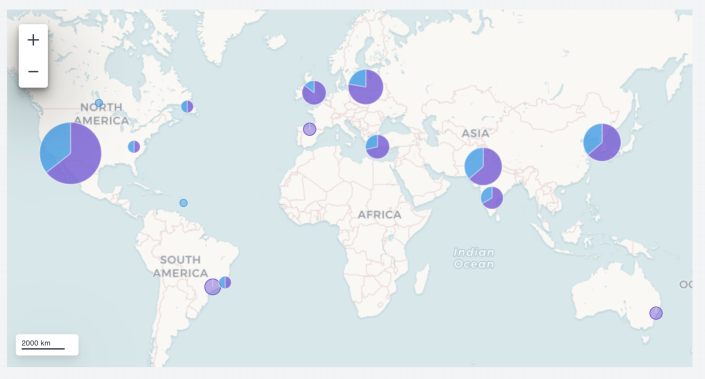
Bubble Map example
The following bubble map example uses bubble clusters to demonstrate the type and number of HTTP requests in different geographic regions:
This is the source code for the bubble map example shown above:
{
    "visualizations": {
        "viz_bubble_cluster": {
            "type": "splunk.map",
            "options": {
                "layers": [
                    {
                        "type": "bubble"
                    }
                ]
            },
            "dataSources": {
                "primary": "ds_DHERK2tc"
            }
        }
    },
    "dataSources": {
        "ds_DHERK2tc": {
            "type": "ds.search",
            "options": {
                "query": "| inputlookup geomaps_data.csv\n| iplocation device_ip\n| geostats latfield=lat longfield=lon count by method"
            },
            "name": "Search_4"
        }
    },
    "defaults": {
        "dataSources": {
            "ds.search": {
                "options": {
                    "queryParameters": {
                        "latest": "$global_time.latest$",
                        "earliest": "$global_time.earliest$"
                    }
                }
            }
        }
    },
    "inputs": {
        "input_global_trp": {
            "type": "input.timerange",
            "options": {
                "token": "global_time",
                "defaultValue": "-24h@h,now"
            },
            "title": "Global Time Range"
        }
    },
    "layout": {
        "type": "absolute",
        "options": {
            "display": "auto-scale"
        },
        "structure": [
            {
                "item": "viz_bubble_cluster",
                "type": "block",
                "position": {
                    "x": 20,
                    "y": 20,
                    "w": 940,
                    "h": 490
                }
            }
        ],
        "globalInputs": [
            "input_global_trp"
        ]
    },
    "description": "",
    "title": "Bubble cluster example"
}
Choropleth Map example
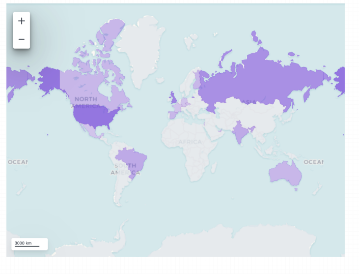
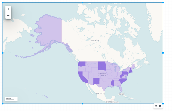
Choropleth maps use IP address locations to display the geographical areas with the highest concentration of unique IP addresses. Two types of services are supported for the Choropleth data layer:
- Choropleth World
- Choropleth USA
A Choropleth World map looks like the following example:
This is the source code for the Choropleth World map example shown above:
{
    "title": "Choropleth map World example",
    "description": "",
    "defaults": {
        "dataSources": {
            "global": {
                "options": {
                    "queryParameters": {
                        "earliest": "$global_time.earliest$",
                        "latest": "$global_time.latest$"
                    },
                    "refreshType": "delay",
                    "refresh": "$global_refresh_rate$"
                }
            }
        }
    },
    "layout": {
        "type": "absolute",
        "options": {
            "height": 1500,
            "backgroundColor": "#FFFFFF",
            "width": 1500,
            "backgroundImage": {
                "sizeType": "contain",
                "x": 0,
                "y": 0,
                "src": "splunk-enterprise-kvstore://62da920421ba6b51c86452a1"
            }
        },
        "globalInputs": [
            "input_global_trp",
            "input_global_refresh_rate"
        ],
        "structure": [
            {
                "item": "viz_RMDixHW2",
                "type": "block",
                "position": {
                    "x": 60,
                    "y": 30,
                    "w": 800,
                    "h": 600
                }
            }
        ]
    },
    "dataSources": {
        "ds_Q1bl1rcg": {
            "type": "ds.search",
            "name": "Search_1",
            "options": {
                "query": "| inputlookup geomaps_data.csv\n| iplocation device_ip\n| lookup geo_countries latitude AS lat longitude AS lon OUTPUT featureId AS country\n| stats distinct_count(device_ip) by country\n| geom geo_countries featureIdField=country"
            }
        }
    },
    "visualizations": {
        "viz_RMDixHW2": {
            "type": "splunk.map",
            "options": {
                "layers": [
                    {
                        "type": "choropleth",
                        "source": "geo://default/world"
                    }
                ]
            },
            "dataSources": {
                "primary": "ds_Q1bl1rcg"
            }
        }
    },
    "inputs": {
        "input_global_trp": {
            "options": {
                "defaultValue": "-60m@m, now",
                "token": "global_time"
            },
            "type": "input.timerange",
            "title": "Global Time Range"
        },
        "input_global_refresh_rate": {
            "options": {
                "items": [
                    {
                        "value": "60s",
                        "label": "1 Minute"
                    },
                    {
                        "value": "300s",
                        "label": "5 Minutes"
                    },
                    {
                        "value": "1800s",
                        "label": "30 Minutes"
                    },
                    {
                        "value": "3600s",
                        "label": "1 Hour"
                    },
                    {
                        "value": "86400s",
                        "label": "24 Hours"
                    }
                ],
                "defaultValue": "60s",
                "token": "global_refresh_rate"
            },
            "type": "input.dropdown",
            "title": "Global Refresh Rate"
        }
    }
}
A Choropleth USA map looks like the following example:
This is the source code for the Choropleth USA map example shown above:
{
    "title": "Choropleth map USA example",
    "description": "",
    "defaults": {
        "dataSources": {
            "global": {
                "options": {
                    "queryParameters": {
                        "earliest": "$global_time.earliest$",
                        "latest": "$global_time.latest$"
                    },
                    "refreshType": "delay",
                    "refresh": "$global_refresh_rate$"
                }
            }
        }
    },
    "layout": {
        "type": "absolute",
        "options": {
            "height": 1500,
            "backgroundColor": "#FFFFFF",
            "width": 1500,
            "backgroundImage": {
                "sizeType": "contain",
                "x": 0,
                "y": 0,
                "src": "splunk-enterprise-kvstore://62da920421ba6b51c86452a1"
            }
        },
        "globalInputs": [
            "input_global_trp",
            "input_global_refresh_rate"
        ],
        "structure": [
            {
                "item": "viz_RMDixHW2",
                "type": "block",
                "position": {
                    "x": 60,
                    "y": 30,
                    "w": 1080,
                    "h": 680
                }
            }
        ]
    },
    "dataSources": {
        "ds_Dw5mWAHF": {
            "type": "ds.search",
            "name": "Search_2",
            "options": {
                "query": "|  inputlookup geo_us_states|  eval numb=len(featureId)\n|  eval numb2=numb*2\n|  rename featureId as state\n|  fields - _featureIdField\n|  fields state, numb"
            }
        }
    },
    "visualizations": {
        "viz_RMDixHW2": {
            "type": "splunk.map",
            "options": {
                "layers": [
                    {
                        "type": "choropleth",
                        "source": "geo://default/us"
                    }
                ],
                "center": [
                    54.19808326805972,
                    -119.64507780072495
                ],
                "zoom": 2.2446191041963415
            },
            "dataSources": {
                "primary": "ds_Dw5mWAHF"
            }
        }
    },
    "inputs": {
        "input_global_trp": {
            "options": {
                "defaultValue": "-60m@m, now",
                "token": "global_time"
            },
            "type": "input.timerange",
            "title": "Global Time Range"
        },
        "input_global_refresh_rate": {
            "options": {
                "items": [
                    {
                        "value": "60s",
                        "label": "1 Minute"
                    },
                    {
                        "value": "300s",
                        "label": "5 Minutes"
                    },
                    {
                        "value": "1800s",
                        "label": "30 Minutes"
                    },
                    {
                        "value": "3600s",
                        "label": "1 Hour"
                    },
                    {
                        "value": "86400s",
                        "label": "24 Hours"
                    }
                ],
                "defaultValue": "60s",
                "token": "global_refresh_rate"
            },
            "type": "input.dropdown",
            "title": "Global Refresh Rate"
        }
    }
}
Set different time ranges for visualizations
By default, the global time range picker sets the time range for all visualizations. Alternatively, you can add additional inputs to set custom time ranges on a per-visualization basis. You might leverage this functionality if you want to view one visualization for the past hour, and compare those results to another visualization over the past day.
An individual KPI can "opt out" from search aggregation by setting "skipAggregation": true within the meta section of the data source definition. When this flag is enabled a KPI data source can use its own custom time range, search query, or refresh rate.
- Add your visualizations to the glass table.
- Click save
 before entering source mode to make sure you don't lose any work.
 - Click source
 to edit the JSON source code directly.
 - To add a new time picker, copy the
globalTimesection underinputsand paste it within theinputssection. - Give the new time picker a name other than "globalTime" and change the token value.
- Add the name of the new time range picker under
globalInputsin thelayoutsection. - Update the query parameters in one of the visualization's data sources to use the token of the time range picker you just added.
- Click Back to return to the glass table editor. Verify that updating the time range for one of the time pickers only updates the corresponding visualization and not all visualizations.
Example
The following code sample shows how to add an additional time picker to a glass table. The new time picker is called otherTime and its token is otherT:
{
   "title":"<Glass Table Title>",
   "description":"",
   "defaults":{
      "dataSources":{
         "global":{
            "options":{
               "queryParameters":{
                  "earliest":"$global_time.earliest$",
                  "latest":"$global_time.latest$"
               },
               "refreshType":"delay",
               "refresh":"$global_refresh_rate$"
            }
         }
      }
   },
   "layout":{
      "type":"absolute",
      "options":{
         "width":1920,
         "height":1080,
         "backgroundColor":"#FFFFFF",
         "showTitleAndDescription":true
      },
      "globalInputs":[
         "input_global_trp",
         "input_global_refresh_rate",
         "other_time"
      ],
      "structure":[
         {
            "item":"viz_eKaKygQC",
            "type":"block",
            "position":{
               "x":700,
               "y":210,
               "w":300,
               "h":300
            }
         },
         {
            "item":"viz_mewWndrq",
            "type":"block",
            "position":{
               "x":280,
               "y":200,
               "w":300,
               "h":300
            }
         }
      ]
   },
   "dataSources":{
      "ds_0fyyHbAC":{
         "type":"ds.search",
         "name":"search_1",
         "options":{
            "query":"<Your SPL search>"
         }
      },
      "ds_epEuNXcE":{
         "type":"ds.search",
         "name":"search_2",
         "options":{
            "query":"<Your SPL search>",
            "queryParameters":{
               "earliest":"$other_t.earliest$",
               "latest":"$other_t.latest$"
            }
         }
      }
   },
   "visualizations":{
      "viz_eKaKygQC":{
         "type":"splunk.singlevalue",
         "options":{

         },
         "dataSources":{
            "primary":"ds_0fyyHbAC"
         }
      },
      "viz_mewWndrq":{
         "type":"splunk.singlevalue",
         "options":{

         },
         "dataSources":{
            "primary":"ds_epEuNXcE"
         }
      }
   },
   "inputs":{
      "input_global_trp":{
         "options":{
            "defaultValue":"-60m@m, now",
            "token":"global_time"
         },
         "type":"input.timerange",
         "title":"Global Time Range"
      },
      "other_time":{
         "options":{
            "defaultValue":"-120m@m, now",
            "token":"other_t"
         },
         "type":"input.timerange",
         "title":"Test Global Time Range"
      },
      "input_global_refresh_rate":{
         "options":{
            "items":[
               {
                  "value":"60s",
                  "label":"1 Minute"
               },
               {
                  "value":"300s",
                  "label":"5 Minutes"
               },
               {
                  "value":"1800s",
                  "label":"30 Minutes"
               },
               {
                  "value":"3600s",
                  "label":"1 Hour"
               },
               {
                  "value":"86400s",
                  "label":"24 Hours"
               }
            ],
            "defaultValue":"60s",
            "token":"global_refresh_rate"
         },
         "type":"input.dropdown",
         "title":"Global Refresh Rate"
      }
   }
}
Alternatively, if you don't want to add a second time picker, you can just hardcode a fixed time into the JSON for that visualization. For example:
"options": {
	"queryParameters": {
		"earliest": "-4h@h",
		"latest": "now"
	},
Configure interactions
Add interaction links that redirect to saved ITSI views such as glass tables, service analyzers, deep dives, dashboards, or to a custom URL.
- Select the object for the interaction link.
- In the Configuration panel, click Add Interaction.
- For On Click, choose from the following options:
Option Notes Link to a saved ITSI view Interaction to one of the following object types: - Saved Glass Table
- Saved Deep Dive
- Saved Dashboard
- Saved Episode Review
- Saved Service Analyzer
Link to custom URL Provide a relative or absolute URL. If you don't provide an http:// address, the generated URL is considered internal to ITSI and uses a localhost URL, for example localhost:8000/<app-name>/<user_provided_url>. If you provide an http:// prefix (for example,http://splunk.com), the interaction directs to that external URL.
The interaction URL includes the visualization's time range as specified in the glass table's source JSON. If you configure an interaction and then change the time range values of the visualization in the source, the updated values aren't added to the interaction URL. To update the time range values, manually edit the interaction URL in the source JSON.You can pass time range tokens in the interaction URL. For example:
/en-US/app/itsi/deep_dive?savedDeepDiveID=5f8780b0bebff6293b20d2ab&earliest=$global_time.earliest$&latest=$global_time.latest$
- (Optional) Select Open in new tab so the link opens in a new tab.
- Click Save.
- Click View to enter view mode and test the link. If drilling down from a KPI visualization, you must click the actual value in the visualization, not just anywhere on the visualization, in order to go to the link.
Note: These visualizations don't support interaction functionality: Events, Filler Gauge, Line Shape, Marker Gauge, Parallel coordinates, Sankey.
Configure visualizations in the source editor
While you can add visualizations from the glass table editor itself, all configuration options must be set in the source editor. The visualization section of the source editor lists all the visualizations on your glass table, including their type, options, associated data sources, and any inputs and tokens. For a comprehensive list of the source options currently available for each visualization type, see Source options reference for the glass table editor in ITSI.
The following visualization types are available in Splunk IT Service Intelligence glass tables:
| Visualization type | Syntax |
|---|---|
| Area chart | splunk.area
|
| Bar chart | splunk.bar
|
| Bubble chart | splunk.bubble
|
| Choropleth SVG | splunk.choropleth.svg
|
| Column chart | splunk.column
|
| Ellipse | splunk.ellipse
|
| Events | splunk.events
|
| Filler Gauge | splunk.fillergauge
|
| Image | splunk.img
|
| Line chart | splunk.line
|
| Line shape | abslayout.line
|
| Link graph | splunk.linkgraph
|
| Map | splunk.map
|
| Markdown | splunk.markdown
|
| Marker Gauge | splunk.markergauge
|
| Parallel coordinates | splunk.parallelcoordinates
|
| Pie chart | splunk.pie
|
| Punchcard | splunk.punchcard
|
| Rectangle | splunk.rectangle
|
| Sankey | splunk.sankey
|
| Scatter chart | splunk.scatter
|
| Single-value icon | splunk.singlevalueicon
|
| Single-value widget | splunk.singlevalue
|
| Single-value radial widget | splunk.singlevalueradial
|
| Table | splunk.table
|
For ITSI 4.18.0 and above, Choropleth USA and Choropleth World cannot be added from the chart icon because it is now used as part of the Map (splunk.map) visualization.
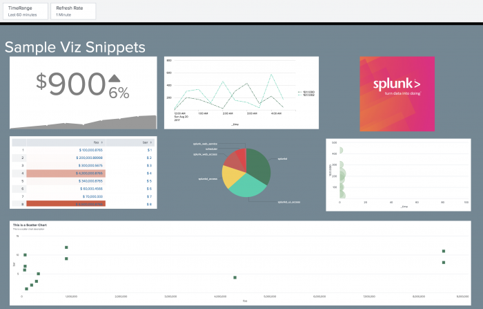
The following glass table shows some of the visualizations currently supported by the glass tables editor:
Sample visualizations glass table definition
The following glass table definition shows how the visualizations above were configured using the source editor.
{
"title":"Sample Viz",
"description":"",
"layout":{
"globalInputs":[
"input_global_trp",
"input_global_refresh_rate"
],
"type":"absolute",
"options":{
"display":"auto-scale",
"width":2000,
"backgroundColor":"#708794",
"height":1600,
"showTitleAndDescription":true
},
"structure":[
{
"type":"block",
"item":"viz_oW1DFpN4",
"position":{
"w":610,
"y":170,
"x":40,
"h":380
}
},
{
"type":"block",
"item":"viz_Fx3n0Ryb",
"position":{
"w":610,
"y":570,
"x":40,
"h":480
}
},
{
"type":"block",
"item":"viz_VadW0za4",
"position":{
"w":610,
"y":170,
"x":1340,
"h":380
}
},
{
"type":"block",
"item":"viz_sn0IH59g",
"position":{
"w":1970,
"y":40,
"x":14,
"h":100
}
},
{
"type":"block",
"item":"viz_OlDu8cpr",
"position":{
"w":640,
"y":170,
"x":680,
"h":380
}
},
{
"item":"viz_wDKJuhbX",
"type":"block",
"position":{
"x":510,
"y":440,
"w":1020,
"h":790
}
},
{
"item":"viz_wGpdheSr",
"type":"block",
"position":{
"x":1350,
"y":570,
"w":600,
"h":470
}
},
{
"item":"viz_iU0C02xJ",
"type":"block",
"position":{
"x":40,
"y":1060,
"w":1910,
"h":510
}
}
]
},
"dataSources":{
"ds_search4":{
"type":"ds.test",
"options":{
"data":{
"fields":[
{
"name":"sourcetype"
},
{
"name":"count",
"type_special":"count"
},
{
"name":"percent",
"type_special":"percent"
}
],
"columns":[
[
"splunkd",
"splunkd_ui_access",
"splunkd_access",
"splunk_web_access",
"scheduler",
"splunk_web_service"
],
[
"600",
"525",
"295",
"213",
"122",
"19"
],
[
"87.966380",
"50.381304",
"60.023780",
"121.183272",
"70.250513",
"90.194752"
]
]
},
"meta":{
}
},
"name":"search4"
},
"ds_search6":{
"options":{
"data":{
"columns":[
[
"2017-08-20T00:00:00.000-07:00",
"2017-08-20T00:30:00.000-07:00",
"2017-08-20T01:00:00.000-07:00",
"2017-08-20T01:30:00.000-07:00",
"2017-08-20T02:00:00.000-07:00",
"2017-08-20T02:30:00.000-07:00",
"2017-08-20T03:00:00.000-07:00",
"2017-08-20T03:30:00.000-07:00",
"2017-08-20T04:00:00.000-07:00",
"2017-08-20T04:30:00.000-07:00"
],
[
"100",
"200",
"170",
"100",
"22",
"301",
"430",
"104",
"221",
"42"
],
[
"220",
"302",
"332",
"112",
"460",
"154",
"121",
"36",
"576",
"165"
],
[
"320",
"3202",
"1332",
"2112",
"2460",
"2614",
"1121",
"316",
"276",
"465"
],
[
"430",
"302",
"332",
"312",
"460",
"354",
"321",
"336",
"376",
"365"
],
[
"520",
"502",
"532",
"112",
"860",
"754",
"121",
"36",
"576",
"265"
],
[
"620",
"902",
"32",
"512",
"860",
"184",
"181",
"76",
"576",
"465"
],
[
"1800",
"1800",
"1800",
"1800",
"1800",
"1800",
"1800",
"1800",
"1800",
"1800"
]
],
"fields":[
{
"name":"_time"
},
{
"data_source":"sum(date_hour)",
"splitby_field":"clientip",
"splitby_value":"10.1.1.000",
"name":"10.1.1.000"
},
{
"data_source":"sum(date_hour)",
"splitby_field":"clientip",
"splitby_value":"10.1.1.002",
"name":"10.1.1.002"
},
{
"data_source":"sum(date_hour)",
"splitby_field":"clientip",
"splitby_value":"10.1.1.003",
"name":"10.1.1.003"
},
{
"data_source":"sum(date_hour)",
"splitby_field":"clientip",
"splitby_value":"10.1.1.004",
"name":"10.1.1.004"
},
{
"data_source":"sum(date_hour)",
"splitby_field":"clientip",
"splitby_value":"10.1.1.005",
"name":"10.1.1.005"
},
{
"data_source":"sum(date_hour)",
"splitby_field":"clientip",
"splitby_value":"10.1.1.006",
"name":"10.1.1.006"
},
{
"name":"_span"
}
]
},
"meta":{
}
},
"type":"ds.test"
},
"ds_search3":{
"options":{
"data":{
"columns":[
[
"2017-08-20T00:00:00.000-07:00",
"2017-08-20T00:30:00.000-07:00",
"2017-08-20T01:00:00.000-07:00",
"2017-08-20T01:30:00.000-07:00",
"2017-08-20T02:00:00.000-07:00",
"2017-08-20T02:30:00.000-07:00",
"2017-08-20T03:00:00.000-07:00",
"2017-08-20T03:30:00.000-07:00",
"2017-08-20T04:00:00.000-07:00",
"2017-08-20T04:30:00.000-07:00"
],
[
"000",
"200",
"170",
"100",
"22",
"301",
"430",
"104",
"221",
"42"
],
[
"20",
"302",
"332",
"112",
"460",
"154",
"121",
"36",
"576",
"165"
],
[
"1800",
"1800",
"1800",
"1800",
"1800",
"1800",
"1800",
"1800",
"1800",
"1800"
]
],
"fields":[
{
"name":"_time"
},
{
"data_source":"sum(date_hour)",
"splitby_field":"clientip",
"splitby_value":"10.1.1.000",
"name":"10.1.1.000"
},
{
"data_source":"sum(date_hour)",
"splitby_field":"clientip",
"splitby_value":"10.1.1.002",
"name":"10.1.1.002"
},
{
"name":"_span"
}
]
},
"meta":{
}
},
"type":"ds.test"
},
"ds_search2":{
"options":{
"data":{
"columns":[
[
"100000.8765",
"200000.88998",
"300000.5675",
"4300000.8765",
"340000.8765",
"60000.4566",
"70000.333",
"8500000.8765",
"900000.22233",
"70000.333",
"8500000.8765",
"900000.22233"
],
[
"1",
"2",
"3",
"4",
"5",
"6",
"7",
"8",
"9",
"10",
"11",
"12"
]
],
"fields":[
{
"name":"foo"
},
{
"name":"bar"
}
]
},
"meta":{
}
},
"type":"ds.test",
"name":"search2"
},
"ds_search1":{
"options":{
"data":{
"columns":[
[
"100",
"200",
"300",
"430",
"340",
"600",
"700",
"850",
"900"
],
[
"1",
"2",
"3",
"4",
"5",
"6",
"7",
"8"
]
],
"fields":[
{
"name":"foo"
},
{
"name":"bar"
}
]
},
"meta":{
}
},
"type":"ds.test",
"name":"search1"
}
},
"visualizations":{
"viz_OlDu8cpr":{
"dataSources":{
"primary":"ds_search3"
},
"type":"splunk.line",
"options":{
"lineDashStyle":"shortDashDotDot",
"seriesColors":[
"#377D5E",
"#09D0AC",
"#F6CF47",
"#CF5656",
"#EB3844",
"#DB5566",
"#3C6DC7",
"#619FDD",
"#C2D48D"
],
"lineWidth":2,
"backgroundColor":"#ffffff",
"foregroundColor":"transparent",
"fontColor":"#000000"
}
},
"viz_oW1DFpN4":{
"options":{
"unit":"$",
"showSparklineTooltip":true,
"rangeColors":[
"#FFFFFF",
"#1E3765",
"#3C6DC7",
"#7755F6",
"#EB3844",
"#F3A846",
"#F6CF47",
"#09D0AC"
],
"sparklineHighlightSegments":6,
"rangeValues":[
100,
200,
300,
400,
500,
600,
700,
1000
],
"sparklineHighlightDots":7,
"sparklineStrokeColor":"#ffffff",
"unitPosition":"before",
"useThousandSeparators":true,
"sparklineDisplay":"after",
"trendDisplay":"percent"
},
"type":"splunk.singlevalue",
"dataSources":{
"primary":"ds_search1"
}
},
"viz_VadW0za4":{
"options":{
"src":"http://www.splunk.com/content/dam/splunk2/images/social/splunk-logo.jpg",
"preserveAspectRatio":true
},
"type":"splunk.image"
},
"viz_Fx3n0Ryb":{
"options":{
"count":10,
"dataOverlayMode":"heatmap",
"useThousandSeparators":true,
"precision":2,
"showRowNumbers":true
},
"type":"splunk.table",
"dataSources":{
"primary":"ds_search2"
}
},
"viz_sn0IH59g":{
"options":{
"fontSize":"custom",
"color":"#ffffff",
"backgroundColor":"transparent",
"markdown":"Sample Viz Snippets",
"customFontSize":65
},
"type":"splunk.markdown"
},
"viz_wDKJuhbX":{
"dataSources":{
"primary":"ds_search4"
},
"type":"splunk.pie",
"options":{
"seriesColors":[
"#377D5E",
"#09D0AC",
"#F6CF47",
"#CF5656",
"#EB3844",
"#DB5566",
"#3C6DC7",
"#619FDD",
"#C2D48D"
],
"backgroundColor":"transparent",
"fontColor":"#ffffff"
}
},
"viz_wGpdheSr":{
"type":"splunk.bubble",
"options":{
"seriesColors":[
"#377D5E",
"#09D0AC",
"#F6CF47",
"#CF5656",
"#EB3844",
"#DB5566",
"#3C6DC7",
"#619FDD",
"#C2D48D"
]
},
"dataSources":{
"primary":"ds_search6"
}
},
"viz_iU0C02xJ":{
"title":"This is a Scatter Chart",
"description":"This is a scatter chart description",
"type":"splunk.scatter",
"options":{
"seriesColors":[
"#377D5E",
"#09D0AC",
"#F6CF47",
"#CF5656",
"#EB3844",
"#DB5566",
"#3C6DC7",
"#619FDD",
"#C2D48D"
],
"fieldColors":"{foo: #3C6DC7, bar: #619FDD}",
"backgroundColor":"#ffffff",
"fontColor":"#616161"
},
"dataSources":{
"primary":"ds_search2"
}
}
},
"inputs":{
"input_global_trp":{
"type":"input.timerange",
"options":{
"token":"TimeRange",
"defaultValue":"undefined, undefined"
}
},
"input_global_refresh_rate":{
"title":"Refresh Rate",
"type":"input.dropdown",
"options":{
"token":"RefreshRate",
"items":[
{
"value":"60s",
"label":"1 Minute"
},
{
"value":"300s",
"label":"5 Minutes"
},
{
"value":"1800s",
"label":"30 Minutes"
},
{
"value":"3600s",
"label":"1 Hour"
},
{
"value":"86400s",
"label":"24 Hours"
}
]
}
}
}
}
Source options reference for the glass table editor in ITSI
You can expand the options of various charts to view and update the property, type, default and description fields associated with those charts:
- To expand the Column chart options, see the Column topic in the Visualizations documentation.
- To expand the Line chart options, see the Line topic in the Visualizations documentation.
- To expand the Map chart options, see the Map topic in the Visualizations documentation.
- To expand the Map layers (object type) options, see the Map topic in the Visualizations documentation.
- To expand the Markdown options, see the Basic markdown topic in the Visualizations documentation.
| Add data sources to glass tables in ITSI | Add inputs and tokens to glass tables in ITSI |
This documentation applies to the following versions of Splunk® IT Service Intelligence: 4.18.0, 4.18.1, 4.19.0, 4.19.1, 4.19.2, 4.19.3, 4.19.4, 4.20.0, 4.20.1
 Download manual
Feedback submitted, thanks!