Part 4: Add a line chart
As a representative of Buttercup Games, you need to present a breakdown of the store's purchase trends. In Splunk Dashboard Studio, you can add a line chart visualization to showcase trends. You will create a line chart that demonstrates purchase trends over time for different game categories.
- Select the add chart icon (
 ) in the editing toolbar, and then select Line.
 - In the Search section of the Select data source panel, select + Create search.
- Name the data source Purchase Trends by Category.
- Add your search. For this tutorial, copy and paste the following search into the SPL query field:
index=main sourcetype=access_* status=200 action=purchase categoryId!=NULL
| fields _time categoryId clientip
| timechart count by categoryId
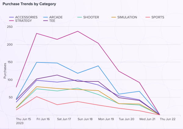
This creates a chart where all purchases within each game category are added up and shown as a line chart. The x-axis represents time and all the lines demonstrating trends for each individual game category are overlaid on the same line chart.
- Select Apply & Close. At this point, you've created a new data source and assigned it to a line chart.
- Select the line chart and title it Purchase Trends by Category.
- In the Color and style section of the Configuration panel, change the Background to transparent.
- In the Legend section of the Configuration panel, select Top from the Legend display drop-down menu.
- In the X-axis grid and labels section of the Configuration panel, turn off Axis title.
- In the Y-axis grid and labels section of the Configuration panel, title the Y-axis Purchases.
- Move and resize your line chart to center it on the top right rectangle.
After completing Part 4, your line chart looks similar to the following:
Next step
You've completed Part 4 of the Splunk Dashboard Studio tutorial and your dashboard has a line chart. Next, you'll show total revenue from Buttercup Games by adding a single value visualization. Continue to Part 5: Add a single value visualization.
| Part 3: Add a table with column formatting | Part 5: Add a single value visualization |
This documentation applies to the following versions of Splunk Cloud Platform™: 9.3.2411, 9.0.2303, 9.0.2305, 9.1.2308, 9.1.2312, 9.2.2403, 9.2.2406, 9.3.2408 (latest FedRAMP release)

 Download manual
Feedback submitted, thanks!