Trellis layout
Trellis is only available for single value visualizations.
Organize your search results with the trellis layout for a holistic view of your data. Trellis layout visualizes your search results by separating each field value or aggregation.
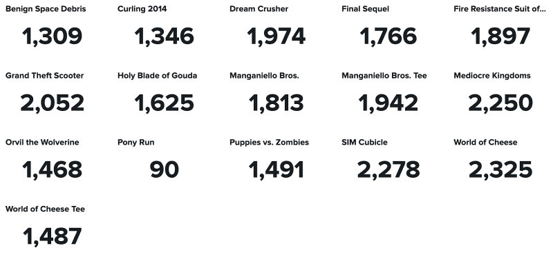
The search in the following example returns customer purchases by product category. Applying a trellis layout creates a view of each product category as its own single value visualization.
index="sample-data" | stats count by productName
The "sample-data" in this example is a data set from the Search Tutorial in the Search Tutorial manual.
Create a trellis layout
- Select a single value or single value radial visualization using the visual editor by clicking the Add chart dropdown menu in the editing toolbar. You can add a single value icon from the Add icon dropdown.
- Select the single value on your dashboard so that it's highlighted with the blue editing outline.
- Set up a new data source by selecting + Create search and adding a search to the Search query window. Or, select an existing data source under the Search, Saved search, or Chain search dropdown lists.
- Activate the trellis layout by toggling on Trellis layout in the Data display section of the Configuration panel.
You can also configure your visualization for the trellis layout by adding the splitByLayout:trellis option in the options stanza of your dashboard definition. The trellis layout might need some manual adjustment to fit your dashboard.
Configurations for trellis layout
Add the following trellis configurations to the options stanza of your dashboard definition for further customization.
| Option | Type | Default | Description |
|---|---|---|---|
| splitByLayout | string | off | Specify the layout method to display the visualization, which splits the data into individual visualizations based on a specific category. The available values are off and trellis. |
| trellisBackgroundColor | string | > themes.defaultBackgroundColor | Specify the background color of the whole panel in the trellis layout display. For example, #ff0000. You can use a hexadecimal code to apply the color. The default for Enterprise light is #ffffff. The default for Enterprise dark is #000000. The default for Prisma dark is #0b0c0e. |
| trellisColumns | number | n/a | Specify the number of columns in a trellis layout container. For example, six columns allow six visualizations per row. Rows populate to accommodate the total number of visualizations. If no column number is specified, the number of columns is automatically set based on the value specified for trellisMinColumnWidth.
|
| trellisMinColumnWidth | number | 100 | Specify the minimum width, in pixels, of each visualization in the trellis container. If you resize the window or panel, you can view the remaining visualizations by scrolling. |
| trellisPageCount | number | 20 | Specify the maximum number of visualizations to display on a single page in the trellis container. The remaining visualizations paginate accordingly. |
| trellisRowHeight | number | 70 | Specify each visualization's height, in pixels, in the trellis container. If you resize the window or panel, you can view the remaining visualizations by scrolling. |
| trellisSplitBy | string | n/a | If applicable, specify the column's field name with categories used or aggregations to split the data into individual visualizations for trellis display. If you use an SPL timechart command, this might default to the SPL by clause field. If you use an SPL chart command, this might default to the first string field.
|
Overview of data-splitting logic
The trellis layout splits data visualizations based on the SPL commands and associated metadata or configurations provided. The data-splitting logic defaults to SPL commands and associated metadata first, then option configurations. If you apply configuration options, any of those options could impact how the logic behaves with SPL commands or data field types. The following examples show different scenarios of data-splitting logic.
Split data with the timechart command
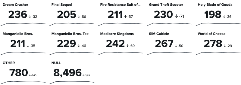
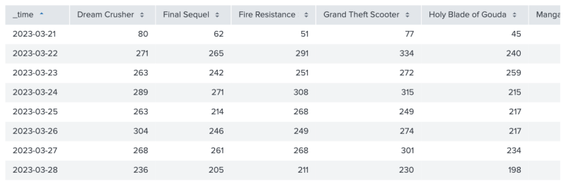
When using the SPL timechart command, the trellis layout defaults to an associated by clause. The following example shows how the trellis layout categorizes each single value visualization by product name as a result of the SPL search index="sample-data" | timechart count by productName. The "sample-data" in this example is a data set from the Search Tutorial in the Search Tutorial manual.
Source code
The following source code example shows a dashboard definition that uses the trellis layout and splits data with the timechart command.
{
    "visualizations": {
        "viz_DgbNcpY7": {
            "type": "splunk.singlevalue",
            "options": {
                "splitByLayout": "trellis"
            },
            "dataSources": {
                "primary": "ds_RWdnS6Rc"
            }
        }
    },
    "dataSources": {
        "ds_RWdnS6Rc": {
            "type": "ds.search",
            "options": {
                "query": " index=\"sample-data\" | timechart count by productName"
            },
            "name": "Search_1"
        }
    },
    "defaults": {
        "dataSources": {
            "ds.search": {
                "options": {
                    "queryParameters": {
                        "latest": "$global_time.latest$",
                        "earliest": "$global_time.earliest$"
                    }
                }
            }
        }
    },
    "inputs": {
        "input_global_trp": {
            "type": "input.timerange",
            "options": {
                "token": "global_time",
                "defaultValue": "-24h@h,now"
            },
            "title": "Global Time Range"
        }
    },
    "layout": {
        "tabs": {
            "items": [
                {
                    "layoutId": "layout_1",
                    "label": "New tab"
                }
            ]
        },
        "layoutDefinitions": {
            "layout_1": {
                "type": "absolute",
                "options": {
                    "width": 1440,
                    "height": 960,
                    "display": "auto"
                },
                "structure": [
                    {
                        "item": "viz_DgbNcpY7",
                        "type": "block",
                        "position": {
                            "x": 300,
                            "y": 100,
                            "w": 700,
                            "h": 260
                        }
                    }
                ]
            }
        },
        "globalInputs": [
            "input_global_trp"
        ]
    },
    "description": "",
    "title": "Single value for trellis with timechart command"
}
Split data with the chart or stats commands
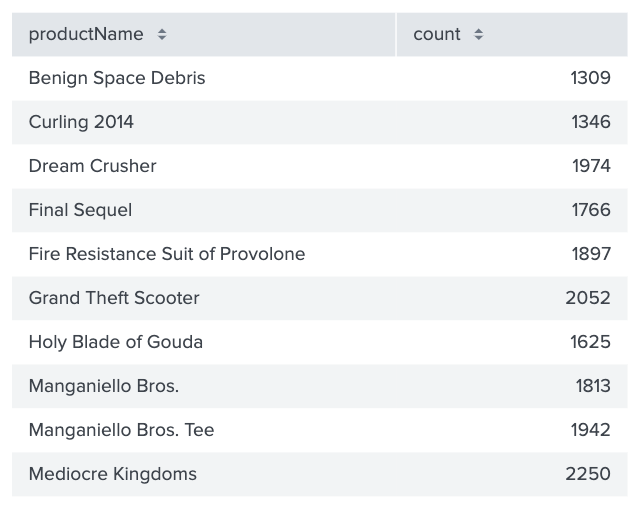
The trellis layout defaults to the first string field when using the SPL chart or stats command with one by clause. The following example shows how the trellis layout categorizes each single value visualization by the productName column as a result of the SPL search index="sample-data" | chart count by productName. The "sample-data" in this example is a data set from the Search Tutorial in the Search Tutorial manual.
Source code
The following source code example shows a dashboard definition that uses the trellis layout and splits data with the chart command.
{
    "visualizations": {
        "viz_3V5QUYuU": {
            "type": "splunk.singlevalue",
            "options": {
                "splitByLayout": "trellis"
            },
            "dataSources": {
                "primary": "ds_fyNUplwK"
            }
        }
    },
    "dataSources": {
        "ds_fyNUplwK": {
            "type": "ds.search",
            "options": {
                "query": "index=\"sample-data\" | chart count by productName"
            },
            "name": "Search_2"
        }
    },
    "defaults": {
        "dataSources": {
            "ds.search": {
                "options": {
                    "queryParameters": {
                        "latest": "$global_time.latest$",
                        "earliest": "$global_time.earliest$"
                    }
                }
            }
        }
    },
    "inputs": {
        "input_global_trp": {
            "type": "input.timerange",
            "options": {
                "token": "global_time",
                "defaultValue": "-24h@h,now"
            },
            "title": "Global Time Range"
        }
    },
    "layout": {
        "tabs": {
            "items": [
                {
                    "layoutId": "layout_1",
                    "label": "New tab"
                }
            ]
        },
        "layoutDefinitions": {
            "layout_1": {
                "type": "absolute",
                "options": {
                    "width": 1440,
                    "height": 960,
                    "display": "auto"
                },
                "structure": [
                    {
                        "item": "viz_3V5QUYuU",
                        "type": "block",
                        "position": {
                            "x": 280,
                            "y": 150,
                            "w": 840,
                            "h": 420
                        }
                    }
                ]
            }
        },
        "globalInputs": [
            "input_global_trp"
        ]
    },
    "description": "",
    "title": "Single value for trellis with chart command"
}
Split specific data with the trellisSplitBy option
If you don't want to rely on the default data-splitting logic, you can split your data by a specific field name using the trellisSplitBy option. For example, you can split the data by price if you have multiple products with different price points. Using trellisSplitBy overrides the logic to split the data by product name.
The following example sets trellisSplitBy: price with the SPL search index="sample-data" | chart count by productName, price. The "sample-data" in this example is a data set from the Search Tutorial in the Search Tutorial manual.
Source code
The following source code example shows a dashboard definition that uses the trellis layout and splits data with the trellisSplitBy option and field name price.
{
    "visualizations": {
        "viz_NmTGVKht": {
            "type": "splunk.singlevalue",
            "options": {
                "splitByLayout": "trellis"
            },
            "dataSources": {
                "primary": "ds_1XNNmpxt"
            }
        }
    },
    "dataSources": {
        "ds_1XNNmpxt": {
            "type": "ds.search",
            "options": {
                "query": "index=\"sample-data\" | chart count by productName, price"
            },
            "name": "Search_3"
        }
    },
    "defaults": {
        "dataSources": {
            "ds.search": {
                "options": {
                    "queryParameters": {
                        "latest": "$global_time.latest$",
                        "earliest": "$global_time.earliest$"
                    }
                }
            }
        }
    },
    "inputs": {
        "input_global_trp": {
            "type": "input.timerange",
            "options": {
                "token": "global_time",
                "defaultValue": "-24h@h,now"
            },
            "title": "Global Time Range"
        }
    },
    "layout": {
        "tabs": {
            "items": [
                {
                    "layoutId": "layout_1",
                    "label": "New tab"
                }
            ]
        },
        "layoutDefinitions": {
            "layout_1": {
                "type": "absolute",
                "options": {
                    "width": 1440,
                    "height": 960,
                    "display": "auto"
                },
                "structure": [
                    {
                        "item": "viz_NmTGVKht",
                        "type": "block",
                        "position": {
                            "x": 150,
                            "y": 90,
                            "w": 930,
                            "h": 200
                        }
                    }
                ]
            }
        },
        "globalInputs": [
            "input_global_trp"
        ]
    },
    "description": "",
    "title": "Single value for trellis with trellisSplitBy option"
}
Configure trellisSplitBy with aggregations
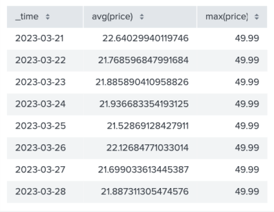
Aggregations are categories specified by field name prefixes. For example, avg(price) is an aggregation of the average price, and max(price) is an aggregation of the maximum price. You can split your data by aggregations using the trellisSplitBy option.
The following example sets trellisSplitBy aggregations with the SPL search index="sample-data" | timechart avg(price), max(price).
Source code
The following source code example shows a dashboard definition that uses the trellis layout and splits data with aggregations.
{
    "visualizations": {
        "viz_ngtz80fU": {
            "type": "splunk.singlevalue",
            "options": {
                "splitByLayout": "trellis"
            },
            "dataSources": {
                "primary": "ds_dKKG8nXI"
            }
        }
    },
    "dataSources": {
        "ds_dKKG8nXI": {
            "type": "ds.search",
            "options": {
                "query": "index=\"sample-data\" | timechart avg(price), max(price)"
            },
            "name": "Search_4"
        }
    },
    "defaults": {
        "dataSources": {
            "ds.search": {
                "options": {
                    "queryParameters": {
                        "latest": "$global_time.latest$",
                        "earliest": "$global_time.earliest$"
                    }
                }
            }
        }
    },
    "inputs": {
        "input_global_trp": {
            "type": "input.timerange",
            "options": {
                "token": "global_time",
                "defaultValue": "-24h@h,now"
            },
            "title": "Global Time Range"
        }
    },
    "layout": {
        "tabs": {
            "items": [
                {
                    "layoutId": "layout_1",
                    "label": "New tab"
                }
            ]
        },
        "layoutDefinitions": {
            "layout_1": {
                "type": "absolute",
                "options": {
                    "width": 1440,
                    "height": 960,
                    "display": "auto"
                },
                "structure": [
                    {
                        "item": "viz_ngtz80fU",
                        "type": "block",
                        "position": {
                            "x": 130,
                            "y": 90,
                            "w": 1010,
                            "h": 330
                        }
                    }
                ]
            }
        },
        "globalInputs": [
            "input_global_trp"
        ]
    },
    "description": "",
    "title": "Single value for trellis with aggregations"
}
Customize trellis columns with trellisMinColumnWidth and trellisColumns
You can customize the width of each visualization in the trellis layout with the trellisMinColumnWidth option. By default, trellisMinColumnWidth adjusts based on the configuration of the config.ts file and the parent panel width.
The following example shows how the trellis layout changes when the default trellisMinColumnWidth is updated to trellisMinColumnWidth: 150.
You can customize the number of visualizations to display in a single row of the trellis panel with trellisColumns. Visualizations with an undefined trellisColumns fill and wrap within the set width of the trellis panel.
The following example shows how visualizations might extend beyond the trellis panel with a trellisMinColumnWidth: 150 and trellisColumns: 6.
| Table | Add an image |
This documentation applies to the following versions of Splunk Cloud Platform™: 9.2.2406, 9.3.2408 (latest FedRAMP release), 9.3.2411




 Download manual
Feedback submitted, thanks!