Part 3: Add a table with column formatting
Let's say that you want to compare the revenue and number of purchases for games sold at Buttercup Games. In Splunk Dashboard Studio, you can format columns in a table visualization by adding dynamic coloring options based on the value within each cell. You'll use this to compare revenue and number of purchases by being able to see the values in a cell at a glance based on its color. In this part of the tutorial, you will create a table with game revenue and purchases data and adjust dynamic coloring based on the number of purchases for each game. You will query the data using the Splunk querying language called Search Processing Language (SPL). For more details, see Search Manual.
The remaining parts of this tutorial depend on you first completing Part 2 and Part 5 of the Search Tutorial. See About uploading data and Make the lookup automatic in the Search Tutorial manual.
If you do not configure the field lookups, the searches in the Dashboard Studio tutorial will not produce the correct results.
- Select the add chart icon (
 ) in the editing toolbar, and then select Table.
 - In the Search section of the Select data source panel, select + Create search.
- Name the data source Most purchased games.
- Add your search. For this tutorial, copy and paste the following search into the SPL query field:
index=main sourcetype=access_* action=purchase status=200
| stats count as Purchases by productName categoryId price
| table productName Purchases categoryId price
| eval Revenue=Purchases*price
| table productName Purchases Revenue categoryId
| sort -Purchases | rename productName as "Game" categoryId as "Category"
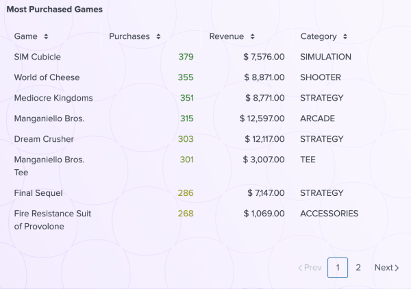
This search adds up the amount of purchases per product, creates a revenue column per product that is made by multiplying the amount of purchases by the price for each product, and sorts the table based on how many purchases were made for each game. The end result is a table with four columns: Game, Purchases, Revenue, and Category.
- Select Apply and close. At this point, you've created a new data source and assigned it to a table.
- Select your table. In the Configuration panel on the right, title your table Most Purchased Games and leave the description field empty.
- In the Data display section of the Configuration panel, enter 8 in the Rows displayed field. This value sets a fixed number of rows displayed in the table. Now you can paginate across all results.
- In the Color and style section of the Configuration panel, select the white box next to the #ffffff. Then, in the color picker below the box, select the checkered white and gray box to change the Background to transparent.
- In the Column-specific formatting section, follow these steps:
- Select + Add column to format and select Revenue - number.
- Select the edit icon (
 ).
). - Change the Units position option to Before and enter $ in the Unit label field.
- Increase the Precision value to 2 and turn on the Thousand Separators.
- The thousand separator is the character used to create space between every three digits in numbers with at least four digits.
After making changes in the Column formatting: "Purchases" pop-up, the changes are saved automatically. You can close the pop-up by selecting anywhere in the Configuration panel away from the pop-up.
- Select + Add column to format again, but this time choose the Purchases - number column.
- Select the edit icon (
 ).
). - Change the Dynamic coloring option to Text.
- Select a color palette. For the best contrast, choose Dark colors if you're using the light theme and Light colors if you're using the dark theme. This color palette only applies to values in the column you selected for dynamic coloring, and not the whole table. You can change the theme of a dashboard using the dropdown in the editing toolbar that says Light. In this tutorial, you will use the light theme.
- You can select + Add range to add a color range, remove (
 ) a range, adjust the color thresholds, and reverse the order of colors (
 ) to best fit the range of data in your table. For this tutorial, delete the provided ranges and instead enter the following six ranges:
- 350 and greater
- 300 to 350
- 250 to 300
- 200 to 250
- 150 to 200
- Less than 150
- Move and resize your table to center it in the bottom right rectangle.
After completing Part 3, your table looks similar to the following:

Next step
You've completed Part 3 of the Splunk Dashboard Studio tutorial and your dashboard has a table visualization with dynamic coloring. Next, you'll add another data source and use it to create a line chart. Continue to Part 4: Add a line chart visualization.
| Part 2: Create a dashboard | Part 4: Add a line chart |
This documentation applies to the following versions of Splunk Cloud Platform™: 9.3.2411, 9.0.2305, 9.1.2308, 9.1.2312, 9.2.2403, 9.2.2406, 9.3.2408 (latest FedRAMP release)
 Download manual
Feedback submitted, thanks!