Single value and single value icon
Use a single value visualization to show a metric and its context for searches returning a discrete number. This same search logic applies to a single value icon visualization, which lets you add a single value and trend value to icons.
A single value can be a count or other aggregation of specific events. For example, the following search creates a single value or single value icon visualization similar to the images below.
index = _internal source = "*splunkd.log" log_level = "error" | stats count

Data formatting
Single value visualizations work best for queries that aggregate data using the stats command or create a time series chart using the timechart command.
Add emphasis to a returned value using dynamic formatting
A caption, a unit notation, and threshold coloring add emphasis to the returned value. If you use a command that returns multiple fields or values, you can use the Major Value & Trend section in the Configuration panel to add a trend indicator and a sparkline (single value only) to show how data values compare.
You can add dynamic coloring in a number of ways. For example, the following search uses the timechart command to track daily errors for a Splunk deployment and displays a trend indicator, sparkline, and color thresholding applied to both the major value and the trend indicator:
index=_internal source="*splunkd.log" log_level="error" | timechart count

Generate a single value or single value icon
- Select a single value visualization using the visual editor by clicking the Add Chart dropdown menu (
 ) in the editing toolbar and either browsing through the available charts, or by using the search option.
Add an icon by choosing an icon from the Add Icons dropdown menu (
) in the editing toolbar and either browsing through the available charts, or by using the search option.
Add an icon by choosing an icon from the Add Icons dropdown menu (  ).
).
- Select the visualization to highlight it.
- Set up a new data source by adding a search to the Search with SPL window.
- To select an existing data source, close the Configuration panel and reopen it. In the Data Configurations section, click +Setup Primary Data Source and click + Create Ad hoc Search to create a new search from this window. You can also choose a new ID that describes the search better than the default.
Configuration panel options for single value and single value icon visualizations
You can use the Configuration panel to configure the following components.
Title
Give your visualization a title. This is also helpful when searching for individual visualizations in the dashboard definitions. This name is not the same as the automatically assigned unique ID.
Description
Give your visualization a description to explain what the user is viewing.
Data Configurations
Choose an existing search or create a new one.
Position & Size
You can use your mouse to change the size or location of the visualization panel, or the Position & Size section of the Configuration panel for sizing by pixel and for placement on the canvas.
Selected Data Field (single value)
Use the dropdown menu to select the field value from your search results that will be displayed as the major value.
Major Value & Trend (single value)
- Use the Unit Position dropdown menu to place a unit string before or after the major value.
- Use the Unit Label field to specify a unit using a string.
- Use Precision to choose the number of decimal places displayed.
- Change the display size of the major value in pixels using the Major Value Size (px) field.
- Use Trend Display to choose to show the trending value as either a percent or an absolute number. You can also choose to remove the trend value from the visualization.
- Change the display size of the trend value in pixels using the Trend Size (px) field.
- Choose where to place a sparkline to show a line that displays the trend of the displayed values over time.
Major Value & Trend (single value icon)
- Toggle the Enable switch to add a major value and a trending value to an icon.
- Use the Unit Label field to add a unit using a string.
- Use Precision to choose the number of decimal places displayed.
- Change the display size of the major value, in pixels, by using Major Value Size (px).
- Use Trend Display to choose to show the trending value as either a percent or an absolute number.
- Change the display size of the trend value in pixels by using Trend Size (px).
Coloring
Use the Coloring section to set colors to apply to value ranges returned by data sources that include a search.
- Dynamic Elements
Use the dropdown menu to select the elements of the visualization to which you want to apply color thresholding. There are multiple options to choose from. For example, if you're formatting a single value icon, you can select from the following menu:
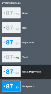
The elements you select from the Dynamic Elements menu will become available to you for color thresholding. For example, if you are coloring a single value icon and you apply thresholding to the icon and the major value, the following options become available: - Dynamic Icon
- Dynamic Major Value
When you click on the default color panel for the elements you've selected, a window will open and you can set different options for the different elements. For example, if you choose to apply coloring to the icon in a single value icon visualization, you can choose to base the color of the icon on the major value or the trend value. - Method
Select Ranges if you want to specify color ranges based on numerical values. You can only set up to 7 ranges using the visual editor. If you would like to add more, you must do so through the source editor by following the format displayed. - Preset Palette
If you select Ranges, you can choose Dark Colors or Light Colors. Use the option that best fits the theme you're using for the dashboard. You can use the dropdown menu to choose from a number of preset color palettes. You can customize them or create your own colors when you set the range values for each color. Click on the color to the left of the range to choose a preset option or enter a hex code. - Choose static colors
You can set static colors for any elements that that are not using dynamic coloring. For example, if you choose not to make the trend value and background fill dynamic, you can chose a single, static color for both. Click on the color box next to the element to choose from a preset palette or enter a hex code to right of the color box. To change the background color of the visualization panel, click the color box to select from a palette or enter a hex code, for example, enter #FF7189 for a shade of pink. - Drilldown Settings
Click + Add Drilldown to allow a user to click the value of a visualization to link to a an external or internal URL. - Code
Select your visualization or its search to view and edit the source code in real-time. You can also change the Visualization ID to a more readable ID to help identify this visualization in the source code.

Source options for single value and single value icon
While you can use the visual editor to set most of the options, there are additional options, such as coloring the area under the sparkline, that can only be set in the source editor for splunk.singlevalue and splunk.singlevalueicon. These options are added to the options field of the visualization stanza. The following example shows a single value visualization with a dynamically colored major value and trend value. It also has a sparkline and a static background color.
Use the following search to reproduce the example:
index=_internal source="*splunkd.log" log_level="error" | timechart count

Single value
Single value options
Expand the code box to view the options that are available for the single value visualization.
| Property | Type | Default | Description |
|---|---|---|---|
| majorValue | (string | number) | > sparklineValues |lastPoint() | Specify the major value to display in the visualization. This can be a static value, or a dynamic value. |
| majorColor | string | > themes.defaultFontColor | Specify the dynamic color of the major value by dataSource or a static color using the hex format. For example, #FFFFFF.
|
| unit | string | N/A | Specify label text to show next to the single value. |
| unitPosition | (before | after) | after | Specify whether you want the unit label to appear before or after the single value. |
| underLabel | string | N/A | Specify the label text that appears below the value. |
| underLabelFontSize | number | 12 | Specify the font size, in pixels, for the text in the label under the visualization. |
| backgroundColor | string | > themes.defaultBackgroundColor | Specify a color to use for the single value background. For example, "#008000".
|
| trendValue | number | > sparklineValues | delta(-2) | The trend value to display in the visualization. |
| trendColor | string | > themes.defaultFontColor | Specify the color for trend value. If using a static value, use the hex value format. For example, #FFFFFF. |
| shouldAbbreviateTrendValue | boolean | false | Specify whether to abbreviate the trend value to 2 decimal places. A magnitude unit will be displayed. |
| sparklineDisplay | (before | after | below | off) | below | Specify where to place a sparkline. You can also disable it. |
| sparklineValues | (number | string) | > primary | seriesByPrioritizedTypes("number", "string", "time") | Specify a list of dynamic or static list of sparkline values to display. |
| showSparklineAreaGraph | boolean | false | Specify whether to show the sparkline as an area graph rather than a line. |
| sparklineAreaColor | string | > sparklineStrokeColor | Specify a dynamic or static color for the fill under the sparkline. For a static color, enter a hex code. For example #FFFFFF.
Note that this setting only works when |
| sparklineStrokeColor | string | > themes.defaultSparklineStrokeColor | Specify a dynamic or static color for the sparkline stroke. For a static color, enter a hex code. For example #FFFFFF.
|
| showSparklineTooltip | boolean | false | Show a tooltip to display values on the sparkline. |
| shouldSparklineAcceptNullData | boolean | true | Specify whether to convert null and non-numeric values in the sparkline to 0. |
| sparklineHighlightSegments | number | 0 | Specify the number of segments to highlight at the top of a sparkline area graph. Note that this setting only works when showSparklineAreaGraph is set to true.
|
| sparklineHighlightDots | number | 0 | Specify the number of markers, or dots, to display at the top of a sparkline area chart. Note that this setting only works when showSparklineAreaGraph is set to true.
|
| trendDisplay | (percent | absolute | off) | absolute | Specify whether the trend value is displayed as a percentage or an absolute count. |
| numberPrecision | number | 0 | Specify the number of decimal places to display. For example, to display three decimal places, enter a value of 3. The maximum value is 20. |
| shouldUseThousandSeparators | boolean | true | Specify whether numeric values use commas as thousandths separators. |
| majorFontSize | number | N/A | Specify the font size (px) for the major value. By default the major value font size is calculated dynamically based on the available space. |
| trendFontSize | number | N/A |
Single value icon
Single value icon options
Expand the code box to view the options that are available for the single value visualization.
| Property | Type | Default | Description |
|---|---|---|---|
| unit | string | N/A | Specify label text to show next to the single value. |
| unitPosition | (before | after) | after | Specify whether you want the unit label to appear before or after the single value. |
| underLabel | string | N/A | Specify the label text that appears below the value. |
| majorValue | (string | number) | > primary | seriesByPrioritizedTypes("number", "string", "time") | lastPoint() | Specify the major value to display in the visualization. This can be a static value, or a dynamic value. |
| majorColor | string | > themes.defaultFontColor | Specify the dynamic color of the major value by dataSource or a static color using the hex format. For example, #FFFFFF.
|
| backgroundColor | string | transparent | Specify a color to use for the single value background. For example, "#FFA500".
|
| showValue | boolean | false | Specify whether to show or hide the major value trend indicator. |
| trendColor | string | > themes.defaultFontColor | Specify the dynamic or static color for the trend value. If using a static value, use the hex value format. For example, #FFFFFF.
|
| trendValue | (number | string) | > primary | seriesByPrioritizedTypes("number", "string", "time") | delta(-2) | Specify the dynamic color of the trend value by dataSource or a static color using the hex format. For example, #FFFFFF.
|
| trendDisplay | (percent | absolute | off) | absolute | Specify whether the trend value is displayed as a percentage or an absolute count. |
| shouldAbbreviateTrendValue | boolean | false | Specify whether to abbreviate the trend value to 2 decimal places. A magnitude unit will be displayed. |
| numberPrecision | number | 0 | Specify the number of decimal places to display. For example, to display three decimal places, enter a value of 3. The maximum value is 20. |
| shouldUseThousandSeparators | boolean | true | Specify whether numeric values use commas as thousandths separators. |
| icon | string | default | Specify an icon. To use one of the default icons, specify the name: activity, clock, pencil, star, or default. To use an icon you've uploaded, specify the location in the key value store. For example, "icon": "splunk-enterprise-kvstore://601c8bdf1922f119a0184e13".
|
| iconPosition | string | (before | after | below | top) | Specify where to display the icon in relation to the single value. |
| iconOpacity | number | 1 | Specify the opacity for the icon using numbers between and including 0 and 1 (inclusinve). This relates to the opacity percentages in the visual editor. |
| showValue | boolean | true | Specify whether to enable or disable the value and trend indicator display. |
| iconColor | string | N/A | Specify the icon color. Use color hex codes. For example, "#FF0000".
|
| majorFontSize | number | N/A | Specify the font size (px) for the major value of single value icon. By default the major value font size is calculated dynamically based on the available space. |
| trendFontSize | number | N/A | Specify the font size (px) for the delta value of the single value icon. |
| Scatter charts | Single value radial |
This documentation applies to the following versions of Splunk Cloud Platform™: 8.2.2112
 Download manual
Feedback submitted, thanks!