Add dynamic options to visualizations
Dynamic options provide more control over visualizations, such as specific data selection and color thresholding. For example, a single value visualization can dynamically modify its background color each time the connected data updates. Conversely, static options don't change based on data and stay the same. For example, a single value visualization can have a fixed font size of 54.
Dynamic and static options make visualizations more comprehensive. The Dashboard Studio visual editor UI provides some basic ways to apply both dynamic and static options. More advanced configurations for dynamic options involve writing the dynamic options syntax in the Dashboard Studio source editor.
Change visualization colors based on data
You can use dynamic coloring for a wide variety of visualizations, such as changes in sales trends. For example, by setting color thresholds for different data ranges, you can visually illustrate if the daily sales count met or fell short of the day's quota. Perhaps the color thresholds have five levels:
- Blue: 25,000+ sales meets the day's quota
- Dark Blue: 20,000 to 24,999 sales
- Black: 15,000 to 19,999 sales
- Dark Red: 10,000 to 14,999 sales
- Red: below 10,000 sales
For more details about dynamically configuring single values, see Single value and single value icon. For a complete list of single value dynamic options, see Source options for single value.
Dynamic options and dynamic options syntax
Whether generated from the UI or written in the source editor, all dynamic options follow the dynamic options syntax (DOS). For example, the visual editor UI can set the dynamic element major value to a single value and assess the value against fixed color thresholds. You can leverage the DOS to customize your dynamic visualizations in the source editor's JSON visualizations section. To access the source editor, click the source icon in the editing toolbar (![]() ). For more details about editing the visualization source code directly, see How the dashboard definition is structured in the source editor.
). For more details about editing the visualization source code directly, see How the dashboard definition is structured in the source editor.
Dynamic options syntax (DOS) structure
The dynamic options syntax (DOS) is the written code for visualizations in Dashboard Studio. The DOS structure has several parts, each separated by a pipe:
- data source: Location of your data sources, searches, and options for each search you create in the visual editor.
- selector functions: Identifies the data associated with the visualization. A dynamic option can have multiple selector functions.
- formatting function: Formats the selected data.
A typical DOS structure looks like the following:
Main structure: "> [data source] | [selector function(s)] | [formatting function]"
Example of dynamically updating color with trendColor
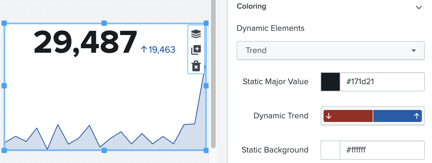
The following example represents a single value visualization dynamically updating the color of its graph and percentage of change. A downward percentage change triggers the red threshold, and an upward percentage change triggers the blue threshold. You can configure the trend colors in the visual editor UI, which populates the source code in the source editor.
/* JSON */

"type": "splunk.singlevalue",
            "dataSources": {
                "primary": "ds_sales"
            },
            "options": {
                "majorValue": "> sparklineValues | lastPoint()",
                "trendValue": "> sparklineValues | delta(-2)",
                "sparklineValues": "> primary | seriesByName('count')",
                "showSparklineAreaGraph": true,
                "sparklineStrokeColor": "> trendColor",
                "trendColor": "> trendValue | rangeValue(trendColorEditorConfig)"
            },
            "context": {
                "trendColorEditorConfig": [
                    {
                        "value": "#9E2520",
                        "to": 0
                    },
                    {
                        "value": "#115BAD",
                        "from": 0
                    }
                ]
            }
As seen in the source code, trendColor follows the DOS structure Main structure: "> [data source] | [formatting function]". trendColor uses data from trendValue, and the formatting function rangeValue applies colors to the visualization based on a range of values from trendColorEditorConfig.
"trendColor": "> trendValue | rangeValue(trendColorEditorConfig)",
When initially creating a visualization with the visual editor UI, some default dynamic options and values may not appear in the source editor, such as majorValue, trendValue, and sparklineValue. If you directly change a default field, its associated values appear in the source code. For more details about default behavior, see Default behavior for options and values.
| Use the action panel to layer, clone, and delete objects | Advanced dynamic options syntax |
This documentation applies to the following versions of Splunk Cloud Platform™: 8.2.2112


 Download manual
Feedback submitted, thanks!