UI text style guidelines
The purpose of user interface (UI) text is to help users achieve their goals by guiding them through the product interface. The act of unifying UI text with product design is known as content design. Content design plays an integral role in creating a seamless user experience. Use the internal Magnetic Design System to drive design decisions for Splunk product UIs.
Much of the guidance for Splunk documentation and UI text overlaps. If you can't find the guidance you're looking for in the UI text style guidelines or the Magnetic Design System, use the guidance provided in other sections of the Splunk Style Guide and reach out to the Content Design team.
Terminology and word usage
Use terms consistently across products and docs. See the following resources for guidance on word usage, product terminology, abbreviations, voice and tone, and more:
| Topic | Link |
|---|---|
| Terms to use and avoid | Usage dictionary |
| Product terminology | Splunk product terminology |
| Splunk-specific terminology definitions | Splexicon |
| Abbreviations | Abbreviations |
| Punctuation | Punctuation and symbols |
| Voice and tone | Splunk voice and tone Use plain language |
| Bias-free language | Write unbiased documentation |
Product abbreviations
Some Splunk products have approved abbreviations that you can use, such as Splunk IT Service Intelligence (ITSI) and Splunk Enterprise Security (ES). Do not use abbreviations if they aren't approved. Refer to your product's specific style sheet to find what abbreviations you can use.
Follow these guidelines for using product abbreviations:
- Strive to use the full product name when possible. Don't use an abbreviation to save space if it sacrifices clarity.
- In long-form text, such as in a guided setup or tooltip, define the abbreviation at first use. See Abbreviations.
- If the product name appears multiple times in the same component or screen and you choose to abbreviate the name, use the abbreviation consistently after defining it.
- In instances where it might not make sense to define the abbreviation or if space is a major concern, such as in a field label or as part of a table, use the approved product abbreviation alone. Avoid this situation when possible.
If you're not sure whether to use abbreviations, contact the Information Architecture team.
Capitalization
Use sentence-style capitalization for all text in Splunk product UIs, including headings. Sentence-style capitalization follows these guidelines:
- Capitalize the first word and proper nouns, such as product names.
- If a heading has a colon, capitalize the word that immediately follows the colon.
- Use lowercase letters for names of features or components.
- Don't use all capital letters to emphasize words.
The following examples show sentence-style capitalization:
Terminal punctuation
Terminal punctuation is punctuation that comes after a sentence or phrase. Follow these best practices to punctuate UI text correctly:
- Use a period at the end of complete sentences.
- If a word or phrase is meant to be read as a question, use a question mark.
- Don't use exclamation marks.
- When writing single, short, descriptive phrases that are not complete sentences, don't use terminal punctuation.
- If a UI element requires more than 1 phrase of description, write them as sentences and use the appropriate punctuation to distinguish them from one another.
- If a single view, page, or dialog box contains descriptive text that uses both full sentences and fragments, try rewriting the full sentences into fragments. If it isn't possible to rewrite the full sentences into fragments, use terminal punctuation for all of the text.
See the following examples of correct and incorrect terminal punctuation:
For more punctuation guidelines, see Punctuation and symbols.
Text formatting
Text formatting is text displayed in a special, specified style. Avoid applying special formatting to text in the UI whenever possible because it introduces visual noise and complexity. Use the typography and styles defined in the design system for headings and paragraph text.
Use the following formatting guidelines:
- Avoid referring to UI elements in the UI. If you're writing in-product documentation, such as for a guided workflow, and you need to refer to UI elements, follow the documentation formatting guidelines in Formatting reference.
- Don't use formatting like bold, italics, or monospaced font in microcopy, such as in tooltips, help text, field labels, button labels, and error messages.
- Don't use all capital letters or bold for emphasis.
- Use indicating nouns to provide context for commands or other code elements rather than using monospaced font for the code element.
See the following examples:
Possessive pronouns
Avoid using possessive pronouns such as "my" and "your" in page names, menu names, and titles. For example, instead of My Settings as a label, use Settings. Instead of Your Workspaces as a page name, use Workspaces.
It's okay to use possessive pronouns in instructional and error message text, such as "Enter your password."
Numbers
In general, use numerals for numbers that appear in the UI, including 0 through 9. Avoid starting a sentence with a numeral.
If a number's numerical value is not the focus of the sentence, spell the number out, as in the following example: "Move an app from one instance to another."
For more guidance on numbers with examples, see Using numbers in text.
Time
When writing about time, follow the guidelines in the Time topic. If you need to abbreviate units of time due to space constraints in a Splunk product UI, use these abbreviations:
| Unit | Abbreviation |
|---|---|
| day | d |
| hour | h |
| microsecond | Don't abbreviate. |
| millisecond | ms |
| minute | min |
| month | mo |
| nanosecond | Don't abbreviate. |
| second | sec |
| week | wk |
| year | yr |
Symbols
Avoid using symbols in UI text. If you need to use a symbol in UI text, write out the name of the symbol first, and then refer to the symbol in parentheses with nonbreaking spaces. See the following example:
| Enter your search after the pipe ( | ). | Enter your search after the |. |
See Show symbols in text for more information on how to use symbols and what to call them.
If you don't have space to write out the name of the symbol, you can use hidden text such as the aria-label attribute to define the symbol. See Spell out words and symbols for more information.
Links
Links help a user find additional information in an effort to achieve their goal. Always let a user know where an in-product link is going to take them. Use descriptive labels so users know what they'll find if they select the link.
When writing text for an in-product link, follow these general guidelines:
- Keep the link text brief while still providing enough context to convey where the link takes the user.
- Keep in mind screen reader users can access a list of all the links on a page without surrounding text, so make sure the link makes sense out of context.
- Don't use phrases like "click here" or "here" as link text.
- Link judiciously. Too many links are a distraction.
Use the specific guidelines for the type of link you are creating:
For guidance on creating links in Splunk documentation, see Formatting links in Splunk documentation.
Links to a page in the application
When including a link to a page in the application, or another location on the same page, you can include the link in a sentence. Follow these guidelines:
- In most cases, use the name of the page or section as the link text.
- Include no more than 1 link in a single sentence.
- Don't link the entire sentence, but instead the text that describes where the user goes if they select the link. If it's a very short sentence that describes the action the user takes on the linked page, it's okay to link the entire sentence.
- Use terminal punctuation with the sentence that contains the link.
The following table shows examples of what to do and what not to do when linking to a page in a sentence:
Links to Splunk product documentation
Format links to Splunk product documentation as a standalone link. A standalone link is a link that is not part of a sentence.
When deciding where to include a link to Splunk documentation in the product UI, identify places in the product workflow where a user might get stuck and need decision support or additional information in order to complete the workflow. Consider whether help text or a tooltip can display the same content without needing to link out of the product. If a user might need more information than help text or a tooltip can provide, add a link to the relevant Splunk documentation page.
Follow these guidelines when creating links to Splunk documentation:
- For the link text, create a synopsis of the doc page title and add the word "documentation" at the end. For example: <doc page title synopsis> documentation
- When creating the synopsis, use a noun phrase or a gerund, which is the noun form of a verb ending in "ing". Don't begin with an imperative verb such as "Configure" or "Create". Imperative verbs might give the user the impression they are taking an action in the UI rather than opening a doc page.
- Don't use terminal punctuation at the end of the link.
- Always follow the text with the external link icon (
 ).This icon means that the link opens in a new tab or window.
 - Don't put a link to Splunk documentation inside of a tooltip.
The following table shows examples of what to do and what not to do when writing link text for links to Splunk documentation:
Links to an external site
For links that navigate outside of the application, such as to a third-party documentation website or Splunkbase, use a standalone link. A standalone link is a link that is not part of a sentence.
Follow these guidelines for links to external sites:
- Determine whether the link is supplemental or essential. Avoid creating deep links to outside websites if they aren't necessary. See Best practices for linking to third-party websites.
- Include the external link icon (
 ). This icon means that the link opens in a new tab or window.
 - Don't use terminal punctuation at the end of the link.
- Links to external sites require maintenance. Regularly check that links to outside websites continue to point where they are intended.
The following table shows examples of what to do and what not to do when writing links to external sites:
Field components
You have a few ways to provide contextual details about fields in a UI. The following table compares the different ways you can provide context about a field and describes when to use each one. See the sections below the table for additional details.
| Field component | Required? | What it is |
|---|---|---|
| Field labels | Required | A concise statement placed directly above a field that provides context about what the user needs to enter or select in that field. |
| Form requirements | Conditional | A concise statement that indicates whether the user is required to fill in all fields in a form or if there are optional fields. |
| Help text | Optional | Supplementary text placed below a field that explains critical information for completing the field, such as syntax or formatting requirements. |
| Tooltips | Optional | Noncritical, supplementary information that appears when a user hovers over an information icon next to a field. Tooltips contain hint text and don't include essential information about the field. |
| Placeholder text | Optional and discouraged | Temporary text located inside of a field that disappears after a user places their cursor into the field. Placeholder text is acceptable only when content is not critical, such as an example of what to enter into the field. |
Field labels
All fields must have a label that follows this guidance:
- Place field labels outside of the field box, and not inside the of field box.
- Keep field labels brief and use sentence-style capitalization.
- Use a noun phrase to describe the field value.
- Avoid phrasing field labels as questions.
- Don't use placeholder text in place of a field label because text inside the field box disappears after the user selects it.
The following screenshot shows examples of what to do and what not to do when creating field labels:

Text for required fields
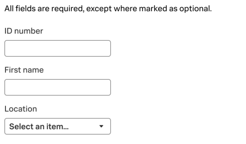
When users are required to fill in all fields in a form, include a line of copy indicating the requirement before the form. The following screenshot shows an example of a form where all fields are required:
Asterisks next to field labels create visual clutter. If you decide to mark required fields with the symbol, state what the asterisk means in the text that precedes the form.
Text for optional fields
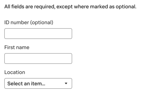
If a field is optional, include the word "optional" in parentheses at the end of the optional field label copy. See the following screenshot for an example of a form with an optional field:
Help text
Help text is a brief statement located directly below a field in a UI that provides important context, such as instructions or formatting requirements. If the information is critical to completing the task, include those details in the help text so it always remains visible. For less critical information, consider using a tooltip instead. See Tooltips.
Use help text to provide clarity and define the purpose of each field. Consider the following points when crafting help text:
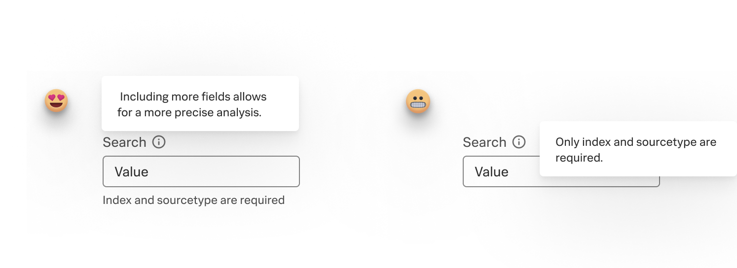
The following screenshot shows the difference between essential help text under a field and a tooltip that's hiding important information:

Tooltips
Tooltips provide supplemental information to help users understand the meaning or purpose of UI elements, such as an icon or a field. However, tooltips require an additional user action: The user must hover over the information icon, which could block surrounding text, hide critical details, or distract the user from the task at hand.
Avoid using tooltips for essential information. Instead, opt for visible help text for clearer and more accessible guidance. See Help text.
Minimize the use of tooltips to enhance usability. If you need to include a tooltip, follow these guidelines:
- Be short and concise. A tooltip can vary in length from 1 word to a couple of short sentences.
- Use sentence-style capitalization.
- Use a period to punctuate full sentences. If the tooltip is a short phrase or the name of a tool or icon, don't punctuate the tooltip with a period.
- Use present tense.
- Don't use "please".
- If the UI element requires a lengthy explanation, consider a different design or use a link to the product documentation instead of a tooltip.
- Don't include interactive elements such as links or buttons in tooltips. If links are needed, use a popover instead. A popover is a component for overlaying content on a page permanently and is used as a last resort.
The following table shows examples of what to do and what not to do when writing tooltips:
The following screenshot shows concise tooltip text that isn't covering a field in a UI:

Placeholder text
Placeholder text is text located inside a field box. Whenever possible, avoid placeholder text for these reasons:
- Placeholder text disappears when users start entering text in the field, which can strain memory and prevent them from reviewing their input.
- Using both help text and placeholder text is redundant and clutters up a form.
- Empty fields catch the eye better than fields with text in them.
- Placeholder text is usually low contrast and not accessible.
Instead of placeholder text, use these UI elements:
- Use help text to provide instructions.
- Use a tooltip to provide hints for filling in the field.
- Always include a field label.
- If you must include placeholder text to show a supplementary example, keep placeholder text short and concise.
Button labels
A button label is text that appears on a call-to-action button in the UI. All buttons need labels. Follow these guidelines when writing button labels:
- Write concise button text. Aim for 1 or 2 words and no more than 4 words.
- Omit the noun unless it's necessary to add clarity.
- Avoid using "Yes" or "No". Instead, write a clear call to action. Be specific so that the user is sure of what action happens after they select the button.
- If the button text requires more than 1 word, start the text with a verb.
- Use a precise verb to describe the action. For example, use "Add" when using an existing object in a new context, and use "Create" when making a new object from scratch.
- Use sentence-style capitalization and capitalize the first word and proper nouns only.
- Avoid articles such as "a", "an", or "the".
- Don't use punctuation such as periods or exclamation marks.
The following table shows examples of what to do and what not to do when writing button labels:
| Cancel | No |
| Save | Yes |
| Create dashboard | Create Dashboard |
| Create table view | Create a table view |
| Continue to tour | Continue to the tour! |
For buttons inside dialog boxes, omit the noun in the button if it is already communicated clearly in the dialog box header or body text. For example, Create is a better fit for a button than Create dashboard in a dialog box titled Create dashboard:

For buttons that lack clear context, such as in a toolbar, include the noun for clarity. For example, Run search is a better fit for a button than Run in a dialog box titled Log Observer:

Empty state text
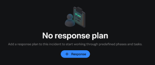
An empty state is a screen in the product UI that will eventually have content on it after the user populates it. Empty state UI text is the information that a user sees instead of a blank screen.
Follow these guidelines when writing empty state text:
- Include a brief summary that explains why the page is empty.
- Write 1 or 2 lines of text that guides the user to the next step.
- Include a button or a link to the next step.
The following image is an example of empty state text:
Confirmation dialog box text
Confirmation dialog boxes appear before a user makes a significant action in the product UI. Work with a designer to create a confirmation dialog box so all elements are cohesive, including the title, body text, and buttons.
When writing content for a confirmation dialog box, make sure all text elements complement each other and aren't repetitive.
Title
Write a brief confirmation dialog box title in the form of a statement or question that describes the task the user is completing. Use the following guidelines:
- When possible, use a verb and noun combination.
- Punctuate the confirmation box title when you write it as a question.
- Use sentence-style capitalization.
- Keep the title short and succinct.
- Remove definite and indefinite articles, such as "a", "an", and "the".
- Write in active voice.
- Avoid casting doubt on the user.
The following table shows examples of what to do and what not to do when writing confirmation dialog box titles:
Body text
Include body text in the confirmation dialog box that's related only to the user's task at hand. Use the following guidelines:
- Don't repeat or rephrase the title of the dialog box.
- Provide context that helps the user decide which action to take next.
- Avoid casting doubt on the user.
- It's okay to use passive voice to avoid placing blame on the user.
- Write in full sentences with terminal punctuation.
The following table shows examples of what to do and what not to do when writing confirmation dialog box body text:
Button text
Create button text that helps a user decide whether to complete or revert their action. See the guidelines in Button labels on this page.
Success messages
Success messages appear after a user completes a significant action in the product UI. Success messages typically appear and disappear briefly, or they might function as a message that the user can dismiss.
When writing a success message, keep the message brief and don't write in complete sentences. Use the following guidelines:
- Use short phrases without terminal punctuation.
- Write affirmatively.
- Use passive voice.
The following table shows examples of what to do and what not to do when writing success messages.
Error and warning messages
Error and warning messages can appear in various places in a UI, including in banners, in screens, or after a field. Error or warning messages can span many reasons, including when there's no data, permissions issues, configuration issues, or unsupported actions.
When writing an error or warning message, use these guidelines:
- Clearly state the problem and what the user can do to resolve it. If cues in the UI help identify the problem for field validation errors, like text color and placement next to the field, it's okay to write the message without explicitly stating the problem.
- Use complete sentences with terminal punctuation.
- Don't use "please".
- It's okay to use passive voice to avoid placing blame on the user.
The following table shows examples of what to do and what not to do when writing error messages:
| Manual names, topic titles, and section headings | Best practices for including videos |
This documentation applies to the following versions of Splunk® Style Guide: current


 Download manual
Feedback submitted, thanks!