Use navigators in Splunk Infrastructure Monitoring
In Splunk Infrastructure Monitoring, a navigator is a collection of resources that lets you monitor metrics and logs across various instances of your services and detect outliers in the instance population based on key performance indicators. Resources in a navigator include, but are not limited to, a full list of entities, dashboards, related alerts and detectors, and service dependencies.
View all navigators
To see all navigators, select Infrastructure from the Splunk Observability Cloud home page.
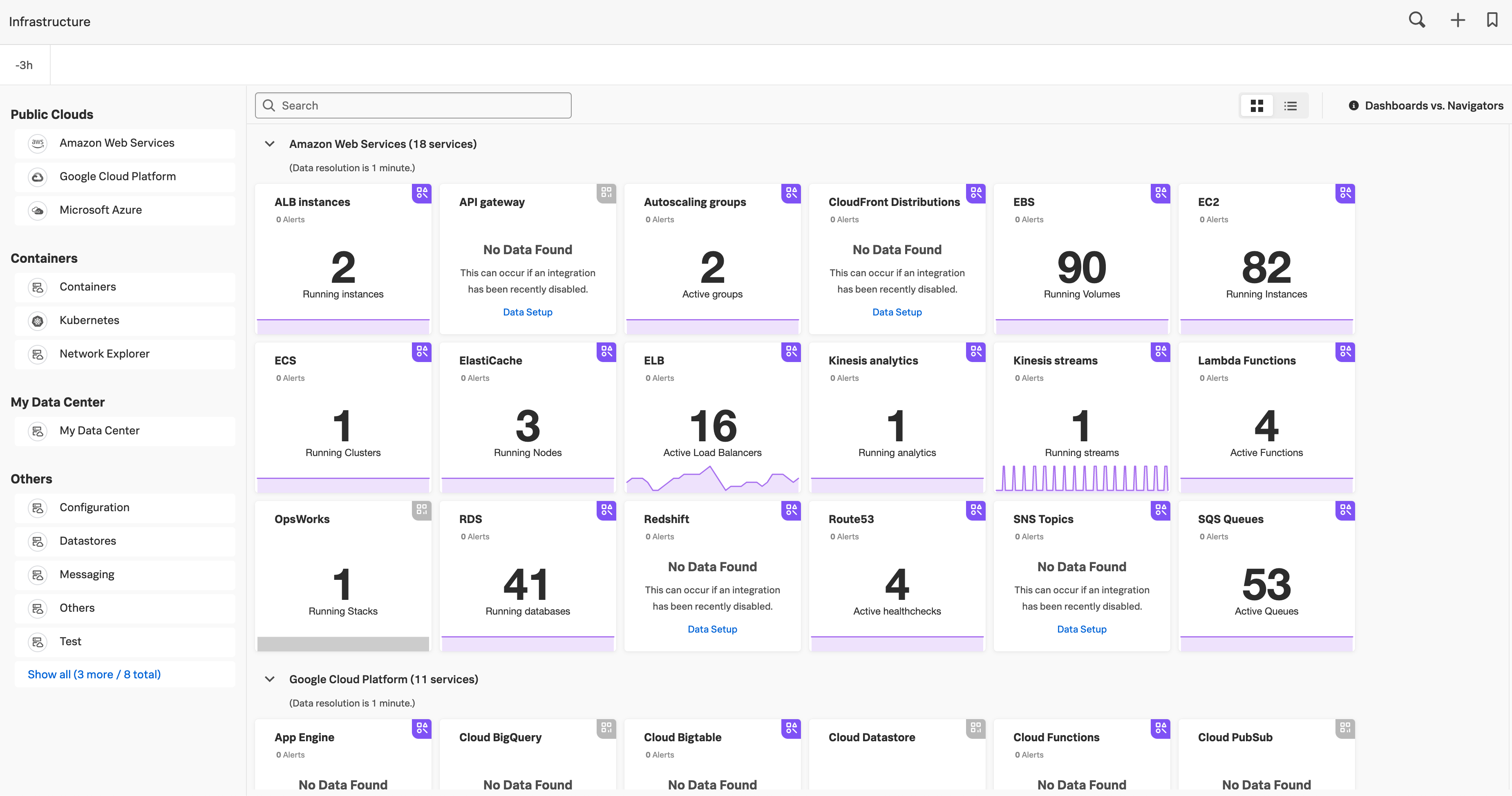
On the Infrastructure Monitoring landing page, each card represents a navigator, corresponding to the services you monitor in Splunk Observability Cloud. A navigator card shows a count of instances in the population and highlights critical alerts linked to that population.
Monitor all instances in a navigator
In most navigators, you have two options to monitor your instances: table view and heat map view.
By default, for AWS, Azure, and select GCP navigators (Google Compute Engine, Google Kubernetes Engine, and Google Cloud Storage), if the region property is available on your data, your instances are grouped by region. Default grouping is applied to both table and heat map views.
The following table shows how instances are sorted in each view:
Instance monitoring option |
Description |
|---|
Table view |
Default view for a navigator.
Instances are sorted in descending order based on the relative value of the metric you select from the Color by drop-down menu.
|
Heat map view |
Each square has a color that represents the relative value of the metric you select from the Color by drop-down menu.
The colors range from low values (lighter colors) to high values (darker colors). You can’t change the default colors for each Color‑by option. The navigator automatically sets the value range for each color.
|
Note
In table view, some columns might be missing data for instances reporting through the Splunk Distribution of OpenTelemetry Collector in the Amazon EC2, GCP Compute Engine, and Azure Virtual Machines navigators. This is due to differences in property names between the Splunk Distribution of OpenTelemetry Collector and native agents such as CloudWatch.
For information on customizing the content and format of the navigator, including filtering, grouping, and more, see Customize navigator display.
For interactive walkthroughs of how to use navigators in Infrastructure Monitoring to troubleshoot your web server or observe your application and the underlying infrastructure, see Splunk Infrastructure Monitoring web server troubleshooting scenario and Splunk Infrastructure Monitoring application monitoring scenario .
For a list of all the available navigators, see Available navigators.
Note
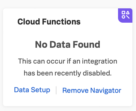
The format and content displayed in the navigator for AWS Lambda is different from what is discussed below.
Drill down
In heat map view, when you hover over a square in a navigator, you can see the information about the instance represented by the square. Click a square to drill down into that instance.
Alternatively, while in table view, you can click the instance ID of an instance to drill down into that instance.
For example, if you click a square representing a host instance, you can see system metrics information in the built-in dashboard with charts. You can also find various properties of the host, processes running on the host, and so on on the Properties sidebar.
Note
The color or statistics for an element might change as you drill down or click through your system. This is because the information might be refreshed between the time you begin navigating and the time a target element is displayed.
As you drill down into a single instance, you can use the breadcrumb trail to switch to the drilldown view of another instance or to return to the navigator view.
Use the Dashboard section
The Dashboard section contains built-in dashboards that provide access to detailed information about the instances displayed.
Dashboards in navigators are read‑only, so you can’t directly make any changes to them. However, you can clone a built-in dashboard to make changes to the clone, or download a built-in dashboard. As an admin, you can also add or remove custom dashboards, and hide any built-in dashboards that you don’t use.
To learn more, see Clone a built-in dashboard in a navigator and Export a built-in dashboard in a navigator in the Built-in dashboards documentation.
Note
Amazon EC2, GCP Compute Engine, and Azure Virtual Machines instances are powered by their respective public cloud services as well as the Splunk Distribution of OpenTelemetry Collector. You need both for all the charts to display data in the built-in dashboards.
If you have only the public cloud service and the Smart Agent configured, some charts in the built-in dashboards for Amazon EC2, GCP Compute Engine, and Azure Virtual Machines instances display no data.
If you have only the public cloud service configured, you can see all the cards representing the services where data come from, but some charts in the built-in dashboards for Amazon EC2, GCP Compute Engine, and Azure Virtual Machines instances display no data.
If you have only Smart Agent configured, Amazon EC2, GCP Compute Engine, and Azure Virtual Machines instance navigators aren’t available.
Customize navigator display
The control bar within each navigator lets you modify which instances are shown, how they are grouped, which metric you are focusing on, and so on.
Use Navigator pinned filters
To ensure quick access to commonly-used filters, many navigators include a curated set of filters that you can apply through buttons on the bar at the top of the navigator home screen. Navigator pinned filters are built into the interface.
Pinned filter options vary from one navigator to another. For example, pinned filters for EC2 navigators (such as Environment, Service, Region, and Zone) are not identical to the set of pinned filters for Kubernetes navigators, because Kubernetes artifacts can be filtered by Cluster and Namespace rather than Region and Zone.
To apply a Navigator pinned filter, do the following:
On the Infrastructure Monitoring landing page, select a navigator to open it.
At the navigator home screen, select the pinned filter you want.
In the drop-down menu of suggested building blocks for that filter, click the checkboxes for the conditions you want to apply. You can select all the conditions at once, or add conditions through individual clicks on those you want.
(Optional) Repeat steps 2 and 3 to pin another relevant filter.
Data in the navigator automatically reflects the application of whatever filter selections you make.
Note
You can apply more than one filter to the dataset for your navigator. Filter settings build on each other. If you manually apply a filter to a field that is already part of a navigator pin filter calculation, the manually-applied values are added to the values in the pin filter.
Add filter
Select Add Filter to create a filter and view a specific slice of your environment based on dimensions or properties you specify. Filtering is particularly useful for viewing only the instances running a specific service, or in a particular availability zone.
Filters that you apply to your host instances also filter dependencies in the navigator sidebar. To learn more about the navigator sidebar, see View dependencies in the same topic.
Customize time range
By default, you see data from the last three hours. You can use the time picker to select a new time range. When you select a new time range, the navigator updates to show the status of instances during that time.
If the time between the end and start dates of your selected time range is more than seven days, the navigator might take longer to respond.
Color by
Use the Color by drop-down menu in the control bar to specify the metric you want to use to color the squares. Square color values vary depending on which Color‑by criteria you choose.
For example, if you select CPU Utilization, colors range from green (lowest 20% of values among all instances) to red (highest 20% of values among all instances). For many metrics, red indicates intensity of performance rather than a problem situation.
White squares indicate instances that do not emit values for the specified metric.
Black squares indicate instances considered “dead” by Infrastructure Monitoring because they do not emit values for a specified period of time.
You can specify settings related to these non-emitting instances by selecting Navigator Settings from the Actions menu (⋯). When the instances begin emitting values again, the squares are recolored accordingly.
Group by
Use the Group by drop-down menu in the control bar to partition instances by the selected dimension or property. As you hover over or select the different options in the list, the instances immediately rearrange themselves in the navigator. This feature lets you do a hierarchical grouping of up to two levels.
In some cases, you might see an option titled “n/a” in the drop-down menu. This group contains instances that don’t have a value for the Group‑by dimension or property you specify.
When you specify a Group‑by field, you can select a group name to filter the navigator to only show the instances in that group. The breadcrumb trail updates to indicate your selected group.
Find outliers
Apply outlier detection to identify instance outliers in your data. Outliers are denoted by the color red based on values of the Color by metric.
Outlier detection can be determined by one of two strategies that are common in data analysis:
For example, if instances are grouped by the service that they are running, colored by cpu.utilization, and outlier detection is enabled, then instances that use significantly more CPU than their others are highlighted in red. You can then investigate those specific instances to determine why they are behaving differently.
While both outlier strategies highlight instances that are behaving differently from others, if the population has two groups of outliers, such as when most instances are running at 20% CPU utilization but three are running at 60% one is running at 80%, deviation from mean finds the greater outlier (instances running at 80%), while the deviation from median can typically identify both groups. You can always switch from one strategy to another to find the one that works best for your specific environment.
The Find Outliers feature also provides a population selector that lets you restrict the comparison population to only those instances that have similar characteristics (as defined by the Group By dimension). For example, you might not want to compare a server against others that are running different software. It is more relevant to determine outliers among servers providing the same service. Grouping instances by the service that they run and using that as your population basis ensures that instances are compared only with their peers to determine if they behave abnormally.
Use metric classes
By default, some navigators display a multi-metric table view with a subset of metrics and KPIs used to monitor the performance of your instances. You can customize the multi-metric table view by using predefined metric classes, which are groupings of related metrics and KPIs useful for troubleshooting specific aspects of your deployment.
If predefined metric classes are available for the navigator, you can use the Metric class drop-down menu in the table view to customize your view.
The Metric class drop-down menu only appears if the navigator has predefined metric classes. For more information on the available predefined metric classes, see Available predefined metric classes.
View dependencies
In table view, heat map view, or the single instance view, select the Dependencies tab to track the dependencies for:
Kubernetes containers.
Hosts (My Data Center hosts, virtual hosts, Amazon EC2 hosts, Azure Virtual Machines, and Google Cloud Platform hosts).
Services running on Kubernetes containers or hosts.
The following table describes the content displayed in the Dependencies tab for different navigators:
Navigator |
What you see in the Dependencies tab |
|---|
Kubernetes navigators |
The services and hosts that are running on the Kubernetes entity. |
Host navigators |
|
Other navigators |
The Kubernetes entities or hosts that the services are running on. |
Best practice
To get the most out of the Dependencies tab, configure the services you want to track in the Splunk Distribution of OpenTelemetry Collector configuration file as service.name values under extraDimensions. By configuring service.name values, you can see more details about your data, such as which individual services are running on specific host instances.
Example
For example, the redis-cart service is included in this Splunk Distribution of OpenTelemetry Collector configuration.
receiver_creator:
  receivers:
    smartagent/redis:
     rule: type == "pod" && name contains "redis"
     config:
       type: collectd/redis
       host: redis-cart
       port: 6379
       extraDimensions:
         service.name: redis-cart
For more information on the Splunk Distribution of OpenTelemetry Collector configuration, see Collector components.
View alerts using navigators
If a service has any active alerts, you can view a list of the service’s alerts through navigators.
Select Infrastructure from the Splunk Observability Cloud home page.
Search for the navigator that you want to view.
Under the navigator title, select the text displaying the number of alerts. Alert numbers and types vary depending on the navigator.
For the following example navigator, the user selected 90 Critical alerts.
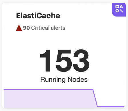
Selecting this text opens a detailed view of the navigator with a list of active alerts shown on the sidebar.
View navigators using alerts
When you’re investigating an alert, you can refer at a glance to Infrastructure in the Next Steps section of the modal window displaying that alert. The section displays a link to the relevant Infrastructure Monitoring navigator. Select that link to open the navigator without losing contextual metadata from the alert. Applicable metadata passes automatically from the alert to the navigator.
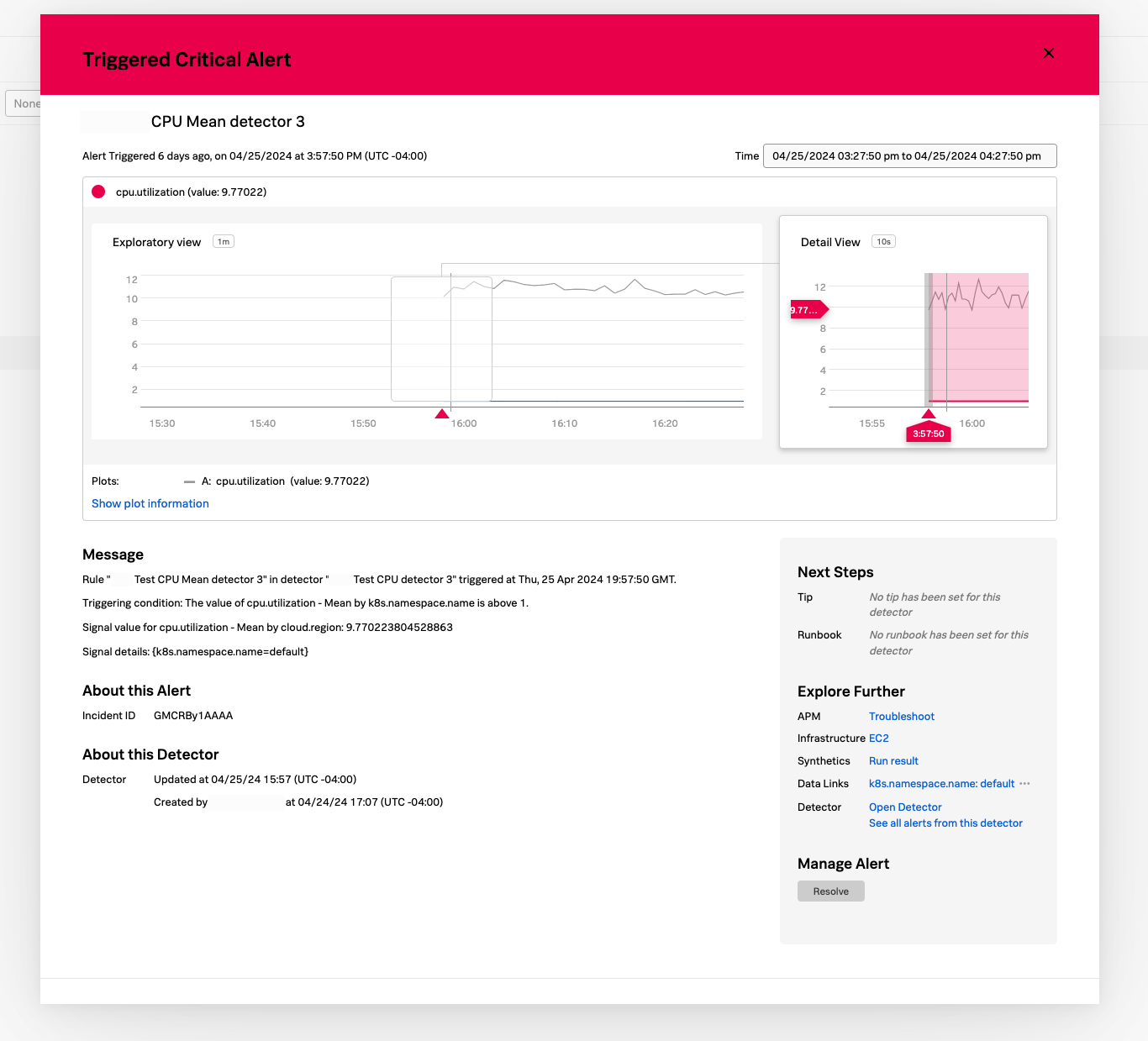
Variable data passed from alerts to navigators includes the time that the alert occurred as well as relevant metrics and properties from the alert.
By linking alerts in real time with the navigators that triggered them, the “alert to navigator” experience makes troubleshooting faster.
Remove an inactive navigator
Note
You need to be an admin to remove a navigator.
When data for an integration hasn’t been received for 72 hours, the navigator for that integration becomes inactive, and you have the option remove it from view. The navigator automatically reappears if data for the integration is received again.
Follow these steps to remove an inactive navigator:
Select Infrastructure from the Splunk Observability Cloud home page. You can only remove a navigator when you’re in the Infrastructure Monitoring landing page view.
On an inactive navigator, select Remove Navigator.
Confirm your selection.