Chart options in the Chart Builder 🔗
Need some context? See Plot metrics and events using chart builder in Splunk Observability Cloud.
In addition to customizing individual plots on a chart, you can set a number of options on the Chart Options tab that apply to the entire chart.
The options that are available depend on the type of chart; no chart type supports all the available options. To learn more, see Chart options compatibility matrix.
See the following sections for all available chart options.
Calendar time zone 🔗
The time zone used for aligning data timestamps and interpreting calendar cycles in analytics functions that perform calculations over calendar windows. To learn more, see Calendar window transformations. All such functions in a chart use the same calendar time zone. You can also view and change the value set here when you edit any calendar window function in the Chart Builder. This option has no effect if there is no function using calendar windows.
Color by dimension 🔗
Color by dimension is generally appropriate when you have one metric you want to look at across multiple sources and want to be able to compare what those sources are doing. For example, in a chart that displays API latency by availability zone, coloring by dimension helps you compare latency across zones.
Color by metric 🔗
Color by metric is generally appropriate when you have more than one metric you want to look at in a given chart. For example, if you display cache hits in plot A and cache misses in plot B, coloring by metric lets you compare the total number of hits with the total number of misses.
You can also use plot names to ensure that plots representing similar metrics and dimensions are displayed in different colors. To learn more, see Plot name. For the purpose of plot display color selection, a different plot name is interpreted as a different metric. If you want two plots with similar signals and dimensions to appear in different colors on the chart, edit the plot names to make sure they contain different text, and select Color by metric. After you do so, the colors of the plots are different from one another.
Color by value 🔗
On a single value chart or a list chart, you can use this option in conjunction with its secondary visualization to have the colors on the chart represent the status of the metric, based on thresholds you specify. For example, if a value goes above (or below) a threshold, the number can be displayed in red. This lets you see status at a glance when looking at the chart on a dashboard.
Note
Using Color by value overrides any plot color setting you might have specified in the plot configuration panel. To learn more, see Plot color. In addition, the Color by value option only applies to the value, not to the color of the chart border, which can change when you link a detector to a chart. To learn more, see Link detectors to charts.
On a heatmap chart, you can use the Fixed option for Color thresholds to specify threshold ranges and colors. These values determine what colors are used for squares in the chart.
A similar option is available for histogram charts. To learn more, see Color theme.
Use with a secondary visualization option 🔗
Caution
If you use the Fixed color threshold option on a heatmap chart, this section doesn’t apply. See Specify threshold ranges and values instead.
Select the secondary visualization type you want to use. To learn more, see Secondary visualization.
If necessary, select Value from the Color by dropdown menu to display the threshold selector. If you have already specified a secondary visualization of Radial or Linear, Color by value is the only option available.
If you are using a secondary visualization of Radial or Linear, set minimum and maximum values, or accept the defaults. These values let Splunk Observability Cloud know how to display the lower and upper boundaries of the visualization.
See Specify threshold ranges and values to learn how to set ranges and colors.
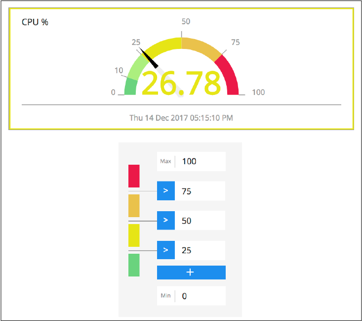
Specify threshold ranges and values 🔗
To specify threshold ranges, start by entering a single value; by default, numbers above this value are displayed in red and numbers below or equal to the value are be displayed in green. You can change these colors, as shown in step 3 below.
You can specify up to four values, which can define up to five color ranges. To specify if a range should be defined as greater than or equal to a value (>=), as opposed to the default of greater than a value (>), click the > symbol to the left of the value.
Enter the first (highest) value you want to represent in the range. For example, if you plan to have values of 25, 50, and 75, enter 75 first.
Note
You must enter the numbers from highest to lowest. However, you can edit them at any time, as long as they are in descending order when you finish.
Click + to increase the number of color ranges. If you change your mind about the number of ranges you want to specify, hover over the value you want to remove and click the x that displays.
By default, Splunk Observability Cloud assumes that low values are desirable (green) and high values are undesirable (red), which is appropriate for metrics such as Latency or CPU Utilization. To set thresholds where lower values are undesirable (for example, if the metric is Available Memory), click the color chips to change them to your desired color. You can use one of the standard colors or click More to see a color palette with more colors to choose from.
As you enter values for ranges, the color changes based on the thresholds you enter. For single value charts, the color of the value changes to reflect the range it falls in. In the illustration below, the number is yellow and there is a yellow border because the value is in the range between 25 and 50.
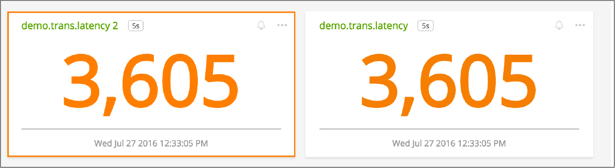
On a dashboard, the border lets you determine at a glance if you have used Color by value to specify thresholds. This feature is especially useful when you use a secondary visualization of Sparkline or None with a single value chart, because you are not seeing the threshold ranges as you are with Radial or Linear visualizations.
In the following illustration, the border on the left indicates that value is orange because it meets a threshold condition. The color of the value on the right reflects the color that is set (or is the default) for the plot in the chart.
Color theme 🔗
Use this option to specify the color family to use when you populate a histogram chart. To learn more, see Histogram charts. The color you select represents the darkest value on the chart; other values are shown with progressively less saturation.
Similar options are available for heatmap charts (see Color thresholds) and for single value and list charts. To learn more, see Color by value.
Color thresholds 🔗
Use this option to specify whether squares on a heatmap chart should be colored from light to dark in a single color range (see Auto color threshold) or should be colored based on color ranges and values you choose (see Fixed color threshold).
Similar options are available for histogram charts (see Color theme) and for single value and list charts (see Color by value).
Auto color threshold 🔗
By default, heatmap charts have a Color threshold setting of Auto, with no minimum or maximum values specified. This means that:
Squares are colored from light to dark in a single color range.
Each color represents one of 5 ranges, based on the actual minimum and maximum values at the time the chart is refreshed (based on its resolution setting). For example, if values range from 0 to 100, the lightest squares represent values ranging from 0 to 20 and the darkest represent values ranging from 80 to 100.
There are always 5 ranges, but you might not see all ranges represented on the heatmap if you have no sources reporting a value in a given range.
Square shading is dynamic, and can change as the minimum or maximum value changes.
You can customize the auto threshold coloring in the following ways:
Specify a fixed minimum value, a fixed maximum value, or both.
For example, suppose you know that most of the values in your chart are between 0 and 1000, with a few outliers in the range of 5000. If you don’t set a maximum, the outlier values are taken into account when shading the squares, which gives you a less representative display. Instead, if you set a maximum value of 1000, the bulk of your squares are shaded in 5 ranges between 0 and 1000, and any values over 1000 are displayed in the darkest color, regardless of their actual value.
Choose a different color scheme.
The default color scheme is shades of green. Click one of the color swatches next to the Max or Min field to choose a different color scheme, or greyscale.
Fixed color threshold 🔗
Select Fixed from the Color thresholds drop-down menu to display the threshold selector, which lets you specify how many color ranges you want to display and the values that each range reflects. The colors of the squares update dynamically based on their values and the ranges you specify.
For example, suppose the squares represent percent of cache misses per host. If you want all hosts reporting values higher than 30% to be colored red, select Fixed and set a single threshold value of 30. Hosts with cache misses below 30% appear green, and those above 30% appear red.
For more information, see Specify threshold ranges and values.
Data table columns 🔗
Use this option to specify which columns you want to display in the data table. To learn more, see View detailed metric data.
By default, all dimensions relevant to the plots on the chart are displayed, along with one or more other fields. To specify which fields are displayed, click Custom. Toggle items on and off as desired.
Note
To learn more about editing the plot names displayed, see Plot name.
To re-order the fields, click and drag the icon that appears when you hover over the items on the list.
Default time 🔗
The default time range applied to most new charts is the last 15 minutes (-15m). However, if a new chart contains AWS-specific metrics, the default time range is the last hour (-1h). This is because AWS metrics are reported less frequently than most other metrics, so a range of one hour is more likely to contain a useful number of data points to display.
Depending on the purpose of the chart, you might want to see values for a longer or shorter time period. Use this option to change the default time range for a chart. To learn more, see Select time range with the time range selector. The value you specify is applied whenever you open the chart or view it in a dashboard, unless there is a time range override. To learn more, see Time range.
Time range and heatmap charts 🔗
By default, a heatmap chart reflects the data point received when the chart last refreshes; charts refresh every 5 minutes. You can specify an absolute time range to see values representing the last data point received at an earlier time. For example, if it is now 3 PM, you could specify a time range ending at 1 PM to see what the heatmap values were approximately 2 hours ago. To learn more, see Specify an absolute time range.
Note
If you want to see past values, don’t choose a relative time range from the Time Range Selector. Choosing a relative time range only continues to display the most recently received data point. Instead, specify an absolute time range.
Description 🔗
In addition to providing a title for a chart, it’s often a good idea to provide additional information about the chart. Providing this information helps other users in your organization understand the data being displayed in the chart.
Display fields 🔗
Use this option to specify which fields you want to display alongside list values in a list chart. To learn more, see Data table columns.
Disable sampling 🔗
In cases where a large number of time series are displayed, for example, when you choose a metric being reported by 500 servers, Splunk Observability Cloud samples a subset of those time series so the chart renders more quickly. The sampled display provides you with an approximate sense of the values in those time series. Analytics still apply to all data.
When data is sampled, you can see a message like this on the chart:

If you click Click here to disable sampling, or check the Disable sampling checkbox in the chart options tab, the sampling message is no longer displayed, and any time series data previously omitted is shown. Depending on the number of time series, disabling sampling might cause the chart to render more slowly.
Group by 🔗
This option lets you select up to two levels of grouping for your data. In the following illustration, results are grouped by plugin_instance within aws_availability_zone.
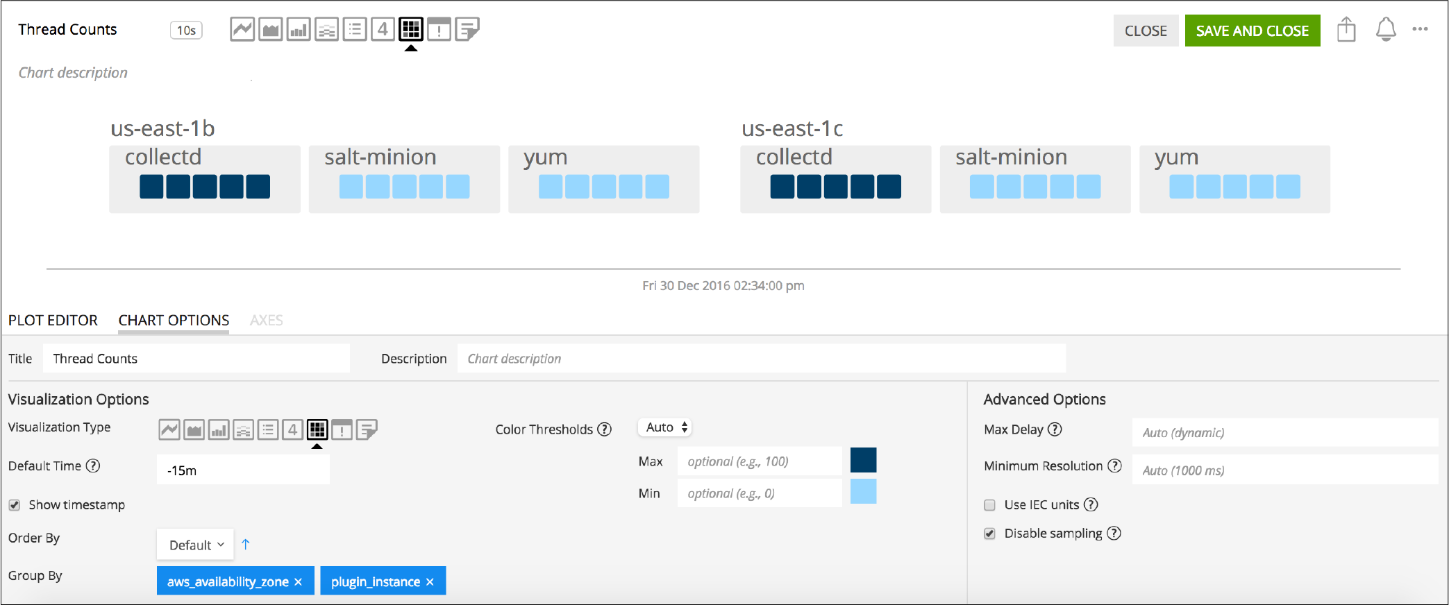
In some cases, you may see a group titled “n/a”. This group comprises metric time series (MTS) that don’t have a value for the Group‑by dimension you specify.
Include zero on Y-Axis 🔗
When selected, this option ensures that a value of zero is included on a Y-axis that is dynamically scaled to accommodate data values.
When plotting values on a chart, Splunk Observability Cloud by default dynamically scales the Y-axis so that the minimum and maximum values are close to the lowest and highest values of the signal. For example, if values range between 2 and 5, the lowest value on the Y-axis is approximately 2. Similarly, if the values range between -5 and -2, the highest value on the Y-axis is approximately -2.
In some cases, however, you might want the respective minimum or maximum displayed to be zero. Including zero can give you a sense for the scale of the values, as well as for the absolute size of the changes or fluctuations over time.
In the following illustration, the chart on the right has this option enabled.

If you have specified a minimum or maximum value for an axis (see Use the Axes tab), zero might not be shown on the Y-axis even if this option is enabled. For example, if you set a minimum value of 50 or a maximum value of -20, zero isn’t shown on the Y-axis; conflicting minimum or maximum values on an axis overrides this option.
Max delay 🔗
By default, the Max delay field is set to Auto, which allows data to come in with as little delay as possible.
If you know that some of your data is delayed and you want to wait for that data to arrive before your charts are updated, click the drop-down menu and choose a new value from the list. For more information, see Delayed data points.
The value you specify is applied whenever you open the chart or view it in a dashboard, unless there is a max delay override. To learn more, see Max delay value.
Maximum precision 🔗
This option specifies the number of digits to display for a value on a single value chart or list chart. When precision is Automatic (the default), the number of digits displayed depends on the space available. The examples shown below compare results when using the values of 2, 3, or 4, but other values are also acceptable. The actual number of digits displayed might be more than the maximum you specify, depending on the value; for example, whole numbers are displayed in full.
Value |
Maximum precision |
Display |
|---|---|---|
1235.76 |
2 |
1236 |
3 |
1236 |
|
4 |
1236 |
|
23.576 |
2 |
24 |
3 |
23.6 |
|
4 |
23.58 |
|
0.23532 |
2 |
0.24 |
3 |
0.235 |
|
4 |
0.2353 |
Minimum resolution 🔗
This option specifies the minimum interval for which Splunk Observability Cloud should roll up values to display a data point on the chart. For example, if you track the number of support calls received per hour, you might not want to see a chart that shows data points representing the number of calls received every 15 minutes, even if data is available at that resolution. Setting this option to 1h ensures that the data points represent values for periods of 1h or more.
To learn more about rollups, see Rollups.
No active metrics message 🔗
This option allows you to add an optional message on graph charts, heatmap charts, list charts, and single value charts to indicate when metrics used in a chart either don’t exist or are inactive.
A metric is considered inactive by Splunk Observability Cloud in the following cases:
The metric hasn’t received any data for 24 hours.
The metric is tagged as
ephemeraland hasn’t received any data for one hour.
Note
A chart with inactive metrics is distinct from a chart with active metrics that doesn’t receive data. For example, a chart might not receive any data despite using active metrics if you use a filter on the chart that doesn’t match any data. On a chart with active metrics, the “no active metrics” message won’t appear even if the chart isn’t receiving any data.
You can specify the following fields for the no active metrics message option:
Field |
Description |
Max length (characters) |
|---|---|---|
Message |
A message that displays in a chart when no active metrics is available |
140 |
Link |
This field has two sub fields:
- Display text: The display text for the URL
- URL: A link to the resource that provides additional information
|
- Display text: 50
- URL: No limit
|
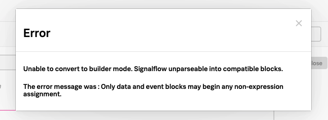
When your message doesn’t appear 🔗
The “no active metrics” message might not appear for charts with inactive metrics in the following cases:
When you use the
graphite()functions in your chart. Splunk Observability Cloud uses the Metric Finder to determine which metrics are inactive, but the Metric Finder doesn’t work on metrics used by these two functions. To learn more about these functions, see graphite() .When you use custom SignalFlow that the SignalFlow API can’t parse in your chart. This can happen even if the custom SignalFlow is valid. When the SignalFlow API can’t parse your custom SignalFlow, you will get this error message when you click View Builder in the Plot Editor tab.
Order by 🔗
This option specifies how you want the squares on a heatmap to be sorted. For example, if you want to see the largest or smallest values in a predictable location in the heat map, select Value. You can sort by any dimension or property associated with the metric. Click the arrow to toggle between ascending and descending sort order.
Note that on a list chart, a sorting option is also available, but it is called Sort instead of Order by. To learn more, see Sort.
Refresh every 🔗
While graph charts refresh in real time, some other chart types (such as single value or list charts) refresh only periodically. For these charts, you can specify a Refresh Every option to set how frequently the display updates.
Note
The refresh interval cannot be lower than the native resolution.
The Referesh every option can have undesired side effects when paired with the lag that can be observed for incoming data, as is sometimes the case with AWS CloudWatch data. For example, if a list displays the current value for a subset of incoming time series indicating latency for the top 25 ELB load balancers and the time series are reporting at a 5m resolution but the refresh interval is set to 5s or 1m, then chances are at any particular refresh, not all of the time series report, and the list appears more sparsely populated as a result.
Secondary visualization 🔗
On a single value chart or list chart, you can use this option to specify how you want the value or list to be displayed.
Sparkline 🔗
A sparkline provides a visual representation of how a value changes over time. When using this visualization, you can color by dimension, metric, or value. To learn more, see Color by dimension, Color by metric, or Color by value.
On a single value chart, the sparkline is displayed below the value. On a list chart, it is displayed to the left of the value.
Radial 🔗
A radial secondary visualization displays values in a format that resembles a speedometer. When you select this option, the display is dark grey until you enter at least one value (see Color by value). Radial visualizations are always colored by value.
On a single value chart, the graphic representation is displayed above the value. On a list chart, the graphic is displayed to the left of the value. On both chart types, the number is displayed in the color corresponding to its threshold range.
Linear 🔗
A linear secondary visualization displays values in a horizontal bar. When you select this option, the display is dark grey until you enter at least one value (see Color by value). Linear visualizations are always colored by value.
On a single value chart, the graphic representation is displayed below the value. On a list chart, the graphic is displayed to the left of the value. On both chart types, the number is displayed in the color corresponding to its threshold range.
None 🔗
On a single value chart, a secondary visualization of None displays only the value as a large number, with no sparkline or any other graphic representation. On a list chart, values on the list are displayed with no graphic to the left of the numbers. When using this visualization, you can color by dimension, metric, or value. To learn more, see Color by dimension, Color by metric, or Color by value.
Show data markers 🔗
This option lets you specify whether small dots are displayed on the chart, indicating the times at which there are data points.
Show events as lines 🔗
This option lets you specify whether vertical lines are displayed at times where event markers are shown on a chart. To learn more, see Display events as they occur.
Show on-chart legend 🔗
This option lets you specify a dimension to be displayed in a legend below the chart. The legend shows the value of the specified dimension associated with each plot in the chart, in the same color as the plot.
If the chart uses left and right Y-axes, information is displayed on the left or right side of the chart, according to the axis used by the specified plot. To learn more, see Left and right Y-axes.
Show timestamp 🔗
This option lets you specify whether to show a timestamp at the bottom of the chart.
Sort 🔗
This option lets you specify the order in which entries are displayed on a list chart.
Note that on a heatmap chart, a sorting option is also available, but it is called Order by instead of Sort. To learn more, see: Order by.
Stack chart 🔗
This option lets you stack areas or columns vertically instead of side by side. All plots should use the same Y-axis. To learn more, see Left and right Y-axes.
You can change the order of the plots to control how the values are displayed in the stack. To learn more, see Configure plot order in a chart.
Title 🔗
The title is displayed at top left in the Chart Builder and is also shown when viewing the chart on the dashboard. You can use the chart: prefix to search for a title when using the global search.
It’s good practice to give a chart a short descriptive title. To provide additional details that are visible when the chart is open in the Chart Builder, see Description.
Use IEC units 🔗
This option lets you specify whether Y-axis values are shown in decimal units (1k = 1000) or IEC units (1k = 1024).
Visualization type 🔗
Chart options compatibility matrix 🔗
The following table shows which chart options are available for which chart type.
Chart option |
Available for line charts |
Available for area charts |
Available for column charts |
Available for histogram charts |
Available for list charts |
Available for single value charts |
Available for heatmap charts |
Available for event feed charts |
Available for text charts |
|---|---|---|---|---|---|---|---|---|---|
x |
x |
x |
x |
x |
x |
x |
|||
x |
x |
x |
x |
x |
|||||
x |
x |
x |
x |
x |
|||||
x |
x |
x |
x |
x |
|||||
x |
|||||||||
x |
|||||||||
x |
x |
x |
x |
||||||
x |
x |
x |
x |
x |
x |
x |
x |
||
x |
x |
x |
x |
x |
x |
x |
x |
x |
|
x |
|||||||||
x |
x |
x |
x |
x |
x |
||||
x |
|||||||||
x |
x |
x |
x |
||||||
x |
x |
x |
x |
x |
x |
x |
|||
x |
x |
||||||||
x |
x |
x |
x |
||||||
x |
x |
x |
x |
x |
x |
x |
|||
x |
|||||||||
x |
x |
x |
|||||||
x |
x |
||||||||
x |
x |
x |
|||||||
x |
x |
x |
x |
||||||
x |
x |
x |
x |
||||||
x |
x |
||||||||
x |
|||||||||
x |
x |
||||||||
x |
x |
x |
x |
x |
x |
x |
x |
x |
|
x |
x |
x |
x |
x |
x |
x |