Plot metrics and events using chart builder in Splunk Observability Cloud 🔗
Charts are highly customizable. This topic describes how to use chart builder’s tools and options to customize your charts to display signals (metrics and events) in an intuitive and compelling way.
Note
Use the chart builder only if you are already familiar with Splunk Observability Cloud charts and are ready to dive into its more advanced features. For a simpler approach to creating charts, see Create a chart using the metrics sidebar.
If you are editing an existing chart, you might want to start by configuring plot lines already on the chart (see Set basic plot options and Set options in the plot configuration panel).
Specify a signal for a plot line 🔗
A signal is the metric or histogram metric you want to plot on the chart, to which you might add filters and apply analytics. Plot lines, or plots, are the building blocks of charts. A chart has one or more plots, and each plot is composed of the metric time series or histogram metric represented by the signal and its properties and dimensions, any filters, and any analytics applied.
Note
Instead of a metric, you can also enter a time series expression to create a composite or derived metric, specify an event to be displayed on the chart, or link a detector to a chart to display its alert status on the chart.
To access chart builder, open the navigation Menu and select Dashboards. In the Create menu (+), select Chart.
Enter a metric name or tag 🔗
If you know the name of the metric or histogram metric you want to view, enter its name directly into the Signal field on the Plot Editor tab. Splunk Observability Cloud uses type-ahead search to show you any metrics that match what you are typing.
Splunk Observability Cloud lets you build a chart to plot a signal for which you have not yet started sending data. Enter the name of the metric or histogram metric you expect to plot and select Enter. When data starts arriving for that signal, it is displayed on the chart.
Use wildcards 🔗
You can use wildcards when entering a metric name into the Signal field.
If your metrics follow the naming conventions for Graphite metrics, see Graphite options for plots for information on using Graphite wildcards and node aliasing.
Note
Wildcard searches return results across all data types. For example, histogram.* returns all metrics and histogram metrics with names matching the search query.
Enter a time series expression instead of a signal 🔗
Another valid entry in the Signals field is a time series expression: a mathematical expression that depends on one or more of the other plots in the chart. Expressions are useful for ratios, rates of change, or any other composite or derived metric you can think of that can be specified using a formula.
Select Enter Formula to enter a formula in the Signals field.
For example, suppose you want to display the percentage of cache hits for a system. If plot A displays a count of cache hits, and plot B displays a count of cache misses, you can use the following formula in plot C to display the percentage of cache hits:
(A/(A+B)) * 100
To see only the composite metric C on the chart, select the eye icon to the left of plots A and B to hide them from the display.
Note
The formula field only accepts arithmetic symbols (+, /, -, *), parenthesis, numbers, and letters representing the plot keys.
Determine the kind of entry a plot is displaying 🔗
If there is any potential for confusion about whether a text entry is an expression, a metric, or an event, Splunk Observability Cloud displays different icons to help you disambiguate:
A ruler icon represents a metric.
A calculator icon represents a mathematical expression.
A diamond icon represents a custom event.
A warning triangle icon represents an alert (event triggered by a detector).
A black bell icon represents a linked detector.
Work with multiple plots 🔗
A chart can contain many plots. After adding multiple plots, you might want to reorder them to make the chart more readable, or to control how they are displayed in the chart. For more information, see Configure plot order in a chart.
You might also want different plots to have different colors or other visualization settings. For more information on customizing a plot, see Set options in the plot configuration panel.
Plot different metric types sharing the same name 🔗
When you send multiple metric types, for example, counter metric and histogram metric, to Splunk Observability Cloud, it is best to use distinct names in order to avoid complications with data processing and analytics.
If you use the same name for different metric types, Splunk Observability Cloud assumes all of these metrics are not histogram.
In this case, if you want to plot a metric as histogram, do the following steps to edit the SignalFlow program:
Select View SignalFlow on the Plot Editor tab.
Change the
data()function tohistogram(). For example, changedata('service_latency')tohistogram('service_latency').Remove the
publish()method as it’s not supported for thehistogram()function.Add a supported method to the SignalFlow program. For example,
histogram('service_latency').sum().
For more information on histogram function and supported methods, see histogram() in the SignalFlow reference documentation.
Use archived metrics in charts 🔗
When you select an archived metric as a signal in your chart, the archived metric can’t be plotted.
To include an archived metric in a chart, route the archived metric to real-time or create exception rules to make it available. For more information, see the Use routing exception rules to route a specific MTS or restore archived data section.
To learn more about MPM, see Introduction to metrics pipeline management.
Filter the signal 🔗
Once you’ve selected a signal, you need to determine the scope of what you want to look at. Splunk Observability Cloud allows you to filter down the signal using metrics metadata.
For example, you might want to look at the latencies for a service, but only for the production environment. In Splunk Observability Cloud, the latency is your metric, and the service and environment names are both likely to be part of the metadata associated with the metric.
As filters are applied, the data shown in the chart updates in real-time, as a way of helping you confirm that you are making the desired selection. For more information on specifying filters, including specifying NOT filters and using multiple filters, see Filters. The instructions for filtering a signal are the same as those for specifying a filter override.
Note
If you choose to allow data matching the filter condition or missing the property, as discussed in Choose what data to allow, data missing the property is excluded if you apply an analytics function and then group by that property. To do this, select Add Analytics, select a function, and then select a Group by value.
As you filter a signal, tokens representing the filter options are added to the Plot Editor tab. If the token is grey instead of the default blue, this indicates that the filter option is being overridden by a dashboard variable or filter that has propagated down to the chart. For example, this can happen when you set a Filter value in the Overrides section that conflicts with a filter you added to a plot line.
Note
If you add or edit any of the Override values, the values are applied to every chart in this chart’s dashboard when you close the chart. For more information, see Specify settings for all charts in a dashboard.
View and change a plot’s rollup or histogram function 🔗
Change rollup for metrics 🔗
Every signal has a default rollup associated with it, which is displayed as Auto. If the rollup label says Multiple, it means that different rollup functions have been applied to different metric time series (MTS) on the same plot. This happens when the rollup setting is left as default, and the plot contains metric time series that have different metric types. MTS on the same plot can have different metric types if the plot contains a wildcard query that matches many different metrics. It can also happen if the plot contains one metric, but that metric is used to record different types of measurements.
Rollups are used to adjust the chart resolution as necessary to effectively display the chart data. For more information, see Data resolution and rollups in charts.
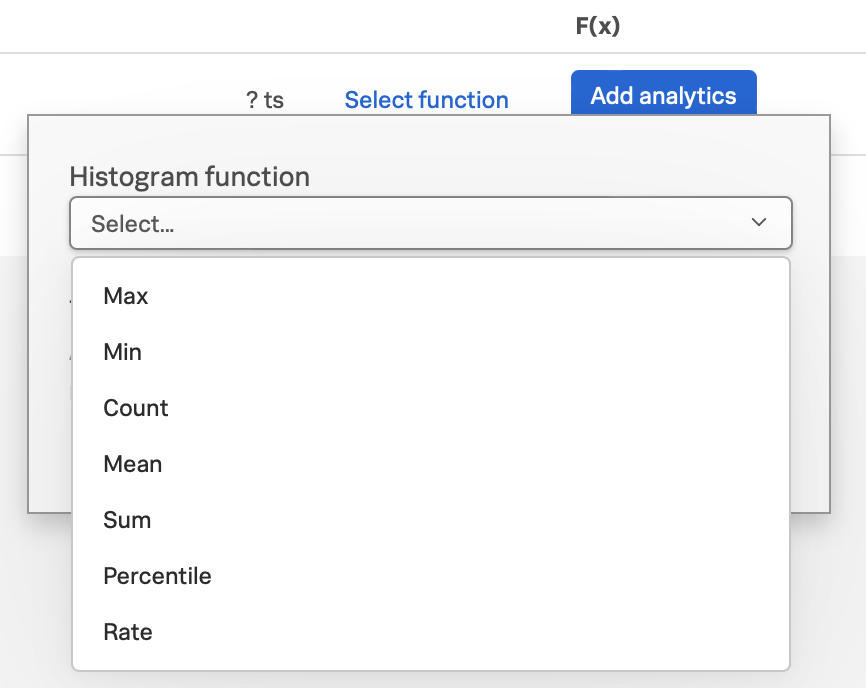
Add histogram function for histogram metrics 🔗
Because histogram data must be summarized by combining the buckets in the histogram together, when you use a histogram metric as the signal for your plot, you must add a histogram function to define how histogram data is interpreted and represented on your chart.
To add a histogram function, select Select function and choose a function from the Histogram function dropdown menu. For more information on histogram function and supported methods, see histogram() in the SignalFlow reference documentation.
Apply analytics to a plot 🔗
You can apply analytics to the time series on this plot. When you select Add Analytics, a list of available functions displays. Splunk Observability Cloud supports not only basic function, such as Sum, Count, and Mean, but also more powerful functions like Percentile, Timeshift, Top/Bottom, and Exclude. Hover over a function to see a brief description.
Note
Some analytics functions have the same name as certain rollup types, but they work in very different ways. For information on how rollups and analytics work together, see Interactions between rollups and analytics functions.
If you know the name of the analytics function you want to apply, type it into the Analytics field. Splunk Observability Cloud provides type-ahead search to show you a list of terms that match. Alternatively, scroll and choose a function from the list. If you apply a function, it displays as a token.
You can apply one or multiple analytics to a signal. If you apply multiple analytics functions to a signal, they are applied in the order in which they display. You can change the order by dragging and dropping the tokens.
Aggregations and transformations 🔗
Many analytics functions are able to perform computations on time series in two ways: aggregations and transformations. Aggregations operate across multiple time series on a plot to display a consolidated view of data, such as the sum of all database calls over a period of time. Transformations show data over a specified period, either a moving window or a calendar window, such as the number of database calls over the past 10 minutes or since the start of the day. For more information, see Aggregate and transform data.
More powerful analytics 🔗
Splunk Observability Cloud analytics can do much more than display simple metric values as described here. Analytics can take your chart from a display of raw metrics to a powerful tool that lets you compare historical data with current data, or show you trending data so you can proactively monitor system health. For more information, see Gain insights through chart analytics.
View detailed metric data 🔗
When you hover over a chart, the plot line for the time series you are focused on is highlighted, and information about the data point displays.
To see detailed information about data points in a chart, select the Data Table tab. If you haven’t pinned a point on the chart, values for the most recent data in the chart display. Alternatively, you can select in the chart to pin a point in time and display the Data Table tab.
Note
If you edited a plot name or specified display units in the chart builder, this information displays when you hover over the chart and in the Data Table. For example, instead of seeing 250 as a value, you might see 250 ms (where you specified ms as a suffix) or $250/millisecond (where you specified $ as a prefix and /millisecond as a suffix).
When you move the cursor through different areas on a chart, the plot line under the cursor is highlighted, and the detail line for that plot line is highlighted. You might have to scroll through the Data Table tab to find the highlighted information. If you have pinned a value, that value displays in the first column of the table, and you can compare other values to it as you move the cursor.
Just as hovering over a plot line highlights a line in the table, hovering over a line in the table highlights the corresponding plot line on the chart.
As you hover over dimensions in the Data Table tab, an Actions menu icon (⋯) displays. Menu options let you add a filter to the chart’s Overrides bar based on the value of the dimension. For more information on filtering an entire chart (as opposed to individual plot lines), see Filters.
Use the Chart Options tab to specify which columns to display on the Data Table tab.
You can export data from the Data Table tab to a CSV file. To do this, select the Export as CSV icon at the top right of the tab.
View events on a chart 🔗
Displaying event markers on a chart can help you see correlations between events that occur (such as a detector triggering an alert) and metrics displayed on the chart. For example, you might discover that CPU % utilization spikes when the number of concurrent users approaches a specific value. You can use this information to tune your system to minimize excessive CPU load as the number of users increases.
For background information on events, see Add context to metrics using events.
Display events as they occur 🔗
The process for adding an event triggered by a detector, or occurrences of a custom event, is essentially identical to specifying a metric as a signal. The only real difference is that if you use the metrics sidebar, you must select the Find events option to search for detector or custom event names.
Note
If you clear the Find metrics option to search only for events, none of the other search options in the metrics sidebar are available. You must enter text manually to find matching detector or custom event names. Similarly, if you add a filter, you can search only for metrics, not for events.
Event markers 🔗
Event markers are shown along the chart’s X-axis. Select the Events tab to view instructions for displaying a list of events, or creating a new custom event.
Hover over an event marker to see the event count in that time window, grouped by severity.
Custom events are shown as hollow diamonds.
Alerts generated by detector events are triangles, color-coded to display the severity of the alert. Solid triangles indicate the event was triggered. Hollow triangles indicate the event cleared.
Click near an event marker to see a list of events for that time interval on the Events tab. The Type column indicates alert status as Triggered or Cleared, and displays the event type for custom events. Information about when the event occurred, how long it took for an alert to clear (or if it is ongoing), and information about the detector that triggered the event display.
Note
If an alert and a custom event occur during the same interval, only the alert marker is displayed. However, any custom events are listed in the events list.
To make it easier to spot correlations between events and metric values, you can display a vertical line along with the event marker. This line is color-coded just like the event marker at the bottom of the chart. To add vertical lines to the markers on the chart, select Show events as lines on the Chart Options tab.
Note
You can also overlay event markers onto charts that are displayed on a dashboard.
Manually add custom events 🔗
To manually add a custom event to a chart, select the Events tab. If you want to add an event at a time that is visible on the chart, select the chart to pin that time.
If there are events displayed in the events list, select Add new event icon in the last column.
If there are no events listed, select the add new event link.
If you have pinned a time, that time displays in the Create Event dialog box. Otherwise, the current time displays.
In the Create Event dialog box, you can start typing to see a list of event types to choose from, or you can create a new event type.
Note the time and any other details you’d like to add. You can use Markdown as well as plain text in the description of the event.
Click Create to generate an event for the selected event type.
Note
If you have created a new event type, you created both the event type, which you can reuse in the future, and an instance of that event type.
On the Plot Editor tab, a new event plot line displays in your chart for this event type. If the new event time is visible on the chart, you’ll see the new event in the chart, as well as all other events for the event type that occurred in the current chart time range.
View and manage event information 🔗
You can see more information about an event by selecting the event on the Events tab. If the notification for an event was muted, that will be indicated.
Click a custom event to edit it or mark it for deletion.
Note that editing and deleting only applies to custom events, not events generated when a detector triggers an alert.
Set basic plot options 🔗
You can set some basic options for the plot by using features available on the signal line and on the Axes tab. For other options available, see Set options in the plot configuration panel.
Visibility of plot lines 🔗
Click the eye icon on the far left of the plot line to show or hide the plot line on the chart. This option is not available for text charts and event feeds. In all chart types except heatmap, multiple plot lines can be displayed.
Note
In a single value chart, if multiple plots are visible, the value on the chart reflects the first visible plot in the plot list.
To hide all plot lines except one, alt-click (or option-click) the eye icon for the plot line you want to display. This can be useful when a chart contains multiple plots and you need to focus on just one. To return to the previous view, alt-click the eye icon again for the visible plot line.
To show or hide all plot lines, select the eye icon above the plot lines and select All or None.
Plot name 🔗
By default, plots are assigned letters of the alphabet to distinguish them from one another. The plot name specifies the text displayed in list charts, detector signals, the Data Table tab, and so forth. By default, the name is the metric or event name plus any analytics applied. To change the plot name, select the name and enter the desired text.
You can also use plot names to ensure that plots representing similar metrics and dimensions are displayed in different colors. For more information, see Color by metric.
Left and right Y-axes 🔗
By default, all plots in a chart use the Y-axis values displayed on the left side of a chart. If you have multiple plots, it might be useful to use a second Y-axis, with values displayed on the right side of the chart. Click the axis selector for the plot, then select left or right. For line charts, a plot that uses the left Y-axis displays with solid lines, and the right Y-axis displays with dotted lines.
Note
If you are using the Stack chart option for an area or column chart, all plots should use the same Y-axis.
Specifying two Y-axes can make chart data look very different. Splunk Observability Cloud adjusts axis values of both axes to enhance the display of the data.
The use of a single Y-axis lets you compare absolute values of the plots.
The use of two Y-axes lets you compare the patterns of the values. You can use custom plot colors to make the chart easier to read.
When you hover over a plot in a chart that has two Y-axes, the Y-axis that is not being used for that plot is dimmed, so it is easy to see which Y-axis values apply to the plot.
Use the Axes tab 🔗
Additional options for Y-axes are available on the Axes tab. This tab is enabled when chart type is Line, Area, Column, or Histogram. If you have specified both left and right Y-axes, you’ll see the same options for each axis.
Label 🔗
Specify text that you want to display vertically along the left and right sides of a chart.
Min/max values 🔗
By default, Splunk Observability Cloud automatically selects minimum and maximum Y-axis values based on the plots visible in the chart window and whether or not the Stacked chart option is enabled in the Chart Options tab. You can specify values to override this behavior. Setting values here might override the Include zero on Y-Axis setting in the Chart Options tab.
Low and high watermarks 🔗
Watermarks are constant values and appear as straight lines at the specified Y-axis values. Watermark lines for the right y-axis are shown as dotted lines. If you specify watermark labels, they appear near the watermark lines. Watermark labels for the right y-axis are shown on the right side of the chart.
Precision 🔗
You can choose the number of digits that are used for Y-axis values by specifying a number in the axis Precision field. The default value used by Splunk Observability Cloud is 3, but if the values plotted in your chart are very close together, such as 0.0004 and 0.0005, then 3 digits is not enough, and you should increase axis precision accordingly.
Set options in the plot configuration panel 🔗
The plot configuration panel lets you set options in addition to those you can set on the signal line. To display the panel, select the Configure plot icon (gear) next to the plot actions menu (⋯) in the last column of the plot line.
The options that are available depend on the type of chart. No chart type supports all the available options.
Display units 🔗
A number displayed on a chart could be anything from a raw number (such as bits or seconds) to transactions per second to the total dollar value of sales made in the last month. Use the Display Units options to help viewers understand what the values on a chart represent and to control how values are displayed. You can specify the unit associated with the metric (bit, byte, ms, etc.) or select Custom to enter a plain text prefix and/or suffix (such as $ and per hour).
All display units are shown when you take any of the following actions:
View a single value or list chart
Look at values in the data table for a chart
Hover over a point on the chart
Specify the metric unit 🔗
Size and time metrics; such as kb, Gb, ms, and w; are available from the Display Units drop-down menu. In addition to displaying on the Data Table tab or when hovering over a chart, the unit you specify display on the y-axis associated with the metric and is automatically scaled as appropriate. For example, if you are measuring a value in seconds and the values range from 10 seconds to 2 minutes, the y-axis might show increments such as 20s, 40s, 1m, 1.5m, and 2m.
Note
For auto-scaling to work as expected, metrics in all plots that share the same y-axis should be of the same unit. For more information on using multiple y-axes, see Use the Axes tab.
Add a prefix and/or suffix 🔗
Unlike specifying the actual unit associated with the metric, the prefix and suffix are text fields that you add to clarify the chart display. They don’t have any intrinsic relationship to the metric on the plot line and are not automatically scaled.
Using display units can also provide information that would not otherwise be apparent.
It can sometimes be useful to apply the Scale analytics function when setting a suffix. For example, if a value is measured in seconds, but you want to display the output in minutes, scale the value to 60 and change the suffix from per second to per minute. You can also use characters, such as /s or /second, instead of per second.
Visualization type 🔗
For graph charts, plots default to a visualization style selected for the chart as a whole, such as line, area, column, or histogram. For example, new plots created on a column chart appear initially as additional columns. However, you can change this setting so a plot uses a different chart display type than the chart default.
For example, if the chart is an area chart, you can choose to display one of its plots as a line.
If you specify a visualization type, a small icon on the plot line indicates the selected type.
Event color 🔗
You can select the color to be used for custom events on a chart. Click a color swatch to apply it to the event. The swatch displays with a white checkmark. Click a marked color to deselect it and have Splunk Observability Cloud re-apply a default color to the event.
If you specify a color, a small icon on the plot line indicates the selected color.
Plot color 🔗
Splunk Observability Cloud chooses plot colors automatically to allow at-a-glance differentiation between metrics or time series with different dimension values. You can manually override this selection.
Click a color swatch to apply it to the current plot. The swatch displays with a white checkmark. Click a marked color to deselect it and have Splunk Observability Cloud re-apply a default color to the plot.
If you specify a color, a small icon on the plot line indicates the selected color.
You can also use plot names to ensure that plots representing similar metrics and dimensions are displayed in different colors. For more information, see Color by metric.
Note that if you have set thresholds using the Color by value chart option, any color you specify here is ignored.
Rollups 🔗
Rollups are a way to summarize data, and they enable Splunk Observability Cloud to render charts or perform computations for longer time ranges quickly, without compromising the accuracy of the results. Depending on whether the metric you’ve chosen is a gauge, counter, or cumulative counter, Splunk Observability Cloud uses a different default rollup. In some cases, you might want to use a non-default rollup. For more information, see Rollups.
Extrapolation policy and Max extrapolations (missing data points) 🔗
If a data point isn’t sent to Splunk Observability Cloud within the expected time frame, by default it is considered to be NULL and is excluded from all data calculations. Depending on the metric type and rollup, you might want to specify a value other than NULL. You can also specify the number of consecutive extrapolated data points for which the selected extrapolation policy applies.
For more information, see Missing data points.
Aliasing 🔗
If a plot uses Graphite style wildcards, options for node aliasing are displayed below the Visualization options.
Enter the aliases you want to use that correspond to the node place values. To make it easier, Splunk Observability Cloud provides examples of the dimension values that correspond to the nodes in question.
For more information, see Node aliasing for Graphite-style metrics.
Configure plot order in a chart 🔗
Plot order determines how data appears on an area or column chart for which you are using the Stack chart option. The values displayed reflect the order of the plots in the chart. For example, if there are three plots in the chart (A, B, and C), the values are stacked with A on top, then B, then C on the bottom.
If you want to change plot order, hover over a plot to display a “drag” icon on the right. Drag the plot to your desired location.
As you move plots, they get out of alphabetical order. To put the letters assigned to the plots back in alphabetical order, while keeping the order of the actual plots, select Resequence Plots in Chart actions menu (⋯). Any formulas in the chart are updated to reflect changes in plot letters.
Handle delayed or missing data points 🔗
Data points being sent to Splunk Observability Cloud can be delayed, or not arrive at all. You can set parameters for how Splunk Observability Cloud determines if a data point is delayed, and for how to extrapolate missing data points in a plot line.
Delayed data points 🔗
As a general rule, when using a streaming analytics system, the more “on time” data points are, the better. In other words, the delta between logical time (the time stamp that accompanies the data points, such as when the measurements are taken) and wall time (the time at which the data points arrive in Splunk Observability Cloud) needs to be as low as possible.
The impact of delayed data points on a streaming analytics system can be illustrated using the following example:
You have a chart that displays the average of the CPU utilization metrics from 10 servers, and 9 of the servers report every 10 seconds and are on time. One laggard, backed up for whatever reason, submits data with a gap between wall time and logical time that is 10 minutes long. Even though that machine sends one data point every 10 seconds, those data points all arrive after a 10‑minute delay.
Max delay 🔗
The Max Delay parameter specifies the maximum time that the Splunk Observability Cloud analytics engine waits for data to arrive for a specific chart. For example, if Max Delay is set to 5 minutes, the computation waits for no more than 5 minutes after time t, for data that timestamped with time t. The leading edge of the CPU utilization chart is no more than 5 minutes behind the current time, and the laggard isn’t considered for the purpose of calculating the average in the streaming chart. When it does arrive, it will be stored properly, such that any re-calculation of the average takes it into account. As such, Max Delay lets you prioritize timeliness over correctness.
When Max Delay is set to the default, Auto, the timeliness of the reporting time series are sampled to determine an appropriate value. The value is chosen to accommodate most, if not all, data by adopting the maximum observed lag after discarding substantial laggards.
You can permanently override the default setting for a chart by choosing a Max Delay value in the Chart Options tab. You can temporarily override the default by setting a max delay override on the dashboard that contains the chart. The upper limit is 15 minutes.
Missing data points 🔗
Time series data can be sparse due to collection policies, failures, or network conditions. If your calculated lists don’t contain the elements you expect, or if it looks like you have gaps in a chart, it is often because the data point was never received by Splunk Observability Cloud.
By default, Splunk Observability Cloud inserts a NULL value for any data point that is missing for a certain period. In certain situations, you might want to use a different policy for one or more plots in a chart. The policy you choose should complement the metric and rollup type. For example, a counter metric with a sum rollup is probably best served with an Extrapolation Policy value of Zero, whereas a Last Value extrapolation might be better for a gauge with a mean rollup.
Extrapolation Policy |
Behavior |
|---|---|
Null (the default policy) |
Inserts a NULL value for missing data points |
Zero |
Inserts a zero (0) value for missing data points |
Last Value |
Uses the last reported value until the next data point arrives |
A Last Value extrapolation does not extrapolate any values prior to the first real value, nor does it extrapolate values for inactive time series, such as metrics that have not reported for a long period of time.
In addition, extrapolated values are not used for charts whose visualization is based on the most recent data point received (list chart, single-value chart, and heatmap charts). That is, only actual values are represented in these chart types, not extrapolated values. For list and single-value charts, if a data point is missing, the chart displays a NULL indicator until an actual value is received.
The Max Extrapolations value indicates the number of consecutive data points that the selected policy applies to. The default value of infinity means that the extrapolation policy applies indefinitely.
To specify the Extrapolation Policy and Max Extrapolations for a time series, use the plot configuration panel for its plot.
Work with SignalFlow 🔗
As discussed in Analyze incoming data using SignalFlow, the heart of the Splunk Observability Cloud platform is a streaming, real-time analytics engine that executes computations written in a flexible language named SignalFlow. A stream is a request for data, like an expression that references another assigned stream.
A stream is represented as a plot line in the graphical plot-builder UI. You can view and edit the SignalFlow underlying a chart by selecting View SignalFlow while on the Plot Editor tab.
To show or hide a sidebar that displays the plot label, select the sidebar/caret icon at far right.
To show or hide plot configuration options when viewing the sidebar, select the plot label or the settings icon (gear).
To return to the graphical plot-builder view, select View builder.
By default, when any chart is opened in the chart builder, Splunk Observability Cloud first attempts to render it in graphical plot-builder mode. The chart builder opens in SignalFlow mode only if the chart cannot be represented in the graphical plot-builder.
Converting a chart from SignalFlow to the graphical plot-builder might change the formatting of the SignalFlow. For example, extra spaces might be removed, or parentheses might be added.
When you edit the SignalFlow that powers a chart, or when you create a chart by writing SignalFlow, you must follow the guidelines below to ensure that the chart can be edited in the graphical plot-builder mode as well. If any element of the SignalFlow in a chart does not follow these guidelines, attempting to convert to graphical plot-builder mode by selecting View builder results in an error.
Convertible SignalFlow can consist of streams only, with each stream assigned to a capital letter from A to Z 🔗
Assign each stream to its own capital letter, from A to Z. Multiple requests for data in a single assignment are not convertible to the plot-builder UI. Expression-type logic can include variables and numbers only.
Will convert |
A = data('cpu.utilization').(label='A')
B = data('cpu.utilization').publish(label='B')
C = (A/B+10).publish(label='C')
|
Won’t convert |
A = data('cpu.utilization').publish(label='A')
B = (A/data('cpu.utilization')+10).publish(label='B')
|
Each stream can have up to one corresponding publish statement 🔗
A publish statement is used to make data visible in a chart. A publish statement also supports labels, which are used for styling and naming of plots in the UI. Splunk Observability Cloud recommends that each publish statement include a label, and that the label match the stream variable assignment. If a publish statement does not have a label, an arbitrary label is assigned when you convert to graphical plot-builder mode.
If publish is present, it must be the last method in a stream statement. More than one publish per stream is not allowed.
Will convert |
A = data('cpu.utilization').publish(label='A')
B = (A).mean().publish(label='avg')
|
Won’t convert |
A = data('cpu.utilization').publish().mean().publish(label='avg')
|
You can’t convert from SignalFlow to plot-builder mode if the chart includes features or functions that you can’t access in plot-builder mode 🔗
Features that you can specify in SignalFlow, but that are not representable in plot-builder mode, include:
Comments.
Any SignalFlow functions that aren’t accessible from the plot-builder.
Programming constructs like loops, imports, and variables.
Any variable assignments, other than streams assigned to capital letters. This means that variable constants might not be used as arguments to stream functions.
Will convert |
A = data('cpu.utilization', filter=filter('aws_availability_zone', 'us-east-1a')).publish(label='A')
|
Won’t convert |
myfancyfilter=filter('aws_availability_zone', 'us-east-1a')
A = data('cpu.utilization', filter=myfancyfilter).publish(label='A')
|
If a filter block contains OR conditions, all of the options must be defined inside the filter statement 🔗
This matches the way that the graphical plot-builder represents filters.
Will convert |
filter("aws_availability_zone", "us-east-1a", "us-west-1a")
filter("aws_availability_zone", "us-east-1a", "us-west-1a") AND filter("aws_instance_type", "i3.2xlarge")
|
Won’t convert |
filter("aws_availability_zone", "us-east-1a") OR filter("aws_availability_zone", "us-west-1a")
filter("aws_availability_zone", "us-east-1a") OR filter("aws_instance_type", "i3.2xlarge")
|
Graphite options for plots 🔗
Use Graphite-style wildcards 🔗
Many Graphite users are accustomed to its wildcard conventions , and use them actively to generate the custom charts that they want. Splunk Observability Cloud supports the use of those conventions in the signal (metric or event) field of the Splunk Observability Cloud chart builder, including asterisks, character lists and ranges, or value lists. However, there are some differences between the behavior of Graphite wildcards and regular wildcards.
For example, for a regular wildcard query, jvm.* returns anything that starts with jvm., even if there are subsequent dots in the name. For example, for jvm.*, jvm.foo, jvm.foo.bar, and jvm.foo.bar.foo would all be returned.
For Graphite wildcards, jvm.* returns only something that has no subsequent dots in the name. For example, for jvm.*, jvm.foo would be returned, but jvm.foo.bar and jvm.foo.bar.foo would not.
To use the Graphite wildcard, enter the appropriate Graphite syntax into the signal field, then select the Graphite wildcard option. If you are using the metrics sidebar, enter any search term with an asterisk between two dot (.) characters, then select Graphite wildcard from the search results list.
When the Graphite wildcard option is selected, the ability to filter plots by dimensions is removed. Graphite naming conventions encapsulate dimension values into dot-separated strings and are in effect selected through the use of wildcards.
Node aliasing for Graphite-style metrics 🔗
One of the most powerful features in Splunk Observability Cloud is its use of dimensions to filter metrics or perform group‑by aggregations. For example, you can filter in or out time series that match datacenter:snc, or calculate the average value of the metric cpu.total.user across multiple hosts, grouped by role.
In Graphite, metric names typically contain multiple dot-separated dimension values, such as snc.role1.server3.cpu.total.user. The dimension keys; such as datacenter, role, and host; are implicit. To use the dimensions in Graphite metric names as if they were native Splunk Observability Cloud dimensions, you can apply on-the-fly dimension aliasing to the chart you’re constructing. This allows you to treat the nodes in a Graphite metric name as if they were dimensions in Splunk Observability Cloud, and you can also assign aliases to the implicit dimension keys to make it easier to use and easier to understand.
Before applying aliasing, you can use the node place values as dimension or property values. After aliasing, you can use the node aliases instead of the node place values in analytics functions. The aliases are also used in the data table.
For information about how to apply aliases, see Aliasing.
What’s next? 🔗
After you’ve created a chart to monitor one or more signals, you might want to adjust various options regarding how the chart is configured. For more information, see Chart options in the Chart Builder) and share the chart with others.
Once you’ve built and configured some useful charts, learn how to use additional analytics functions to expand a chart’s contents from data into information. For more information, see Gain insights through chart analytics.
You can also create detectors based on the chart to trigger alerts when certain thresholds are met. For more information, see Create a detector from a chart. Once created, you can link a detector to a chart to display its alert status on the chart.
Note that sometimes the metrics data that you’re sending does not reach the Splunk Observability Cloud service, or is delayed. Because Splunk Observability Cloud is streaming data visualizations and analytics in real time, you need to decide how you want Splunk Observability Cloud to interpret those gaps and delays. For more information, see Delayed data points and Missing data points.