Gain insights through chart analytics 🔗
Splunk Infrastructure Monitoring analytics can change a chart that is displaying raw metric data into a powerful tool that gives you a deeper understanding of patterns and trends, so you can more effectively monitor infrastructure, application or service health. In this section, we provide instructions for how to do the following.
Compare your aggregate utilization levels by service through a group‑by
Correlate multiple metrics by viewing them on the same chart
Compare current values with hourly, daily, weekly or other historical patterns
Use the Timeshift function to understand trends towards failure
See percentages or ratios via time series expressions
Show Top or Bottom N lists to find simple outliers or rankings
See changes in distribution through the use of histograms
Smooth out your data to see general patterns rather than focus on temporary peaks or valleys
This section assumes you are familiar with the following topics.
Compare aggregates by service or other metadata 🔗
When you are looking at infrastructure metrics for a good-sized fleet of hosts, virtual machines or containers, it is often more instructive to look at them at an aggregate level and compare the aggregates than to look at individual instances. Many of the analytics functions allow you to group the output by metadata, which serves this purpose perfectly.
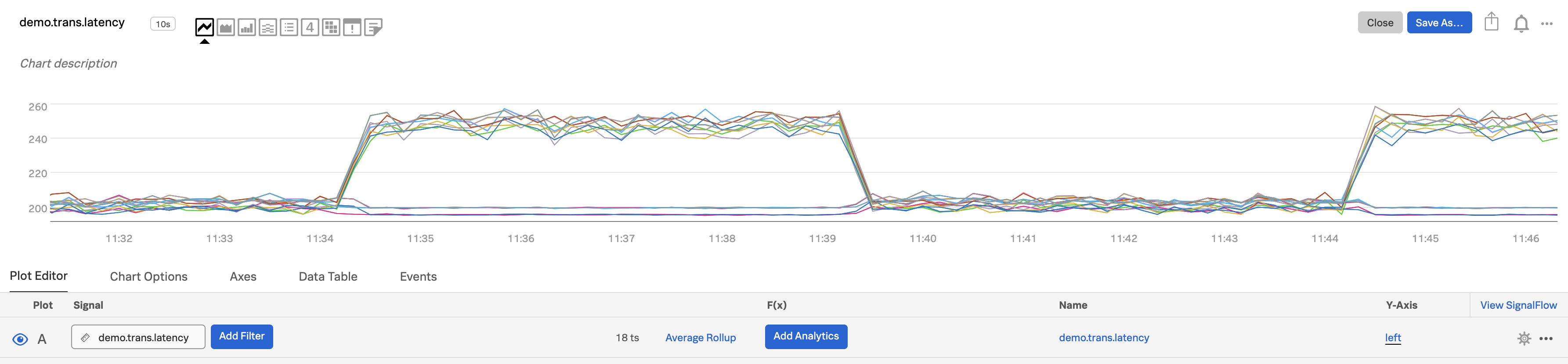
Select the metric you want to compare at an aggregate level (e.g. across services) and enter its name in the Signal field for plot A. In this example, we are plotting
demo.trans.latency.
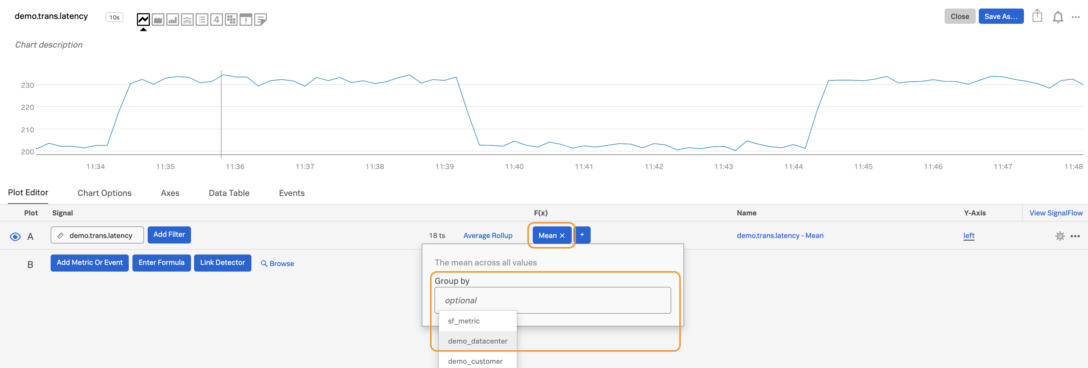
In the Analytics field, select the function you want to apply, such as
mean:aggregation. The chart now displays a single plot line displaying the mean value of the aggregation across all time series in each time interval.

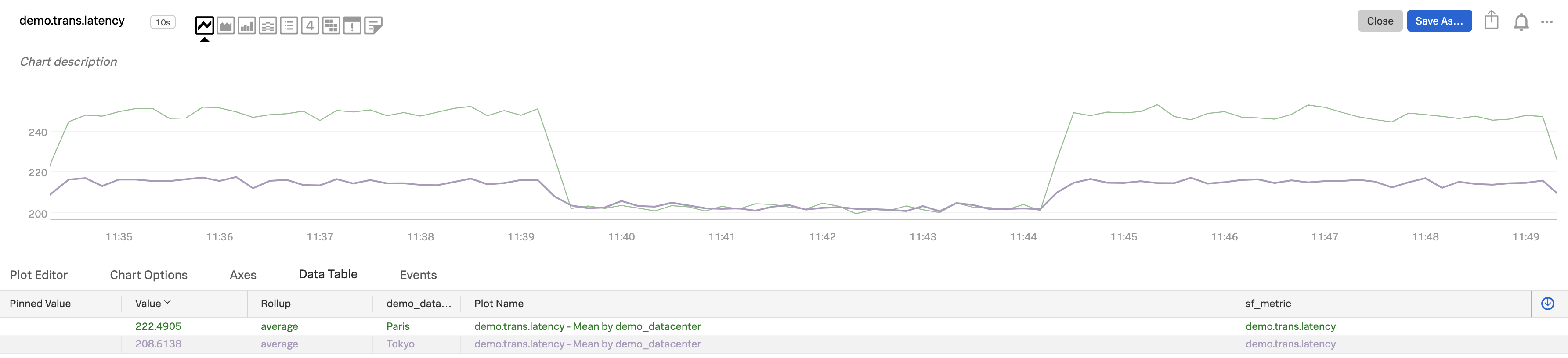
Click on the selected function for the plot. Click the group‑by dropdown. Select the metadata you want to group by, such as service (if you are sending in a dimension named “service”), aws_availability_zone (if you are using AWS) or other metadata. In this example, we chose
demo_datacenter.
Now you can see the metric aggregated across all resources (hosts/vm/container) in each sub-group. As the data table shows, each plot line represents one of the two
demo_datacenters.
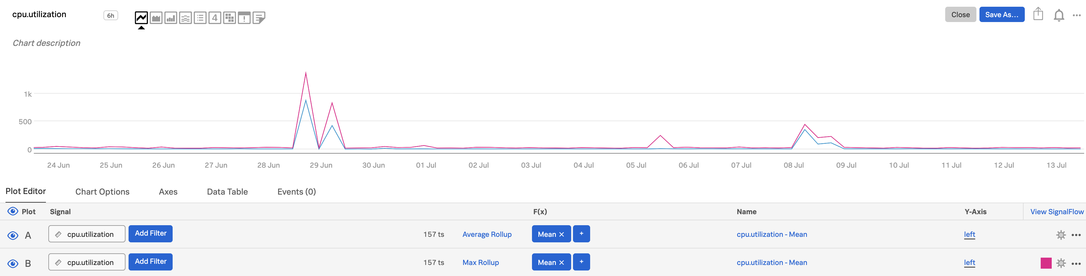
Retain peaks and valleys in longer time ranges 🔗
By default, Splunk Infrastructure Monitoring selects a rollup that is appropriate for the time range and chart resolution you have selected. For example, let’s assume you are sending a metric every 10 seconds to Infrastructure Monitoring, and that its metric type is gauge. If you are looking at a month’s worth of that metric in a chart, there are too many data points to display (6 data points per minute x 60 minutes per hour x 24 hours per day x 30 days per month = 259,200 data points).
In this situation, Infrastructure Monitoring applies the default visualization rollup of Average for a gauge metric. This rollup has the effect of averaging out the data, and makes peaks or valleys that are visible at the higher resolution less apparent.
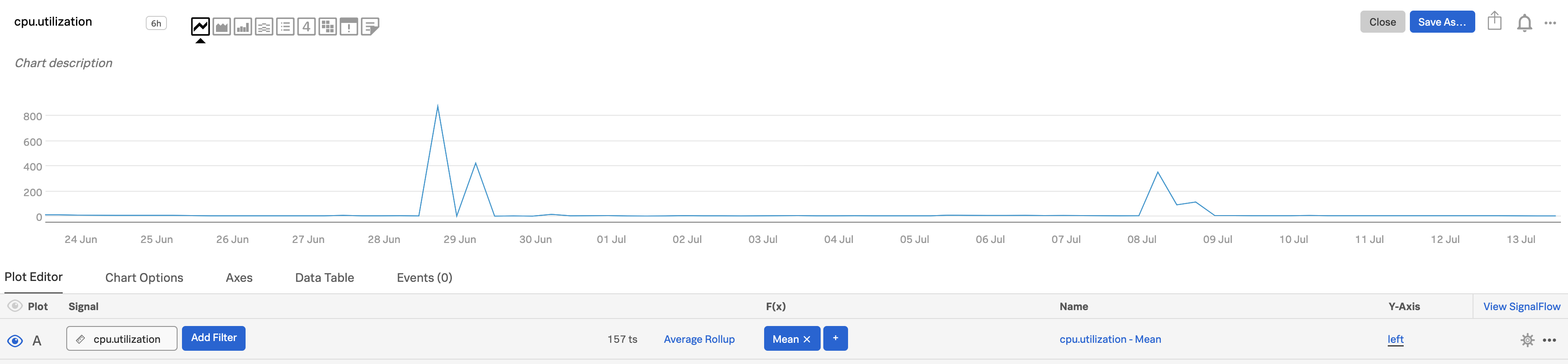
To retain the peaks or valleys, you can change the rollup to max or min, whichever is more relevant to your metric. The Y-axis value range may change from what it was in the original visualization. In this illustration, we clone plot A and change the rollup to max in plot B (and change the color in plot B to make the differences easier to see). To clone a plot line, open the plot’s Actions menu (⋯) at the far right of the plot line, then select Clone. For information on changing plot color, see Set options in the plot configuration panel.
To make peaks and valleys even more noticeable, increase the chart display resolution. Here, we change it from the default to Very High. The differences are more visible.
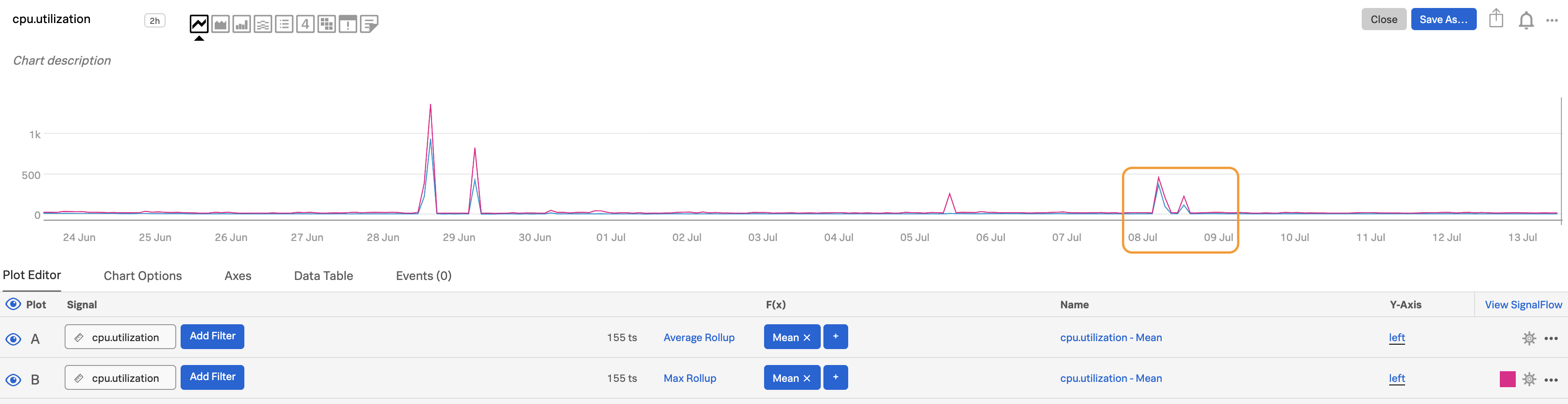
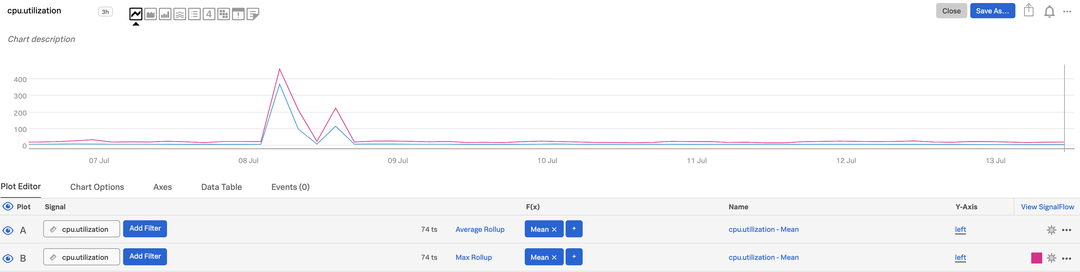
Choosing a shorter time frame increases visibility as well. Here, we change the time range from the past 20 days to the past week.
For more information about the interactions between rollups, chart resolution, and analytics, see Data resolution and rollups in charts.
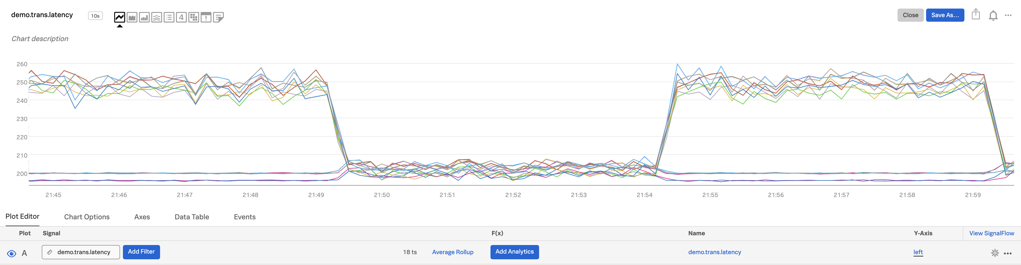
Correlate multiple metrics 🔗
It is often useful to visualize multiple metrics on the same chart so as to more easily correlate their behavior. For example, you may want to look at the number of transactions happening per second alongside the latency of the transactions. Splunk Infrastructure Monitoring lets you display as many metrics as you want on a single chart, and gives you two Y-axes in case the ranges of the metrics’ values are significantly different.
Select the metric you want to compare and enter its name in the Signal field for plot A. In this example, we are using
demo.trans.latency.Select the second metric and use it in plot B. We’ve selected
demo.trans.count.
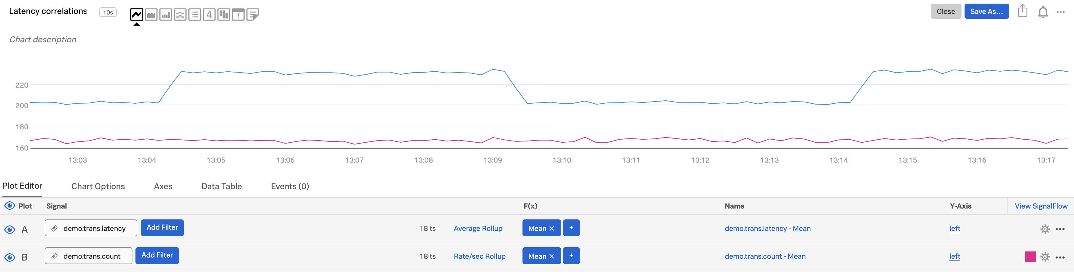
In plot B, click Y-Axis and select right. To learn more, see Left and right Y-axes.
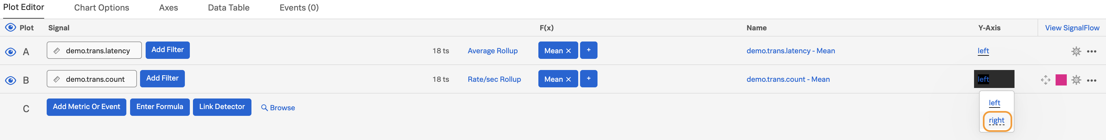
Using the visualization type option for each plot line, select different types for A and B, such as Line for A and Column for B. To learn more, see Visualization type. In this example, we also used plot configuration options to change the color of plot line B to enhance visibility. To learn more, see Plot color.

View weekly, daily or hourly comparisons 🔗
If time of day or week matters for understanding whether your apps or infrastructure are performing within normal bounds, or if your business sees cyclical or periodic demand, e.g. weekdays and weekends are very different, then you can create charts that highlight the change from one week, one day, one hour etc. to the next. (Note that Splunk Infrastructure Monitoring allows you to do comparisons using whatever timeframe you want, not just these intervals.)
Use the first plot (plot A) to show the metric you care about, then clone A to create plot B. (To clone a plot line, open the plot’s Actions menu (⋯) at the far right of the plot line, then select Clone.) In this example, we are using
memory.usage.totalas our signal.Add a Timeshift function to plot B, entering a time range over which the change matters, For example, use
5mfor 5 minutes,2dfor 2 days, and1wfor 1 week.
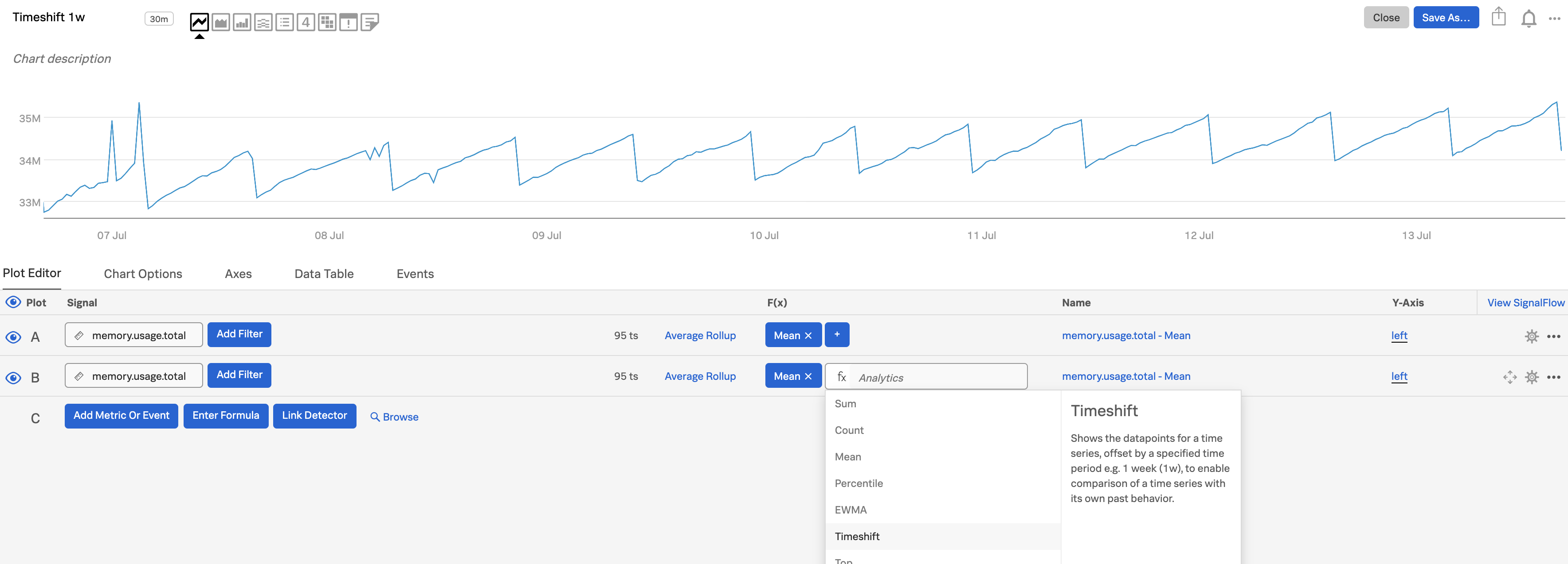
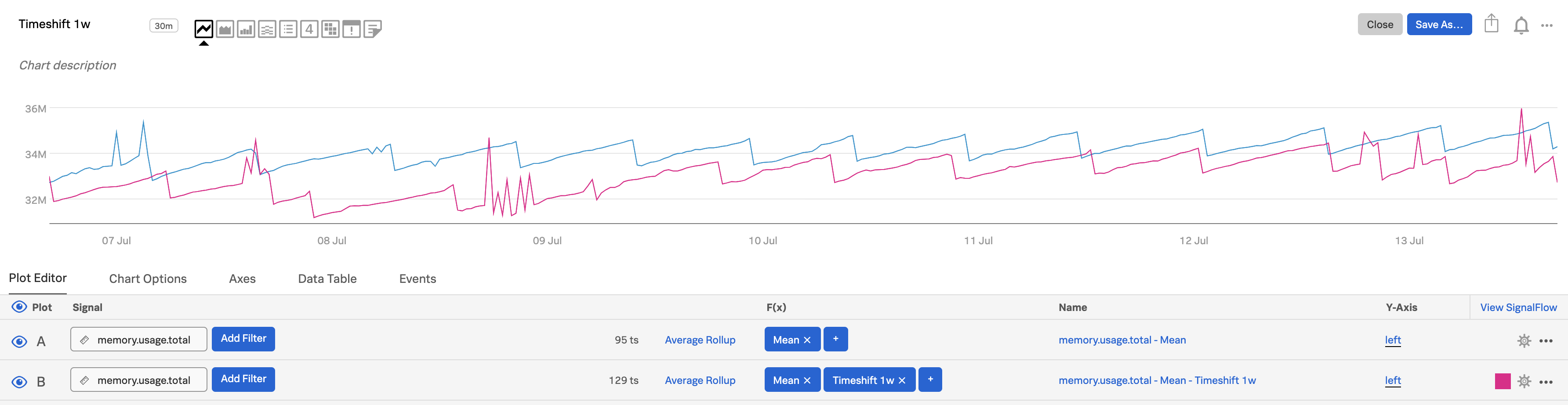
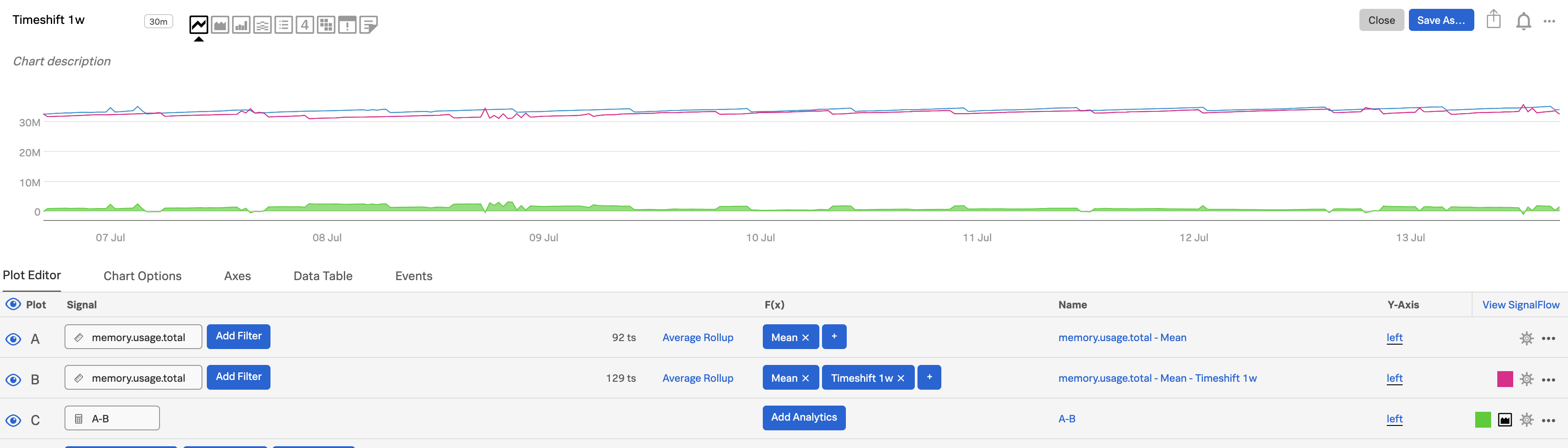
In plot C, click on Enter Formula to enter
A-Bto see the difference between now and a week ago.Use the plot configuration panel to specify an area visualization for plot C. To learn more, see Set options in the plot configuration panel.
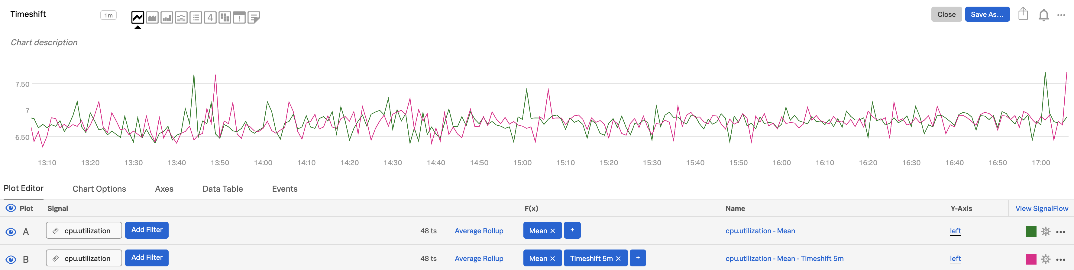
Use the Timeshift function to understand trends 🔗
In infrastructure and application monitoring, the trend of a metric (the rate at which it is changing) is frequently of greater interest than the absolute value of the metric itself. For example, it might not be meaningful to know that your CPU is 70% utilized, but you might care to know that the utilization has doubled consistently for the past 10 minutes, as that might indicate that the system is trending towards failure.
Use the first plot (plot A) to show the metric you care about (we used the mean for
cpu.utilization), then clone A to create plot B. (To clone a plot line, open the plot’s Actions menu (⋯) at the far right of the plot line, then select Clone).Add a Timeshift function to plot B, entering a time range over which the change matters, e.g.
5mfor 5 minutes.

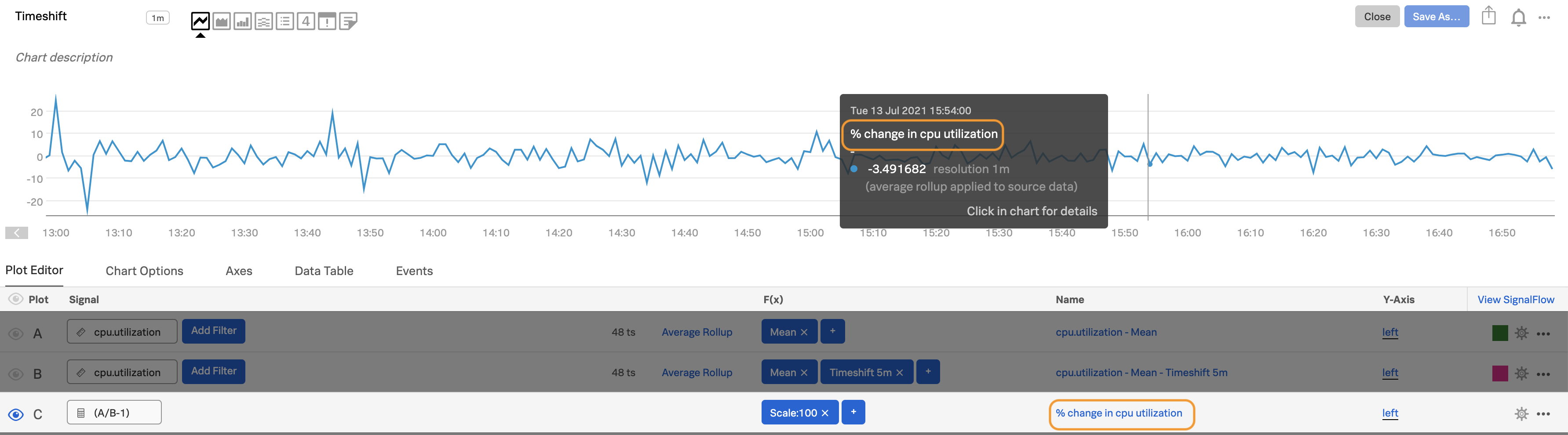
In plot C, enter the formula
(A/B-1)and add ascale:100function to express the rate of change as a percentage.Alt-click or option-click on the eye icon next to plot C to display only that plot, which shows you the percentage change over your disk utilization from 5 minutes prior.
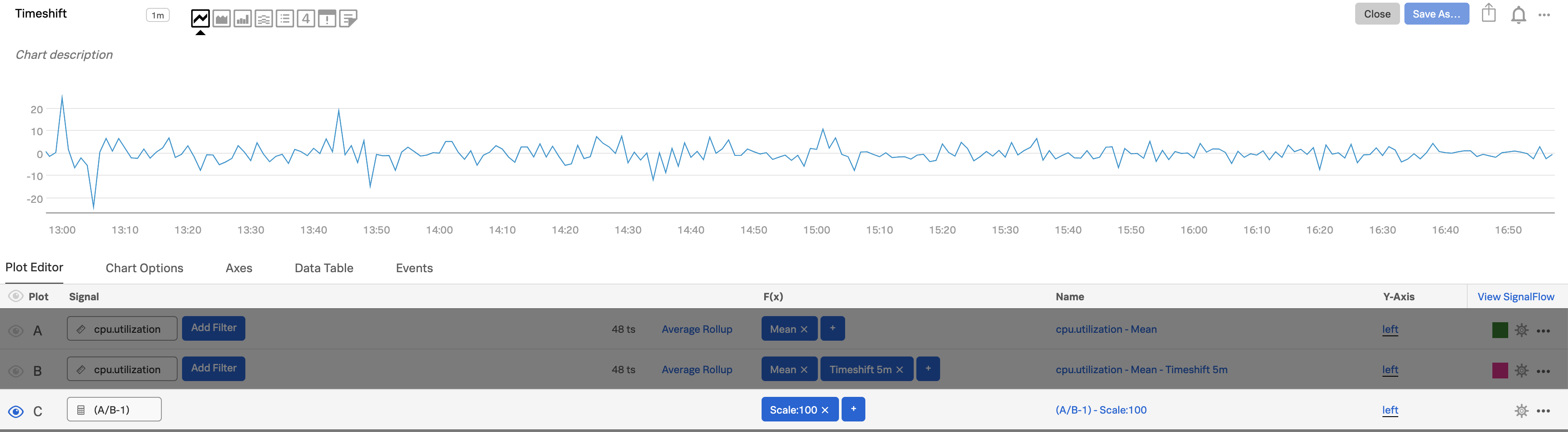
Edit the plot name for plot C, so useful information shows up when you hover over the chart or view the data table.
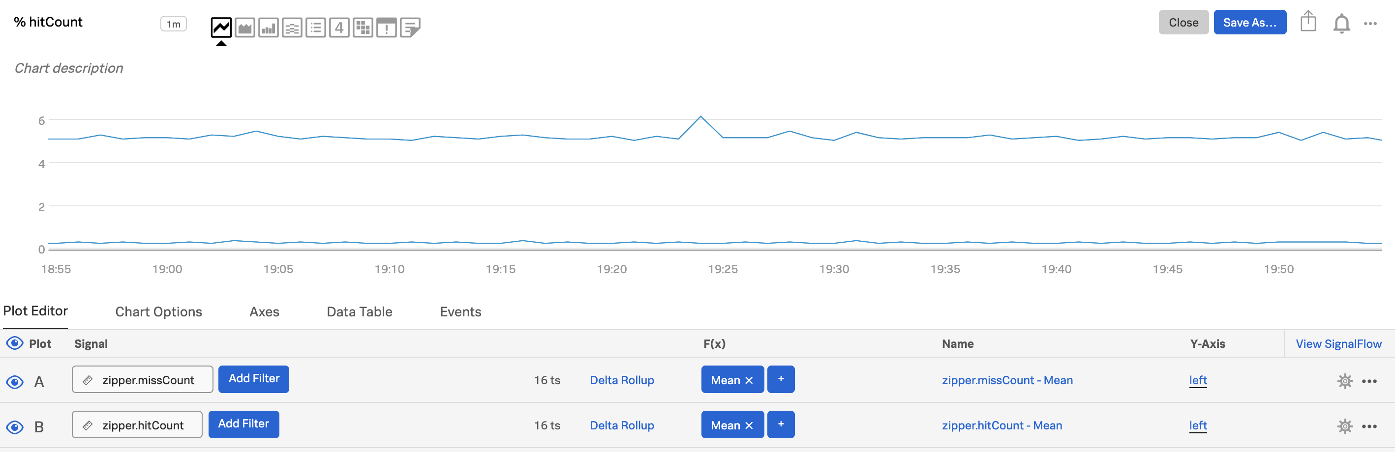
Use percentages or ratios 🔗
In many cases, you may want to see percentages or ratios rather than the raw metric. For example, the ratio of return codes that signify failure to those that signify success, or the percentage of cache hits out of total cache accesses (hits + misses).
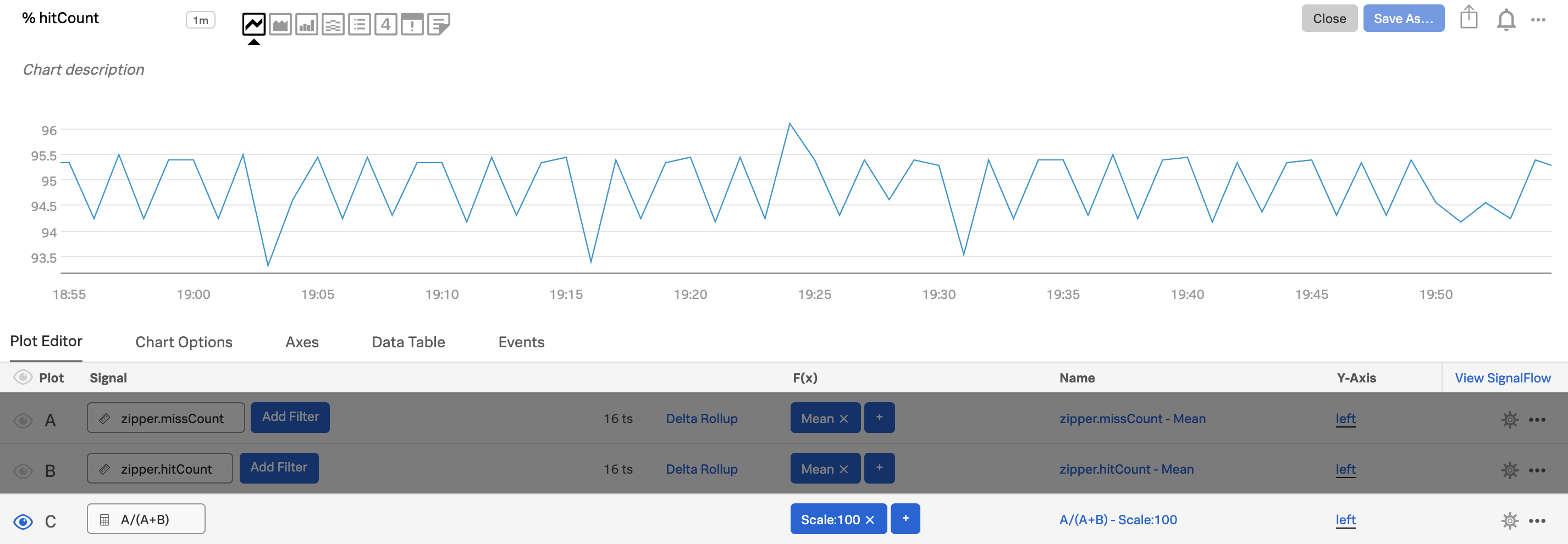
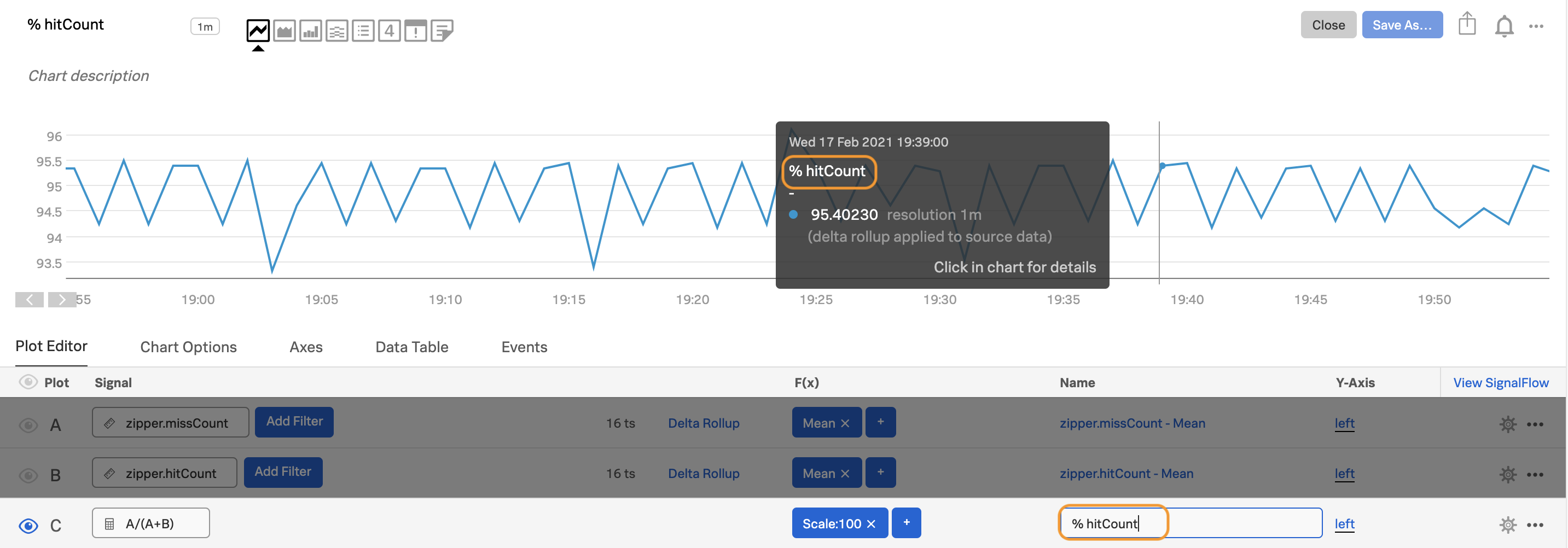
Use the first plot (plot A) to show one of the metrics you care about, e.g.
zipper.missCount.Use the second plot (plot B) to show the other metric you want, e.g.
zipper.hitCount.
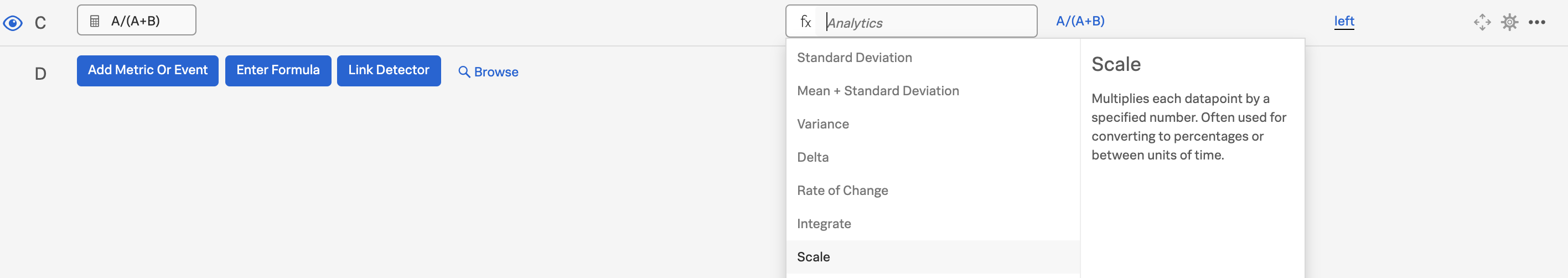
In plot C, enter formula
A/(A+B)and add ascale:100function to express the ratio as a percentage.
Alt-click or option-click on the eye icon next to plot C to hide the other plots. You are left with a chart that shows the percentage of missed hits over time.
Edit the plot name for plot C, so useful information shows up when you hover over the chart (before and after shown below) or view the data table.
Use percentiles to see population overviews 🔗
When you want to get a quick overview of a population, a distributed percentile chart is a good option. To construct such a chart, use non-stacked area charts. Select Show on-chart legend in the Chart Options tab (see Show on-chart legend), then show the plots like the following.
p10. In the first plot (plot A), enter the metric and filters you want, then use the Percentile function and enter
10as the value.median. Clone plot A and use
50as the value.p90. Clone plot B and use
90as the value.
This illustration shows what such a chart might look like:
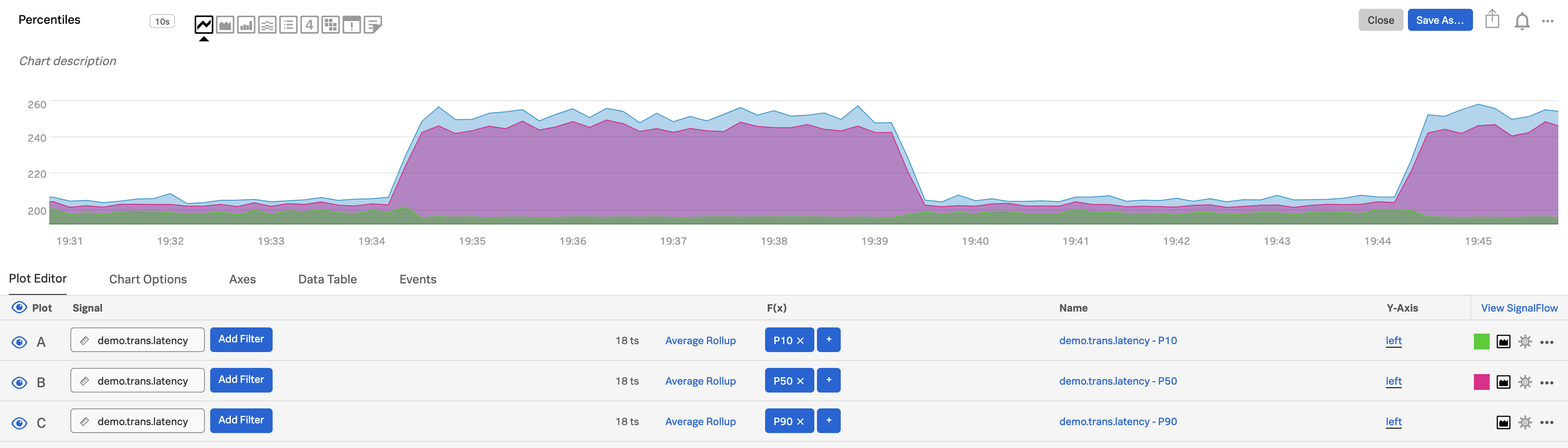
To see specific values, hover over different points on the chart or display the data table.
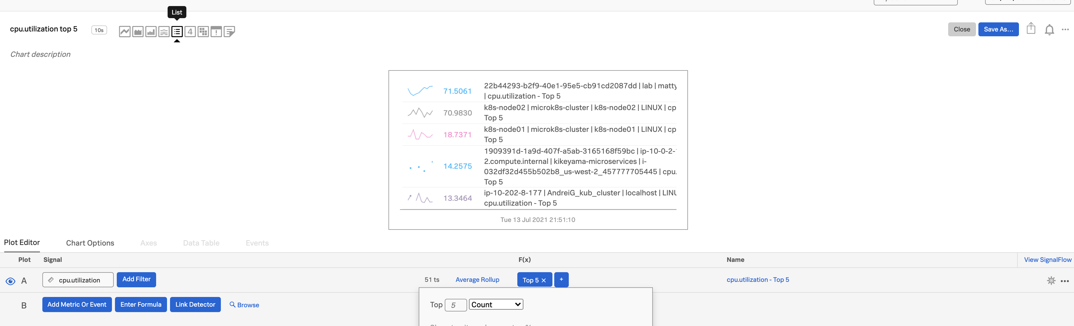
Show Top or Bottom N lists 🔗
Top or bottom N charts are great for showing simple outliers, rankings or worst performers.
Enter a metric for plot A. We chose
cpu.utilization.Select List as your chart type.
Apply the analytics function Top or Bottom, then choose either the number of values you want to see in the list or the percentage range you want to see. In this example, we chose
Top 5and specified Count.
To reduce redundant metadata on the chart, select
customunder the Display Fields option in the Chart Options tab to hide the plot name.Sort Top N charts by
Descendingvalue, or Bottom N byAscendingvalue.
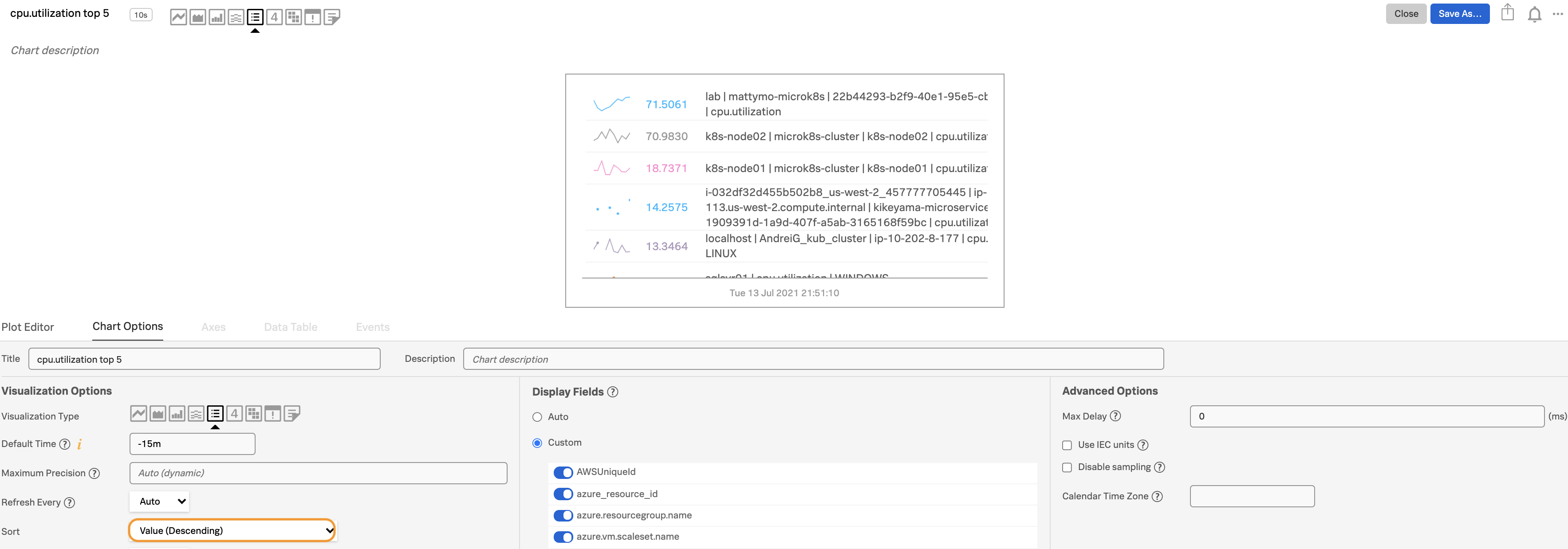
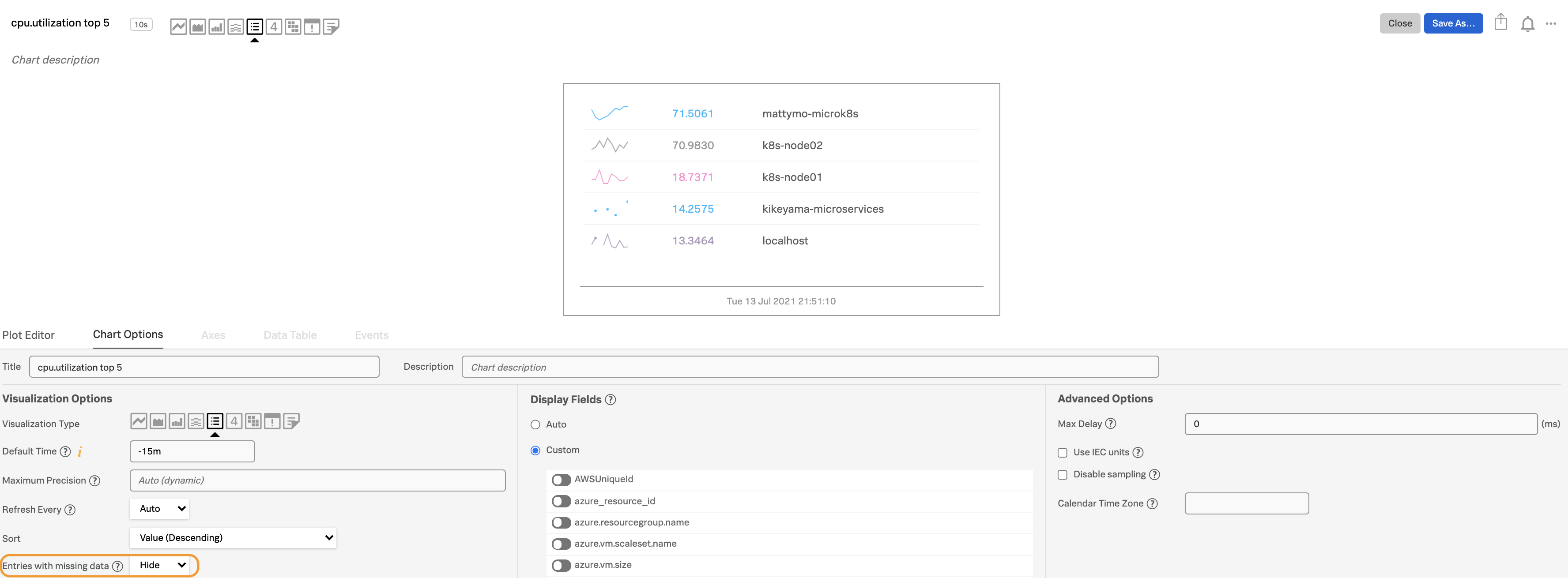
To make the chart even easier to read, use the Display Fields option to hide more fields. You can also hide Entries with missing data under the Visualization Options.
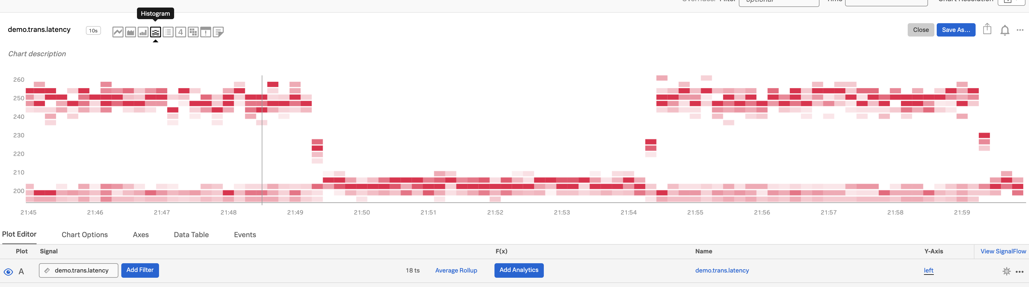
See changes in distribution 🔗
A histogram is a good way to look at the distribution of a population at a single point in time. Splunk Infrastructure Monitoring provides histograms so you can look at the change in that distribution over time. This is useful for surfacing unexpected changes, e.g. in the latencies of requests served by a cluster.
Select a metric that is being sent from a relatively large number of sources. In this case, we chose
demo.trans.latency.
Choose the histogram graph type.
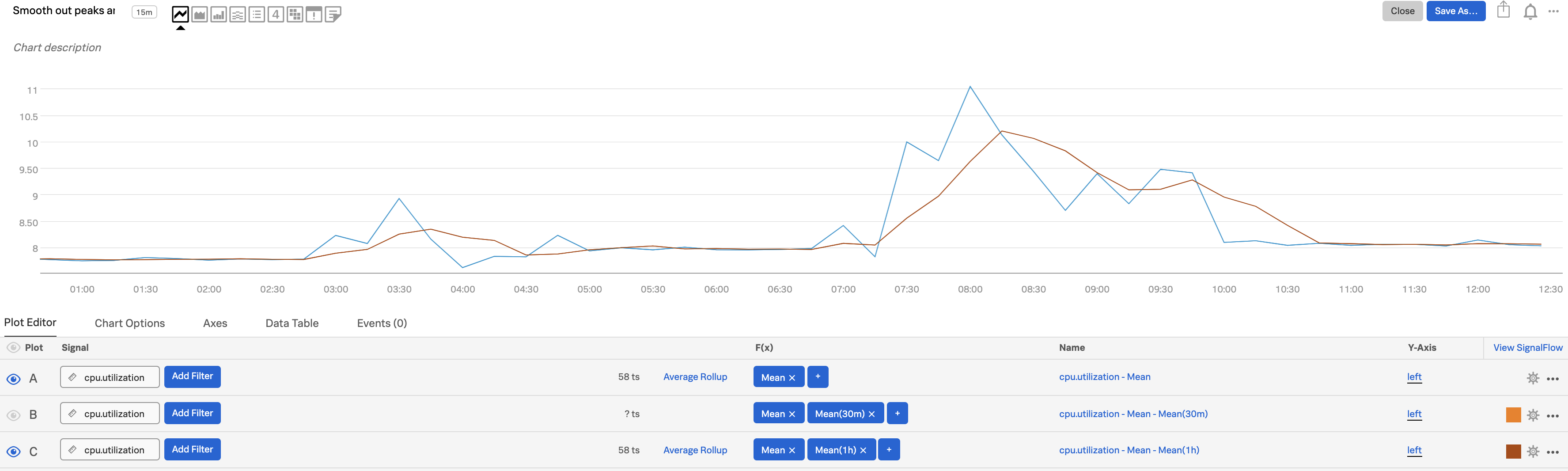
Smooth out peaks and valleys 🔗
Do you want to smooth out peaks and valleys in your data, to see general patterns from one period to the next? If you can’t tell at a glance if a value is generally steady, rising, or falling, you want to see data normalized in a moving average format, from one time period to the next. To do this, use the Transformation option instead of Aggregation. The Transformation option is available with the following analytics functions: Mean, Minimum / Maximum, Percentile, Sum, and Variance. For Mean, Minimum, Maximum, and Sum, you can specify either a moving window (the past number of minutes, hours, etc.) or a calendar time window (over the past day, week, month, etc.)
Determine an appropriate interval for applying a moving average.
Use the
Meananalytics function, select theMean:Transformationoption, then select the appropriate time window option.Enter your interval, e.g. 5m.
In the following illustration, values and moving averages are displayed for cpu.utilization as follows:
Plot A: Actual values
Plot B: 30-minute moving average
Plot C: 1-hour moving average
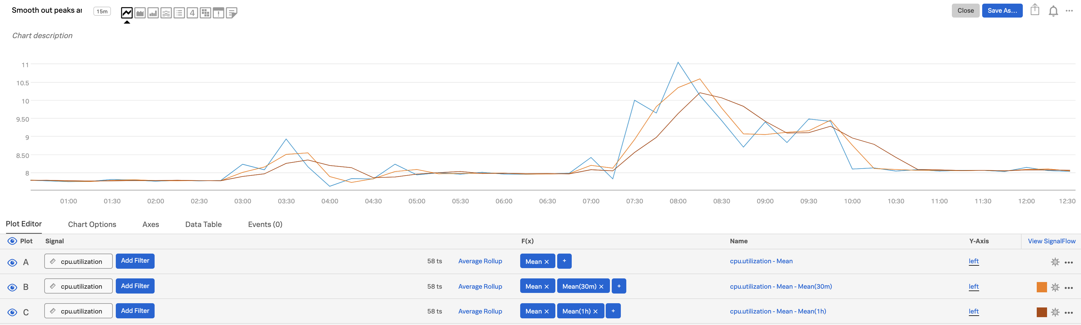
You can also hide plot lines to make the chart easier to read:
Next steps 🔗
For details about all available analytics functions, see the Analytics reference for Splunk Observability Cloud.
Once you have developed charts to help you proactively monitor your system, the natural next step is to want to view and receive alerts when values reach certain criteria. For information on how to do this, see Introduction to alerts and detectors in Splunk Observability Cloud.