Chart types in Splunk Observability Cloud 🔗
Charts in Splunk Observability Cloud are components of a dashboard. Each chart type provides a different way to represent your data:
- Graph charts: Display data points over a period of time. Graph charts come in four different forms.
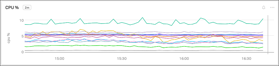
Line charts: Display data in a plot with data points connected by a series of straight lines.
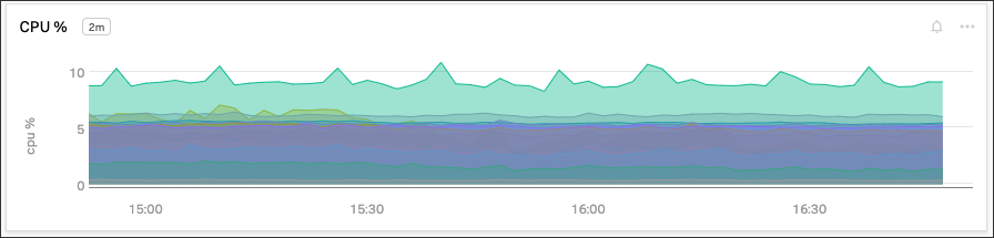
Area charts: Display in a plot similar to a line chart, except that the area below the line is filled.
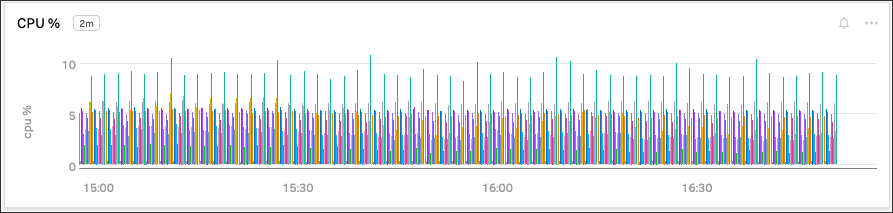
Column charts: Also known as bar charts. Display each data point as a vertical bar going from the x-axis origin to the measured value of the data point. The bars aren’t connected.
Histogram charts: Display as horizontal rectangles on a two-dimensional plot. The starting and ending x-position of a rectangle represents the time duration over which data points for that rectangle were collected. The y-position of a rectangle represents the number of data points collected in that time duration.
List charts: Display multiple data points at each point in time. They show recent trends in the data, including up to 100 data points.
Single value charts: Display a single value for a data point as it changes over time. In most cases, you use this type of chart to display important metrics as a single number.
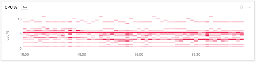
Heatmap charts: Display a series of squares each representing a single data point of the selected metric. The color of each square represents the value range of the metric allowing quick identification of values that are higher or lower than desired.
Event feed charts: Display a list of events instead of metric data.
Text charts: Display descriptive textual information. Add this chart to a dashboard to provide an introduction or instructions for other charts in the dashboard.
Table charts: Display metrics and dimensions in the table format.
To learn more about selecting the appropriate charts in Splunk Observability Cloud, see the following sections for more description and example on each chart type.
Graph charts 🔗
Use graph charts when you want to display data points over a period of time.
Each metric time series (MTS) in the chart appears as a single plot, and each plot has its own color. For example, a series of line plots for AWS MTS might be colored by their AWS availability zone dimension, with red indicating us-east-1, green indicating us-east-2, and purple indicating eu-west-1.
Graph charts can have one of four forms:
Line charts 🔗
Use line chart when you want to see a series of straight lines that connect the data points in the MTS.
Area charts 🔗
Use area charts when you want to display your data using both lines and shaded areas between the lines and the x-axis. Each line indicates how an MTS changes over time, while each shaded area indicate how each MTS contributes to the overall trend.
Column charts 🔗
Use column charts to display your data as shaded vertical bars starting at the x-axis and ending at the data point value. By default, each plot point is shown as an independent bar.
You can also stack column charts. The bars representing each value appear as vertical stacks at the corresponding time value along the x-axis.
Histogram charts 🔗
Use histogram charts to display your data as rectangular bars indicating how many plot points are at that value. For example, a green bar might indicate a higher density of plot points with the relevant value than a red bar. Alternatively, darker shades of a single color might indicate a higher density of plot points for a value than a lighter shade of that same color.
By default, the values of a histogram plot display in a random order. You can organize them into two grouping levels to clarify the data. For example, you can group data by AWS region or availability zone to make it easier to track performance within each region or availability zone.
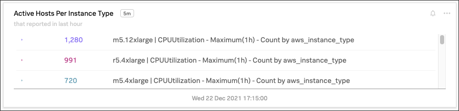
List charts 🔗
Use list charts to display current data values in a list format. By default, the name of each value in the chart reflects the name of the plot and any associated analytics. To avoid having the raw metric name displayed on the chart, give the plot a meaningful name.
A list chart can display up to 100 items at a time.
Sort list charts 🔗
You can sort a list chart using the API. For more information, see the Sort a list chart section in the Splunk Observability Cloud Developer Guide.
List chart prefix and suffix 🔗
To help describe the list chart values, add prefix and suffix strings:
The
valuePrefixproperty specifies a prefix string.The
valueSuffixproperty specifies a suffix string.
List chart secondary visualization 🔗
Secondary visualizations help you see trends in a list chart:
Sparkline: Shows recent trends for each value
Radial: Shows a dial that marks where the current values are among the expected range of values
Linear: Shows a bar that marks where the current values are among the expected range of values
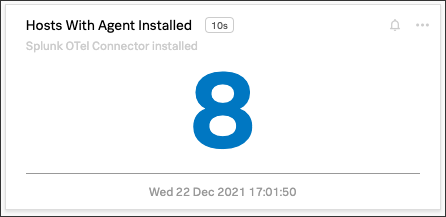
Single value charts 🔗
Use single value charts when you want to see a single number in a large font that represents the value of a single data point on a plot line. In most cases, you use this type of chart to display important metrics as a single number.
For example, use single value charts in a summary dashboard shown on a wall TV. The dashboard can display the number of active hosts, active processes, or number of requests served in the past 24 hours.
You can highlight the value using specific colors based on thresholds. For example, when the number of requests served over the past 24 hours meets the daily goal, you can set the color of the value to change from red to green.
If the input stream for a single value chart contains more than one MTS, the chart displays the first MTS it detects in the stream and ignores the others.
Single value chart prefix and suffix 🔗
To help describe the chart value, add prefix and suffix strings:
The
valuePrefixproperty specifies a prefix string.The
valueSuffixproperty specifies a suffix string.
Single value chart secondary visualization 🔗
Secondary visualizations help you see trends in a single value chart:
Sparkline: Shows recent trends of the value
Radial: Shows a dial that marks where the current value is among the expected range of values
Linear: Shows a bar that marks where the current value is among the expected range of values
By default, a single value chart doesn’t show any additional visualizations.
Best practices for single value charts 🔗
If multiple plots are marked as visible, the value represents the first visible plot in the list. For example, if plots A and B are visible, the value represents plot A. If you hide plot A, the value represents plot B.
An especially useful option for this chart type is Color by value, which lets you use different colors to represent different value ranges.
Caution
To display an accurate value, the plot must use an aggregate analytics function that generates a single value for each data point on the chart, such as mean, sum, max, and so on. If the plot line always reflects only a single time series, no analytics function is needed. However, this is uncommon.
If the plot line on the chart shows multiple values, that is one line per metric time series (MTS) when viewed as a line chart, the single number displayed on the chart might represent any of the values for a given point in time.
Heatmap charts 🔗
Use heatmap charts when you want to see the specified plot in a format similar to the navigator view in Splunk Infrastructure Monitoring, with each square representing each source for the selected metric, and the color of each square representing the value range of the metric.
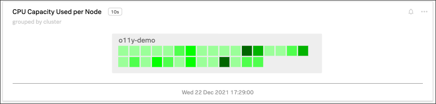
Heatmap charts help you identify values that are higher or lower than you expect.
Heatmap chart grouping 🔗
To highlight the information for a specific aspect of your data, group the data points. You can use up to two dimensions for the grouping. For example, you can group CPU utilization by AWS availability zone as the primary grouping dimension, and number of host CPU cores as the secondary grouping dimension.
To help describe the values in the heatmap, add prefix and suffix strings:
The
valuePrefixproperty specifies a prefix string.The
valueSuffixproperty specifies a suffix string.
Event feed charts 🔗
Use event feed charts when you want to see a list of events on your dashboard. An event feed chart can display one or more event types depending how you specify the criteria.
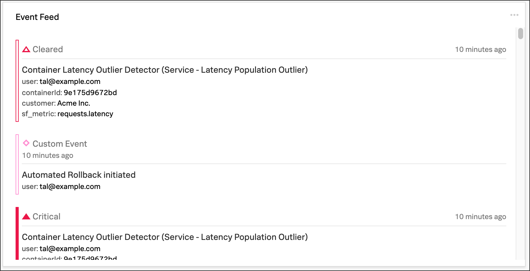
To customize the information shown in the feed, see Add an event feed chart to a dashboard.
Text charts 🔗
Use text charts when you want to place a text note on the dashboard instead of displaying metrics. The text appears in the same type of panel that Splunk Observability Cloud uses to display data.
Splunk Observability Cloud lets you use GitHub-style Markdown in your text.
Note
Inserting images using Markdown is not supported in text charts.
Table charts 🔗
Use table charts when you want to see metrics and dimensions in table format. Each metric name and dimension key displays as a column. Each output metric time series displays as a row. If there are multiple values for a cell, each time series displays in a separate row.
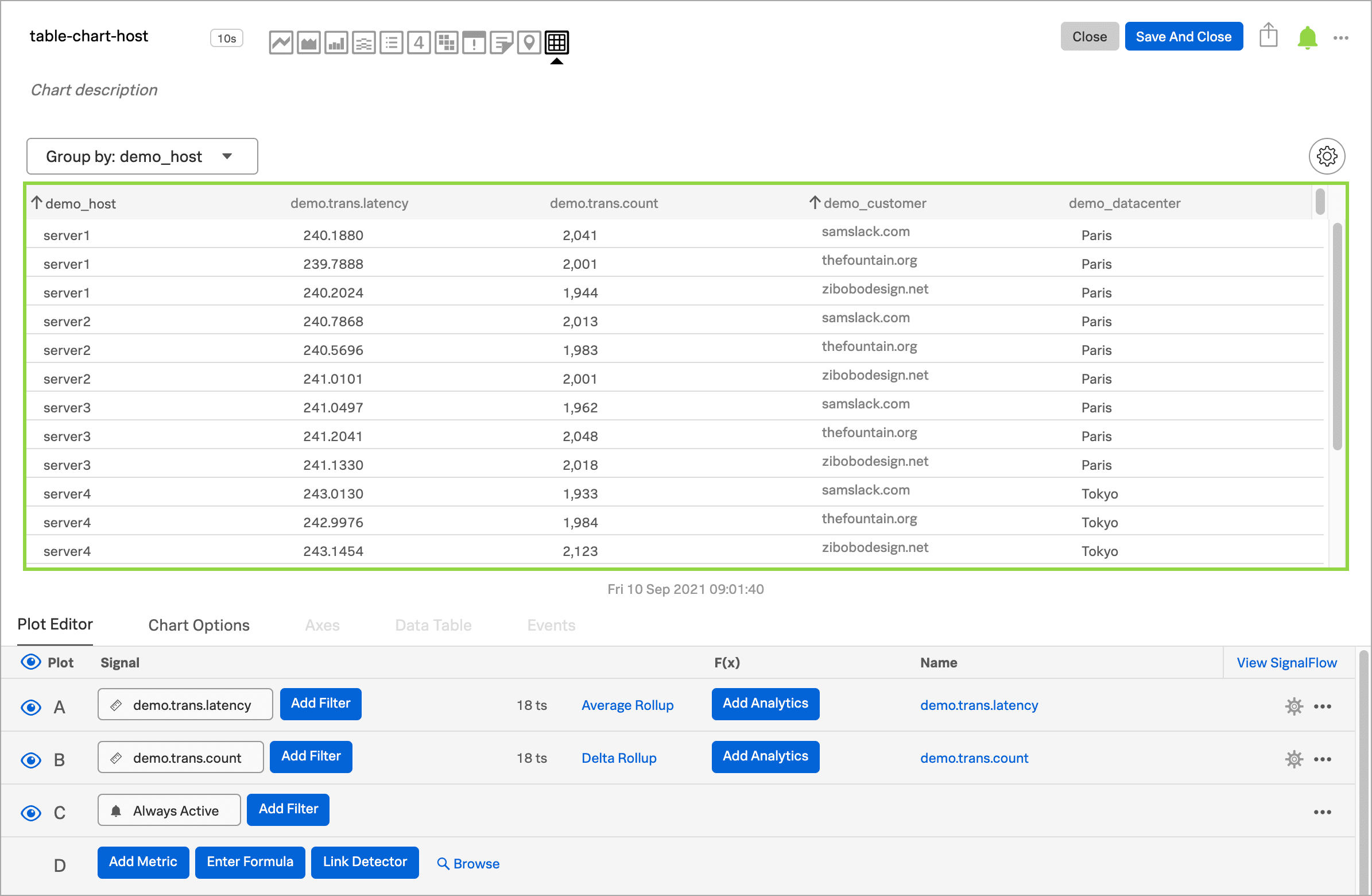
You can group metric time series rows by a dimension. To do this, select the Group by menu and select the dimension you want to group the rows by. The selected dimension’s column becomes the first column and each row of the table displays to represent one value of the dimension.
For example, group the table by the host dimension to display the health and status of each host in your environment.
If you group by a dimension column that you’ve hidden, the column displays to accomplish the requested grouping.
After using the Group by option to group the table, there might still be more than one row per dimension value. This can happen if there are multiple values for a column per grouping dimension value. To resolve this, you can apply aggregation analytics to plots. For more information about aggregation, see Aggregate and transform data.
If there are missing data values for a table cell, the cell displays no value.
Here are some additional ways in which you can customize a table chart to best visualize your data:
Reorder a dimension column
Select and drag the column header to move the column to its new position. You can’t reorder metric columns.
Show or hide a column
In graphical Plot Editor view, select the gear icon near the upper right of the table. In the SHOW/HIDE COLUMNS section, select the column name to switch between showing and hiding the column.
In SignalFlow Plot Editor view:
To hide a metric column, comment it out by adding a
#to the start of the metric’s line of SignalFlow code. Alternatively, you can remove the metric.To show or hide a dimension column, select the gear icon near the upper right of the table. In the SHOW/HIDE COLUMNS section, select the dimension column name to switch between showing and hiding the column.
Sort table values
Select a column header to switch between sorting by ascending and descending order. An arrow icon displays in the column header to indicate the sort order.
Link a detector to the table chart
Select the Alerts icon (bell) near the upper right of the Chart Builder. Select Link detector to link the table chart to an existing detector. Select New Detector From Chart to create a new detector to link the table chart to.
For more information about creating a new detector from a chart, see Create a detector from a chart.
A chart that is linked to a detector displays with a border color that corresponds to the alert status of the linked detector. For example, if there are no alerts issued by the detector, the chart displays with a green border. The chart displays alerts in the chart header, but doesn’t display alert status per row.