Splunk Observability Cloudのチャートタイプ 🔗
Splunk Observability Cloudのチャートはダッシュボードのコンポーネントです。各チャートタイプは、データを表現するために異なる方法を提供します:
- グラフチャート:ある期間にわたるデータポイントを表示します。グラフチャートには4つの異なる形式があります。
線グラフ:連続した直線で結んだデータポイントを使ってプロット内のデータを表示します。
面グラフ:折れ線グラフに似たプロットで表示します。ただし、折れ線より下のエリアが塗りつぶされます。
カラムチャート:棒グラフとも呼ばれます。各データポイントを、X軸の原点からデータポイントの測定値までの垂直な棒として表示します。棒はつながっていません。
ヒストグラムチャート:2次元プロット上に横長の長方形で表示します。長方形の開始と終了のx方向の位置は、その長方形のデータポイントが収集された期間を表します。長方形のy方向の位置は、その期間内に収集されたデータポイントの数を表します。
リストチャート:各時点の複数のデータポイントを表示します。最大100個のデータポイントを含め、データの最近の傾向を示します。
単一値チャート:データポイントの単一の値を、時間の経過とともに変化するように表示します。ほとんどの場合、このタイプのチャートは、重要なメトリクスを単一の数値として表示するために使用します。
ヒートマップチャート:選択したメトリクスの1つのデータポイントを表す各四角形のシリーズを表示します。各四角形の色は、メトリクスの値の範囲を表し、望ましい値よりも高い/低い値を素早く識別することができます。
イベントフィードチャート:メトリクスデータの代わりにイベントのリストを表示します。
テキストチャート:テキストによる説明的な情報を表示します。このチャートをダッシュボードに追加して、ダッシュボード内の他のチャートの紹介や手順を提示することができます。
テーブルチャート:メトリクスとディメンションを表形式で表示します。
Splunk Observability Cloudで適切なチャートを選択する方法については、以下のセクションで、各チャートタイプの詳細な説明と例を参照してください。
グラフチャート 🔗
グラフチャートは、ある期間にわたるデータポイントを表示したいときに使用します。
チャート内の各メトリック時系列(MTS)は単一のプロットとして表示され、各プロットには独自の色が付きます。例えば、AWS MTSに関する一連のラインプロットが、AWSのアベイラビリティゾーンのディメンションによって色分けされ、赤は us-east-1、緑は us-east-2、紫は eu-west-1 を示すといった具合です。
グラフチャートは以下の4つの形式のいずれかになります:
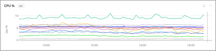
線グラフ 🔗
線グラフのチャートは、MTSのデータポイントを連続した直線で結んで表示したい場合に使用します。
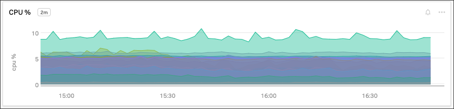
面グラフ 🔗
面グラフは、折れ線と、折れ線とX軸の間の網掛けエリアを両方使用してデータを表示したい場合に使用します。各線はMTSが経時的にどのように変化しているかを示し、各網掛けエリアは、各MTSが全体的な傾向にどのように寄与しているかを示します。
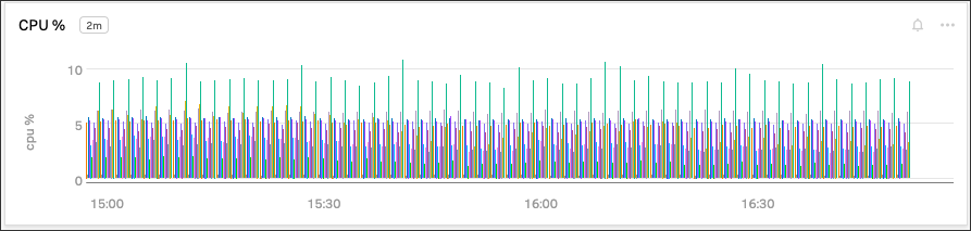
カラムチャート 🔗
カラムチャートは、X軸を始点としデータポイントの値を終点とする色付きの垂直棒としてデータを表示したい場合に使用します。デフォルトでは、各プロットポイントが独立した棒として表示されます。
カラムチャートを積み上げることもできます。各値を表す棒は、X軸に沿った対応する時間値の位置に垂直方向の積み上げとして表示されます。
ヒストグラムチャート 🔗
ヒストグラムは、その値にどれだけのプロットポイントがあるかを示す長方形の棒としてデータを表示したい場合に使用します。例えば、緑色の棒は、赤色の棒よりも該当する値のプロットポイントの密度が高いことを示すかもしれません。あるいは、単一の色における濃い色合いは、同じ色の薄い色合いよりも、ある値に対するプロットポイントの密度が高いことを示すかもしれません。
デフォルトでは、ヒストグラムのプロットの値はランダムな順序で表示されます。データを明確にするために、2つのグループレベルに整理することができます。例えば、AWSのリージョンやアベイラビリティゾーンごとにデータをグループ化し、各リージョンやアベイラビリティゾーン内のパフォーマンスを追跡しやすくすることができます。
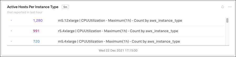
リストチャート 🔗
現在のデータ値をリスト形式で表示したい場合は、リストチャートを使用します。デフォルトでは、このチャート内の各値の名前は、プロット名および関連する分析を反映します。生のメトリクス名がチャートに表示されることを回避するには、プロットに意味のある名前を付けます。
リストチャートは一度に100項目まで表示できます。
リストチャートの並べ替え 🔗
API を使用してリストチャートを並べ替えることができます。詳細については、『Splunk Observability Cloud開発者ガイド』の「 リストチャートの並べ替え 」セクションを参照してください。
リストチャートのプレフィックスとサフィックス 🔗
リストチャートの値を分かりやすくするために、プレフィックスとサフィックスの文字列を追加します:
valuePrefixプロパティはプレフィックス文字列を指定します。valueSuffixプロパティはサフィックス文字列を指定します。
リストチャートの第2視覚エフェクト 🔗
第2視覚エフェクトは、リストチャートでトレンドを確認するのに役立ちます:
スパークライン:各値の最近の傾向を表示します
ラジアル:現在の値が予想される値の範囲のどこにあるかを示すダイヤルを表示します
リニア:現在の値が予想される値の範囲のどこにあるかを示す棒を表示します
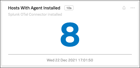
単一値チャート 🔗
単一値チャートは、プロット上の単一のデータポイントの値を示す1つの数字を大きなフォントで見たい場合に使用します。時間の経過とともに変化するように表示します。ほとんどの場合、このタイプのチャートは、重要なメトリクスを単一の数値として表示するために使用します。
たとえば、壁面のテレビに表示されるサマリーダッシュボードで単一値チャートを使用します。このダッシュボードには、過去24時間のアクティブなホスト数、アクティブなプロセス数、または処理済みのリクエスト数を表示できます。
閾値に基づいて、特定の色を使って値を強調表示できます。たとえば、過去24時間に処理されたリクエスト数が1日の目標に達した場合に値の色を赤から緑に変更するように設定できます。
単一値チャートの入力ストリームに複数のMTSが含まれる場合、チャートは、ストリーム内で最初に検出したMTSを表示し、他のMTSは無視します。
単一値チャートのプレフィックスとサフィックス 🔗
チャートの値を分かりやすくするために、プレフィックスとサフィックスの文字列を追加します:
valuePrefixプロパティはプレフィックス文字列を指定します。valueSuffixプロパティはサフィックス文字列を指定します。
単一値チャートの第2視覚エフェクト 🔗
第2視覚エフェクトは、単一値チャートでトレンドを確認するのに役立ちます:
スパークライン:値の最近の傾向を表示します
ラジアル:現在の値が予想される値の範囲のどこにあるかを示すダイヤルを表示します
リニア:現在の値が予想される値の範囲のどこにあるかを示す棒を表示します
デフォルトでは、単一値チャートには追加の視覚エフェクトは表示されません。
単一値チャートのベストプラクティス 🔗
複数のプロットが「表示(visible)」としてマークされている場合、値はリスト内の最初の「表示」プロットを表します。例えば、プロット Aと Bが「表示」の場合、値はプロット Aを表します。プロット Aを「非表示(hide)」にしている場合、値はプロット Bを表します。
このチャートタイプで特に便利なオプションは 値別に色分け で、これを使用すると、異なる値範囲を表すために異なる色を使うことができます。
注意
正確な値を表示するには、プロットで、Mean、Sum、Maxなどのように、チャート上の各データポイントの単一値を生成する集計の分析関数を使用する必要があります。プロット線が常に単一の時系列だけを反映する場合は、分析関数は必要ありません。ただし、これは珍しいケースです。
チャート上のプロット線が複数の値を示している場合、つまり、線グラフとして見た場合に1つのメトリック時系列(MTS)ごとに1つの線が表示される場合、チャート上に表示される単一値は、ある時点の任意の値を表している可能性があります。
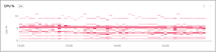
ヒートマップチャート 🔗
ヒートマップチャートは、指定したプロットをInfrastructure Monitoringのナビゲータービューに似た形式で表示したい場合に使用します。各四角形は選択したメトリクスの各ソースを表し、各四角形の色はメトリクスの値範囲を表します。
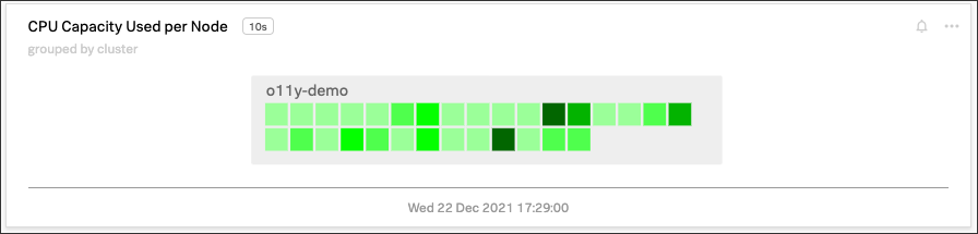
ヒートマップチャートは、予想よりも高い値や低い値を識別するのに役立ちます。
ヒートマップチャートのグループ化 🔗
データの特定の側面の情報をハイライトするには、データポイントをグループ化します。グループ化には最大2つのディメンションを使用できます。たとえば、1つ目のグループ化ディメンションとしてAWSアベイラビリティゾーン別のCPU利用率をグループ化し、2つ目のグループ化ディメンションとしてホストCPUコア数をグループ化できます。
ヒートマップ内の値を分かりやすくするために、プレフィックスとサフィックスの文字列を追加します:
valuePrefixプロパティはプレフィックス文字列を指定します。valueSuffixプロパティはサフィックス文字列を指定します。
イベントフィードチャート 🔗
イベントフィードチャートは、ダッシュボード上にイベントのリストを表示したい場合に使用します。イベントフィードチャートは、条件の指定方法によって、1つまたは複数のイベントタイプを表示できます。
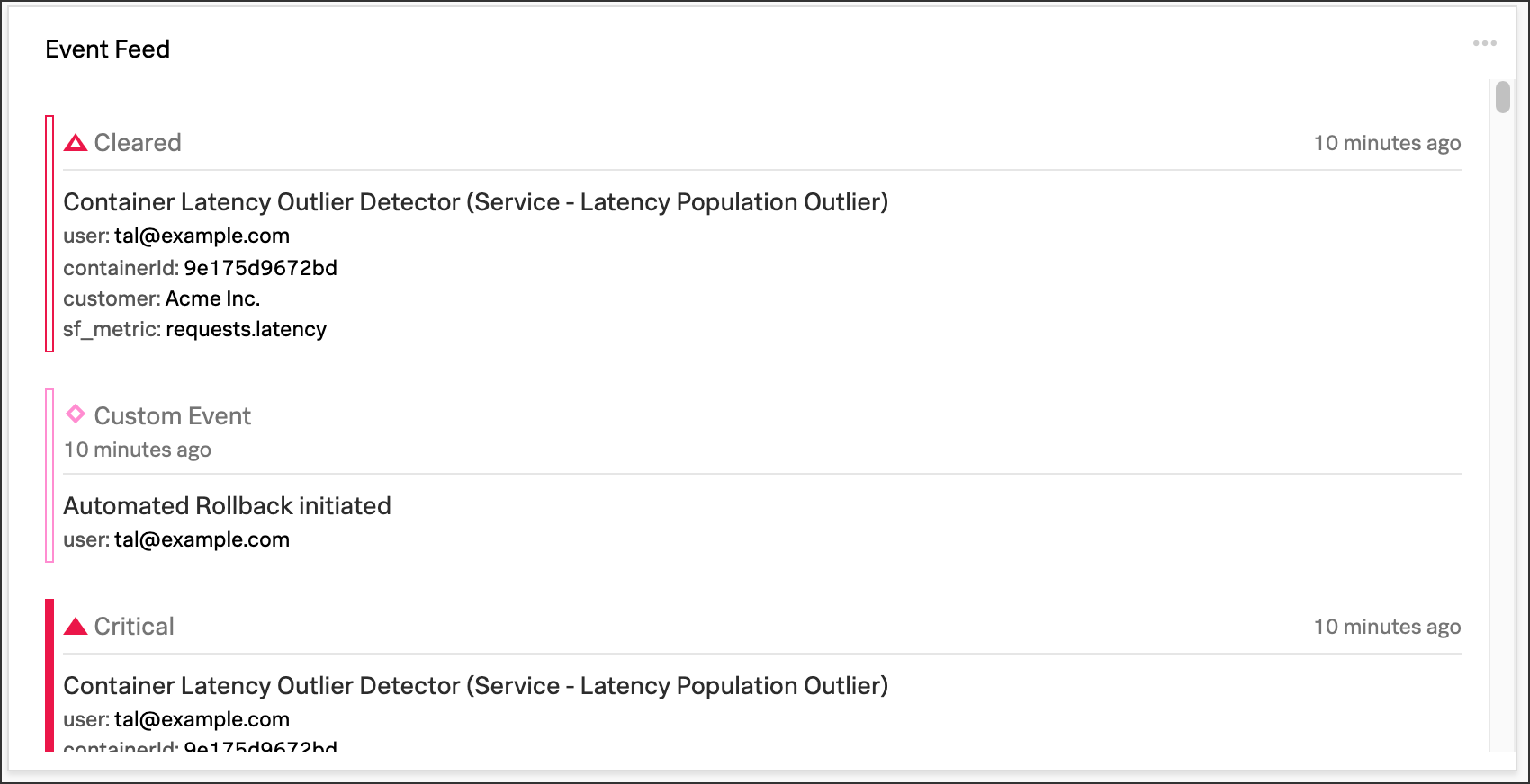
フィードに表示される情報をカスタマイズするには、ダッシュボードにイベントフィードチャートを追加する を参照してください。
テキストチャート 🔗
テキストチャートは、メトリクスを表示するかわりにダッシュボード上にテキストノートを配置したい場合に使用します。このテキストは、Splunk Observability Cloudがデータの表示に使用するのと同じタイプのパネルに表示されます。
Splunk Observability Cloudでは、テキストにGitHubスタイルのMarkdownを使用することができます。
注釈
Markdownを使用した画像の挿入は、テキストチャートではサポートされていません。
テーブルチャート 🔗
テーブルチャートは、メトリクスとディメンションを表形式で表示したい場合に使用します。各メトリクス名とディメンションキーは列として表示されます。各出力メトリック時系列は行として表示されます。1つのセルに複数の値がある場合は、各時系列が別々の行に表示されます。
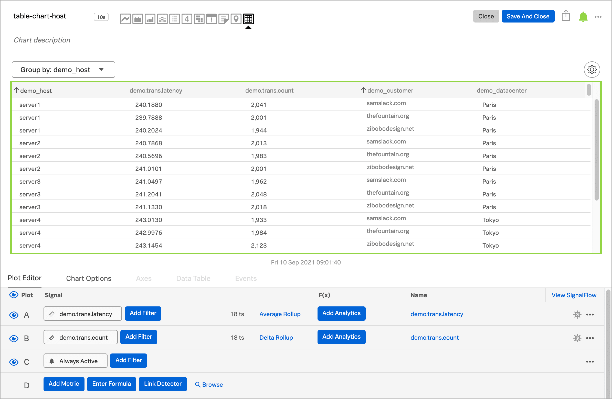
メトリック時系列行をディメンションでグループ化することができます。これを行うには、グループ化 メニューを選択し、行のグループ化に使用するディメンションを選択します。選択したディメンションの列が最初の列になり、テーブルの各行がそのディメンションの1つの値を表すように表示されます。
たとえば、host ディメンションでテーブルをグループ化して、環境内の各ホストの健全性とステータスを表示します。
非表示にしているディメンション列によってグループ化すると、要求されたグループ化を実行するためにその列が表示されます。
グループ化 オプションを使用してテーブルをグループ化しても、ディメンション値ごとに複数の行が存在する場合があります。これは、グループ化ディメンション値ごとの列の値が複数ある場合に発生します。これを解決するには、プロットに集計分析を適用します。集計の詳細は、データの集約と変換 を参照してください。
テーブルのセルに欠落したデータ値がある場合、そのセルには値が表示されません。
テーブルチャートをカスタマイズしてデータを最適に視覚化する方法をいくつか示します:
ディメンション列を並べ替える
列のヘッダーを選択してドラッグし、その列を新しい位置に移動します。メトリクス列の並び替えはできません。
列を表示または非表示にする
グラフィカルプロットエディタービューで、テーブルの右上付近にある歯車アイコンを選択します。列の表示/非表示(SHOW/HIDE COLUMNS) セクションで、列名を選択して列の表示と非表示を切り替えます。
SignalFlowプロットエディタービューの場合:
メトリクス列を非表示にするには、SignalFlowコードのメトリクスの行の先頭に
#を追加して、コメントアウトします。または、メトリクスを削除することもできます。ディメンション列を表示または非表示にするには、テーブルの右上付近にある歯車アイコンを選択します。列の表示/非表示(SHOW/HIDE COLUMNS) セクションで、ディメンション列名を選択して、列の表示と非表示を切り替えます。
テーブルの値を並べ替える
列のヘッダーを選択して、昇順による並べ替えと降順による並べ替えを切り替えます。列のヘッダーに表示される矢印のアイコンで、ソート順が分かります。
ディテクターをテーブルチャートにリンクする
「チャートビルダー」の右上付近にある アラート アイコン(ベル)を選択します。ディテクターのリンク を選択して、テーブルチャートを既存のディテクターにリンクします。チャートから新しいディテクターを作成 を選択すると、テーブルチャートとリンクさせる新しいディテクターを作成できます。
チャートから新しいディテクターを作成する方法については、チャートからディテクターを作成する を参照してください。
ディテクターにリンクされたチャートには、リンクされたディテクターのアラートのステータスに対応する色の枠が表示されます。例えば、ディテクターから発されたアラートがない場合、チャートには緑色の枠が表示されます。チャートのヘッダーにはアラートが表示されますが、行ごとのアラートステータスは表示されません。